The network for creativity
Join 1.25M professional creatives like you
Connect with clients, get discovered, and run your business 100% commission-free
Creatives on Contra have earned over $150M and we are just getting started
Back to feedPost
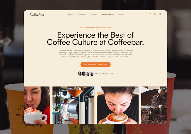
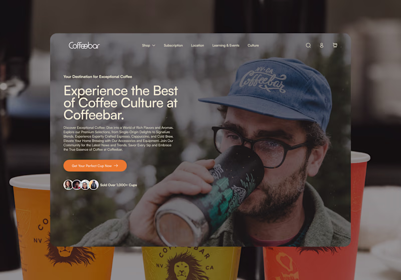
Taste Test
I’m exploring two homepage hero directions for a Coffeebar concept and testing which one feels stronger for the brand.
Direction 1 leans more editorial and product-focused, with a cleaner cream layout, image grid, and a stronger emphasis on coffee culture and product discovery.
Direction 2 feels more immersive and lifestyle-driven, using full-bleed photography, darker overlays, and a warmer coffeehouse atmosphere to create more emotion and brand personality.
Both directions can work, but they communicate slightly different things:
Direction 1: clean, curated, product-forward
Direction 2: warm, emotional, lifestyle-focused
I’m leaning toward the second direction because it feels more human and memorable, but I’d love to hear which one feels stronger at first glance.
11 voted
41%
16 voted
59%
27 votes
Closed
This DIRECTION 2 really stands out. The effort and thought behind it are obvious, and it shows in the final result. Keep pushing like this, you're building something remarkable.
Thank you, I really appreciate that. I’m leaning toward Direction 2 as well — it feels more emotional and connected to the brand. Excited to keep refining it.
Direction 2 for sure. Coffee is a sensory experience and the full-bleed photography captures that atmosphere in a way Direction 1 just doesn't. The cream layout is clean but it feels more like a product catalog.
Exactly. Direction 1 feels clean, but Direction 2 captures more of the mood and sensory experience around coffee. That full-bleed photography makes it feel more immersive and less like a product catalog.
good work!
Thanks 🙏
Direction 1
Direction 2 for me — the immersive lifestyle photography with the darker, warmer tone creates so much more emotional connection. Coffee brands sell a feeling, not just a product, and D2 nails that!
Direction 2 for me — the immersive lifestyle photography with the darker, warmer tone creates so much more emotional connection.
Direction 2 is better
Direction 1. It feels more distinctive and gives coffee, while Direction 2 feels more lifestyle-focused. The image grid also helps tell the story faster.
Good point. Direction 1 definitely tells the coffee/product story faster with the image grid.
That’s the tradeoff I’m seeing too — D1 feels more immediate and distinctive, while D2 feels more emotional and immersive.
Direction 1 feels more premium and editorial to me — the cream tones give it a luxurious, specialty coffee feel. Great concept exploration!
Thank you, I appreciate that. I agree — Direction 1 has a more premium/editorial feel, especially with the cream tones and image grid.
That’s the interesting tradeoff: D1 feels more specialty coffee, while D2 feels more atmospheric and lifestyle-driven.
Both are nice but I like Direction 1
I’m curious why is that?
Direction 2 for me — full-bleed photography creates that 'I want to be there' feeling instantly. Direction 1 is clean but Direction 2 has soul.
Exactly. Direction 2 has more of that “I want to be there” feeling, which feels important for a coffee brand. Direction 1 is clean, but D2 brings more mood and soul.
Direction 2
The network for creativity
Join 1.25M professional creatives like you
Connect with clients, get discovered, and run your business 100% commission-free
Creatives on Contra have earned over $150M and we are just getting started
Related posts
Here is my submission for the #makeathon
FocusDock is a calming focus timer designed for work, study, reading, and deep focus sessions.
https://detach-lime-09329627.figma.site/
The idea started from a simple problem: most focus timers are functional, but they don’t feel personal or emotionally engaging. I wanted to create a timer that feels more like a small ritual, choosing your environment, placing your clock, setting the mood, and starting a focused session with intention.
With FocusDock, users can:
Choose a focus duration
Pick from different illustrated desk, shelf, and table backgrounds
Select a clock style
Place the clock naturally inside the scene
Start a clean, distraction-free focus session
Use ambient sounds or music to support concentration
The design direction is soft, calm, and minimal, using 2D illustrated backgrounds with clear surfaces where the clock can sit naturally. The goal is to make the clock feel like an object inside the workspace, not just a floating timer UI.
I’m using Figma’s suite of tools to explore the visual system, generate the interface direction, and build the interactive prototype with Figma Make. A big part of the challenge is making the experience feel polished: smooth transitions, thoughtful placement, responsive layouts, and a focus flow that feels simple but meaningful.
For me, this project is about turning time management into a calmer, more intentional experience.
social post: https://x.com/sir_hsn/status/2063623301201858694?s=20
So good 😍
Thats a banger presentation, awesome work! 🔥
Challenges
View allTrending
Claude
Claude has entered the design space. How are you using Claude Design?
Contra University
Learn from expert creatives how to earn more using next-gen AI tools.
MagicPath
The canvas is infinite, and exploration is becoming the workflow. How are you using MagicPath?
creativeaiflow
Creative AI workflows are evolving. What tools do you use, and what are their strengths and weaknesses?
freelancerlife
Freelancer life is wins, pivots, and everything in between. What’s yours right now?
