The network for creativity
Join 1.25M professional creatives like you
Connect with clients, get discovered, and run your business 100% commission-free
Creatives on Contra have earned over $150M and we are just getting started
Back to feedPost
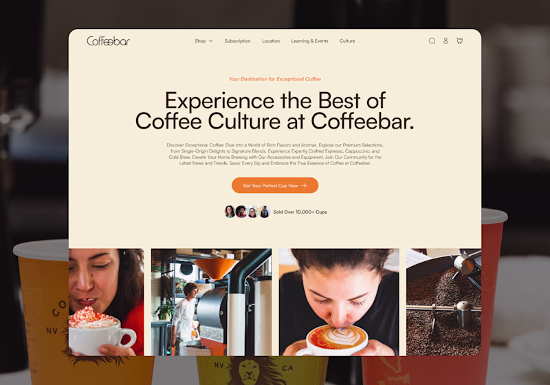
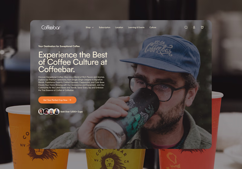
Taste Test
I’m exploring two homepage hero directions for a Coffeebar concept and testing which one feels stronger for the brand.
Direction 1 leans more editorial and product-focused, with a cleaner cream layout, image grid, and a stronger emphasis on coffee culture and product discovery.
Direction 2 feels more immersive and lifestyle-driven, using full-bleed photography, darker overlays, and a warmer coffeehouse atmosphere to create more emotion and brand personality.
Both directions can work, but they communicate slightly different things:
Direction 1: clean, curated, product-forward
Direction 2: warm, emotional, lifestyle-focused
I’m leaning toward the second direction because it feels more human and memorable, but I’d love to hear which one feels stronger at first glance.
11 votes
Ends in 1d
This DIRECTION 2 really stands out. The effort and thought behind it are obvious, and it shows in the final result. Keep pushing like this, you're building something remarkable.
Direction 2 for sure. Coffee is a sensory experience and the full-bleed photography captures that atmosphere in a way Direction 1 just doesn't. The cream layout is clean but it feels more like a product catalog.
good work!
The network for creativity
Join 1.25M professional creatives like you
Connect with clients, get discovered, and run your business 100% commission-free
Creatives on Contra have earned over $150M and we are just getting started
Related posts
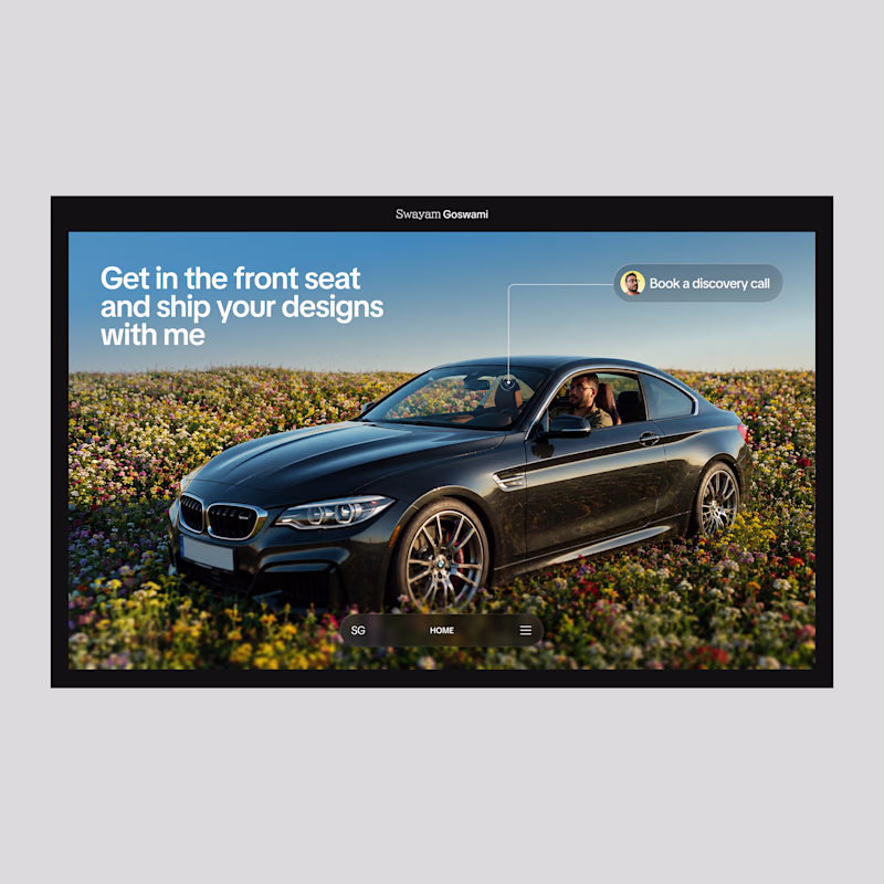
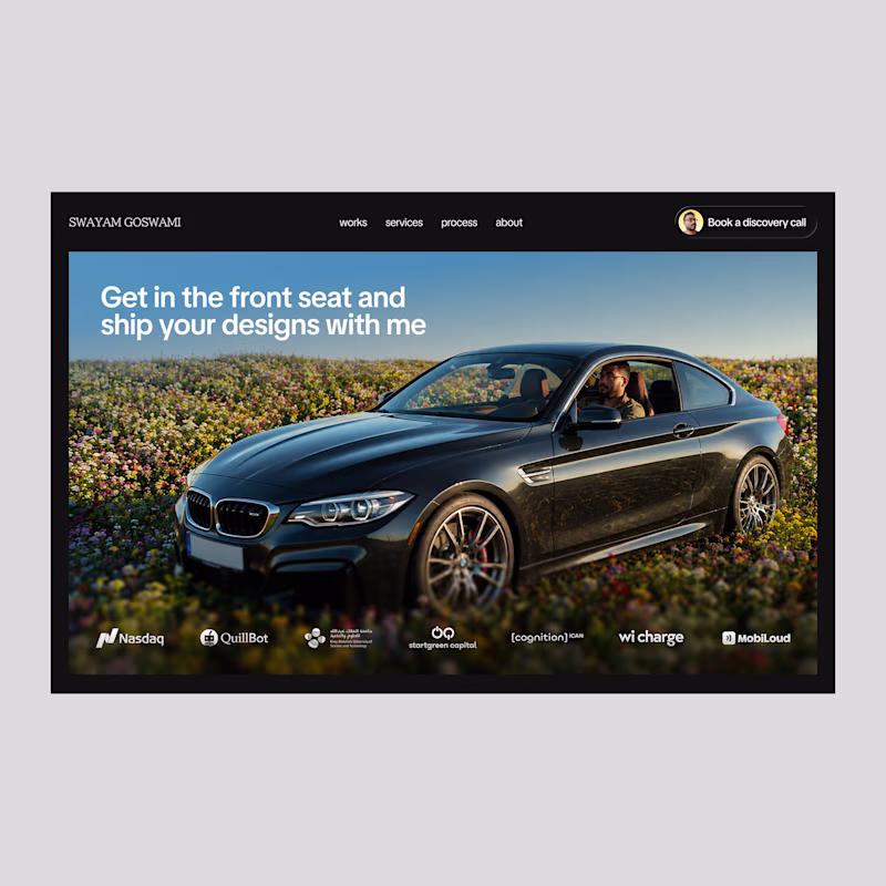
Taking a bold route for my website because you got to take risks in this market!
Which one nailed it?
5 voted
28%
13 voted
72%
18 votes
Closed
Traditional all the way
Footer design for Forja AI
Framer + Claude
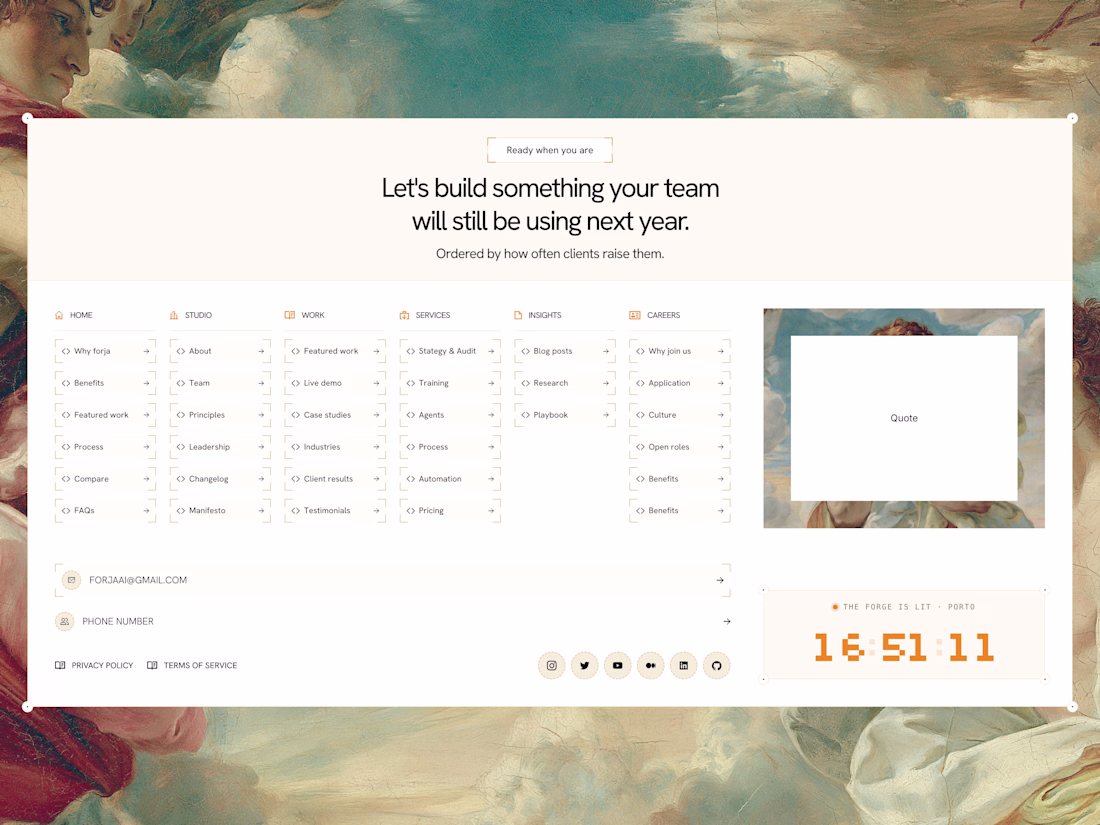
Looks cool
Earlier this week, Timelaps, a brand designed and developed by BrightStudios has been featured on a billboard next to Nasdaq.
Always an incredible feeling
PS full case study is available over on our profile
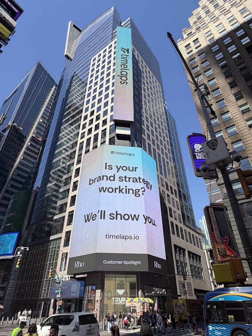
I saw this somewhere today (most likely on linkedin) and I knew I've seen this name/company somewhere.. now I remember. Well deserved! 🤘 🐐
Challenges
View allTrending
Claude
Claude has entered the design space. How are you using Claude Design?
Contra University
Learn from expert creatives how to earn more using next-gen AI tools.
MagicPath
The canvas is infinite, and exploration is becoming the workflow. How are you using MagicPath?
creativeaiflow
Creative AI workflows are evolving. What tools do you use, and what are their strengths and weaknesses?
freelancerlife
Freelancer life is wins, pivots, and everything in between. What’s yours right now?