The network for creativity
Join 1.25M professional creatives like you
Connect with clients, get discovered, and run your business 100% commission-free
Creatives on Contra have earned over $150M and we are just getting started
Back to feedPost
Taste Test

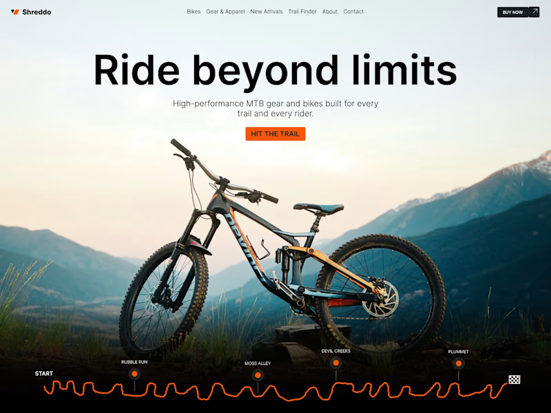
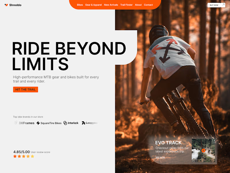
Another hero exploration, this time for an MTB store. I guess I should hit some trails soon. Which one gets your wheels turning, A or B? 🚵
70 voted
69%
32 voted
31%
102 votes
Closed

Hero A all day everyday

Great job


I love B


Hero A for me

I think option A but with little bit of background motion. What you think?

hero B look's great

Hero A looks cool

Hero B stands out for me

The reason I chose B is in motion, In line with the text. Meanwhile, in option A, there is only a bicycle without a rider. If you show the rider from the front, or the side, it might be better. The lighting also needs to be rearranged to make it look more immersive. I like your...

Good job with both but I would go for A

amazing design bravo bro

I think A looks better

This is so cool

My vote is for B

Hero A for me

Hero B has an artistic vibe

Give me hero A
Hero B for me. It's not just about the design, it's how it makes the users feel. "Would seeing the hero section make me scroll down for more?". If we're focused on the market analysis? B would do way better than A

hero A, though i do have to say, i think potentially incorporating the title's all-caps design as shown in hero B could push the whole of the drive to get exploring & in motion beyond limits of the viewer's screens! that said, truly fantastic work you've put together here! ...

A looks stunning, while B looks unique


I prefer Hero A to Hero B


Hero B for me

A,simple and worth exploring

A for me. The focal point is much stronger. The bike immediately grabs attention, and the background complements it rather than competing with it. :)

it A for me

I think Option B is stronger from a UX perspective. It's easier to scan, the visual hierarchy is clearer, and the value proposition comes across much faster.
That said, I really like the trail graphic in the first concept.

Hero B


B. the action shot sells the ride not the bike and that's what an MTB buyer is actually shopping for. A is the cleaner product frame but it reads like a spec sheet, B reads like Saturday morning. keep A's layout discipline for the category pages

Hero A for me.
The network for creativity
Join 1.25M professional creatives like you
Connect with clients, get discovered, and run your business 100% commission-free
Creatives on Contra have earned over $150M and we are just getting started
Related posts

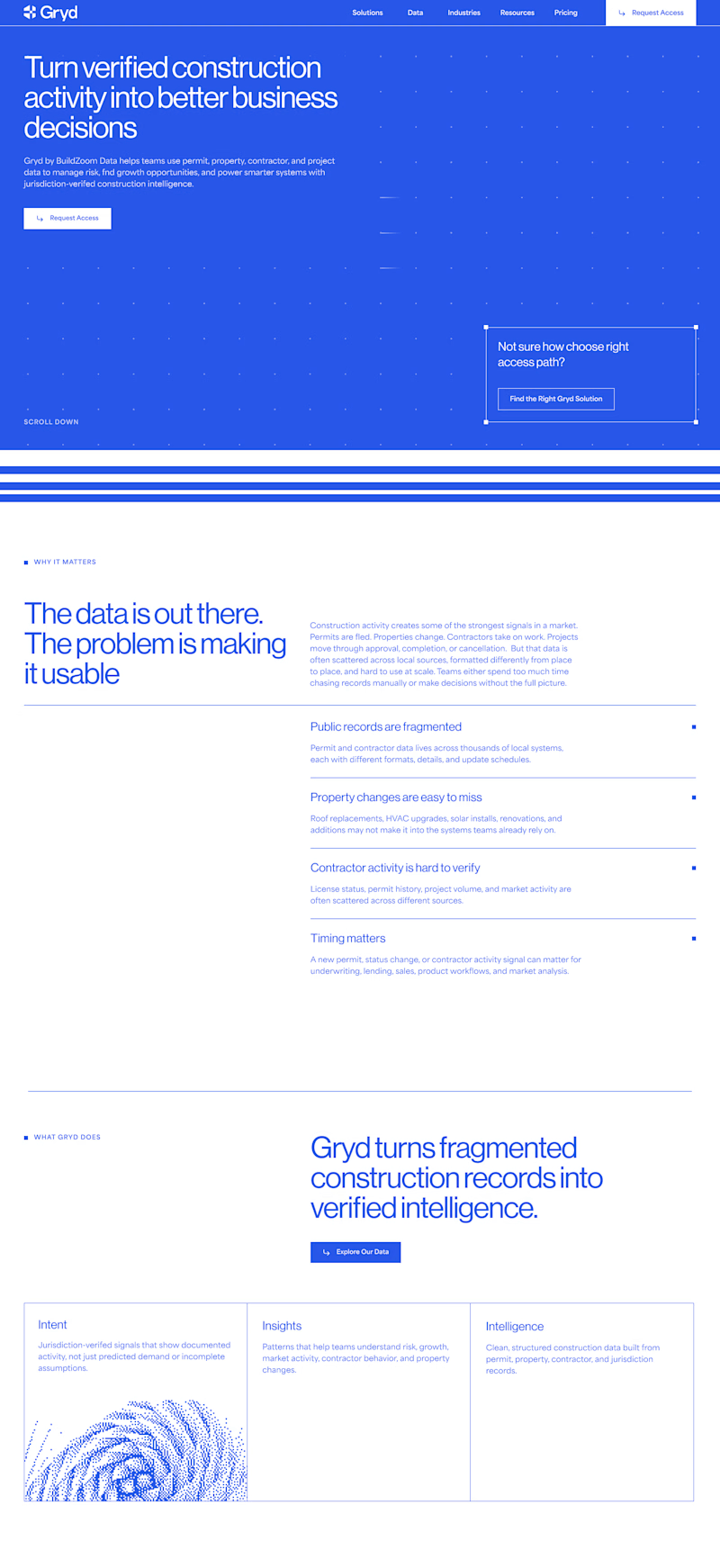
I'm currently working on a website that focuses on data, with minimal imagery and a clean, linear branding style. My question is: is it better to alternate the blocks frequently, as in the version on the left, or to make most of the page blue? 🤔
20 voted
95%
1 voted
5%
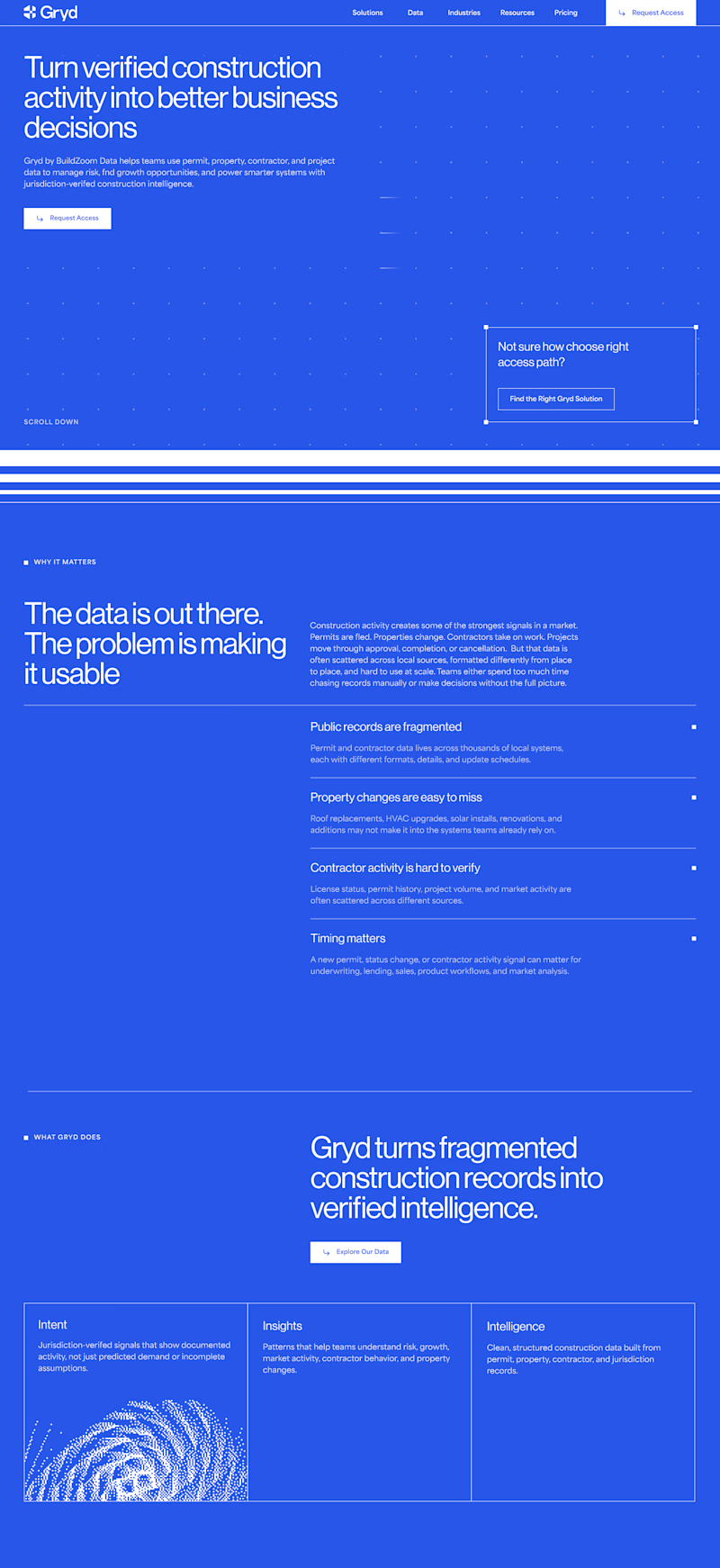
21 votes
Closed
White and blue for me always

You're starting a new project today.
Which one are you choosing? 👀
🅰️ Claude Code
🅱️ Codex
What's the biggest advantage of your choice? 👇
69 voted
85%
12 voted
15%
81 votes
Closed

If you asked me this 2 months ago, I would've chosen Codex. But Claude is another level these days (specially because of the extended usage limit).


We’ve just wrapped up another project! 🚀
It actually started with a different plan – the client wanted to build everything on Circle.
Before designing the website, we took time to map out the community structure and member journey. After reviewing the project goals, we realized Kajabi would be a much better fit.
Sometimes the most valuable part of a project isn't building the website – it's helping a client choose the right platform from the start.
The result? A fully integrated Kajabi website with products, community, and a seamless experience all in one place.



Impressive 👍








Trending

Claude
Claude has entered the design space. How are you using Claude Design?

Contra University
Learn from expert creatives how to earn more using next-gen AI tools.

MagicPath
The canvas is infinite, and exploration is becoming the workflow. How are you using MagicPath?
creativeaiflow
Creative AI workflows are evolving. What tools do you use, and what are their strengths and weaknesses?
freelancerlife
Freelancer life is wins, pivots, and everything in between. What’s yours right now?


