The network for creativity
Join 1.25M professional creatives like you
Connect with clients, get discovered, and run your business 100% commission-free
Creatives on Contra have earned over $150M and we are just getting started
Back to feedPost
Ciaocycling — Brand Identity
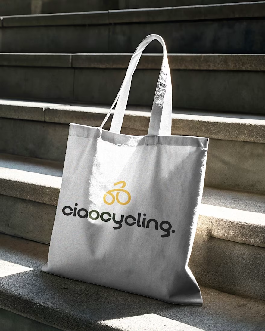
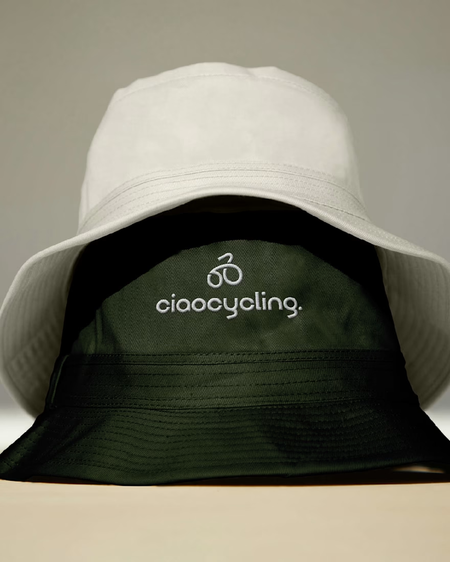
The project started with a clear idea: create a cycling brand that feels premium, but still calm and easy. The brand is built for people who enjoy cycling as a lifestyle, not just performance, but travel, culture, and experience.
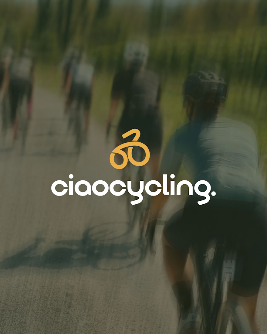
The logo is bold but friendly. The small letters make it feel more human and approachable, while still strong. The icon is made from one continuous line, inspired by the flow of cycling and even Italian pasta—soft, natural, and effortless.
The colors are muted and earthy to reflect nature, warmth, and slow travel. Nothing loud, nothing distracting.
Typography is clean and balanced, designed to feel modern but timeless.
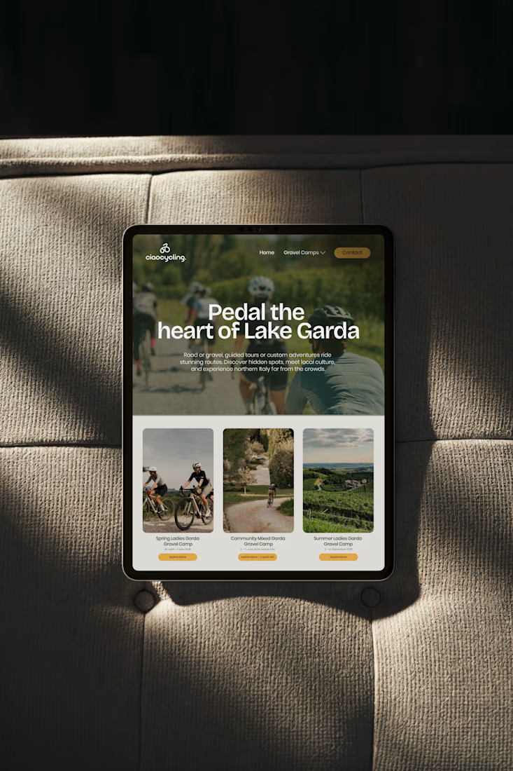
Every part of the identity is made to work across real uses from caps and signage to digital screens without losing its feel.


Loved the mark and logotype. This is very impactful. Good to see something that is based on strategy. Great work!

Thanks a lot Amit. I really appreciate your support; this is really inspiring.

I love the type you chose for the logo. Everything goes together so seamlessly 🔥
Thank you, I really appreciate it. It’s actually a custom typeface I developed specifically for this project to give the brand a more distinctive and refined feel.
That's even more impressive! The "y" & "g" especially are standouts for me ♥️
Glad you liked it.

Nice!
Thank you, I appreciate it.
The network for creativity
Join 1.25M professional creatives like you
Connect with clients, get discovered, and run your business 100% commission-free
Creatives on Contra have earned over $150M and we are just getting started











Related posts

An existing brand identity showcased across a new campaign. This was one of my favourite projects ever!
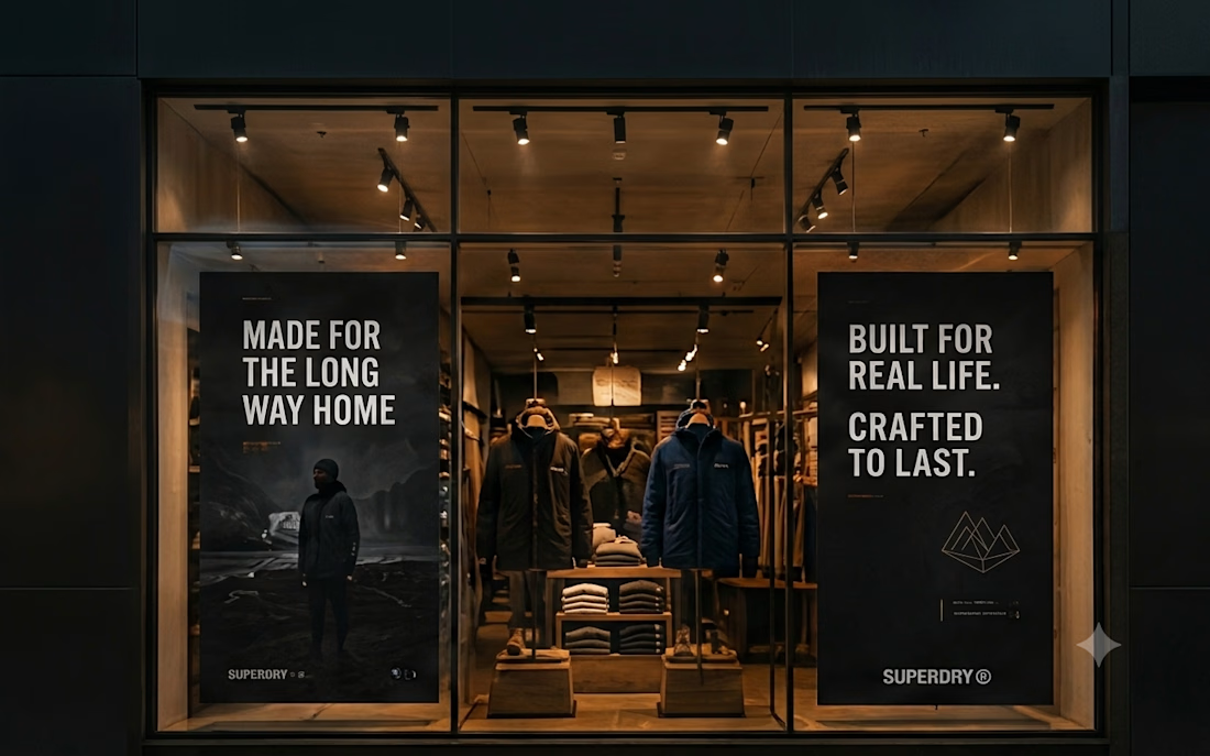
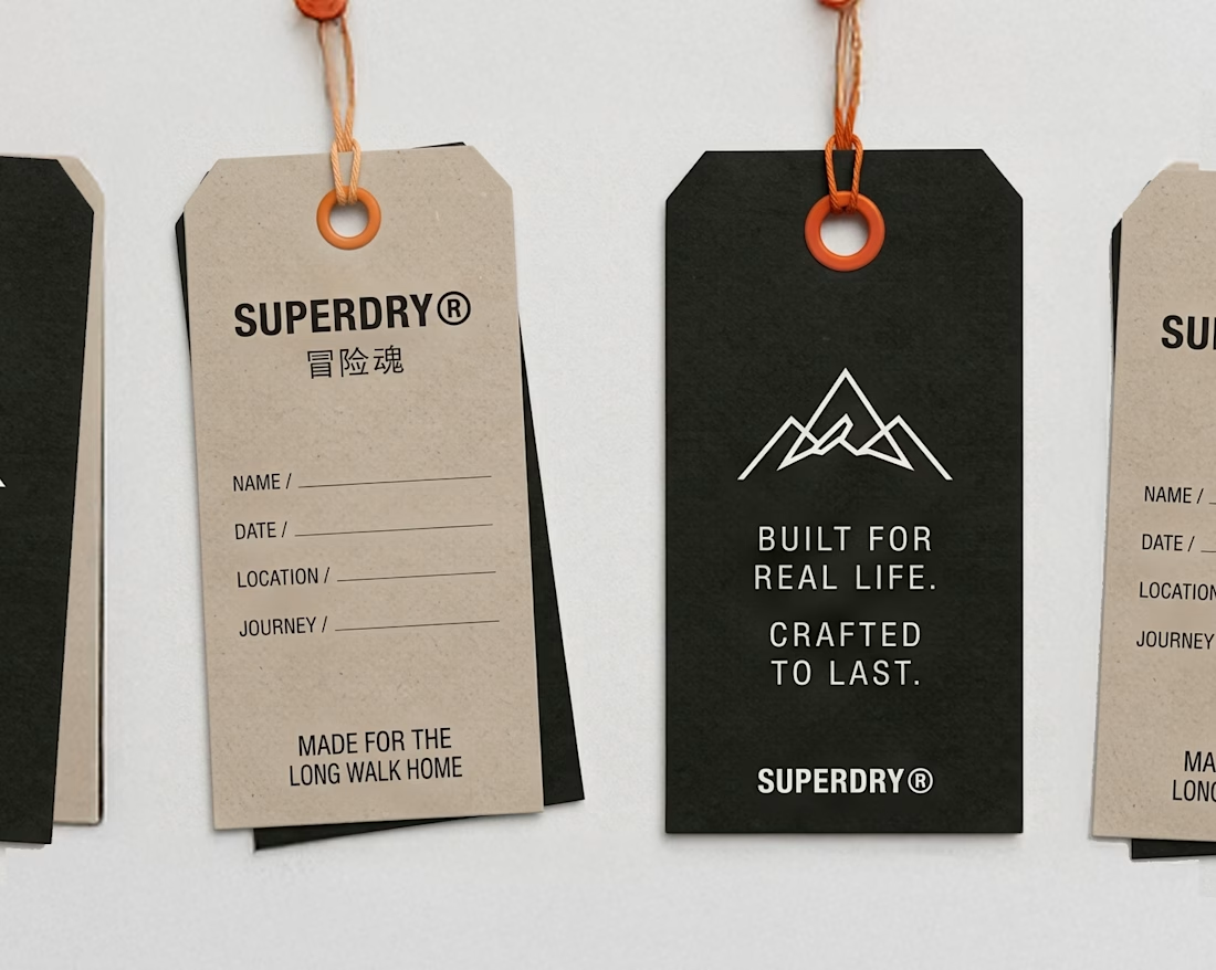
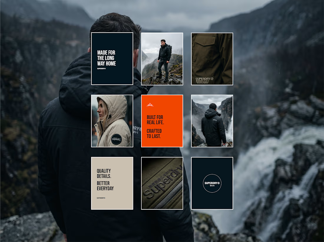
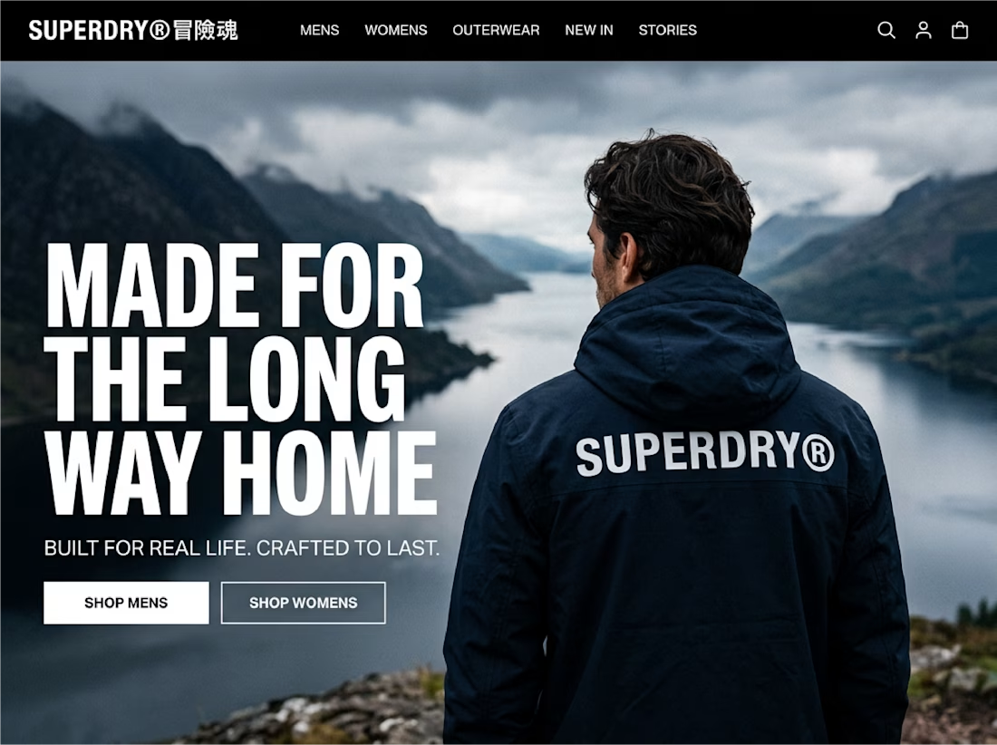

Great brand identity design specially bottom right and bottom left designs ❤️❤️
Great job Seadhna🔥🔥

Most early-stage brands play it safe and disappear after a while. For Drylendar, I did the opposite.
3 weeks from brief to full identity: logo, illustration system, app visuals, collectible cards and even merch.
AI makes things cheaper. Personality makes brands memorable.
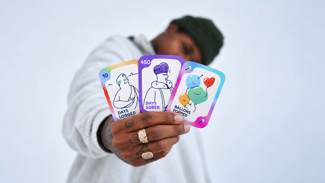
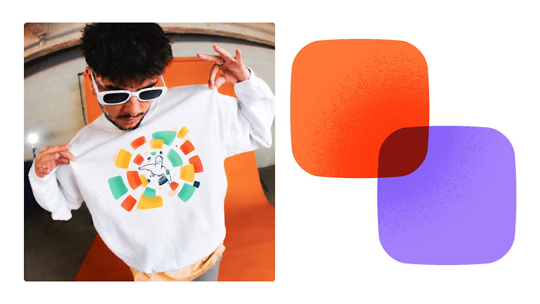
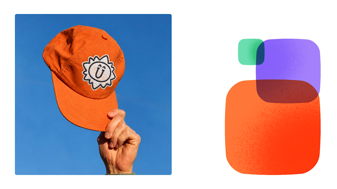
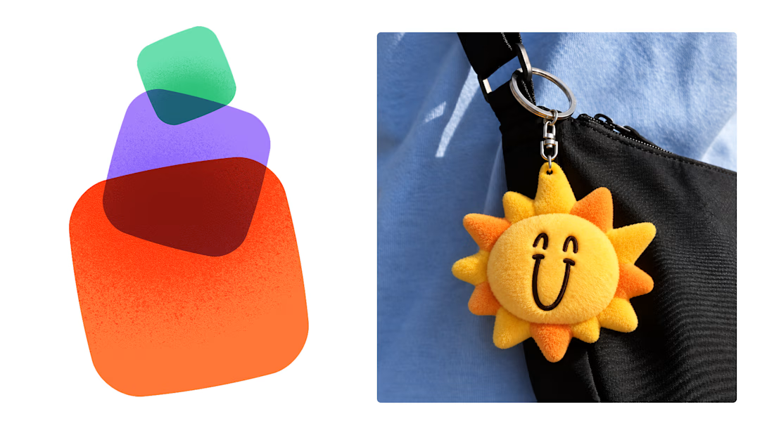

This is exactly what branding should be! 🔥 3 weeks for full identity, merch, cards - you really built personality, not just a logo. Love the Drylendar vibe. AI makes it cheap, but this makes it memorable - so true!

Have you ever designed packaging for a brand that never launched? 👀
Surprisingly, it’s happened to me more times than I expected.
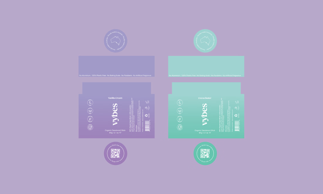
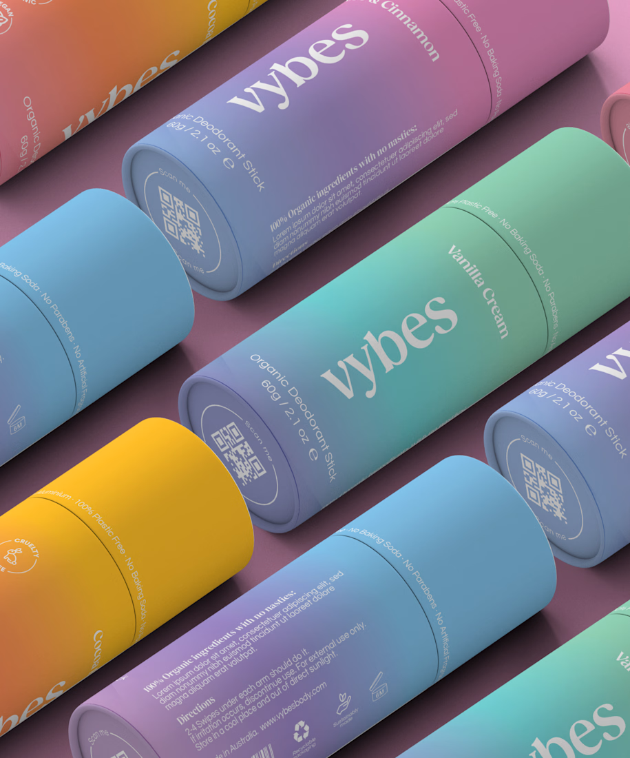
Vybes was an organic deodorant brand from Australia I worked on, designing packaging for a product that, in the end, never made it to market.
It’s a weird feeling putting so much thought into packaging for a product that people will never see on a shelf.
How many unreleased projects are hiding in your folders? 😂