The network for creativity
Join 1.25M professional creatives like you
Connect with clients, get discovered, and run your business 100% commission-free
Creatives on Contra have earned over $150M and we are just getting started
Back to feedPost
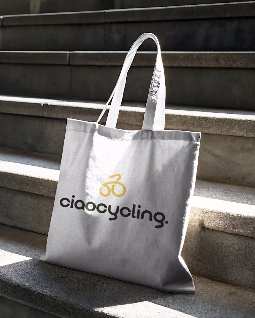
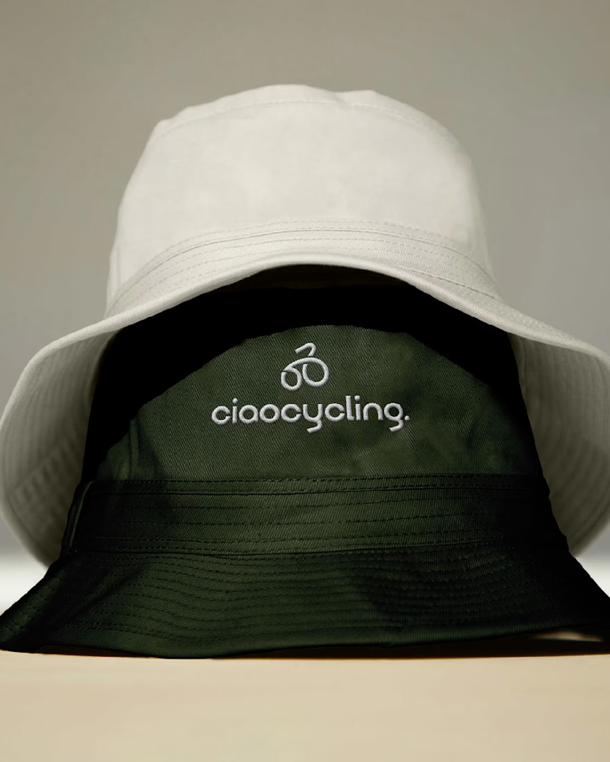
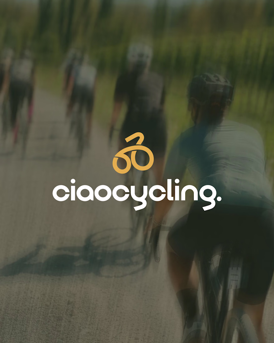
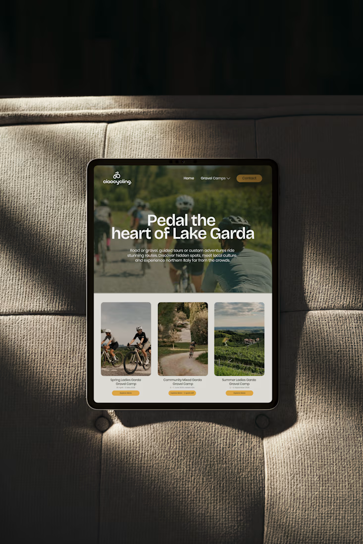
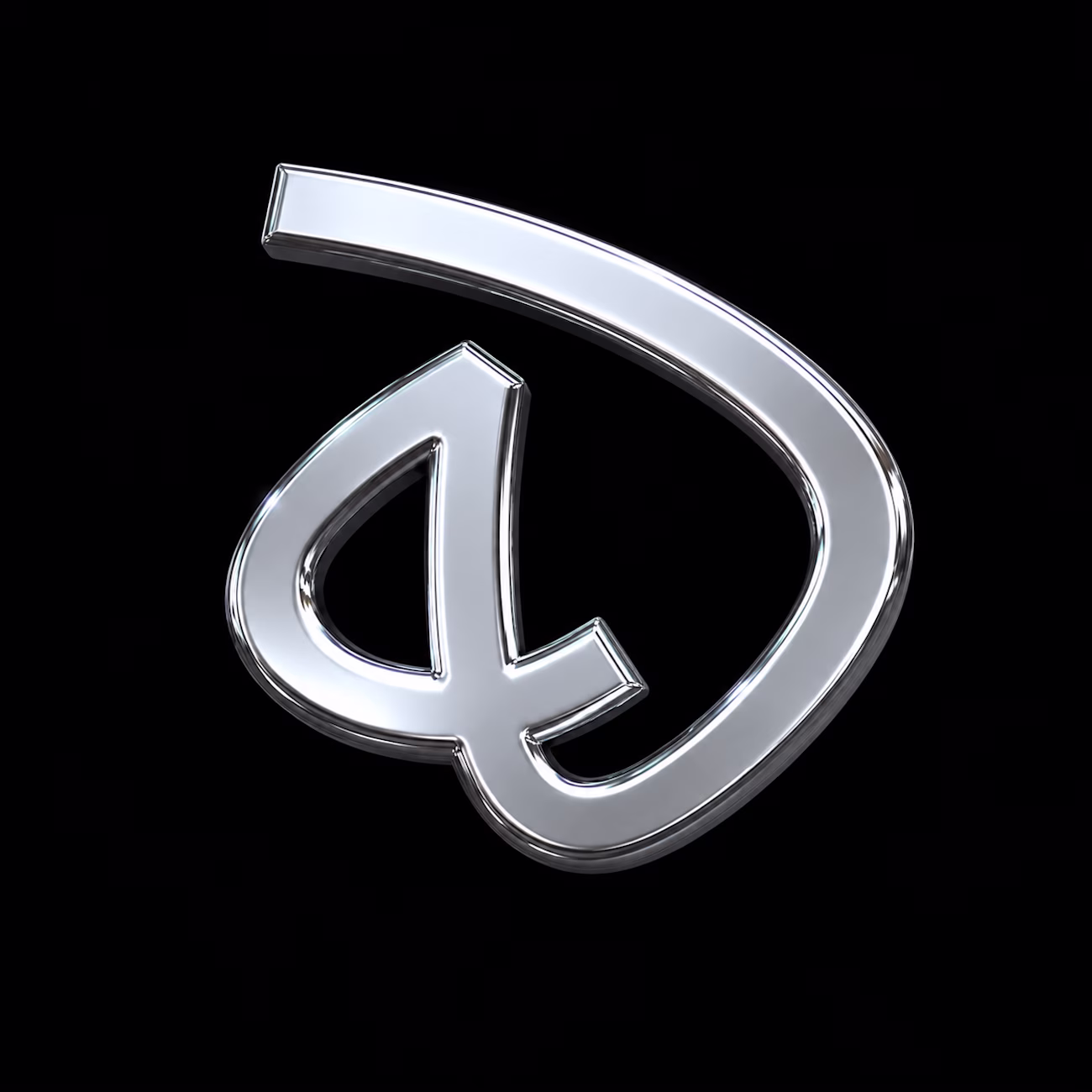
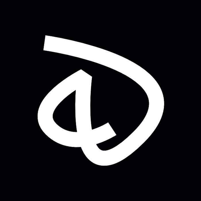
Ciaocycling — Brand Identity
The project started with a clear idea: create a cycling brand that feels premium, but still calm and easy. The brand is built for people who enjoy cycling as a lifestyle, not just performance, but travel, culture, and experience.
The logo is bold but friendly. The small letters make it feel more human and approachable, while still strong. The icon is made from one continuous line, inspired by the flow of cycling and even Italian pasta—soft, natural, and effortless.
The colors are muted and earthy to reflect nature, warmth, and slow travel. Nothing loud, nothing distracting.
Typography is clean and balanced, designed to feel modern but timeless.
Every part of the identity is made to work across real uses from caps and signage to digital screens without losing its feel.
Loved the mark and logotype. This is very impactful. Good to see something that is based on strategy. Great work!
Thanks a lot Amit. I really appreciate your support; this is really inspiring.
This really stands out. The effort and thought behind it are obvious, and it shows in the final result. Keep pushing like this, you're building something remarkable.
Thank you so much, I really appreciate it. I’ve been putting a lot of focus into refining the process and thinking behind the work, so it means a lot that you noticed.
I love the type you chose for the logo. Everything goes together so seamlessly 🔥
Thank you, I really appreciate it. It’s actually a custom typeface I developed specifically for this project to give the brand a more distinctive and refined feel.
That's even more impressive! The "y" & "g" especially are standouts for me ♥️
Glad you liked it.
This looks clean
Thanks brother, glad you liked it.
Nice!
Thank you, I appreciate it.
The network for creativity
Join 1.25M professional creatives like you
Connect with clients, get discovered, and run your business 100% commission-free
Creatives on Contra have earned over $150M and we are just getting started
Related posts
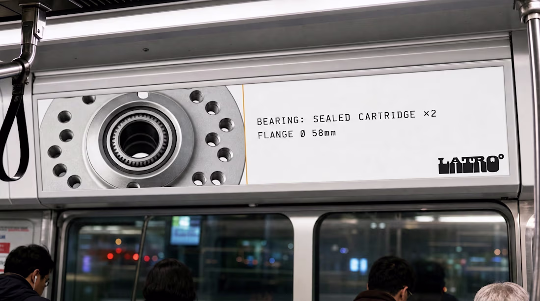
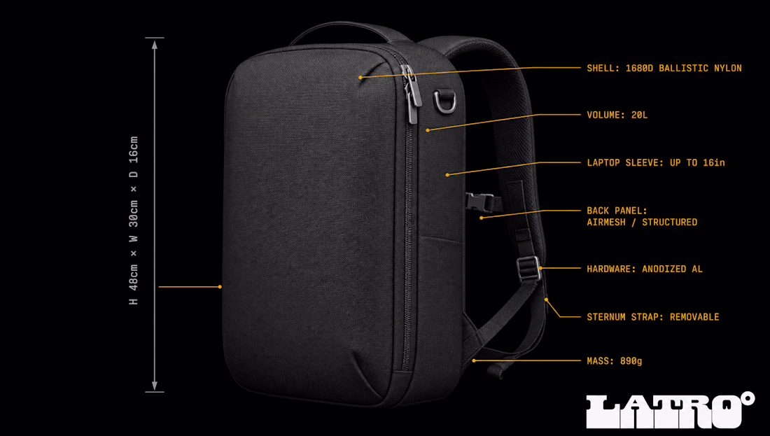
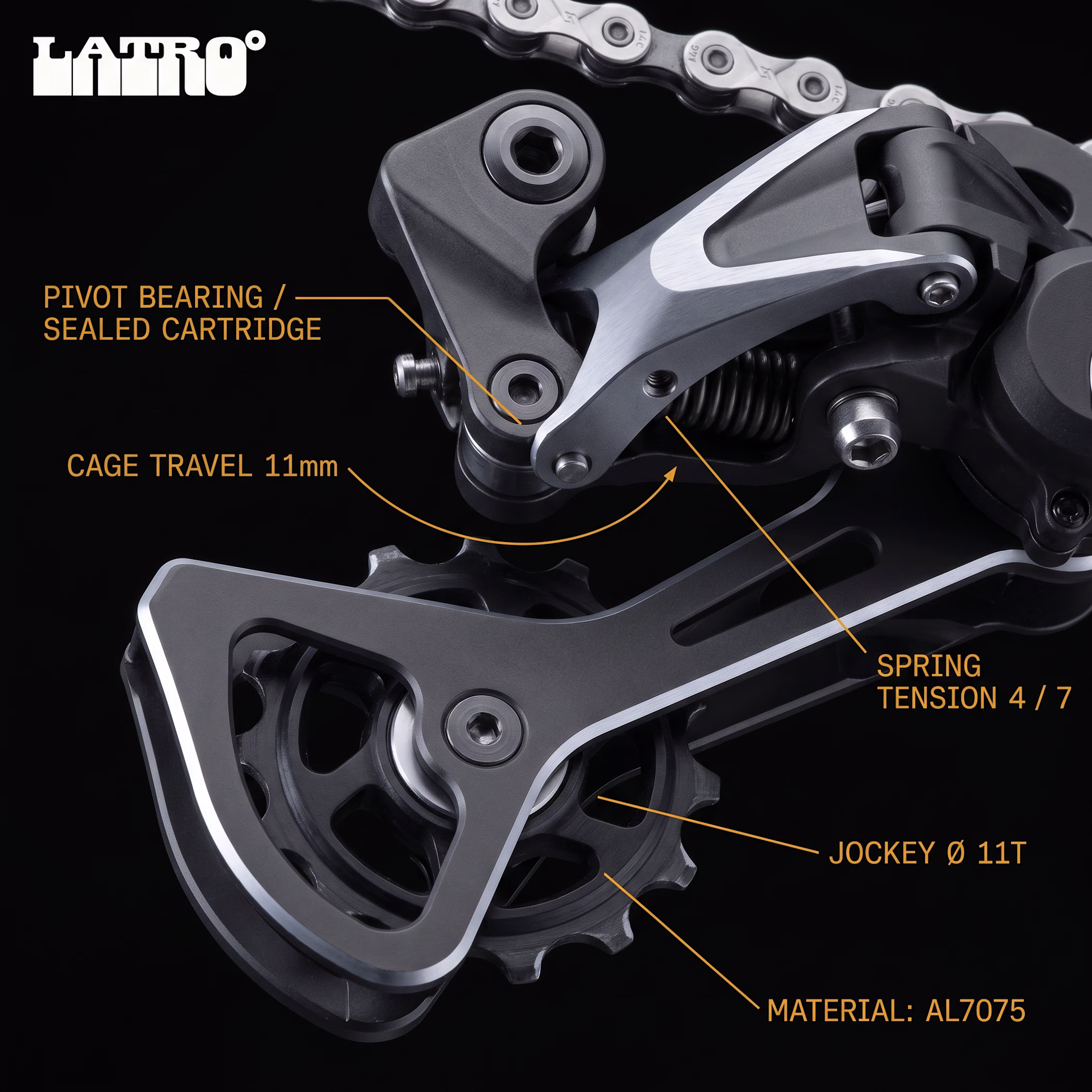
nobody asked for a cycling brand that looks like a decommissioned aerospace catalog.
built one anyway.
LATRO° case study is live.
Incredible!
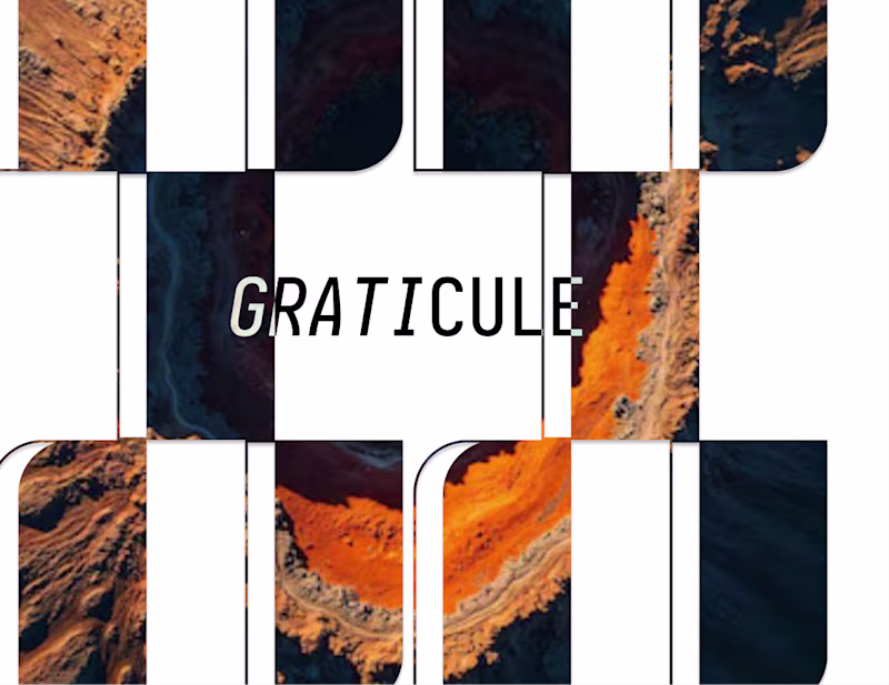
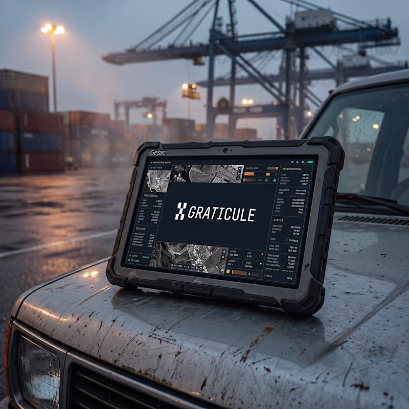
Two directions emerged while building Graticule.
Which direction feels more credible for a company building the intelligence layer for cities?
A — expressive, editorial, light-filled systems
B — operational, technical, dark infrastructure aesthetics
Both were explored during the development of Graticule.
Only one survived contact with the mission.
Case study soon.
12 voted
50%
12 voted
50%
24 votes
Closed
I'd vote Expressive! For a SaaS brand, having that editorial, human feel can really stand out. Operational works, but expressive builds deeper connection.
I haven't posted here in a little while.
I forgot how great this place is for design threads and inspiration.
I wanted to share the logo mark I've recently done for my design studio (DesignOps Studio).
I've decided to go with a mark for the brand. I wanted something that reflects the process of building design systems.
- You start here
- You iterate
- Then you end there.
Trending
Claude
Claude has entered the design space. How are you using Claude Design?
Contra University
Learn from expert creatives how to earn more using next-gen AI tools.
creativeaiflow
Creative AI workflows are evolving. What tools do you use, and what are their strengths and weaknesses?
portfolioreview
The best portfolios tell a story, not just show a grid. Share yours for feedback.
freelancerlife
Freelancer life is wins, pivots, and everything in between. What’s yours right now?