The network for creativity
Join 1.25M professional creatives like you
Connect with clients, get discovered, and run your business 100% commission-free
Creatives on Contra have earned over $150M and we are just getting started
Back to feedPost
Taste Test
Which one feels stronger? 👀
Same logo, two different animation directions.
Which version would you pick? 1 or 2?
62 voted
66%
32 voted
34%
94 votes
Closed

Version 1 makes the logo feel more visually clear!

Yeah, I can see that 👌 Glad Version 1 reads clearer!

I'll go with version 1
Appreciate it! Good to know you prefer Version 1

Version 2
Thanks! Interesting to see Version 2 getting some love too.

Thanks! Glad Version 1 stood out to you.

Excellent
Thanks!

version 1 is super clean, i like it🔥
Thanks! Glad you like the clean approach 🔥

Version 1, because it's more like an animation and has intent/idea behind it, and v2 is more like a logo reveal kind of.
Yeah, exactly what I was aiming for. Appreciate the feedback!

Thanks! Good to know Version 2 works for you too.


Version 1 feels stronger. The simpler motion keeps the focus on the logo and communicates the idea more clearly.
Appreciate it! That was the idea, keep it simple and let the logo do the work.


Version 1 bro

Version 1 for me

Version 2 exudes a sense of luxury.

which ai did you used
I don’t use AI bro, I created on Adobe After Effects!

Version 2 is the BEST : )

Version 2 for me. The full lockup building in with that glow gives it more weight, and pairing the mark with the wordmark helps people actually connect the two when they see the icon alone later. Version 1 is cleaner but reads more like a loading spinner than a brand moment.
The network for creativity
Join 1.25M professional creatives like you
Connect with clients, get discovered, and run your business 100% commission-free
Creatives on Contra have earned over $150M and we are just getting started

Challenges
View all


Related posts


Product first or brand first? 🤔
We're cutting the promo reel for our case study and can't agree on its start. ✨
Which product ad opening would make you stay past the first 3 seconds?
Vote and tell why! 👇
Product DesignSoftware DevelopmentAdobe After EffectsCinema 4DFigmaBrand DesigncreativeaiworkflowUX Design


15 voted
25%
46 voted
75%
61 votes
Closed

I think both is important, but good product first.

Both on-brand. Just two different sides of the same story.
Which color would make you trust "better spaces, a healthier you" more? 👇

44 voted
100%
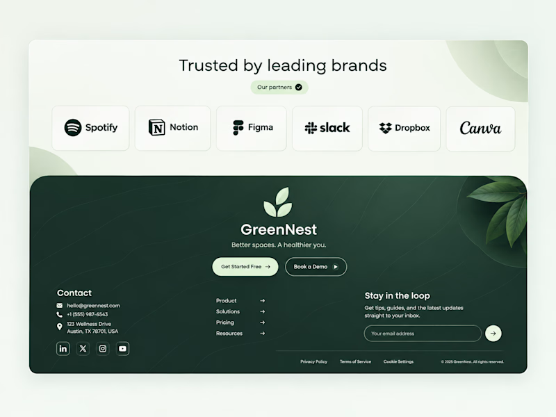
0 voted
0%
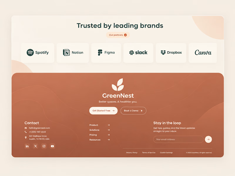
44 votes
Closed


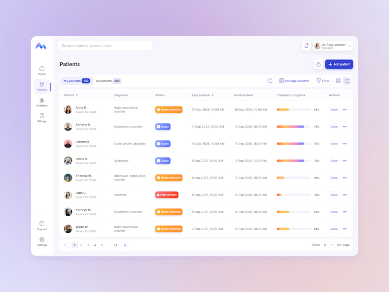
Same data, two different ways to experience it 🤔
I explored two patient list layouts for a mental health platform: a card view and a table view.
Cards feel more visual and personal, but space is limited and adding more information can quickly make them crowded. For complex enterprise products, I often find tables more practical — they’re easier to scan, compare, sort, and can support more columns when users need greater visibility.
For this kind of workflow, I’m leaning toward the table view. Which would you choose — cards or table?
11 voted
55%
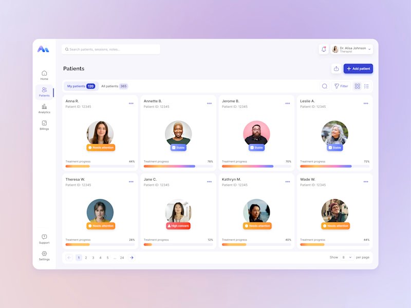
9 voted
45%
20 votes
Closed

For a mental-health patient list the choice isn't really card vs table — it's scan-speed vs context. The card wins the first meeting because the photo and name set the clinician's mental model before they touch the row, but the table is what holds up under the daily rhythm of...