The network for creativity
Join 1.25M professional creatives like you
Connect with clients, get discovered, and run your business 100% commission-free
Creatives on Contra have earned over $150M and we are just getting started
Back to feedPost


The network for creativity
Join 1.25M professional creatives like you
Connect with clients, get discovered, and run your business 100% commission-free
Creatives on Contra have earned over $150M and we are just getting started


Related posts

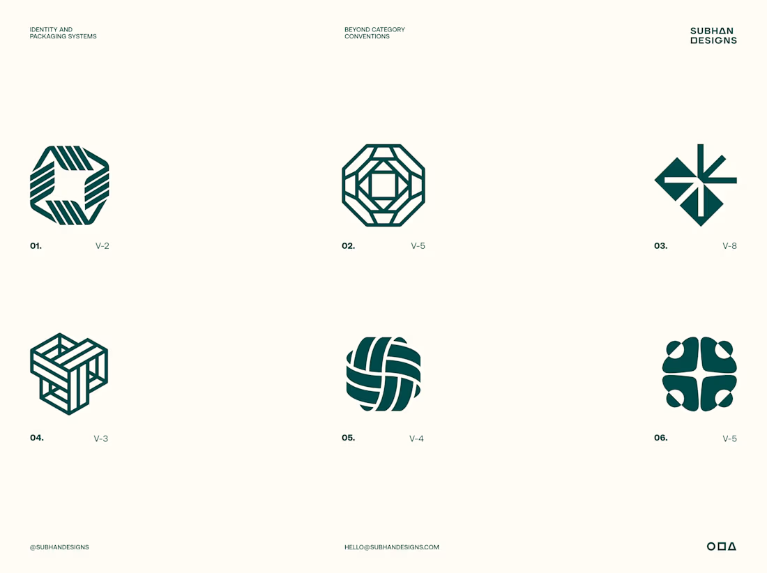
A logo is only a fraction of what we deliver.
The real value starts long before design. Understanding the brand, its audience, personality and positioning lays the foundation for every creative decision we make with our clients.
But logo exploration is where things get interesting. It's where strategy begins to take visual form, setting the direction for the entire identity system.
For Tandem, we explored multiple directions built around four ideas: Shared Progress, Simplified Complexity, Continuous Movement and Unlocking Opportunities.
Six distinct concepts. Six different interpretations of the same brand strategy.
Which direction do you think answers the brief best, and why?



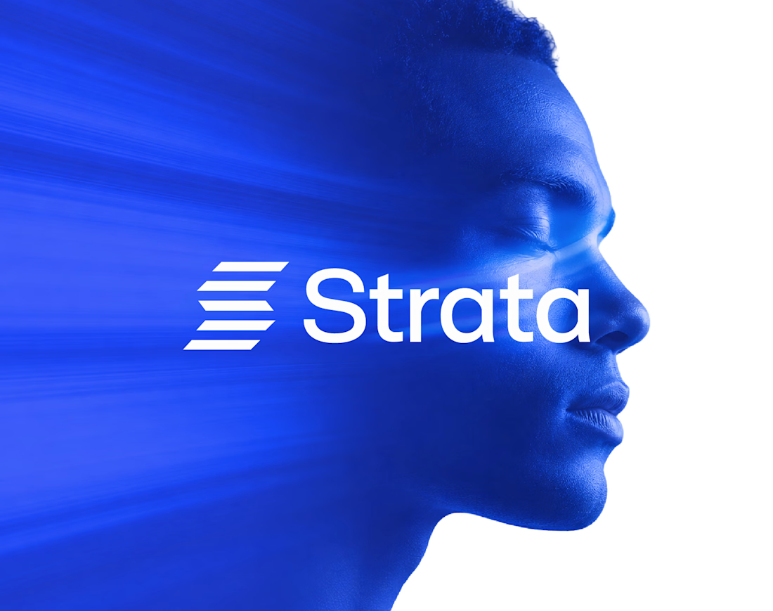
In geology, strata are layers laid down over time, each one holding the rest. That’s exactly what an enterprise platform should feel like.
I designed the brand identity for Strata, a SaaS platform that connects fragmented systems, data, workflows and teams. The name already carried the idea, so the identity makes it visible: “Every layer, working as one.”
Logo: Five stacked layers forming a subtle S, solid like rock and arranged for motion.
Principle: “Complexity, organized into movement” turns a dense product story into something calm.
Palette: Strata Blue #2447F9, near-black #02040C and white. Flat colour only, so every layer stays distinct.
Layout: Modular grids and architectural spacing that build pages the way strata build ground, in order.
Imagery: Portraits washed in Strata Blue, with light streaming through, putting people at the centre of the system.
A good name sets up the brand. The identity has to prove it.
If your SaaS or B2B platform needs a brand as solid as its infrastructure, let’s talk.
#BrandIdentity #SaaSBranding #TechBranding #LogoDesign


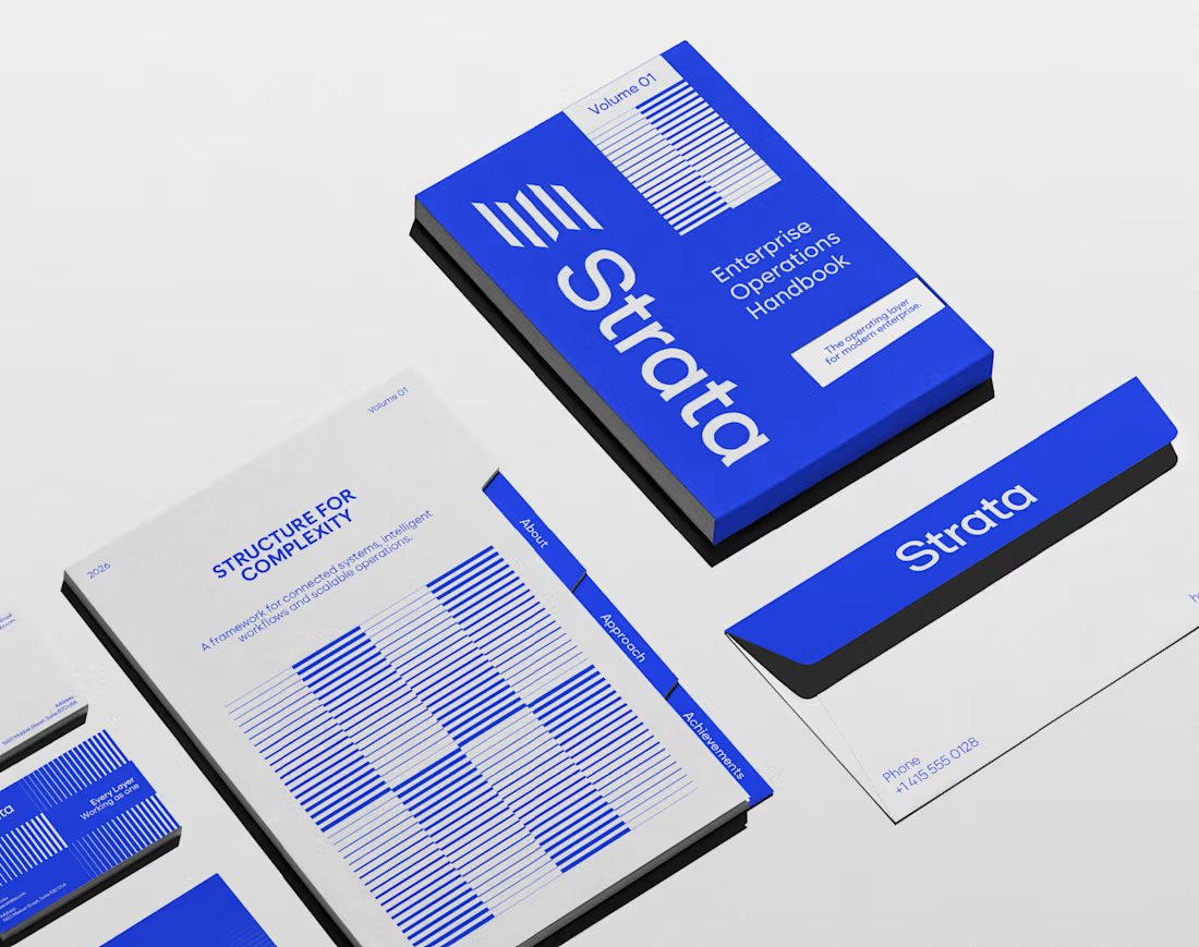
Enterprise software is rarely complex because of one system. It’s complex because nothing talks to anything else.
I designed the brand identity for Strata, an enterprise SaaS platform that connects fragmented systems, data, workflows and teams. The idea: “Every layer, working as one.”
Logo: Five horizontal layers stacked into a subtle S, separate parts moving as one structure.
Principle: “Complexity, organized into movement” shapes every layout decision.
Colour: Strata Blue #2447F9 with near-black and white. Solid colour only, no gradients, so it reads as clarity.
System: Modular grids, strong alignment and architectural spacing, so every surface feels engineered.
Imagery: Human portraits in Strata Blue, a reminder that behind every workflow there are people.
The best enterprise brands make complexity feel quiet.
If your SaaS company needs a brand that makes a complex product feel simple, let’s talk.
#BrandIdentity #SaaSBranding #LogoDesign #B2BBranding