The network for creativity
Join 1.25M professional creatives like you
Connect with clients, get discovered, and run your business 100% commission-free
Creatives on Contra have earned over $150M and we are just getting started
Back to feedPost

Enterprise software is rarely complex because of one system. It’s complex because nothing talks to anything else.
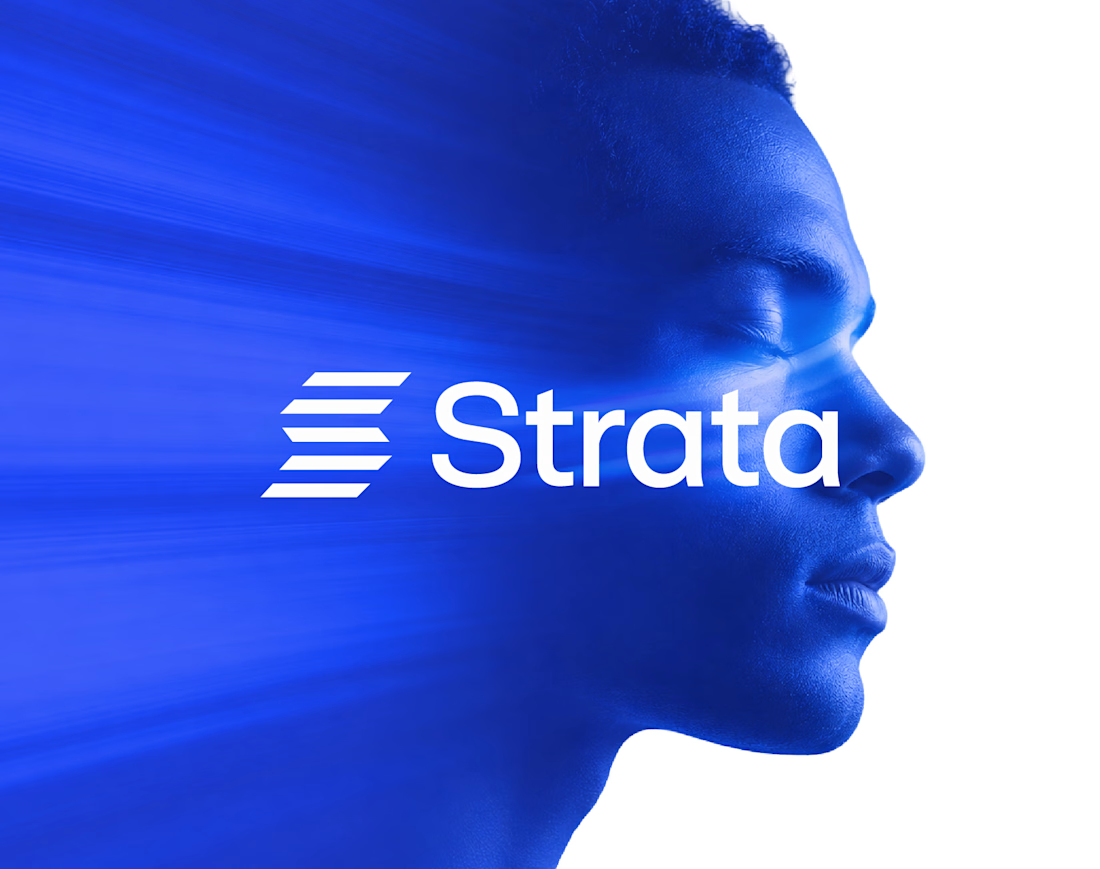
I designed the brand identity for Strata, an enterprise SaaS platform that connects fragmented systems, data, workflows and teams. The idea: “Every layer, working as one.”
Logo: Five horizontal layers stacked into a subtle S, separate parts moving as one structure.
Principle: “Complexity, organized into movement” shapes every layout decision.
Colour: Strata Blue #2447F9 with near-black and white. Solid colour only, no gradients, so it reads as clarity.
System: Modular grids, strong alignment and architectural spacing, so every surface feels engineered.
Imagery: Human portraits in Strata Blue, a reminder that behind every workflow there are people.
The best enterprise brands make complexity feel quiet.
If your SaaS company needs a brand that makes a complex product feel simple, let’s talk.
#BrandIdentity #SaaSBranding #LogoDesign #B2BBranding

The network for creativity
Join 1.25M professional creatives like you
Connect with clients, get discovered, and run your business 100% commission-free
Creatives on Contra have earned over $150M and we are just getting started
Related posts

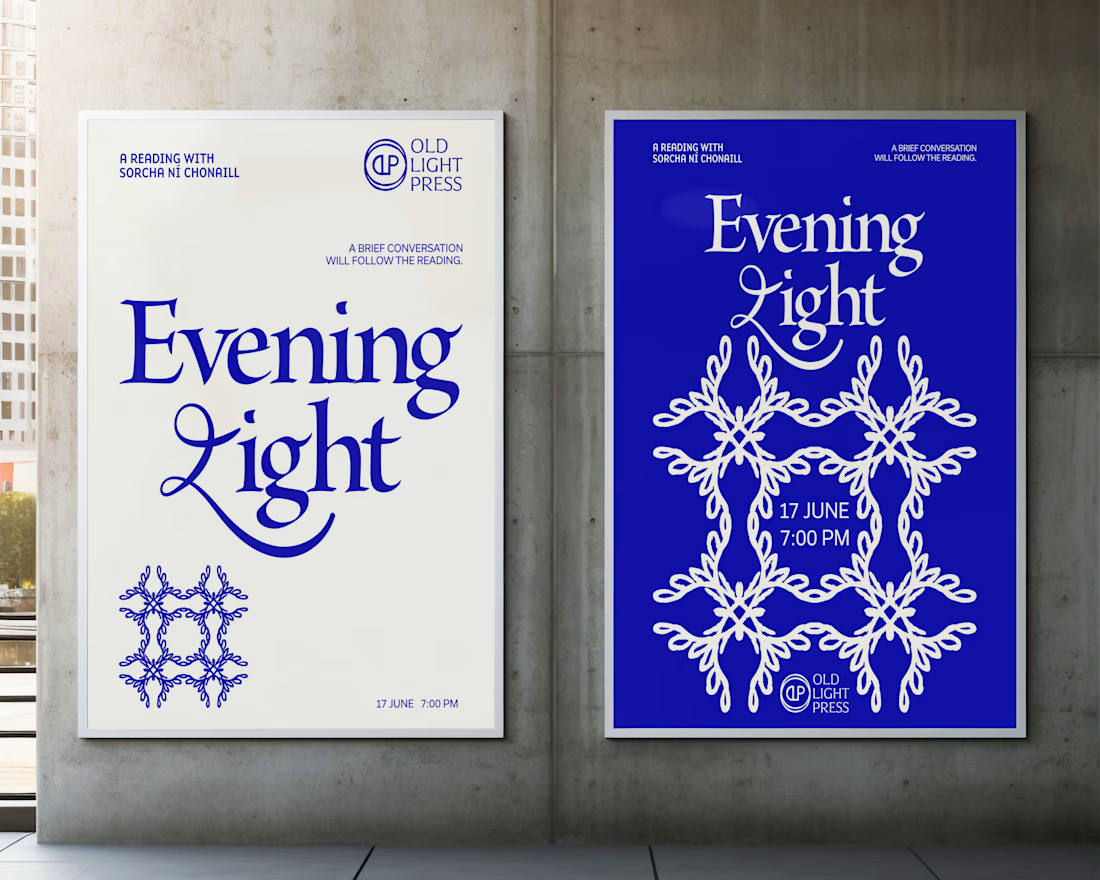
Brand identity concept for Old Light Press.

I love that all of your projects have a whimsy vibe 💖

A little behind-the-scenes look at a brand identity coming together.
I'm currently working on a new identity for a coworking space in Austin, TX, with a vintage-inspired direction, warm colors, and a logo that brings a bit of nostalgia into a modern setting.

Carrying the vintage idea onto the coasters and the dot pattern gives the identity somewhere to live besides the logo.

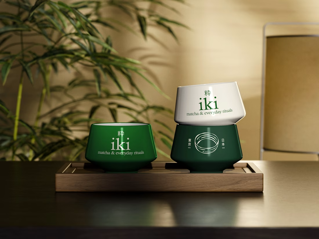
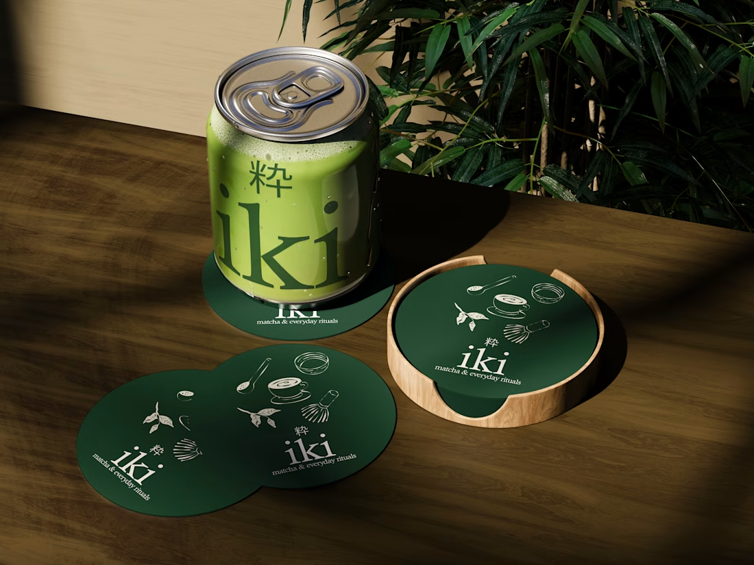
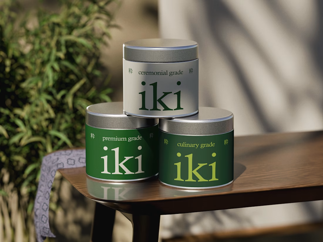
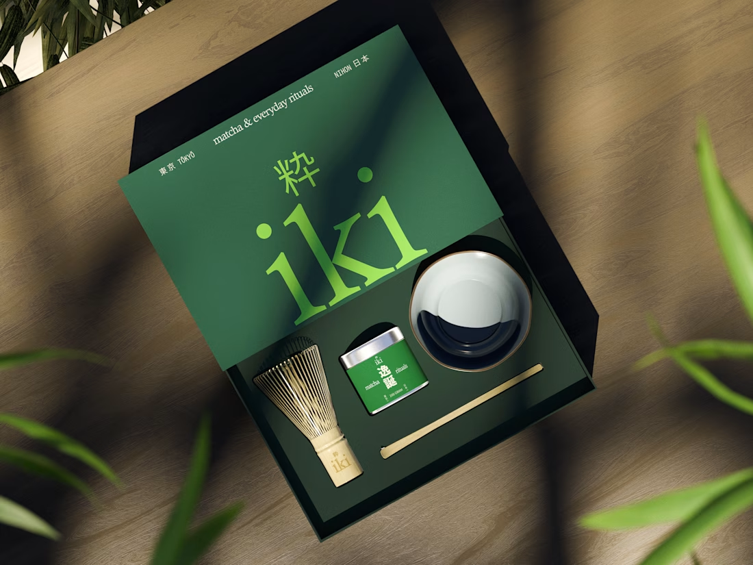
more glimpses of iki 🍵
the project is almost finished, and i should be wrapping everything up next week.
it’s been a fun one to work on, especially seeing how the initial concept has evolved into a complete visual identity.
excited to share the final result soon :)