The network for creativity
Join 1.25M professional creatives like you
Connect with clients, get discovered, and run your business 100% commission-free
Creatives on Contra have earned over $150M and we are just getting started
Back to feedPost

Excited to share my latest project - Volver Wine & Food. 🍷
I designed and developed a premium WooCommerce store focused on elegant visual presentation, intuitive product discovery, advanced filtering, responsive layouts, and a streamlined shopping experience.
From custom UI design to WordPress and WooCommerce development, every decision was made with usability, performance, and future growth in mind.
Take a look at the full case study and let me know what you think!
#WebDesign #WooCommerce #WordPress #EcommerceDesign #Elementor #UIDesign


Beautiful work! The elegant visual direction fits the wine brand perfectly, and the whole presentation feels polished and premium. 🍷
The network for creativity
Join 1.25M professional creatives like you
Connect with clients, get discovered, and run your business 100% commission-free
Creatives on Contra have earned over $150M and we are just getting started





Related posts


New case study - tash.cards, a Y Combinator backed platform for investing in graded sports cards. Identity design, commissioned by baked.design
The heart of the system is a pattern language taken from security printing. Every letter of the wordmark becomes a guilloché tile, like the engraving on banknotes and certificates, and tiles combine into endless patterns.

Nice!

Hi! Sharing my new project: a CRM dashboard for dental clinics 🦷
A day timeline for every chair, patient records with tooth charts, and a voice AI assistant for the front desk.
I’d really appreciate your support and feedback ❤️
Full project
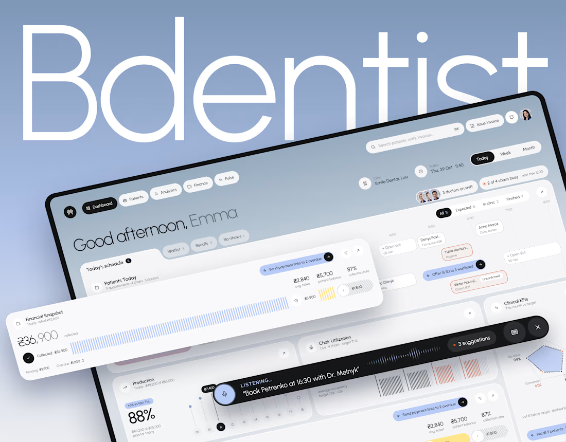

The blue-grey in the dashboard reminds me of Porsche's color. Looks elegant and powerful at the same time. Love this kind of minimal grey.

How do you make a construction brand feel consistent from a business card to a building site?
Brixon’s identity brings angular lettering, an assembled geometric symbol, and a lime, black, and white palette together.
I carried those elements into stationery, brand guidelines, team identification, social graphics, and site signage, then brought the system into motion with Adobe After Effects.
The connecting decision: keep the geometry and layout structure consistent while the logo details, messages, and application previews change within the animated panels.
My contribution covered brand design, graphic design, and motion design.
What draws your attention first: the wordmark, the lime palette, or the rotating symbol?
See the full Brixon case study. If you’re shaping a construction or development brand, I’m available for brand identity and motion projects.

Incomparable work!