The network for creativity
Join 1.25M professional creatives like you
Connect with clients, get discovered, and run your business 100% commission-free
Creatives on Contra have earned over $150M and we are just getting started
Back to feedPost
Hello, everyone!
First post here 🙌
Sharing a recent branding project I worked on at the end of 2025.
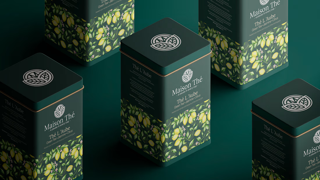
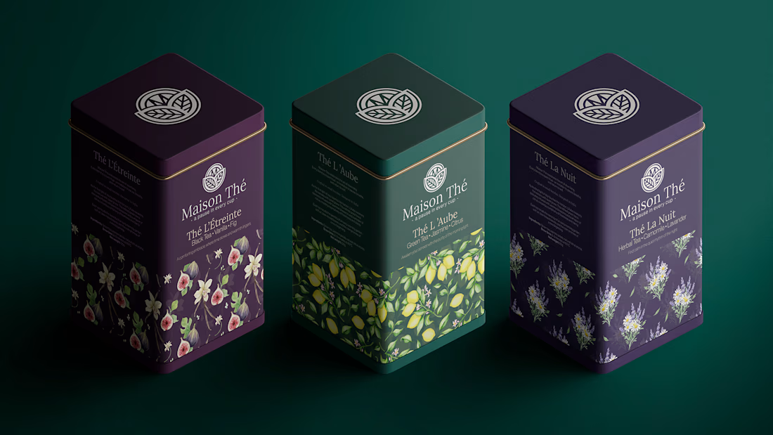
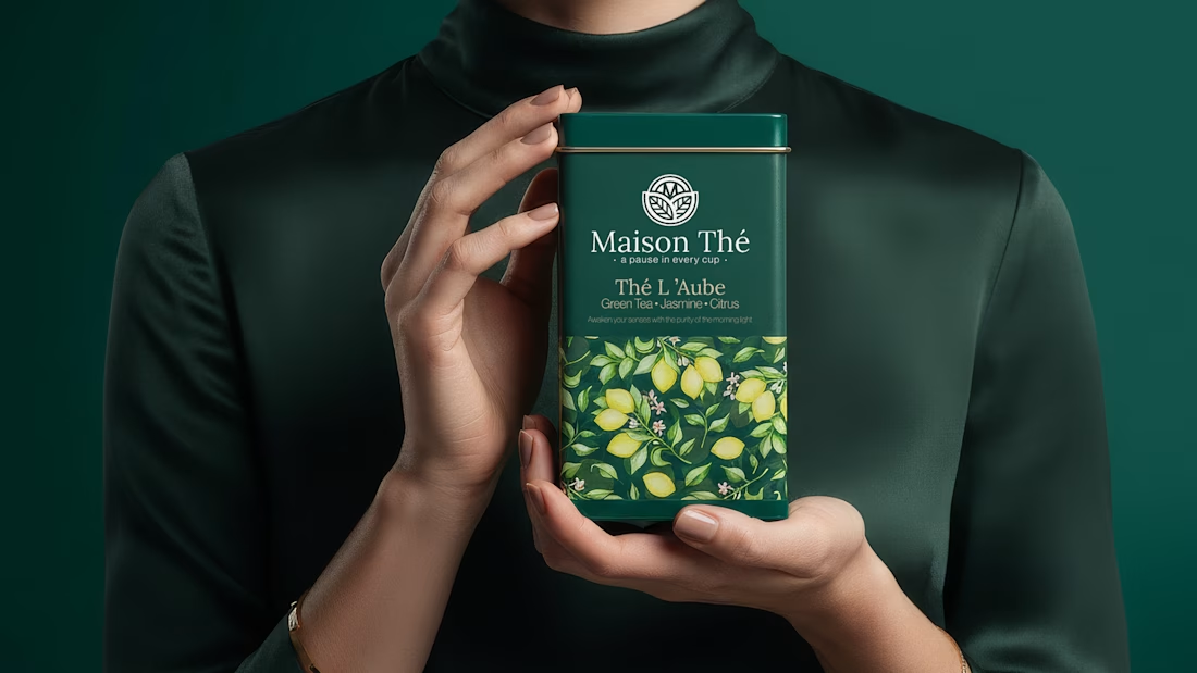
Maison Thé - Logo, Visual Identity & Packaging Design (2025)
Built a complete visual identity around calm sophistication. Elegant modern logo, balanced typography and a rich palette of deep greens and soft neutrals. Packaging highlights each flavor while staying cohesive. Maison Thé now communicates premium quality and its philosophy - a pause in every cup.
Full Project: Maison Thé


This looks really nice, Georgi.

Thanks, I appreciate it!


Very nice Georgi
Thank you!

design cameou great !🙌
Thanks! 🙌
you are welcome 🙌

The modern logo works really well with the more classic branding. Super nice!
That was the idea. Thanks 🙌

Well done !!!

great design💯

So amazing georgi

stunning!

very cool


Hey Georgi, welcome.
Very solid first post, looking great!

Very elegant!

delicado y elegante el diseño:💯


i can see this being displayed at premium cafes and stores everywhere!

This looks good

Such a sophisticated feel, great work!


Oh wow! Great visuals. Really looks elegant

awesome work 💯

Love the colors and how clean Design is 🙌
The network for creativity
Join 1.25M professional creatives like you
Connect with clients, get discovered, and run your business 100% commission-free
Creatives on Contra have earned over $150M and we are just getting started


Related posts

High-End Sneaker Motion Promo | Commercial Video Ad Design,.....Elevate your brand's visual identity with high-converting motion design and commercial video editing!
Are you ready to make your footwear brand stand out in the crowded digital market? I specialize in creating cinematic, high-impact short video ads, motion graphics, and social media promos that grab attention within the first 3 seconds and drive massive engagement.
From dynamic typography to sleek product rotations and high-end color grading, this piece is crafted to turn casual scrollers into loyal customers. Perfect for Instagram Reels, TikTok, YouTube Shorts, and paid ad campaigns.
What’s Included:
Custom high-resolution video motion ad (4K/1080p)
Engaging dynamic text & smooth transitions
Professional sound design / background audio integration
Optimized sizing for multiple social platforms (9:16 / 1:1)
Let’s bring your product to life with stunning visuals! Feel free to reach out before ordering to discuss your custom animation or video editing needs.


The blue box and the white and blue sneaker on that deep blue gradient make a strong colour story for a product promo. Do you build the 3D shoe from scratch or from a client model?


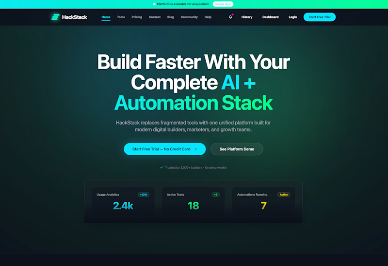
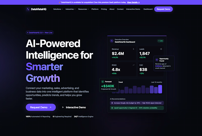
Which homepage would make you more likely to explore the platform?
HackStack features bold typography, teal gradients, and a centered layout focused on AI tools and automation. DataVistaHQ uses purple accents, a split layout, and a prominent dashboard preview to introduce its business intelligence platform.
I would like your perspective on the visual design, clarity, and first impression. Which approach communicates its value more effectively and makes you want to take the next step?
Vote for your preferred design and share what influenced your choice: the colors, headline, layout, dashboard preview, or overall presentation.
#WebDesign #AIWebsites #UIUXDesign #SaaSDesign #TransformedDesign


2 voted
17%
10 voted
83%
12 votes
Closed

Visually, I lean toward DataVistaHQ, but the cognitive load is really high. The value proposition and the stats feel like they're competing for attention.
On the other hand, HackStack has a much better visual hierarchy. The value proposition and CTA group immediately give me a...

Investors and users judge your brand first.
here is the first impression it should make.