The network for creativity
Join 1.25M professional creatives like you
Connect with clients, get discovered, and run your business 100% commission-free
Creatives on Contra have earned over $150M and we are just getting started




The network for creativity
Join 1.25M professional creatives like you
Connect with clients, get discovered, and run your business 100% commission-free
Creatives on Contra have earned over $150M and we are just getting started





Related posts


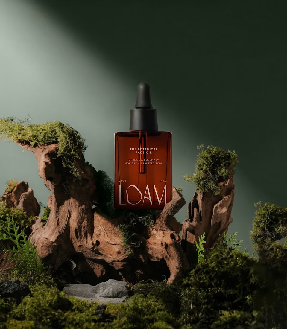
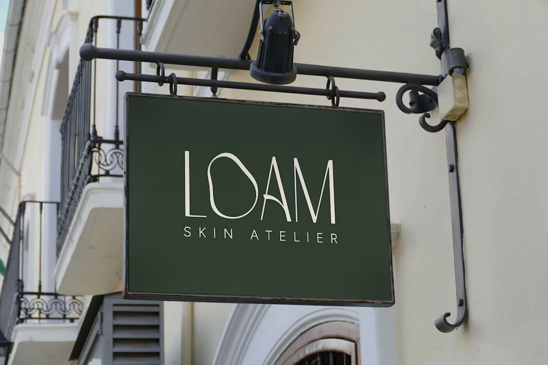
LOAM Skincare Brand Identity by FLM Studio
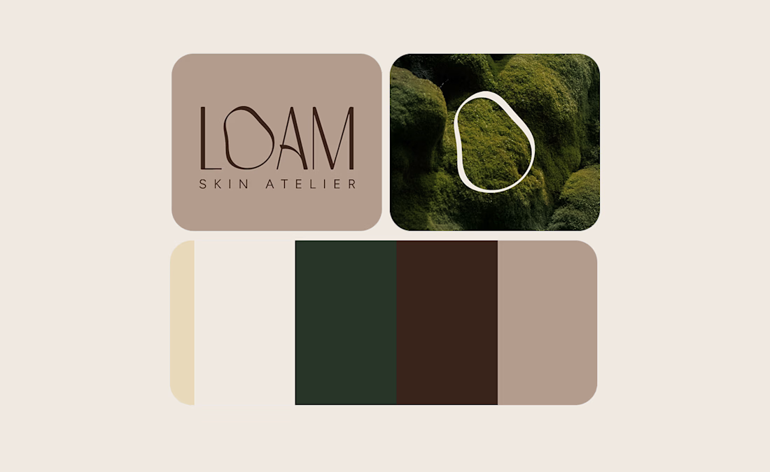
LOAM is a luxury skin atelier built around a simple belief: skin doesn’t need perfecting, it needs understanding. Named after the rich, fertile soils of the Dolomites, FLM Studio created an identity rooted in nature, individuality and strengthening skin from the ground up.
Earthy tones. Refined typography. Tactile textures. At its heart sits the imperfect O, an organic symbol inspired by the irregular beauty of real human skin.
A complete brand identity balancing clinical precision with ritual luxury, created for a deeply personal and tailored approach to skincare.
#branding #branddesign #brandidentity #skincare #luxurybranding



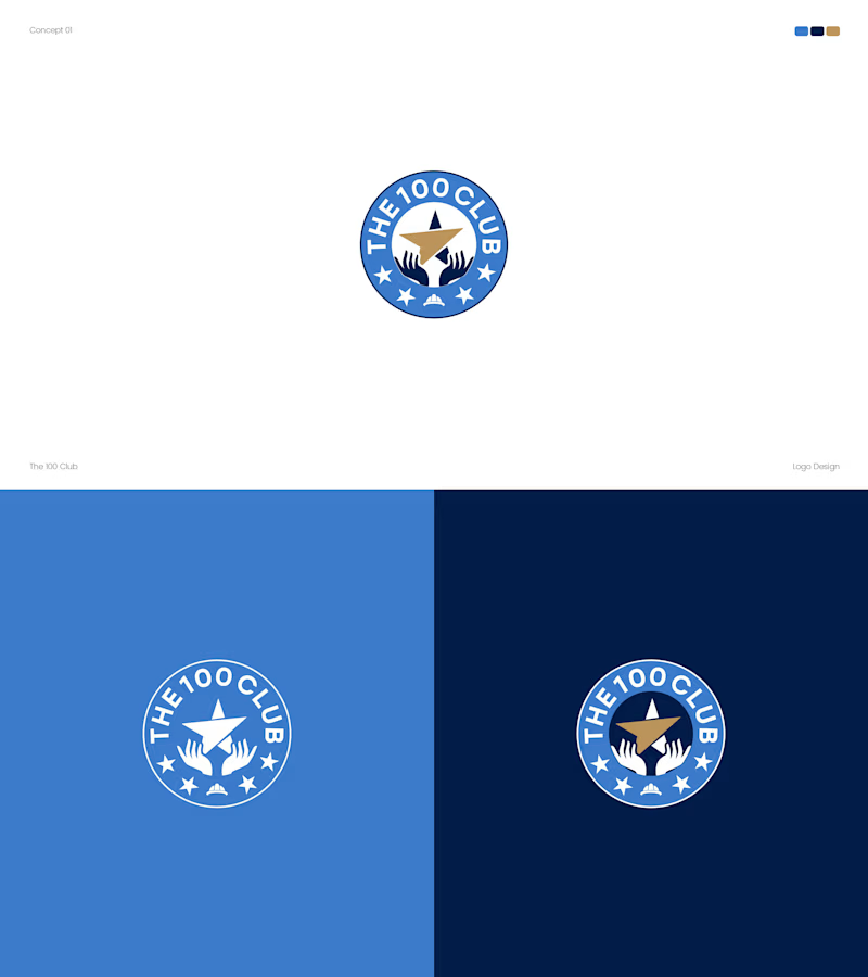
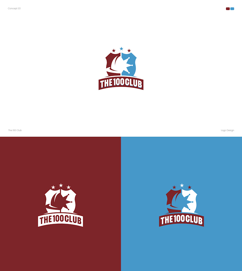
Working on a logo for The 100 Club. Two very different directions.
Concept A: Badge style, blue and gold, hands holding a star.
Concept B: Shield crest, red and blue, bold and sporty.
Which one fits a club identity better? A or B? 👇
4 voted
25%
12 voted
75%
16 votes
Closed


Both options turned out amazing
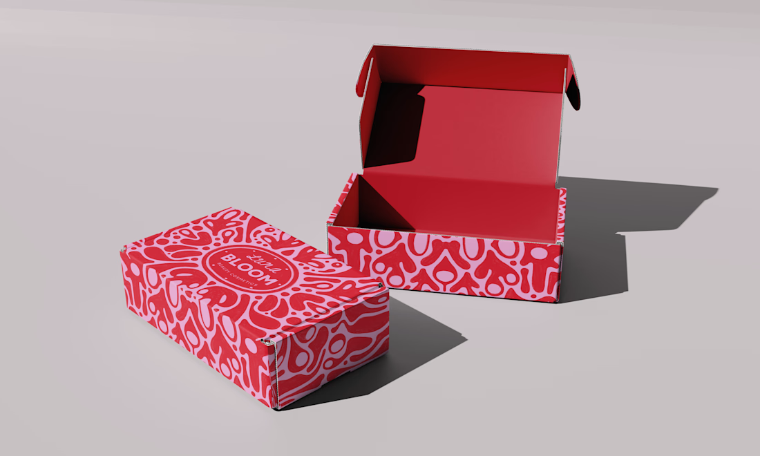
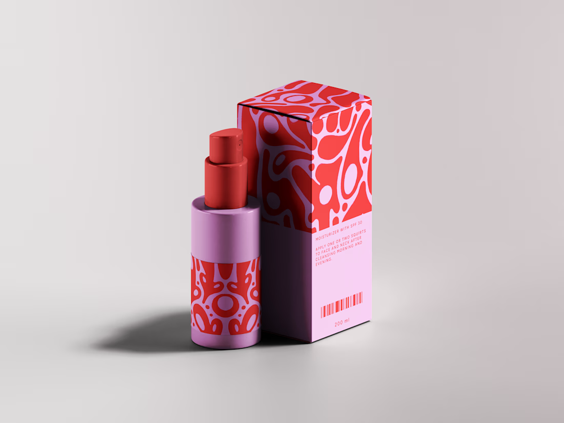
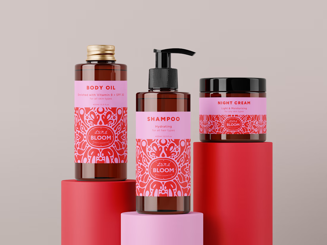
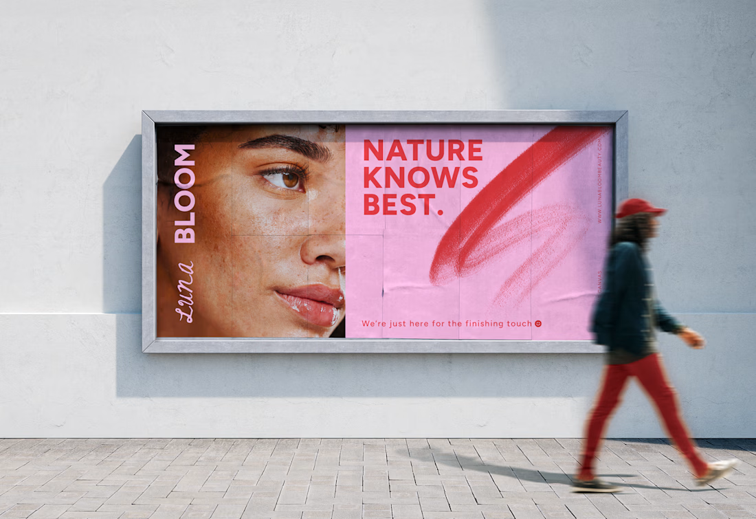
Luna Bloom Skincare Brand Identity by FLM Studio
Luna Bloom is an imagined, all-natural skincare brand created by FLM Studio around a simple idea: skin is beautifully imperfect. Designed for a younger audience, the brand celebrates spotty, scarred and sensitive skin rather than promising to hide it.
Bright pink. Expressive pencil marks. Hand-drawn illustration. The identity brings together a playful contemporary aesthetic with the raw textures and imperfections of real skin.
A self-initiated brand identity spanning creative direction, logo design, typography, packaging and a custom illustration system.
#branding #branddesign #brandidentity #packaging #skincare