The network for creativity
Join 1.25M professional creatives like you
Connect with clients, get discovered, and run your business 100% commission-free
Creatives on Contra have earned over $150M and we are just getting started
Back to feedPost

For IQONIC, everything started with a single letter: Q.
From research and early explorations to the final mark and visual identity, this is the process behind turning a simple insight into a recognizable brand.
Watch the idea take shape.
Full IQONIC case study on my profile.
The network for creativity
Join 1.25M professional creatives like you
Connect with clients, get discovered, and run your business 100% commission-free
Creatives on Contra have earned over $150M and we are just getting started

Challenges
View all


Related posts

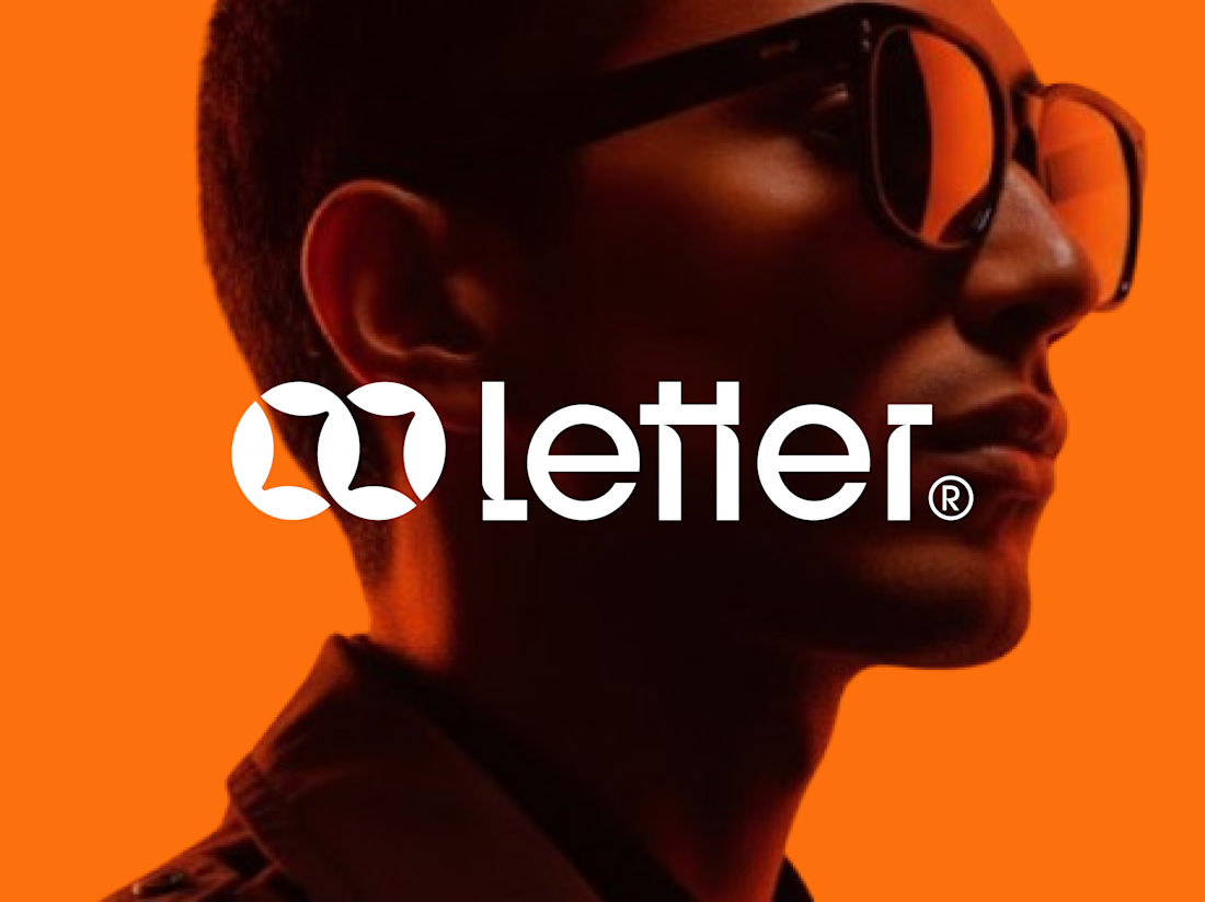
Letter — Visual Identity for a Multinational Company
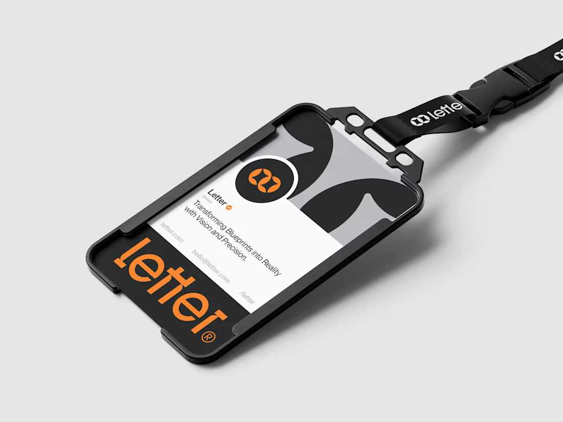
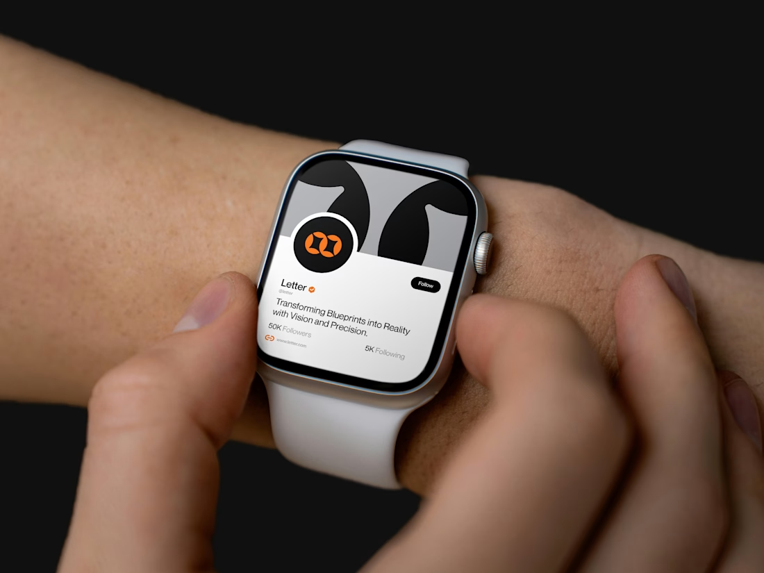
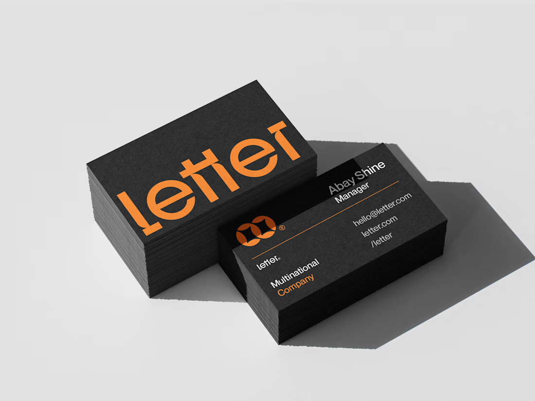
For Letter, I built the mark around two interlocking loop forms — a subtle nod to connection and precision, the kind of detail that makes a logo feel deliberate at a glance.
I developed the full system from there: wordmark, icon mark, a bold orange-and-black palette, and mockups across ID badges, business cards, lanyards, and even a smartwatch — showing the brand holding its identity everywhere it lands.
Transforming Blueprints into Reality with Vision and Precision.



Absolutely amazing work, well done!

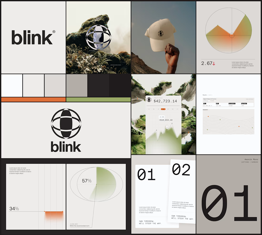
some visuals from the brand wall for blink
creative direction by me
visual identity by Eva Landaluce

beautiful work!

Some of the best client relationships feel like partnerships.
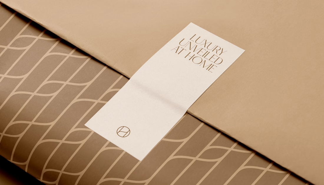
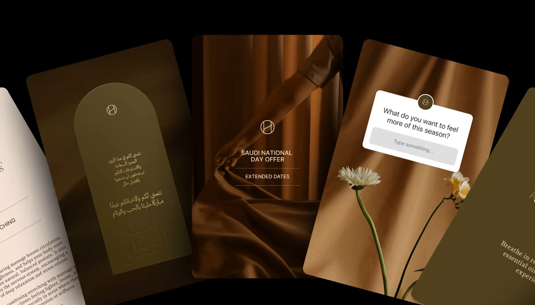
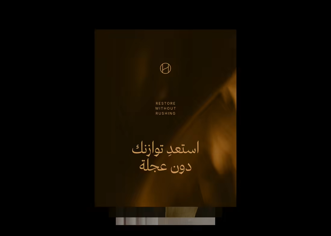
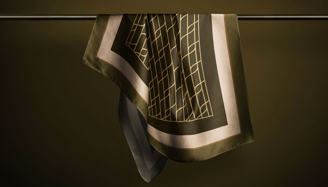
Harmony is a premium massage brand in Saudi Arabia I've been working with for the past two years. What started as a brand refresh grew into something ongoing as the brand expanded.
The core of the refresh was reworking the color palette into something more elevated, building a custom brand pattern that grew from the logo they already had rather than starting from scratch, and defining a visual language that works cohesively across English and Arabic. Creative direction has continued to shape how the brand shows up as it grows. That consistency is something you can feel when a brand actually invests in it.
Full project on my profile.