The network for creativity
Join 1.25M professional creatives like you
Connect with clients, get discovered, and run your business 100% commission-free
Creatives on Contra have earned over $150M and we are just getting started
Back to feedPost

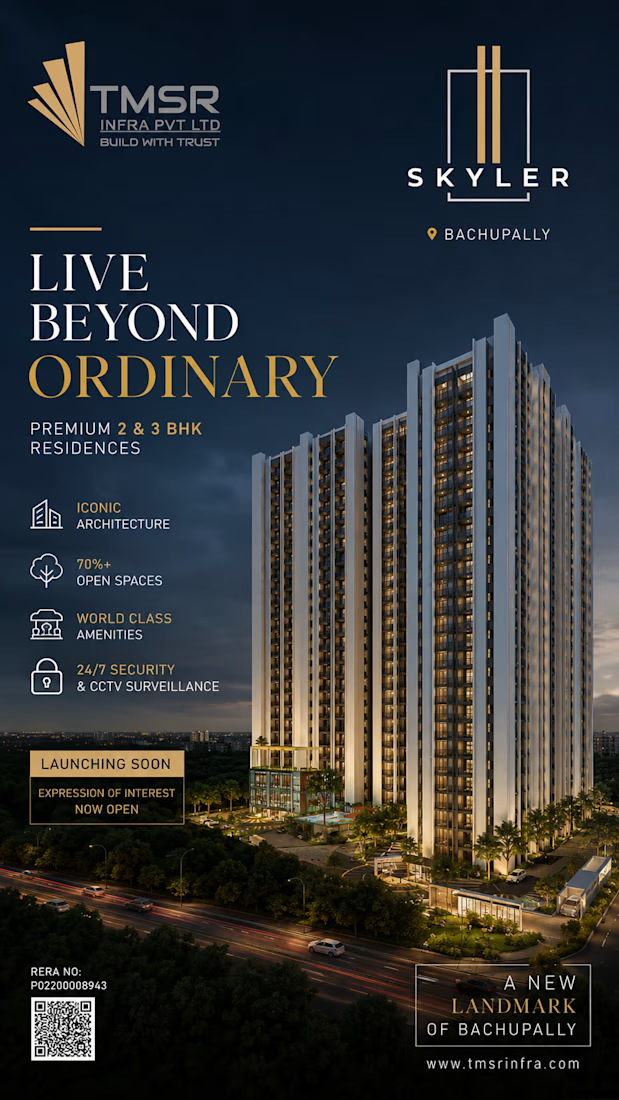
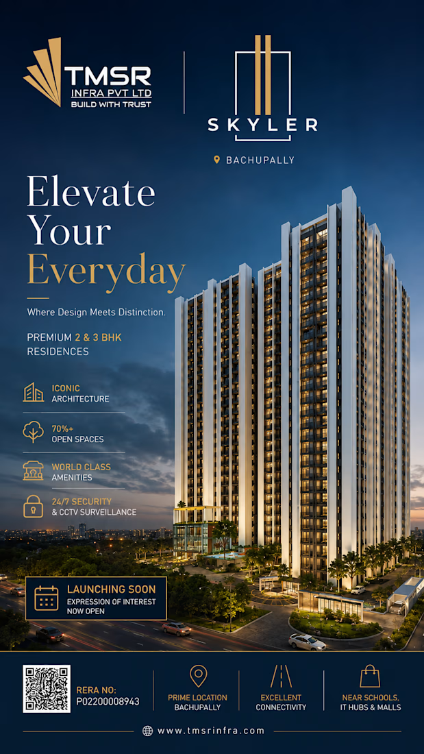
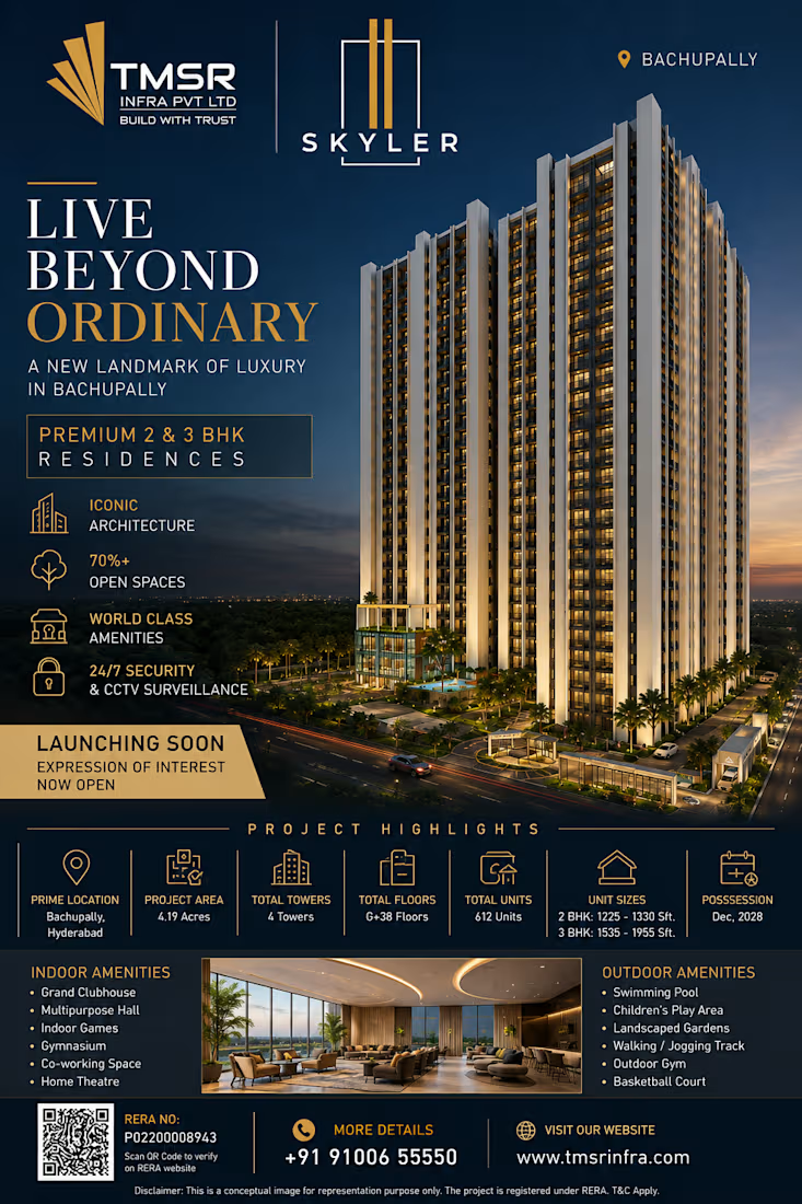
Thank You so much for TMSR SKYLER for this Kind opportunity.
I designed This premium marketing poster For TMSR INFRA Residential project "Skyler".
I used :-
#canva #adobephotoshop #adobeexpress #chatgpt
Creative Design Creative StrategistGraphic DesignAdobe PhotoshopChatGPTCanvaadobeexpressadobephotoshop


The network for creativity
Join 1.25M professional creatives like you
Connect with clients, get discovered, and run your business 100% commission-free
Creatives on Contra have earned over $150M and we are just getting started



Related posts

After a long time finally
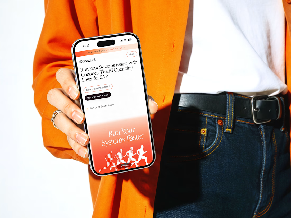
New case study: Conduct AI 🖥️
Designed and built in Framer.
Take a look 👇


Love the clean layout.

I joined Contra just a week ago and have mostly shared the client branding work I do through Mariya Design.
But I haven't properly introduced the other branch of my practice yet:
Color Systems by Mariya.
It started from something I kept running into in brand and packaging work: a color palette can look beautiful and still be surprisingly difficult to use.
So I began building systems around color instead of collecting combinations.
Today that includes:
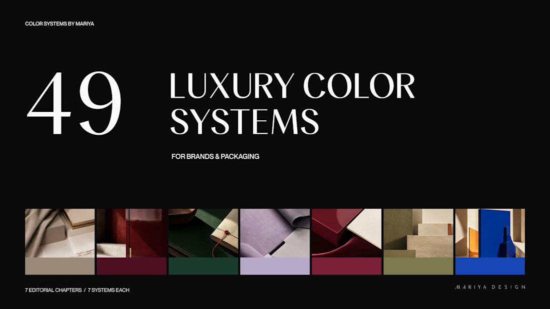
/49 Luxury Color Systems
Role-led color systems for branding and packaging.
/365 Cultural Color Palettes
A growing archive of color directions inspired by places, objects, materials and visual culture around the world.
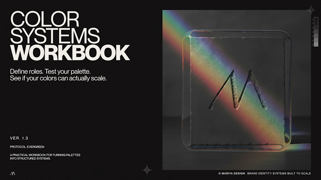
/Color Systems Workbook
A free tool for turning color inspiration into a usable system.
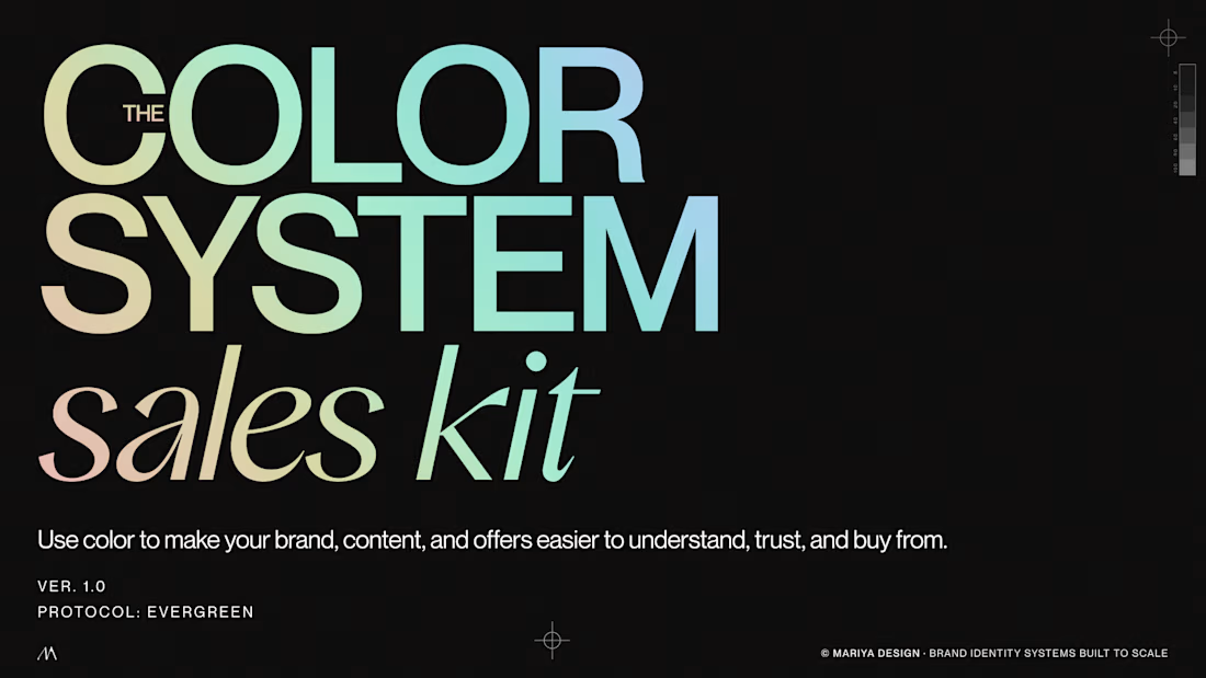
/Color System Sales Kit
A practical tool for designers presenting and selling color direction to clients.
I'll share some of the systems, visual references and thinking behind them here over the next few weeks.
If you're a designer, brand strategist or just slightly obsessed with color, this side of my work is probably for you.
Color Systems by Mariya
mariya.design/color-systems


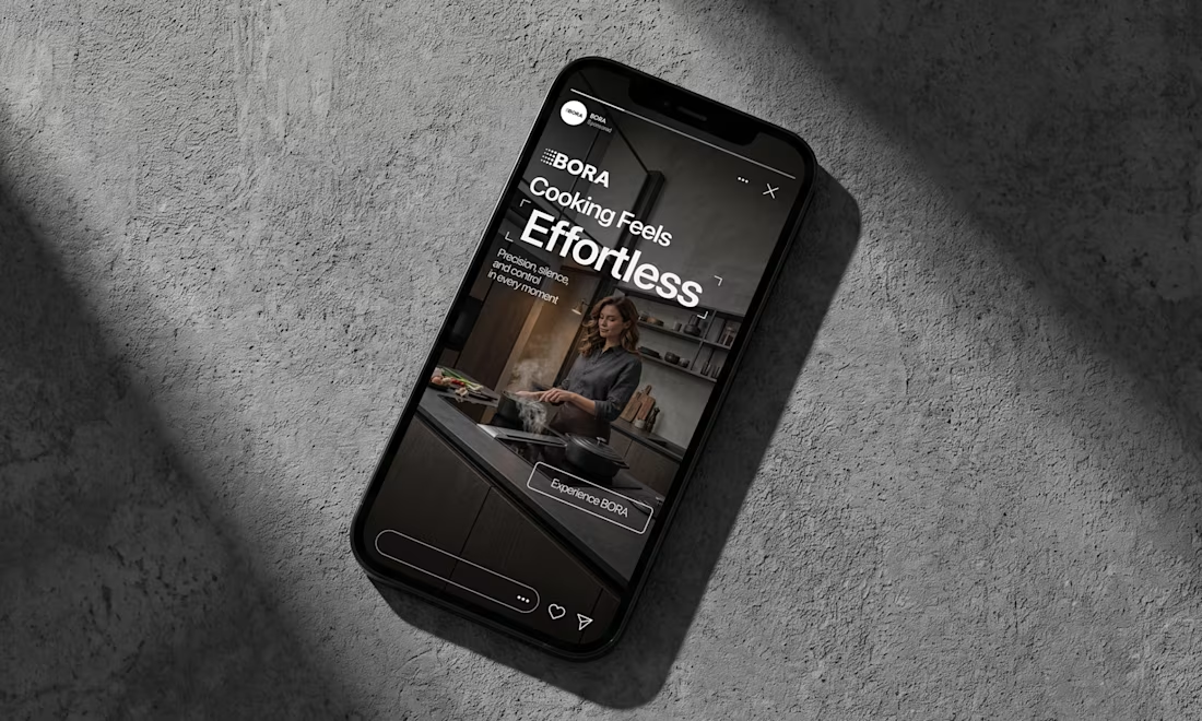
BORA – Ad Creative Concept
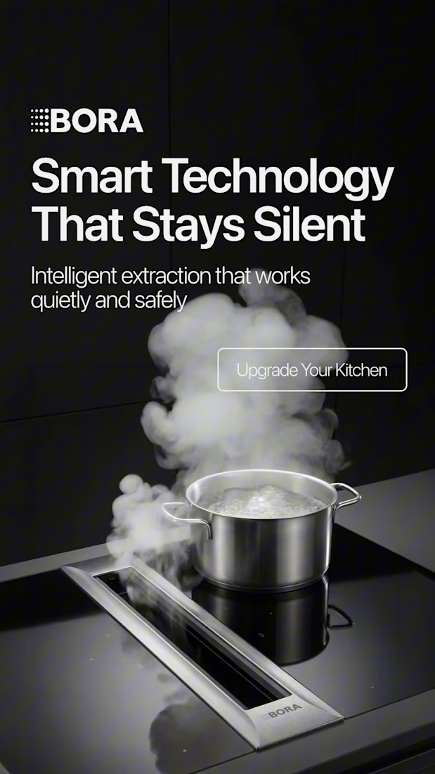
Most kitchen appliance ads sell you the warm family dinner. I wanted to try the opposite.
Built this BORA concept as a portfolio piece, treating the product like architecture instead of tech – dark marble, concrete, no hands, no food styling. Just a pot, steam, and silence.
The steam does all the movement in the motion piece. Typography stays out of the way – one line, low CTA, nothing fighting the composition. Turns out when you strip out the lifestyle, the price point sells itself.



Treating the appliance like architecture is a strong direction.