The network for creativity
Join 1.25M professional creatives like you
Connect with clients, get discovered, and run your business 100% commission-free
Creatives on Contra have earned over $150M and we are just getting started
Back to feedPost

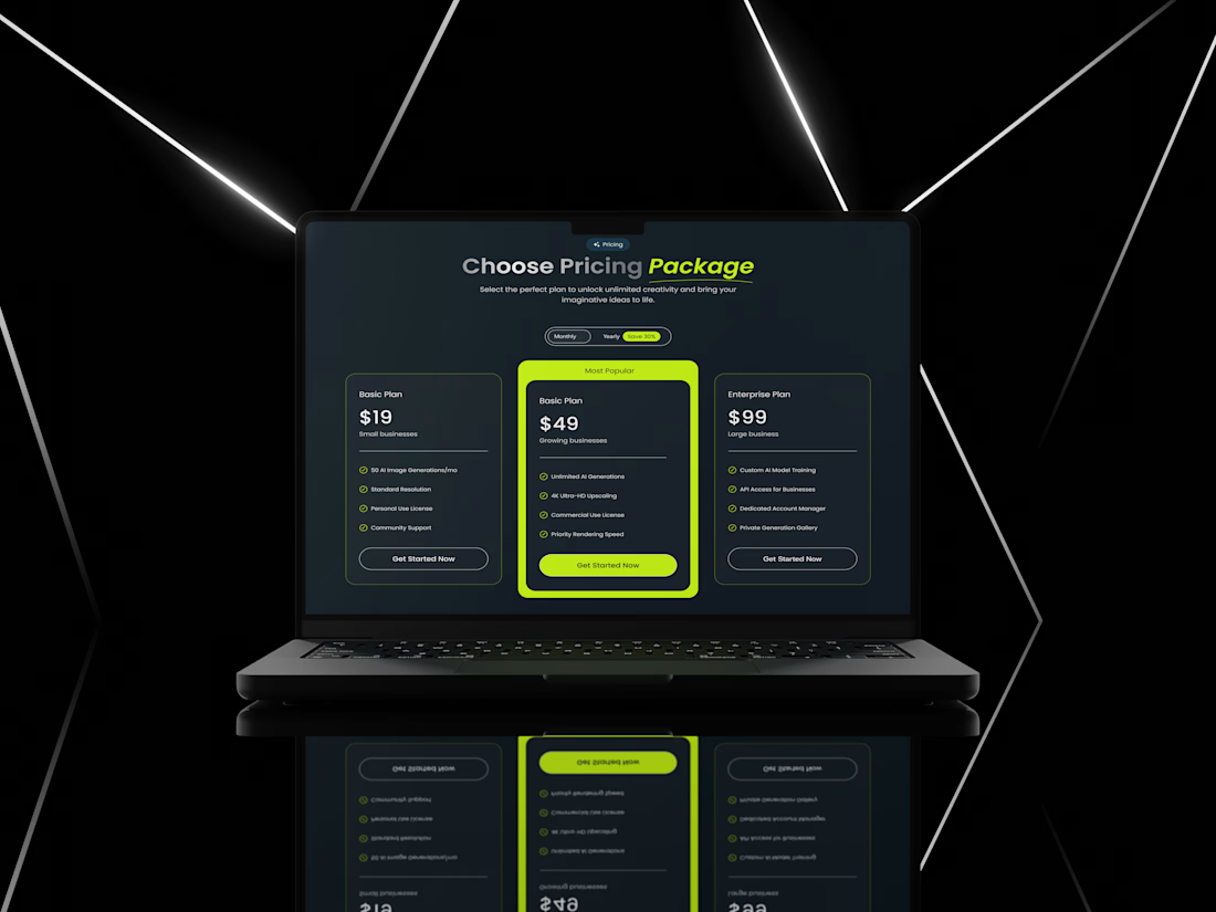
Reimagining Pricing UI for High Conversions 🚀
The Challenge
Most pricing pages fail because they overwhelm users with too much text or lack a clear "hero" plan. My goal was to design a pricing layout for an AI platform that is sleek, professional, and drives users toward the most profitable plan.
Design Strategy:
Visual Dominance: I used a vibrant Neon Green accent for the "Most Popular" plan. This creates a psychological anchor, instantly grabbing the user’s attention.
Structured Hierarchy: Clear separation between features using checkmarks ensures users can compare plans in under 5 seconds.
Modern Dark UI: Used a deep dark palette to give it a premium, futuristic "AI-tool" vibe that resonates with tech audiences.
CTA Placement: Clean, rounded buttons with high contrast to ensure the "Get Started" path is frictionless.

The network for creativity
Join 1.25M professional creatives like you
Connect with clients, get discovered, and run your business 100% commission-free
Creatives on Contra have earned over $150M and we are just getting started
Trending

Claude
Claude has entered the design space. How are you using it?

Contra University
Learn from expert creatives how to earn more using next-gen AI tools.
Brand Design
The best brand designers are on Contra. Scroll to see what's trending in brand design. What are you building?
creativeaiflow
Creative AI workflows are evolving. What tools do you use, and what are their strengths and weaknesses?
freelancerlife
Freelancer life is wins, pivots, and everything in between. What’s yours right now?


Related posts

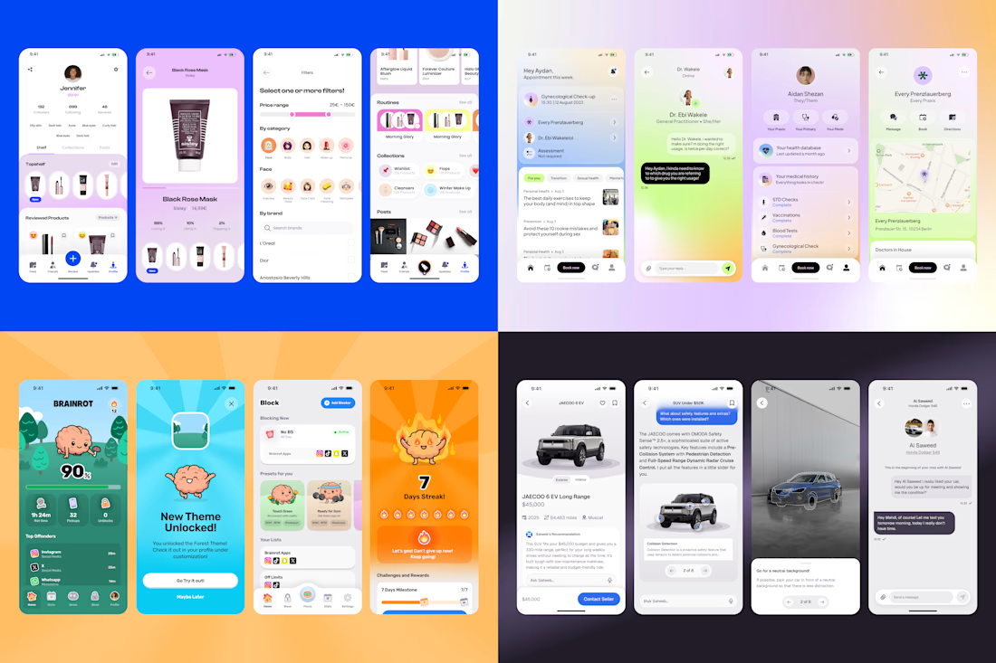
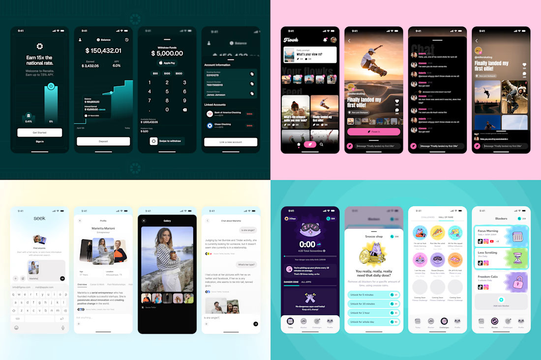
Last year around this time I felt that Webdesign and Branding weren't scratching my design Itch anymore, and decided I would try and take on more iOS projects.
Fast forward one year, and I've worked on more than 10 projects, most of which are live in Appstore already, and landed a gig for Freelance App Designer at BeReal in the process. The best part? I feel like I have still so much more to learn!
Exploit your design powers, expand your offer and learn something new whenever you have a chance!


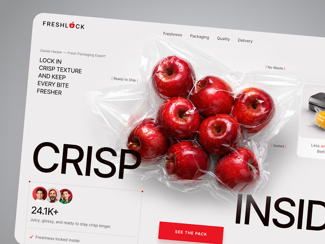
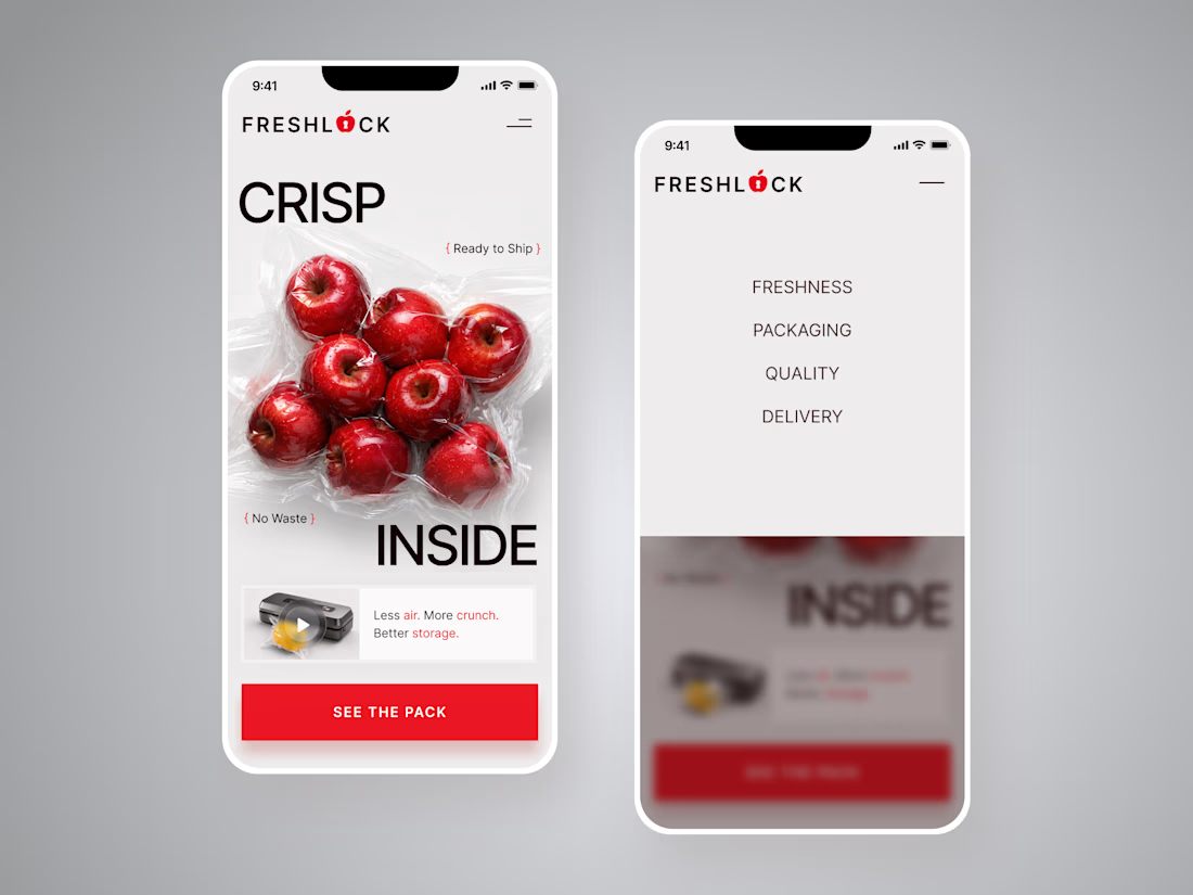
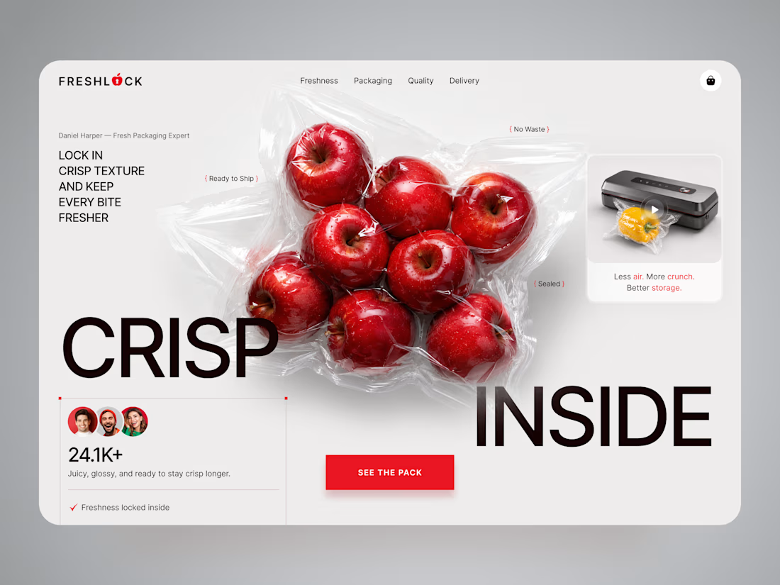
FreshLock — Food Packaging Landing Page Design 🍎📦
FreshLock is a modern landing page concept created for a food packaging brand focused on preserving freshness, reducing waste, and presenting innovative packaging solutions through a clean digital experience.
The goal was to communicate product benefits instantly while making the website feel fresh, premium, and trustworthy. The visual direction combines bold typography, minimal layouts, realistic product imagery, and vibrant red accents to create a strong first impression while keeping the focus on the product.
Special attention was given to:
• a product-first hero section that immediately highlights freshness and packaging quality;
• clean visual hierarchy that makes key messages easy to scan;
• responsive desktop and mobile layouts optimized for every device 📱;
• trust-building elements showcasing product quality, freshness, and customer confidence;
• bold CTAs that encourage users to explore the product and learn more;
• a minimal interface that lets the packaging and product visuals become the center of attention;
• a scalable landing page design suitable for future product launches and marketing campaigns.
The result is a modern, conversion-focused landing page that helps communicate product value, strengthens brand credibility, and creates an engaging experience from the very first screen ✨
Looking to create a modern landing page for your food, packaging, FMCG, or consumer product brand? Let's build something fresh together 🚀



🔥 🔥 🔥

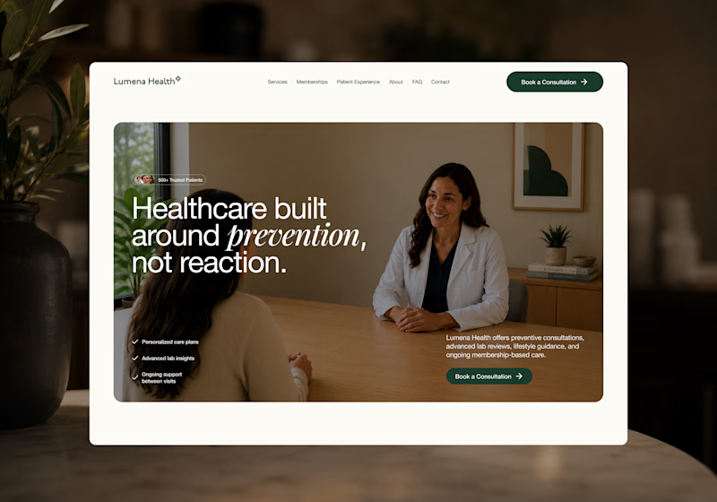
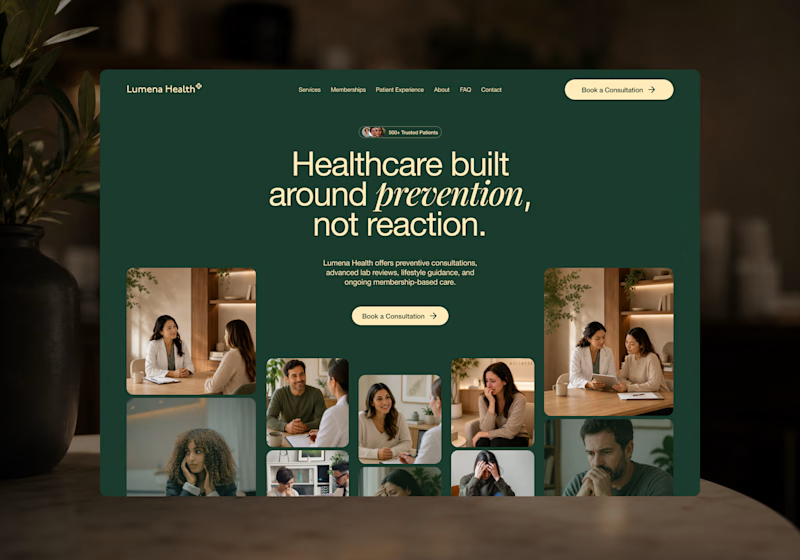
I’m exploring two homepage hero directions for a Lumena Health concept and testing which one feels stronger for a preventive healthcare brand.
Both directions focus on the same core message: healthcare built around prevention, not reaction.
Direction 1 feels more warm, human, and consultation-focused.
The large lifestyle image creates a clear patient/provider moment right away, which helps the experience feel personal and trustworthy.
Direction 2 feels more premium, editorial, and brand-driven.
The dark green background, centered headline, and image collage make the page feel more elevated and visually distinctive.
Direction 1: personal, warm, trust-focused
Direction 2: premium, editorial, brand-forward
Which direction feels stronger for a preventive healthcare website?
25 voted
40%
37 voted
60%
62 votes
Closed

Direction 1's consultation-focused warmth feels like it'll convert better for anxious first-time patients, but Direction 2's premium editorial feel might build more trust with referral sources. Did you already have a lean going in, or are you genuinely torn?