The network for creativity
Join 1.25M professional creatives like you
Connect with clients, get discovered, and run your business 100% commission-free
Creatives on Contra have earned over $150M and we are just getting started
Back to feedPost

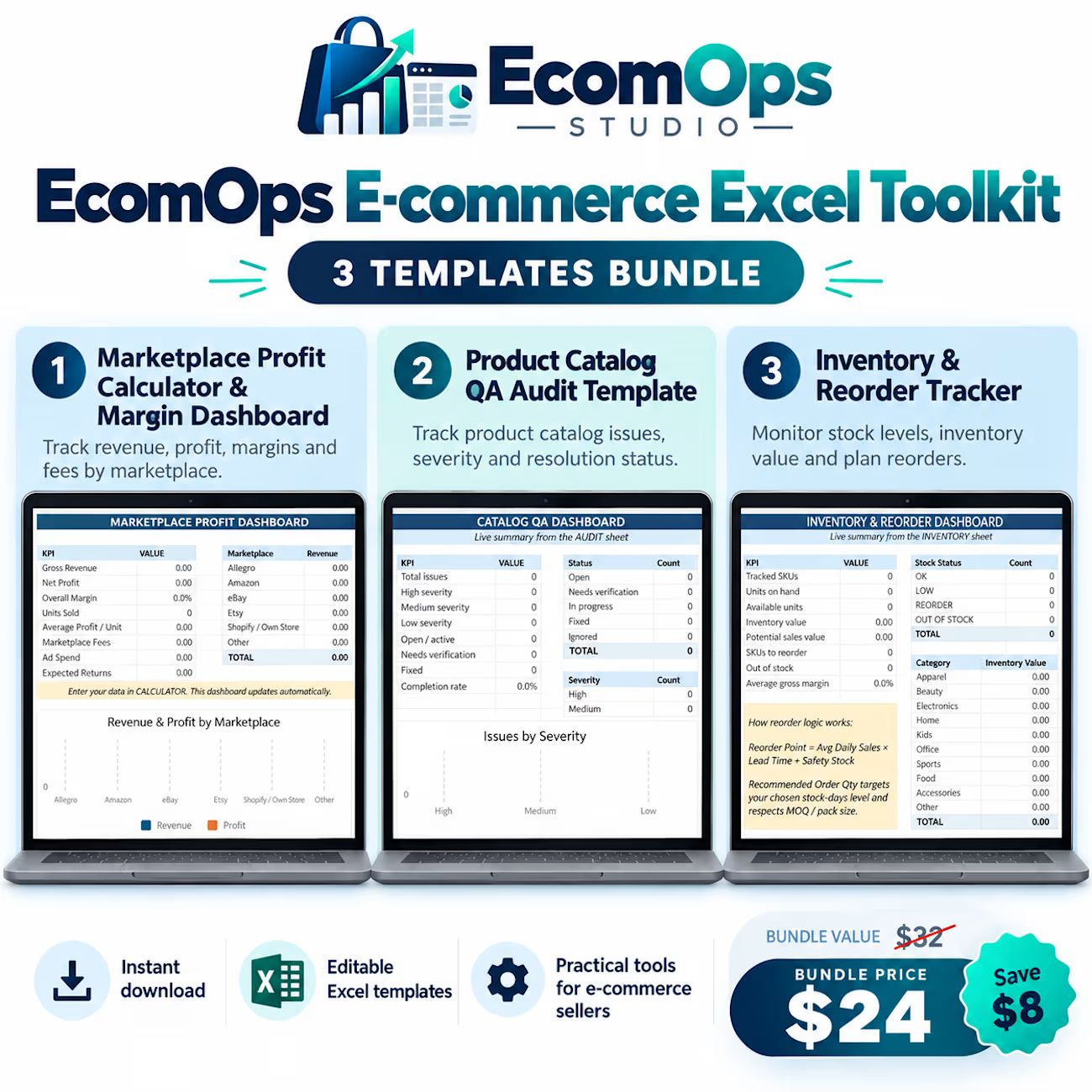
EcomOps Studio – E-commerce Excel Toolkit


The network for creativity
Join 1.25M professional creatives like you
Connect with clients, get discovered, and run your business 100% commission-free
Creatives on Contra have earned over $150M and we are just getting started







Related posts

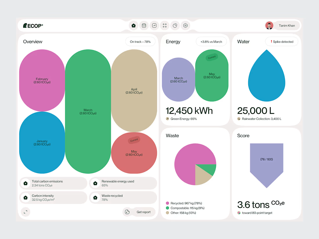
Sustainable Emission Tracker Dashboard
Sustainability platforms often bring together a large amount of environmental data.
The challenge is turning that information into something people can understand quickly.
For this Sustainable Emission Tracker Dashboard, we designed the experience around emissions performance, sustainability targets and progress tracking.
The interface uses clear metric cards, structured charts and visual indicators to create a more understandable view of environmental performance.
Rather than treating every data point equally, the dashboard creates hierarchy around the information users are most likely to monitor and act on.
Focus: Carbon Emissions Tracking · Sustainability Dashboard · ESG UI/UX · Data Visualization · Climate-Tech Product Design
The goal was to make complex environmental data feel structured, readable and useful.
Designed by WaxyWeb.
Building a sustainability or climate-tech product?


Excellent job!

This is such a great example of turning complex data into a visual experience. 🎾🔥
Love how the court becomes part of the analytics instead of just sitting in the background. Really impressive work!

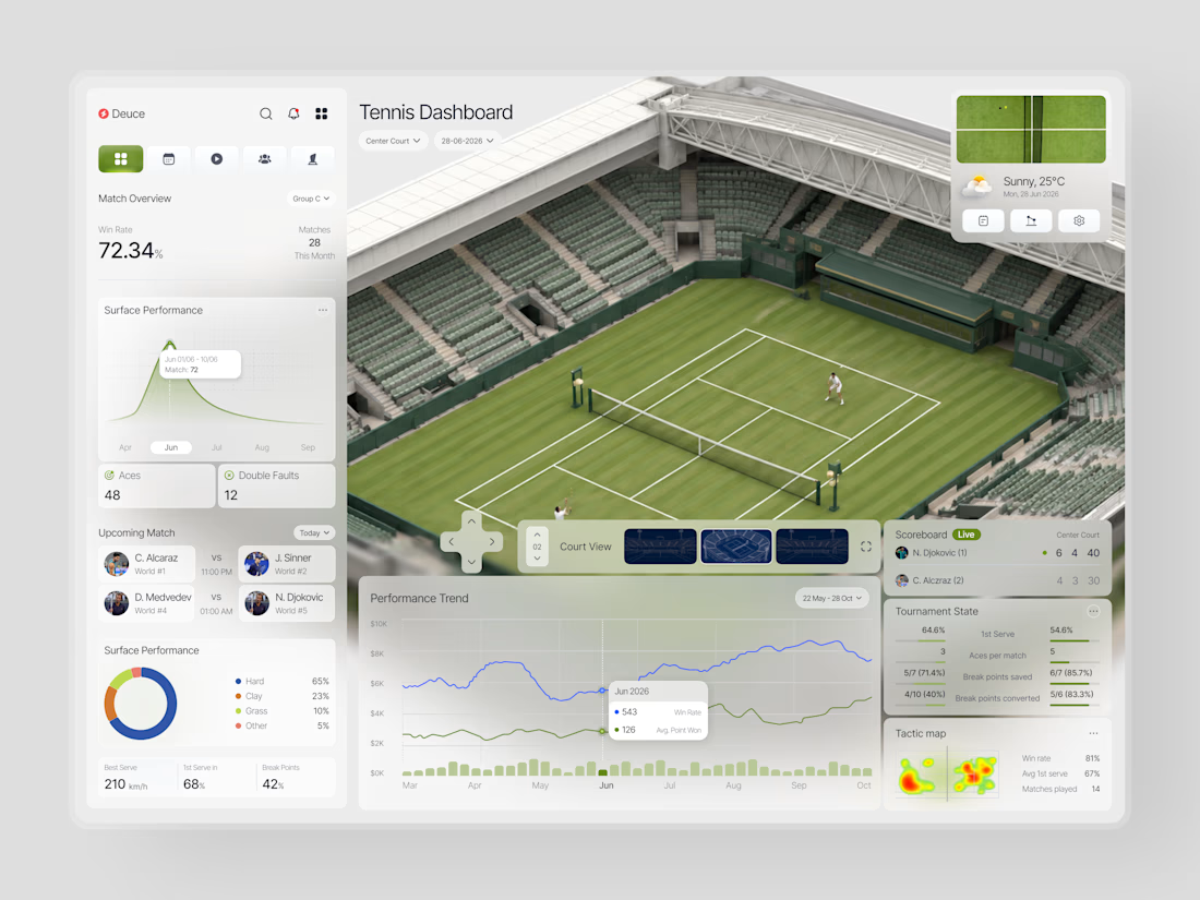
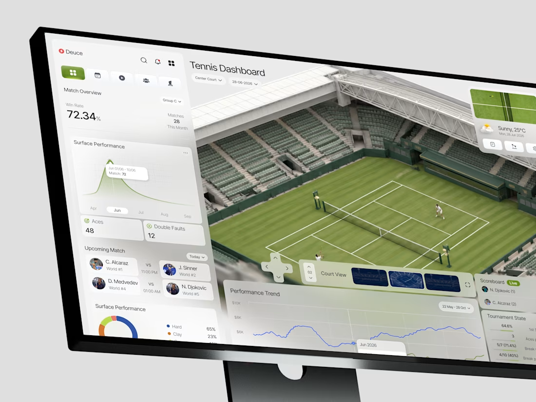
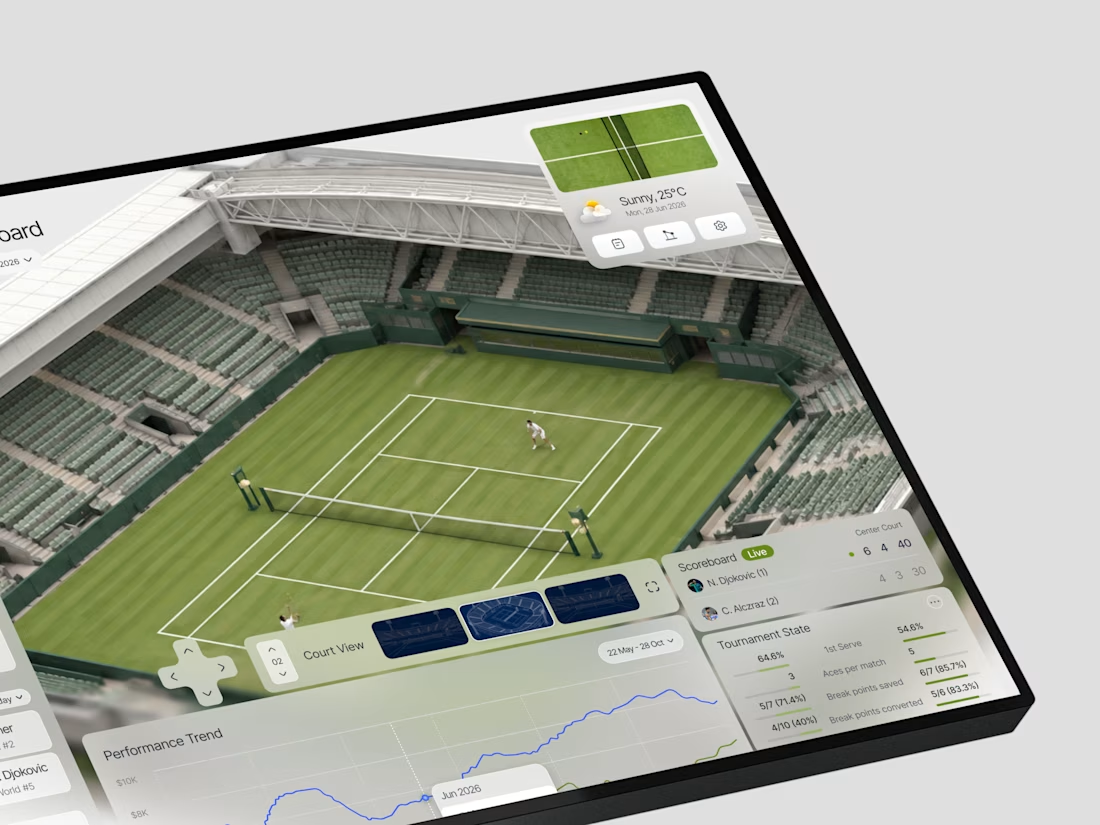
When does a sports dashboard need the court to be more than a background?
In this case, we were designing Deuce a tennis analytics platform that needed to make complex match data feel immediate and spatial, not just numerical.
The brief was clear: analysts and coaches don't just...

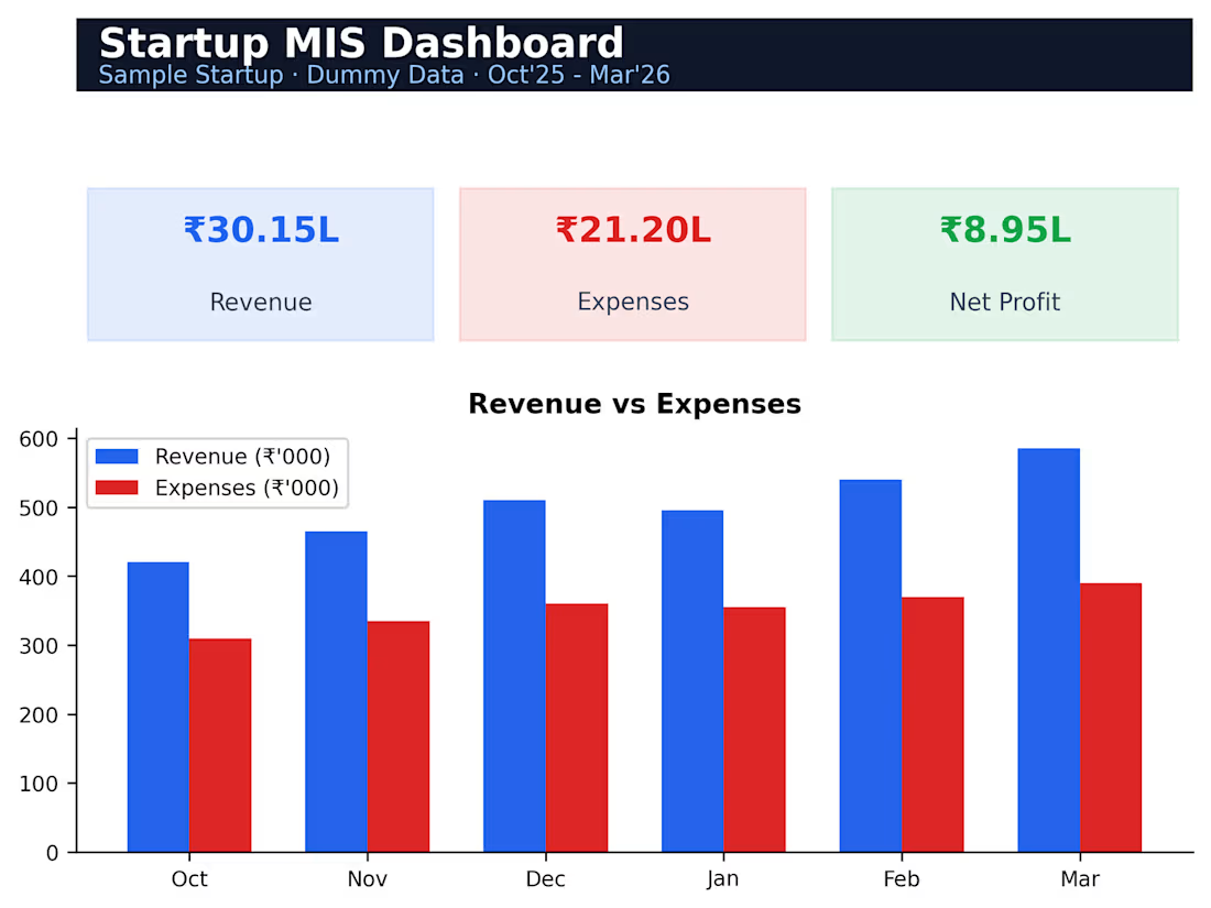
A 6-month MIS dashboard tracking revenue, expenses, net profit and margin trends with an auto-updating bar chart, giving founders a one-page view of business health.