The network for creativity
Join 1.25M professional creatives like you
Connect with clients, get discovered, and run your business 100% commission-free
Creatives on Contra have earned over $150M and we are just getting started
Back to feedPost

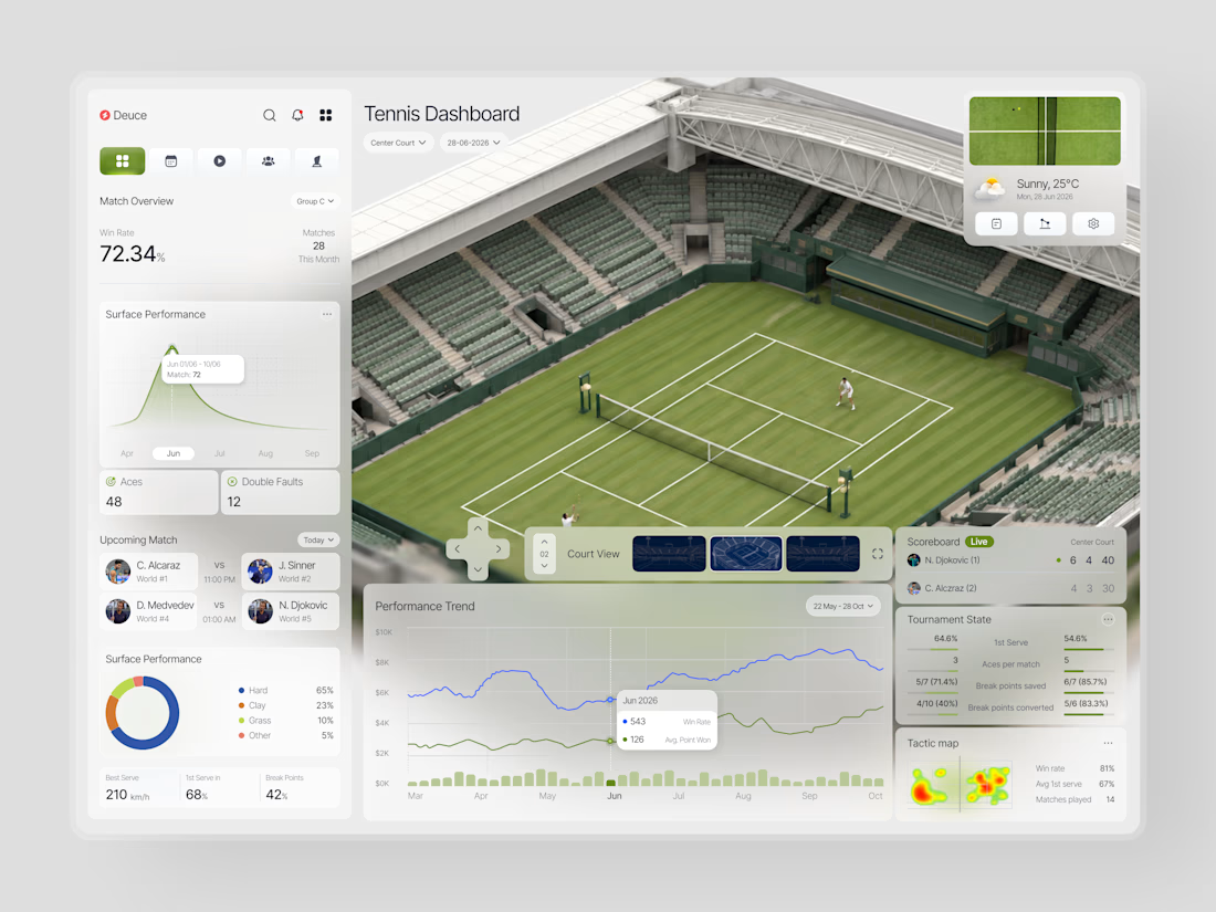
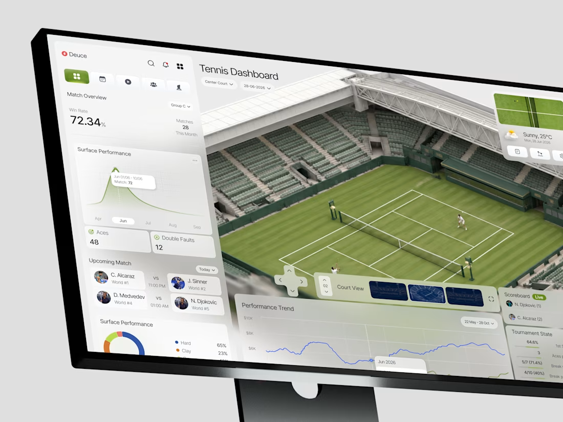
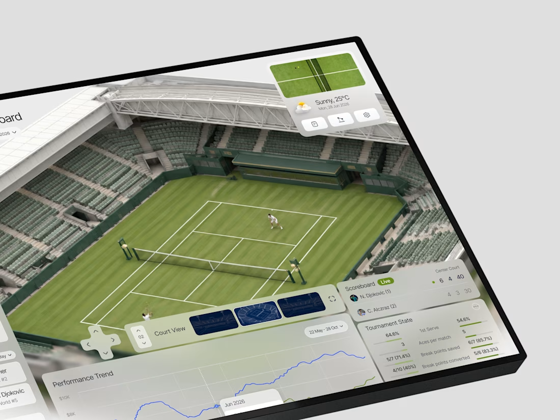
This is such a great example of turning complex data into a visual experience. 🎾🔥
Love how the court becomes part of the analytics instead of just sitting in the background. Really impressive work!

When does a sports dashboard need the court to be more than a background?
In this case, we were designing Deuce a tennis analytics platform that needed to make complex match data feel immediate and spatial, not just numerical.
The brief was clear: analysts and coaches don't just...
The network for creativity
Join 1.25M professional creatives like you
Connect with clients, get discovered, and run your business 100% commission-free
Creatives on Contra have earned over $150M and we are just getting started

Challenges
View all


Related posts

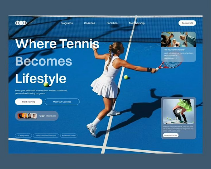
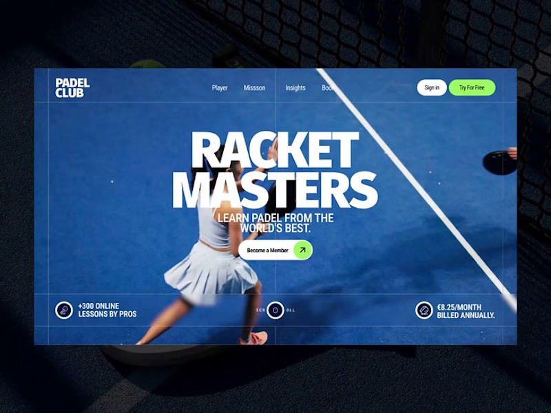

Option 1 reads more like a club site you could book from — the card stack gives membership and classes a place to land. Option 2's Racket Masters type is the punchier poster, but it feels tighter as a homepage hero.

A quick summary of my longstanding collab with the good folks over at Stacklist.
I got to try on so many different hats with this one (mainly UI/UX & graphic design) and had lots of fun in the process 🙌

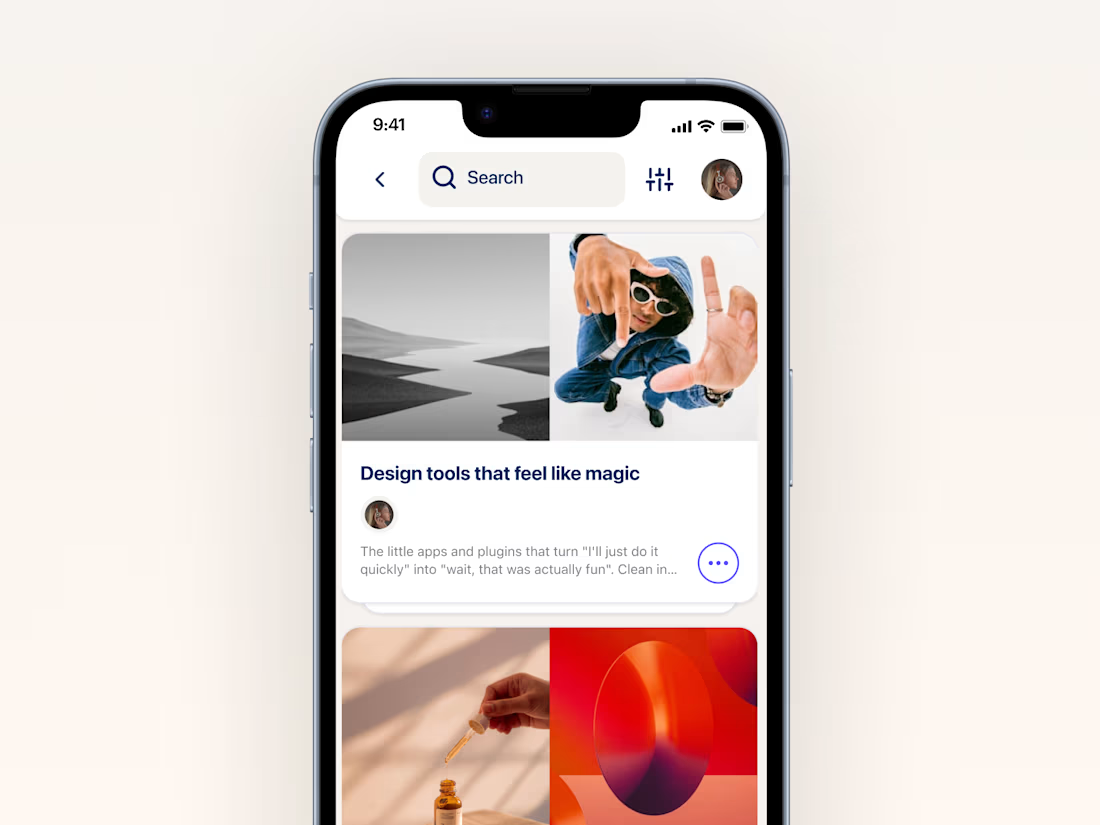
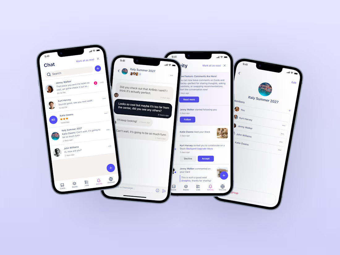
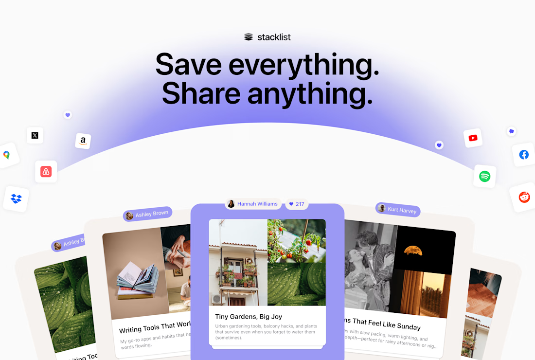

Long collaborations are a great chance to build a consistent design language.

Curious about the workflow behind these highlights. Which parts of the project used AI video, and which needed more hands-on editing or motion work?