The network for creativity
Join 1.25M professional creatives like you
Connect with clients, get discovered, and run your business 100% commission-free
Creatives on Contra have earned over $150M and we are just getting started
Back to feedPost

When does a sports dashboard need the court to be more than a background?
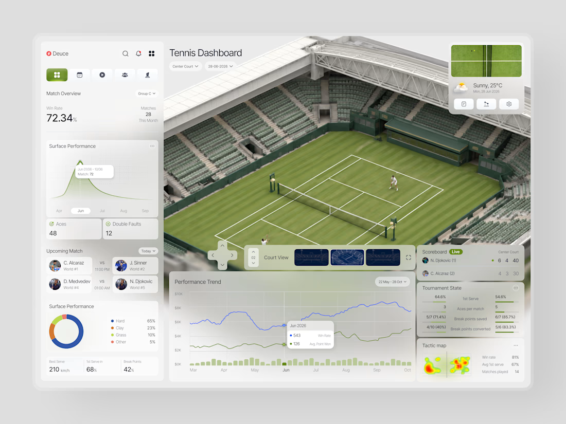
In this case, we were designing Deuce a tennis analytics platform that needed to make complex match data feel immediate and spatial, not just numerical.
The brief was clear: analysts and coaches don't just want stats. They want to feel like they're watching the match while reading the data.
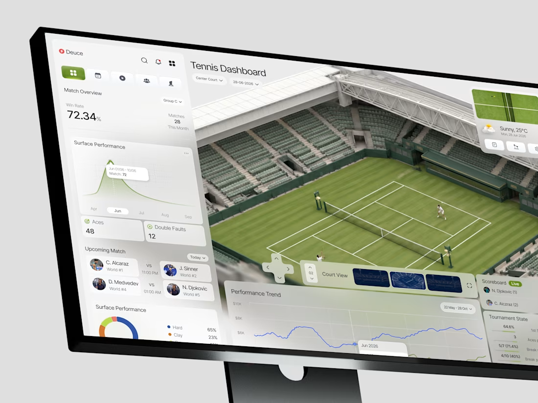
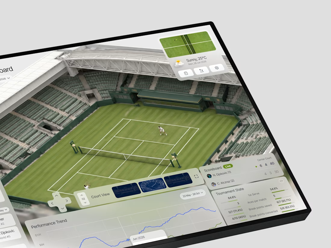
So we made the Wimbledon court the literal center of the interface. Every panel orbits it match overview and surface performance on the left, live scoreboard and tournament state on the right, performance trend running the full width below. The court isn't decoration. It's the anchor that makes every number feel like it belongs to a real moment on a real surface.
72.34% win rate. 48 aces. 210 km/h best serve. Djokovic leading Alcaraz 6-4 on Center Court. Alcaraz vs Sinner tonight at 11 PM. Tactic heatmaps showing where points are won and lost.
What we noticed was that spatial context changed how the data felt. The same numbers in a standard table read as analysis. Wrapped around a court, they read as intelligence.
Do you think sports UI design is still underestimating how much context and spatial layout affect how data is understood?

Amazing

Simply incredible

Nice aesthetics, but composition feels bottom-heavy.

Amazing Dashboard ✨

Impressive design

Amazing💯


Yeah, the court makes the data feel way more real. Really smart idea.

Spatial context does more than decorate here: anchoring the panels around the court turns each metric into a located event, so a coach reads position before number. My one caution is glance legibility, when the anchor is that detailed the surrounding panels need a quieter...


wow,, amazing

Awesome

This is amazing work !

Absolutely. Spatial context can turn raw statistics into something instantly understandable. When the interface reflects the actual environment of the sport, the data feels more connected to the action rather than just being numbers on a screen.

Beaautiful


100% yes. Wrapping data around the court completely changes how the brain processes it. It stops being a spreadsheet and starts feeling like a live view from the coaches box.

so clean . love this green <3

Awesome Work

Nice work

This feels like a good example of UI reflecting how people actually think about the problem, rather than just displaying the data. What was the hardest part to get right?

wow

Really impressive work! 👏 The way you’ve made complex tennis data feel visual and spatial instead of just numerical is fantastic. 🎾🔥
The network for creativity
Join 1.25M professional creatives like you
Connect with clients, get discovered, and run your business 100% commission-free
Creatives on Contra have earned over $150M and we are just getting started

Challenges
View all


Related posts

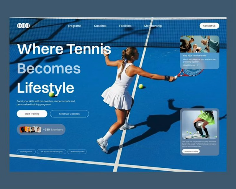
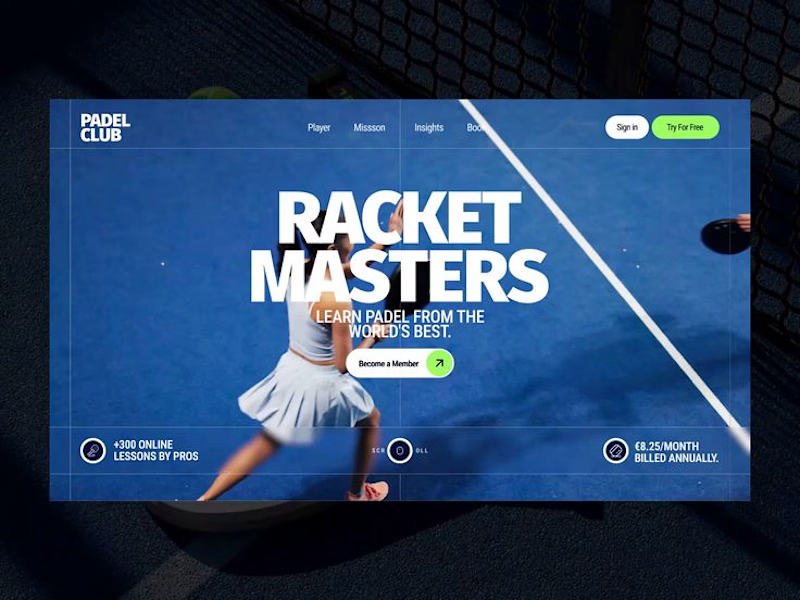

Option 1 reads more like a club site you could book from — the card stack gives membership and classes a place to land. Option 2's Racket Masters type is the punchier poster, but it feels tighter as a homepage hero.


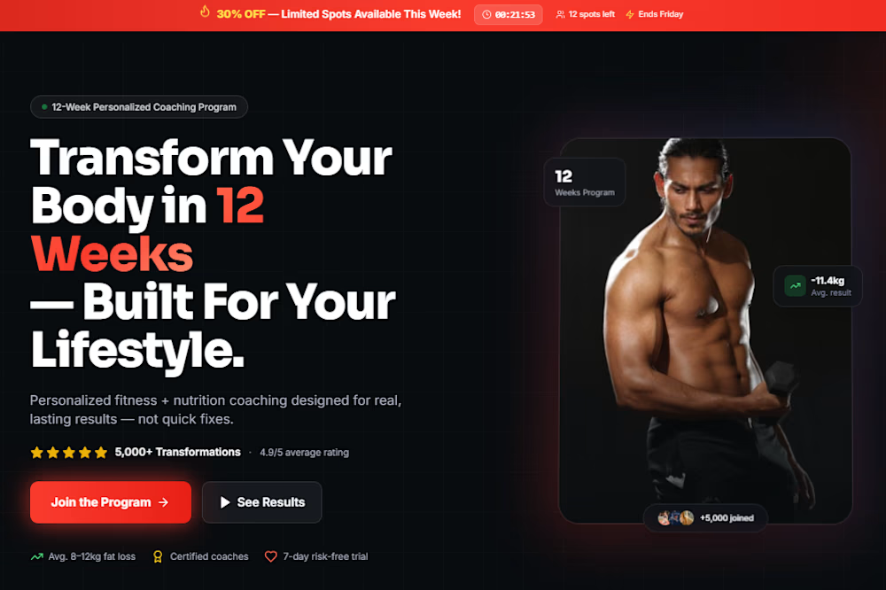
I’d put this around an 8. The 12-week type split carries the promise, and the program card next to the athlete keeps the offer concrete instead of generic.