The network for creativity
Join 1.25M professional creatives like you
Connect with clients, get discovered, and run your business 100% commission-free
Creatives on Contra have earned over $150M and we are just getting started
Back to feedPost
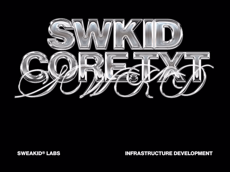
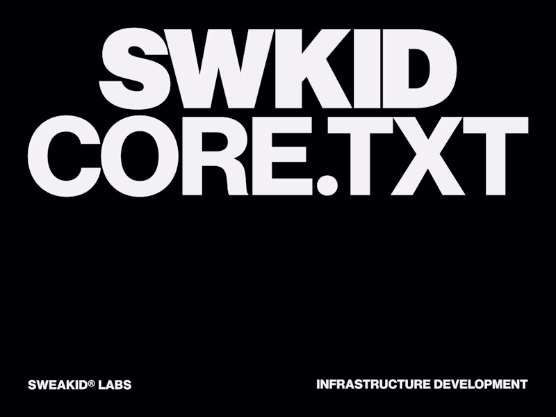
Taste Test
A/B test for the SWKID CORE.TXT cover artwork.
I’m finalizing the packaging for my modular grid system, and I want to hear from the community. Both options follow strict layout discipline, but they project entirely different energies.
Option A: Pure Swiss minimalism. Heavy typographic restraint and clean space.
Option B: Y2K Chrome aesthetics layered over a dark brutalist grid.
Which direction represents the architecture of design better?
4 votes
Ends in 1d
the left one looks really good
Option A for me. When the product is a grid system, the cover should demonstrate that restraint, not override it. The Swiss approach lets the typography carry the weight without competing with the concept.
The network for creativity
Join 1.25M professional creatives like you
Connect with clients, get discovered, and run your business 100% commission-free
Creatives on Contra have earned over $150M and we are just getting started
Related posts
I tried this trending bento grid design...
which one looks better?
1 voted
17%
5 voted
83%
6 votes
Closed
Just dropped a new case study on my Behance profile 👇
Guys, help me choose the right cover. For now, our team chooses first, but happy to hear feedback from the Contra community 😉
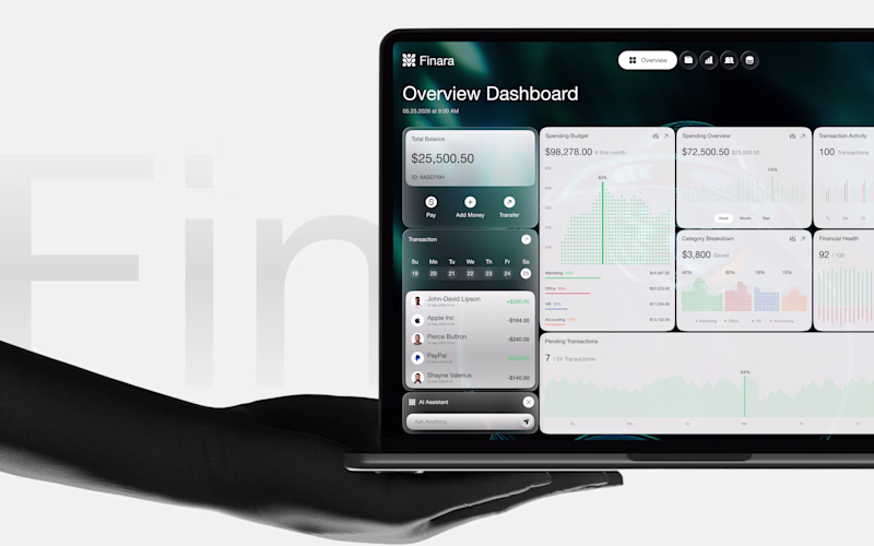
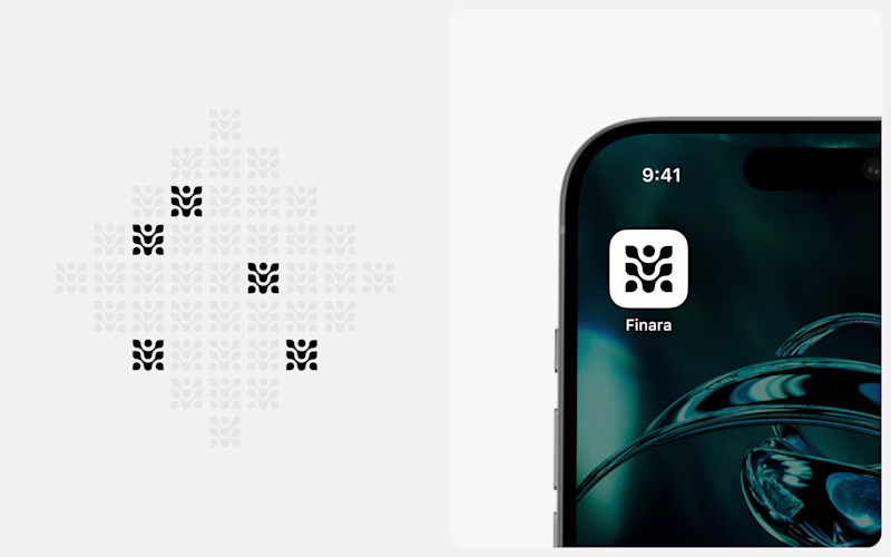
Full case - Finara Branding + UX/UI
38 voted
75%
13 voted
25%
51 votes
Closed
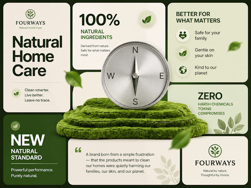
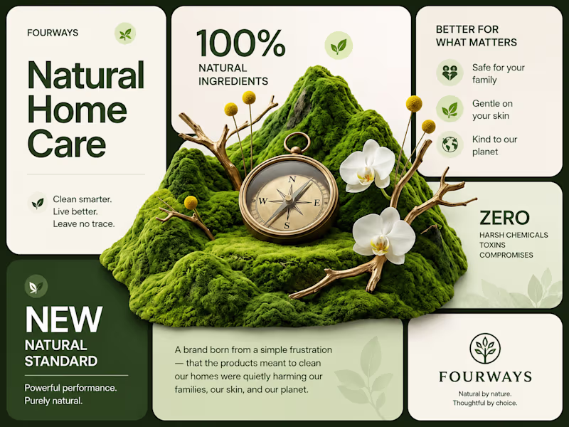
Dashboard preview
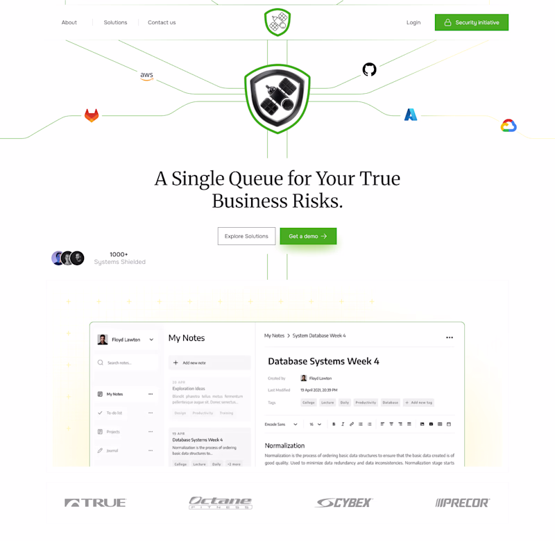
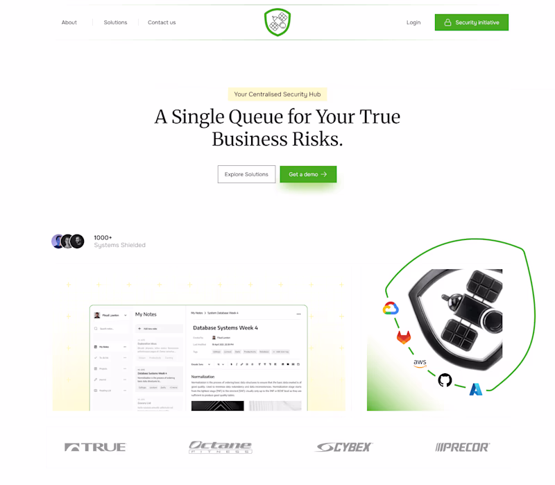
A or B? Polling the community on my latest homepage revamp. 🚀
I am currently engineering a premium digital experience for a recent revamp project. I’m stuck between two structural directions and would love the Contra community's feedback before I take this from Figma into the final front-end build.
7 voted
88%
1 voted
12%
8 votes
Closed
The illustration in A makes it stand out
Challenges
View allTrending
Claude
Claude has entered the design space. How are you using Claude Design?
Contra University
Learn from expert creatives how to earn more using next-gen AI tools.
MagicPath
The canvas is infinite, and exploration is becoming the workflow. How are you using MagicPath?
creativeaiflow
Creative AI workflows are evolving. What tools do you use, and what are their strengths and weaknesses?
freelancerlife
Freelancer life is wins, pivots, and everything in between. What’s yours right now?