The network for creativity
Join 1.25M professional creatives like you
Connect with clients, get discovered, and run your business 100% commission-free
Creatives on Contra have earned over $150M and we are just getting started
Back to feedPost
Taste Test

A/B test for the SWKID CORE.TXT cover artwork.
I’m finalizing the packaging for my modular grid system, and I want to hear from the community. Both options follow strict layout discipline, but they project entirely different energies.
Option A: Pure Swiss minimalism. Heavy typographic restraint and clean space.
Option B: Y2K Chrome aesthetics layered over a dark brutalist grid.
Which direction represents the architecture of design better?
6 voted
60%
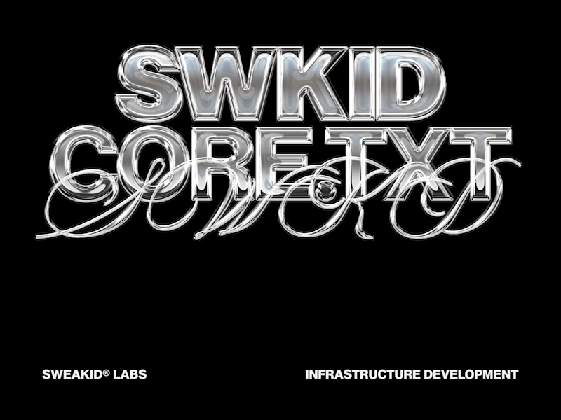
4 voted
40%
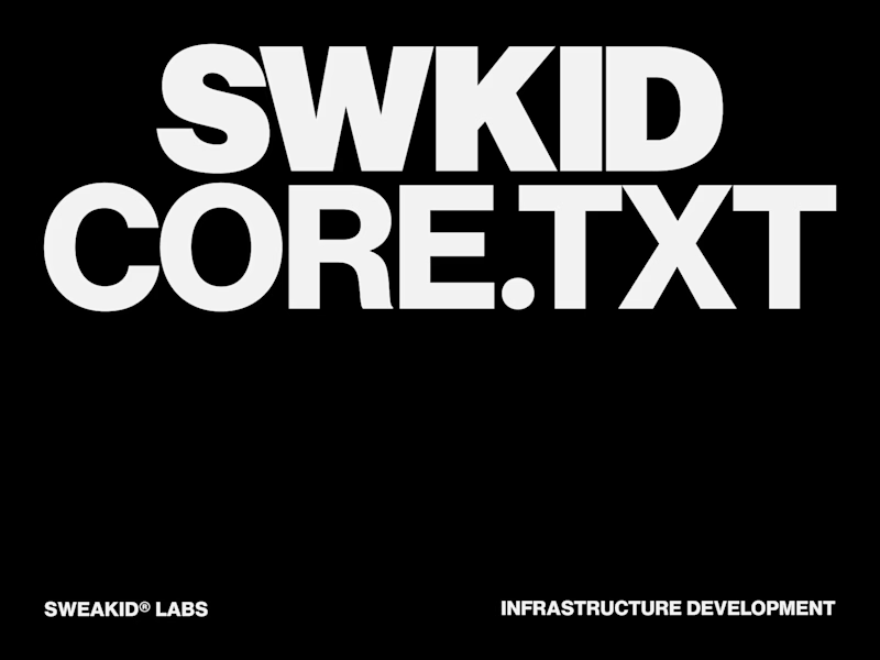
10 votes
Closed

Option A for me. When the product is a grid system, the cover should demonstrate that restraint, not override it. The Swiss approach lets the typography carry the weight without competing with the concept.


the left one looks really good

Option 1 gives premium vibes

Option 1 for me! The distorted, glitchy treatment gives it so much more energy and tension while still keeping that strict grid discipline. Both are strong though, SWEAKID!

Option 2

good work!
The network for creativity
Join 1.25M professional creatives like you
Connect with clients, get discovered, and run your business 100% commission-free
Creatives on Contra have earned over $150M and we are just getting started

Challenges
View all


Related posts

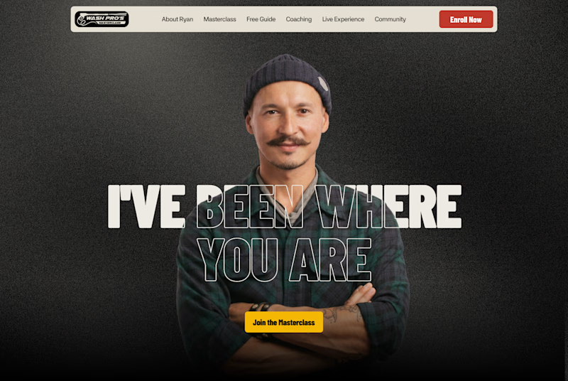
Which layout is better?
.
.
Curious which one wins? Follow along for more tests like this x.com/rightnextstep

20 voted
67%
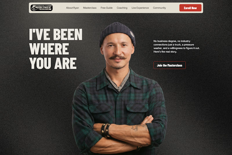
10 voted
33%
30 votes
Closed

Hero 1 shows the hero text very well but you might need to work on the Hero CTA for "join the masterclass", I will probable miss it as a key action if I was a regular user


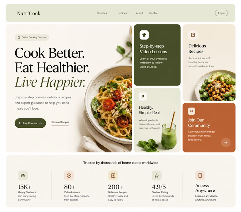
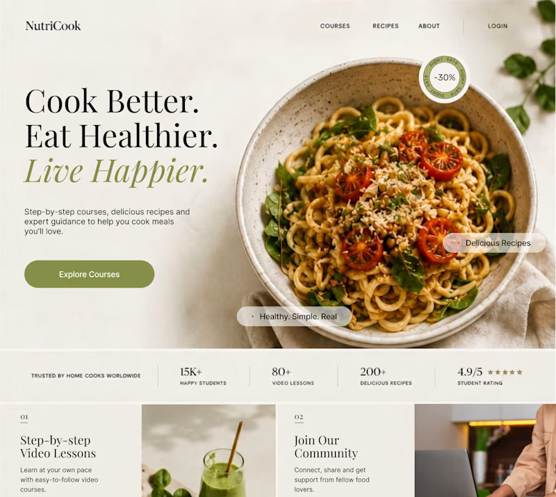
Same content. Two completely different vibes.
What happens when you keep the course content the same, but change the structure, typography, and color palette?
Two hero sections. One course. Two different visual experiences.
Which one would you choose? 1 or 2?
29 voted
41%
42 voted
59%
71 votes
Closed
Option 1 works well , the heirarchy and card layout on the hero is very smart

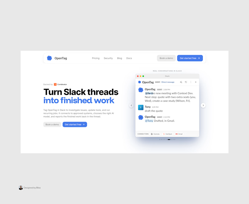
A brilliant SaaS tool needs a landing page that instantly builds trust and drives action.
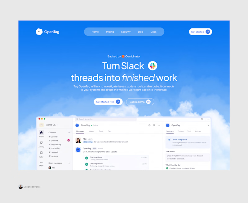
I recently put together this visual upgrade for OpenTag to explore how tightening the layout could elevate their first impression.
Option A (The Original): Strong product copy, but the split layout and floating elements create competing focal points that divide the user's attention.
Option B (The Redesign): Centered messaging, a much clearer visual hierarchy, and a dynamic, breathable layout. The goal was to remove distractions and let the product interface take center stage.
Which direction do you think communicates the value better and creates a stronger first impression?
Let me know your pick!

8 voted
100%
0 voted
0%
8 votes
Closed

Great work, Emmanuel!