The network for creativity
Join 1.25M professional creatives like you
Connect with clients, get discovered, and run your business 100% commission-free
Creatives on Contra have earned over $150M and we are just getting started
Back to feedPost

WhatsApp is great for talking to customers.
But once a team starts handling those conversations, things get messy fast.
Who’s replying?
Who owns the conversation?
What did the customer ask last time?
Did someone already follow up?
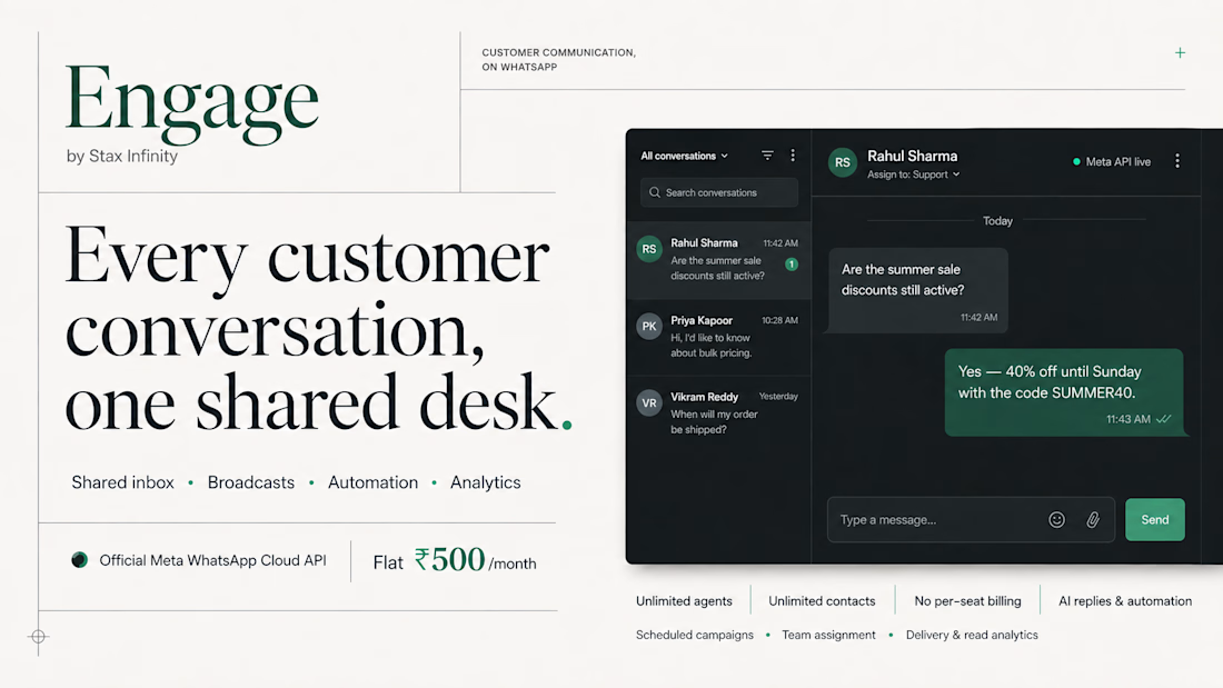
That was the problem behind Engage by Stax Infinity — a shared WhatsApp inbox built for customer teams.
I worked on turning that operational mess into a product experience that feels simple, clear and easy to navigate.
The focus was on making conversations easier to manage, improving visibility across the team, and helping people move from “another WhatsApp chat” to an actual customer workflow.
The interesting part for me wasn't just making it look good.
It was figuring out how a team should work together around a conversation.
You can check out the product here: https://engage.staxinfinity.com/
Always love working on products where UX has to solve a real operational problem.
Need help turning a complex product into a simple experience? Let’s talk.

The network for creativity
Join 1.25M professional creatives like you
Connect with clients, get discovered, and run your business 100% commission-free
Creatives on Contra have earned over $150M and we are just getting started




Related posts

What should a creative agency website actually feel like?
For Orvika, we didn't want another agency site built around the same safe layouts and predictable sections.
We pushed the visual direction further with oversized typography, editorial layouts, bold imagery, and stronger contrast, while keeping the experience structured enough to communicate the agency's work and capabilities clearly.
The goal wasn't just to make it look different.
It was to make the agency feel different.
Designed in Figma and built in Framer.
We're sharing more of the websites and digital experiences we've been working on here over the next few weeks.



Very neat man

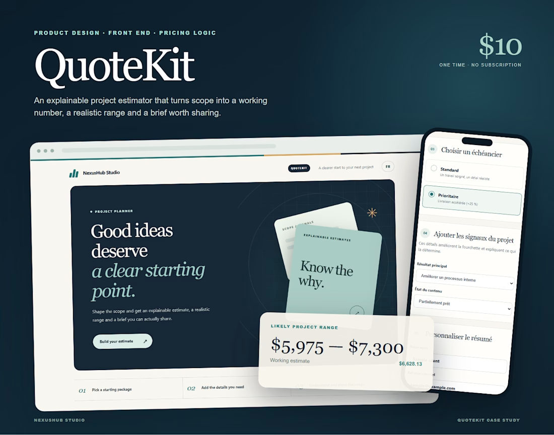
I built QuoteKit because quoting a project should not feel like guessing in public.
A client starts with a package, shapes the scope, chooses a timeline and explains what they need. QuoteKit turns those choices into a working estimate, a realistic range and clear reasons behind the price.
It works in English and French, adapts to mobile and gives both sides a summary they can copy, download or print.
I designed the product, pricing logic and interface for NexusHub Studio. It is a small tool with a simple goal: make the first client conversation clearer.
QuoteKit is available for 10 USD with a commercial license.
What would you want an estimator like this to explain before you send a quote?
Quote clearly. Start better.
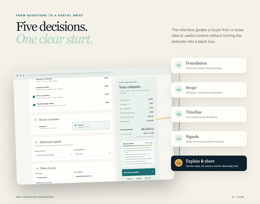
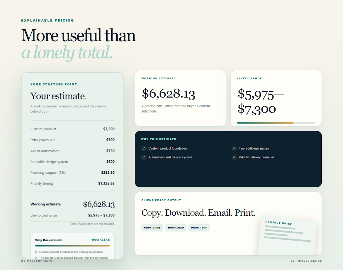
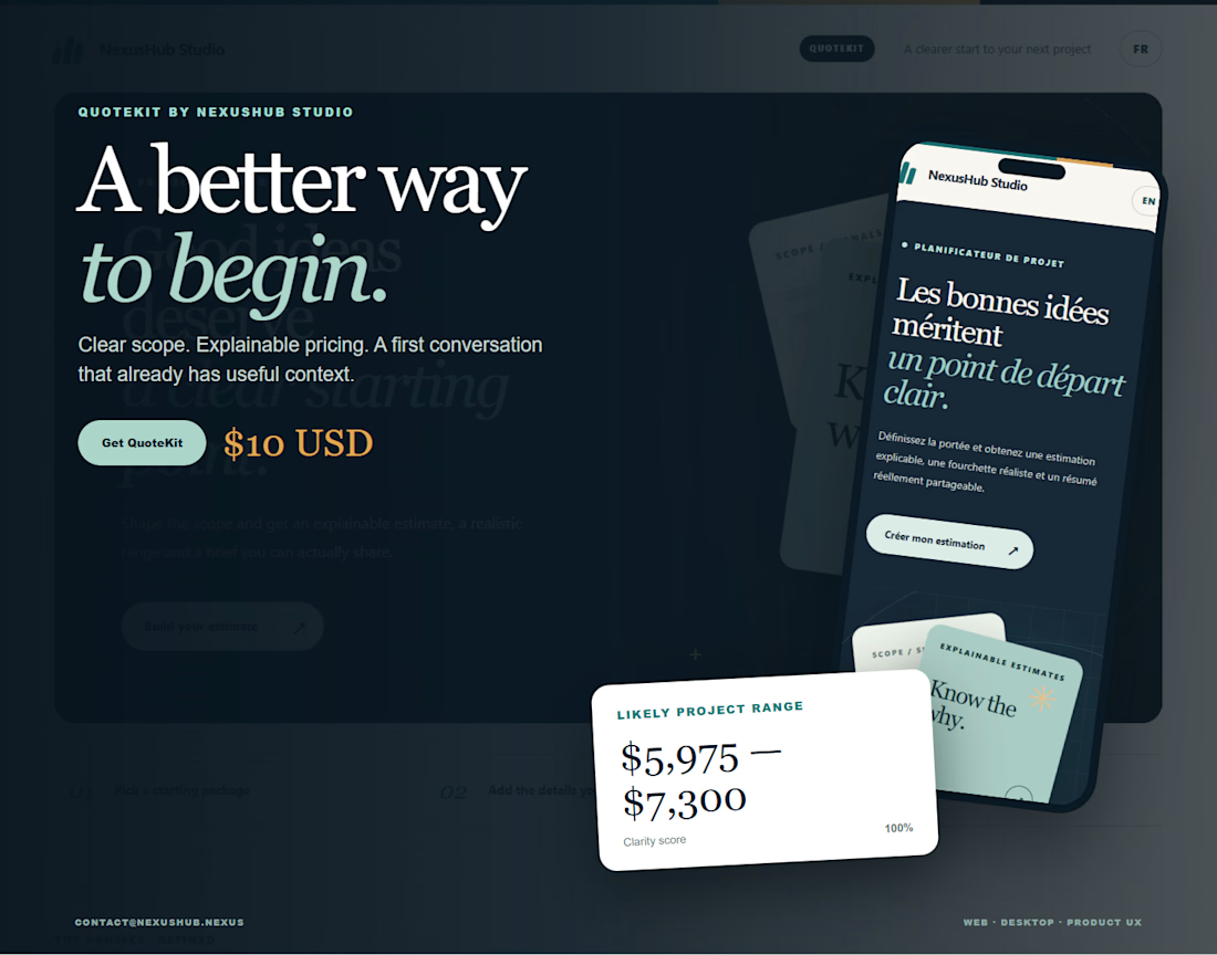

Explaining the estimate turns pricing into a much clearer conversation.

💳 Making Financial Products Feel Simple
I designed this finance website for Sendit, with one goal in mind: make everyday payments feel simple, trustworthy, and effortless.
The design focuses on:
Clear messaging and strong visual hierarchy
Trust-focused finance UI
Simple payment interactions
Clean, modern layouts
Conversion-focused sections
A responsive experience designed around the user
For fintech products, good design isn’t just about looking modern. It’s about making people feel confident when money is involved.
If you’re building a fintech, SaaS, payment platform, or financial product and need a website that communicates trust and clarity, I’d love to work with you.


Solid execution on a hard brief.