The network for creativity
Join 1.25M professional creatives like you
Connect with clients, get discovered, and run your business 100% commission-free
Creatives on Contra have earned over $150M and we are just getting started
Back to feedPost

Logo design for a food truck: Authentic Cali flavor, boldly brought to the South.


The network for creativity
Join 1.25M professional creatives like you
Connect with clients, get discovered, and run your business 100% commission-free
Creatives on Contra have earned over $150M and we are just getting started






Related posts

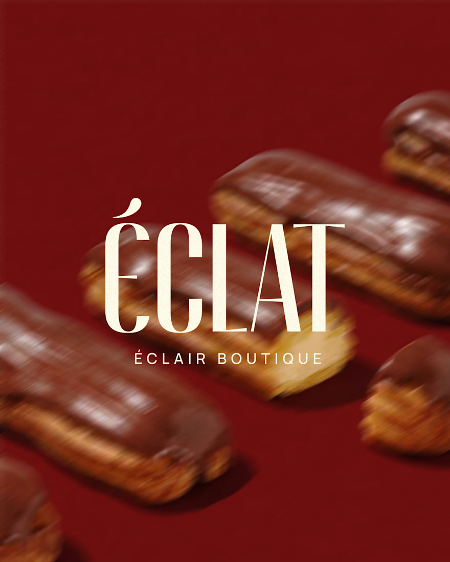
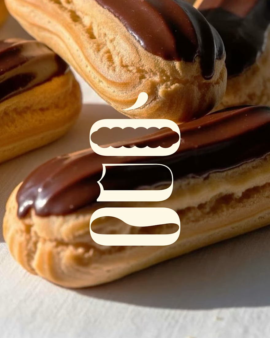
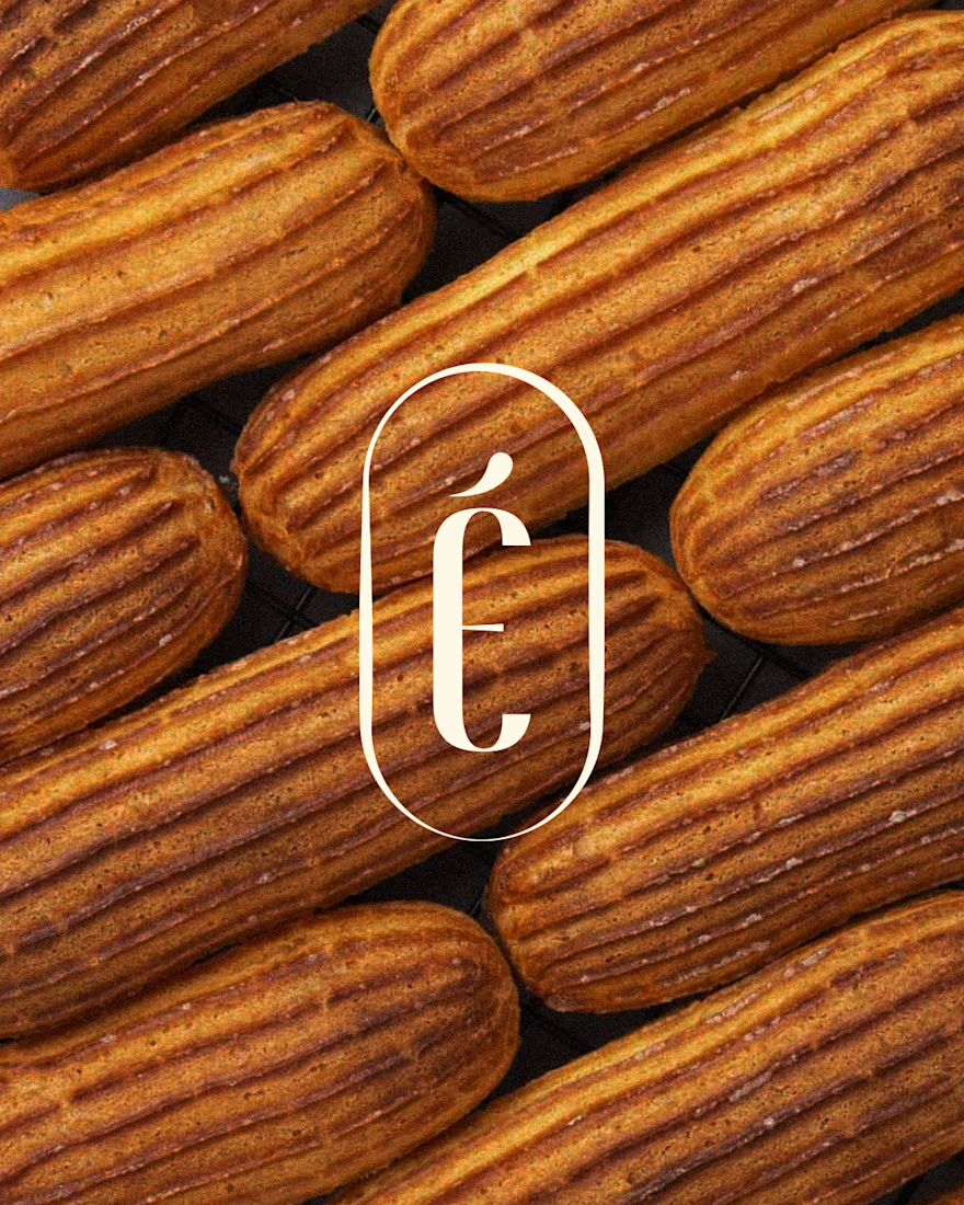
The custom logotype for Éclat is a visual homage to the geometry of French pastry. The typography is inspired by the iconic, elongated silhouette of the éclair, where the soft, rounded lines of the letterforms mirror the structure of the pastry.


Ooh, love this!

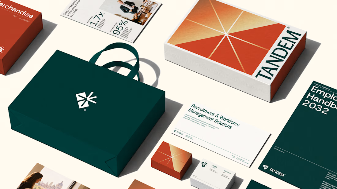
Tandem brings two different worlds together and unlocks new opportunities for both.
If I had to describe this project in one line, that's what I'd say.
The entire brand system reflects this idea. From the name and logo to the colours and graphic language, every element reinforces the same thought: bringing businesses and workers together to create momentum.
We had a blast building this identity, and I'm genuinely happy with how it turned out!
Would love to know what you think☺
The complete project is here



Nice work!!



Simply brilliant!