The network for creativity
Join 1.25M professional creatives like you
Connect with clients, get discovered, and run your business 100% commission-free
Creatives on Contra have earned over $150M and we are just getting started
Back to feedPost

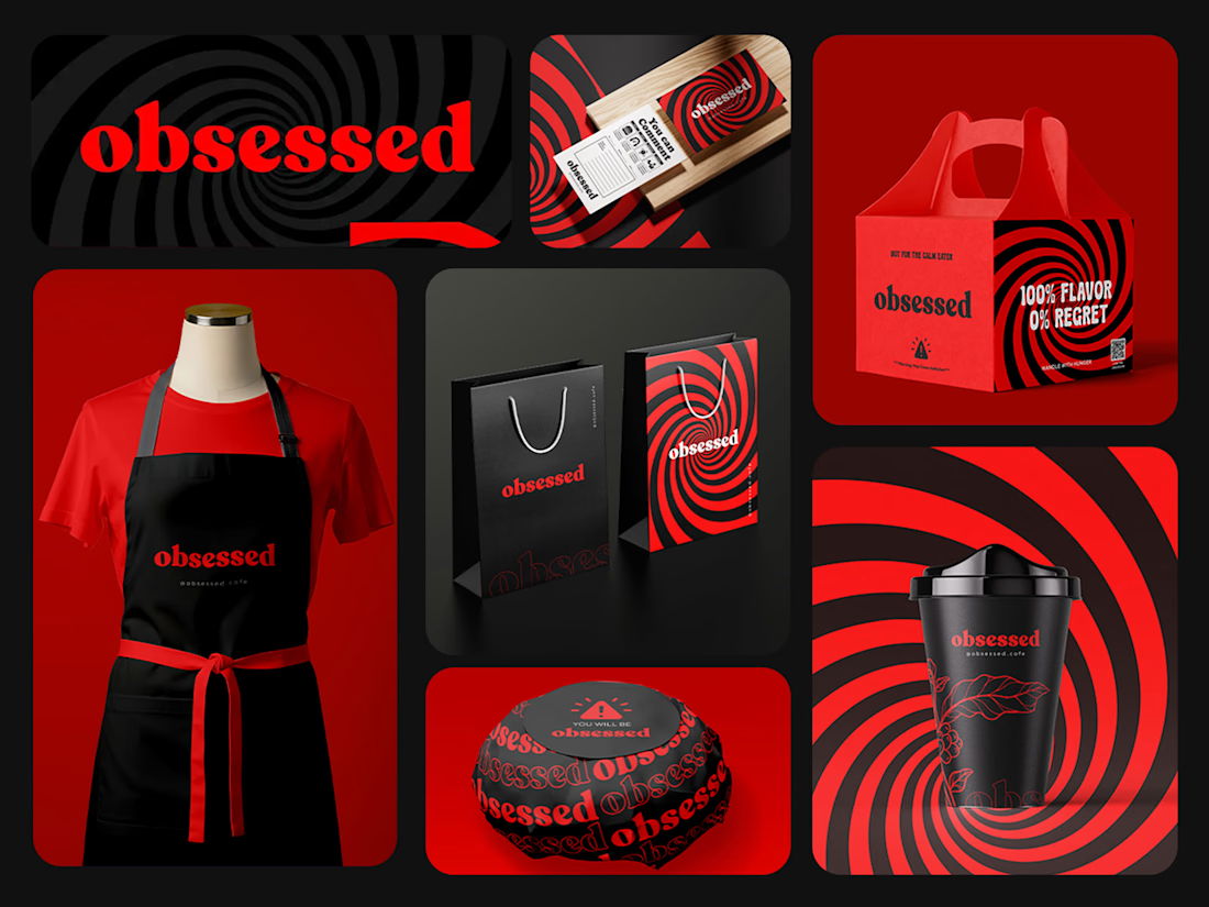
Obsessed | Complete Brand Identity System
Obsessed is a bold consumer brand built around passion and premium quality. The brief required a visual identity that felt confident, modern, and memorable something that would stand out immediately in a competitive product market.
The process started with brand positioning and competitor research to define a visual direction that felt genuinely distinct. From there the identity system was built around a strong wordmark, a tight color palette, and a typography system designed to work across digital and print applications.
Deliverables included the primary logo with full variations, brand color palette with HEX and CMYK codes, typography guide, brand style guide covering usage rules and application examples, and all source files in AI, EPS, PNG, and PDF formats.


The network for creativity
Join 1.25M professional creatives like you
Connect with clients, get discovered, and run your business 100% commission-free
Creatives on Contra have earned over $150M and we are just getting started




Related posts


Clean work !

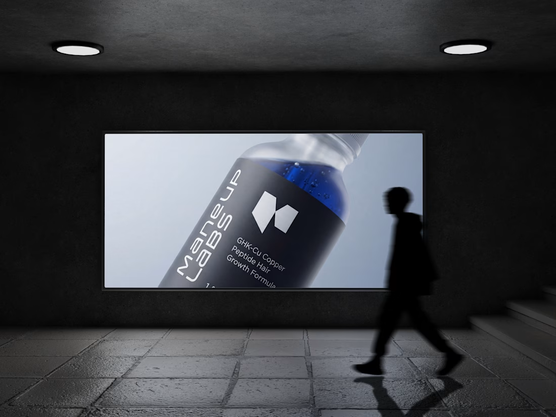
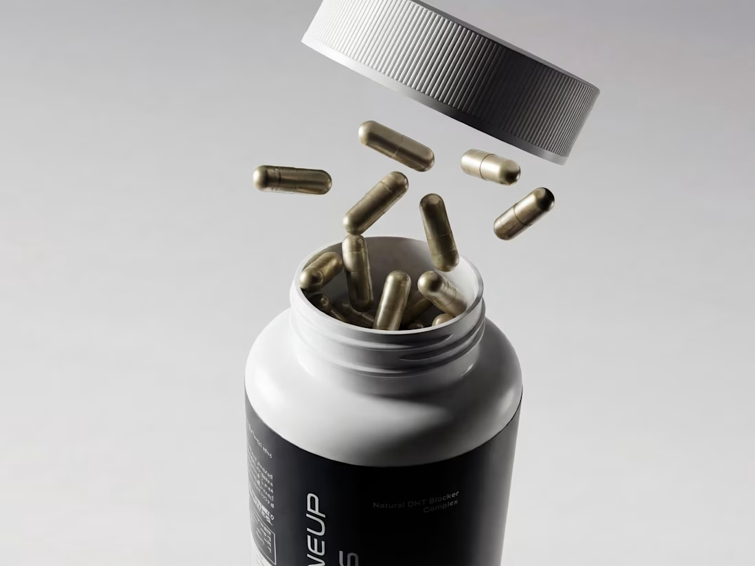
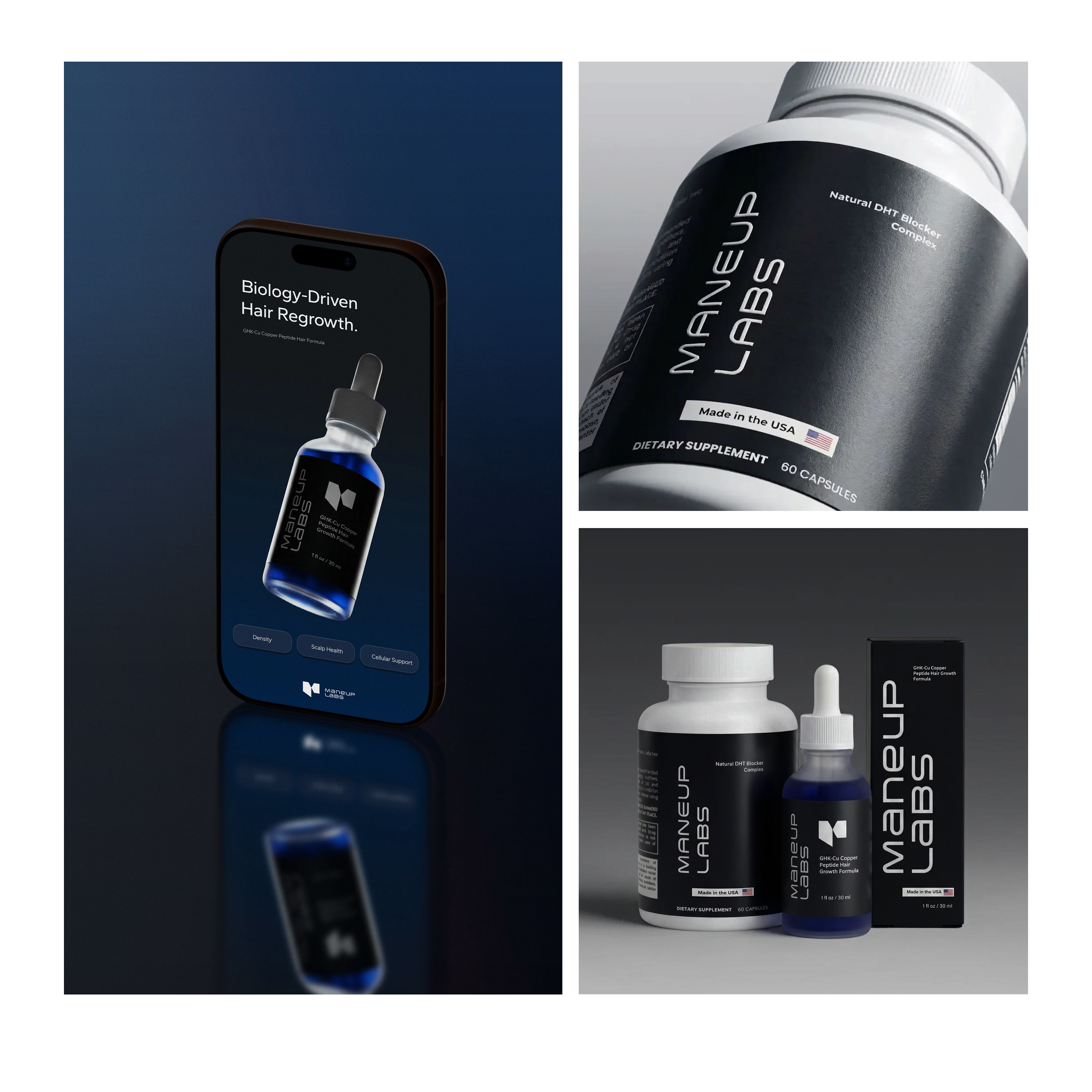
Hot take: hair growth products don't have to look like medicine to work like it.
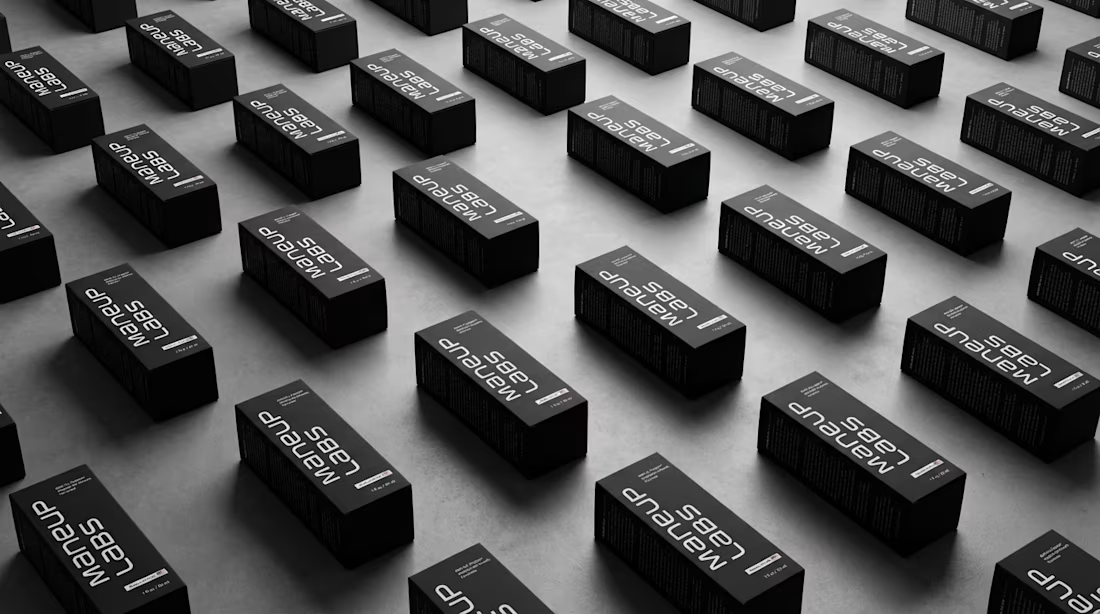
Most brands in this category go clinical white and blue, it reads safe, but it also reads like something you'd hide in a drawer, not something you'd want visible on your sink. For Maneup Labs, I went almost fully black instead.
That was a real risk. In a category this saturated with sterile, pharmacy-white packaging, going dark could just as easily read cold, or get lost next to competitors leaning into "clean = trustworthy." But it did the opposite: next to every clinical-looking bottle on the shelf, black reads premium, not medicinal, closer to what you'd expect from a grooming or fragrance brand than a hair-loss aisle.
That's the audience shift the whole rebrand was built around, not the guy who wants to feel like he's medicating something, but the guy who wants a product that looks like it belongs on his counter.
Would a bottle like this make it out of your bathroom cabinet and onto your sink?

Looks amazing! 💙

Which WANDER logo would you choose?
A travel brand doesn’t just need a logo —
it needs a visual identity that makes you want to explore.
So I explored 2 different directions for the same brand
Bold & Minimal
Vote in the poll.
And Tell me what made you choose it in the comments.
#LogoDesign #BrandIdentity #GraphicDesign #LogoInspiration #VisualIdentity
11 voted
92%
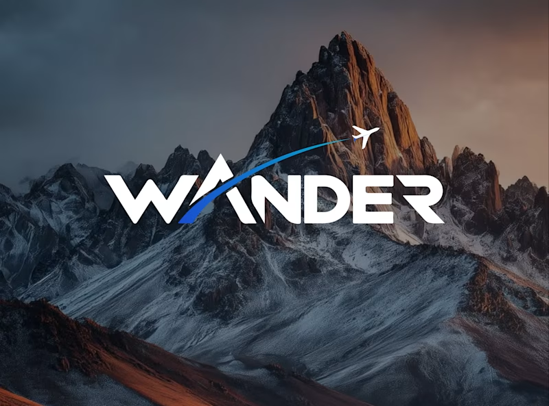
1 voted
8%
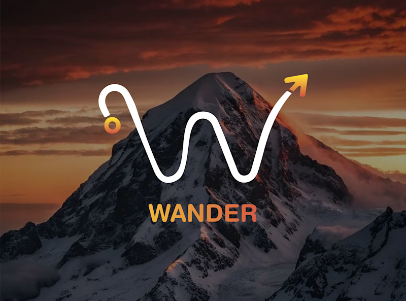
12 votes
Closed

Minimal for me. The W drawn as a winding mountain path is doing double duty, letterform and route in one, exactly what a travel brand wants. Bold is clean but the swoosh W tells a little story before you read a single word.