The network for creativity
Join 1.25M professional creatives like you
Connect with clients, get discovered, and run your business 100% commission-free
Creatives on Contra have earned over $150M and we are just getting started
Back to feedPost
Taste Test
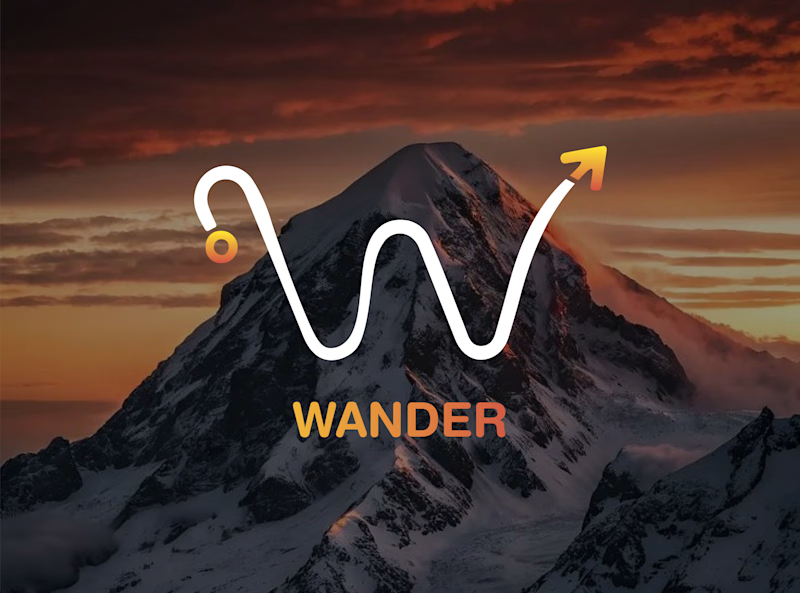
Which WANDER logo would you choose?
A travel brand doesn’t just need a logo —
it needs a visual identity that makes you want to explore.
So I explored 2 different directions for the same brand
Bold & Minimal
Vote in the poll.
And Tell me what made you choose it in the comments.
#LogoDesign #BrandIdentity #GraphicDesign #LogoInspiration #VisualIdentity


9 votes
Ends in 1d

First one has a realistic sense in logo with plane,
second one feels like,
trying to make it look good somehow.

Thank you for the feedback I will Definitely work on improving it.

second one looks cool.


i'd pick bold. that plane over the white WANDER is fun


Thankyou so much for feedback.

Thank you for feedback


Option 1 for clean scalability across digital platforms, but the Minimal direction feels more versatile for modern travel apps and UI systems. Minimalist vectors hold up better at smaller viewports and retain high visual clarity across light and dark modes
Thankyou so much for feedback


Minimal for me. The W drawn as a winding mountain path is doing double duty, letterform and route in one, exactly what a travel brand wants. Bold is clean but the swoosh W tells a little story before you read a single word.
Thank You So Much For The Feedback.
Thankyou so much for the feedback.Glad you liked it.
The network for creativity
Join 1.25M professional creatives like you
Connect with clients, get discovered, and run your business 100% commission-free
Creatives on Contra have earned over $150M and we are just getting started

Challenges
View all


Related posts


🎴 TASTY TEST 06/30: Which travel discovery experience would you choose?
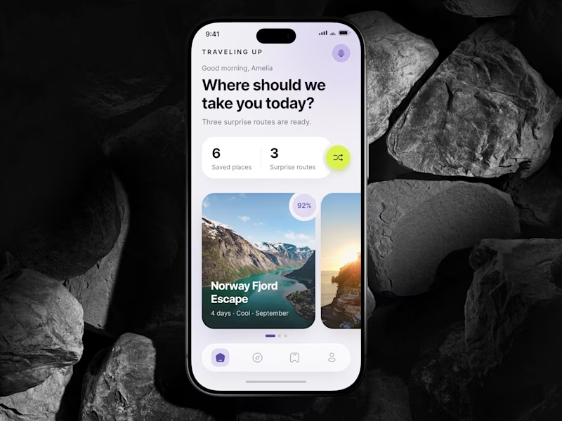
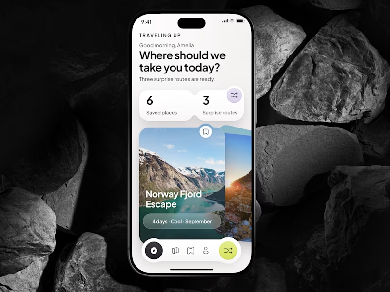
Traveling Up is probably my first mobile concept outside client work in almost three years. It was inspired by a trip where not knowing the destination was part of the fun.
Same app. Same destination. Two ways to discover it.
🤍 A Clean Carousel
Calmer, lighter, more familiar.
💚 B Immersive Deck
Bigger imagery, stronger overlap, more tactile navigation.
Which one makes you want to swipe and see where the app takes you next?
A or B? 👇
#MobileAppDesign #TravelApp #MobileUX #UIDesign #ProductDesign #AsolDesign
23 voted
49%
24 voted
51%
47 votes
Closed


New cover, new visual taste test.
As a visual director, the hardest choice is choosing between your own creations.
Two covers. Two directions. One choice.
Which one gets your vote?


34 voted
79%
9 voted
21%
43 votes
Closed
the blue background makes the orange shapes pop

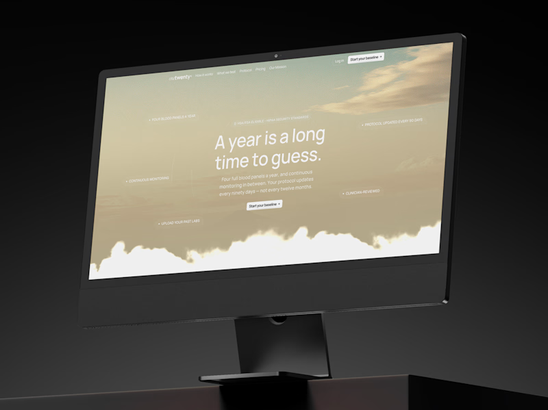
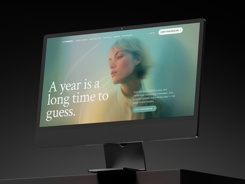
a longevity health membership asked me for the first ten seconds of their site. two opinionated directions, not four safe ones.
A · the instrument: https://onetwenty-direction-a.framer.website/
opens with how it works, shown through real product interface. the clearest version of what the category already does.
risk: one more health dashboard.
B · the publication: https://onetwenty-direction-b.framer.website/
opens with the reader's doubt, then explains. a big serif headline, one photo, a section that plays the idea out as you scroll.
risk: drifting into wellness.
the copy is nearly identical in both, on purpose. so the question isn't which one looks better:
which one would make you trust a health company with your blood and your data?
vote, and tell me why below.

10 voted
17%
49 voted
83%
59 votes
Closed

B look similar to this https://templatoria.com/templates/clearpath
templatoria.com
ClearPath — Framer Template for Therapists and Coaches
ClearPath is a warm Framer template for therapists, coaches, and personal growth professionals. Built for services, client stories, journals, and booking-focused websites.