The network for creativity
Join 1.25M professional creatives like you
Connect with clients, get discovered, and run your business 100% commission-free
Creatives on Contra have earned over $150M and we are just getting started
Back to feedPost


So yes, it's just a login screen. Doesn't mean it has to be boring.
This one's for Truxco, a Swedish marketplace for buying and selling used buses across Europe. Not the industry you'd expect design craft from. Exactly why it stands out.
The login is the first thing every user touches, every single session. It can feel like a chore, or it can set the tone for everything behind it.
A "boring industry" is just an industry nobody's designed properly yet.

so few login pages offer engaging visuals, i love this. the moving text, the unconventional shaping details on the left, the unfurl of text... chef's kiss!
Thank you Nicolette!

Right on point most websites looks very clean and engaging until you get to their login and it feels so different from the whole website flow. Looks great man welldone

It doesn’t have to be boring 💯 🔥
This is good!

That’s great Ralph! I thought I was the only one who believes even the little things in any industry need to be top-notch. The details matter.

The motion blur on the bus behind the login form is such a clever touch, it turns a static moment into part of the journey. What made you land on that visual metaphor over something more literal like route lines or a ticket motif?

Keeping the form fields themselves completely plain and putting all the craft into the motion-blurred bus photo is the right split - a login flow that gets fancy with its inputs usually just adds friction, the personality belongs in the half nobody has to interact with.


"A boring industry is just an industry nobody's designed properly yet" might be my favorite line I've read on here this week. Did Truxco come in already expecting this level of polish, or did you have to sell them on it?


Amazing work👏🔥🔥

That's great🔥

Love the blur!

Love the movement man, great ideas! 💯

Super clean work! 🏆

True, even small screens like a login can set the tone. I like how much character you gave this one.

Looks good👏


login screen for a bus marketplace going this hard, love it
The motion blur on the bus photo does the work of urgency so the login form itself can stay static and fast to scan. Smart division of labor between image and UI.


Nice work, It looks minimal
The split-screen with the bus in motion works because it puts the login in context before you're even logged in — you know what the app is for at the exact moment you'd normally see a blank form.

One of the best design have seen so far today..... Good job

Amazing design

this looks great

The network for creativity
Join 1.25M professional creatives like you
Connect with clients, get discovered, and run your business 100% commission-free
Creatives on Contra have earned over $150M and we are just getting started





Related posts

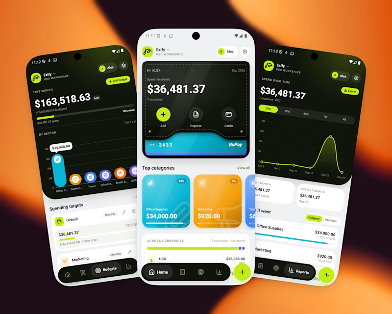
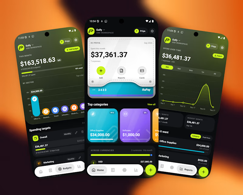
A great app should not just function, It should feel visually distinct
When the market is full of similar-looking products, design becomes part of the product’s well identity
For this finance project, we focused on a sleek UI, intuitive UX, and a visual language that doesn’t feel generic
Both dark and light modes were designed to feel equally intentional.
Which one do you prefer?

10 voted
56%
8 voted
44%
18 votes
Closed

I’d go with Light Mode. 👌 It feels fresh, clean, and the UI elements stand out beautifully against the background. Both are strong, though! 🔥


pure eye candy 😍


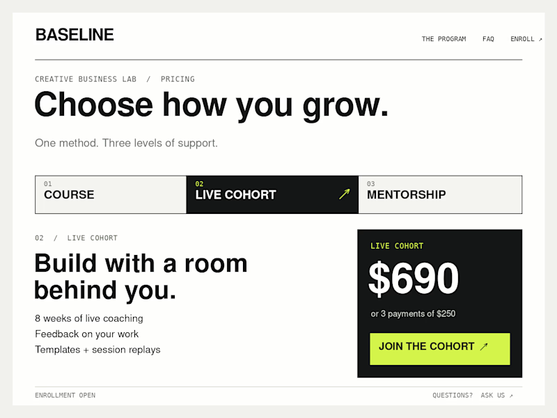
Which Kajabi pricing section would you ship?
Creative Business Lab has three paths: Course, Live Cohort, and Mentorship. Both designs show the same $690 Live Cohort with the same benefits. Only the presentation changes.
Vote Horizontal tabs or Side tabs, then tell me the one thing you’d improve before launch. Have a stronger third approach? Show it in the replies.

21 voted
50%
21 voted
50%
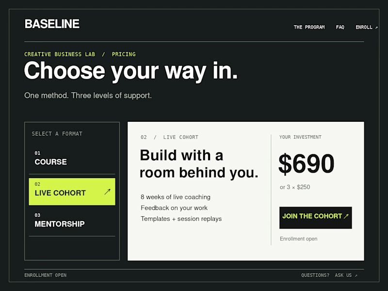
42 votes
Closed

Horizontal. side tabs read as nav, people skip them. though the stronger third option is no tabs at all, three cards side by side. both of these hide two prices behind a click and comparison is the one job a pricing section has.