The network for creativity
Join 1.25M professional creatives like you
Connect with clients, get discovered, and run your business 100% commission-free
Creatives on Contra have earned over $150M and we are just getting started
Back to feedPost
Taste Test


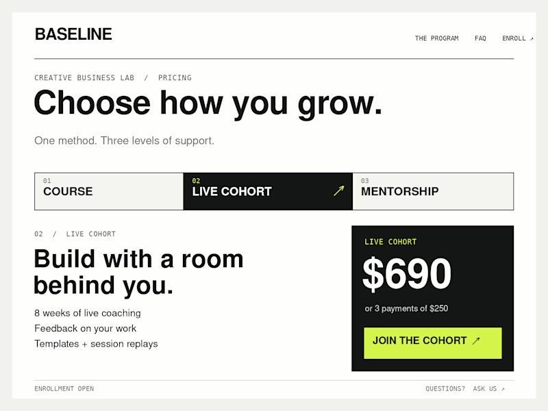
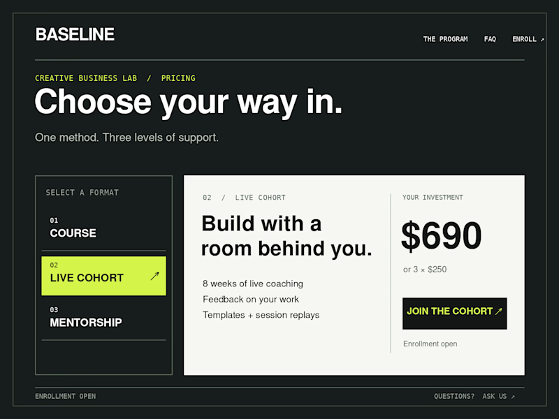
Which Kajabi pricing section would you ship?
Creative Business Lab has three paths: Course, Live Cohort, and Mentorship. Both designs show the same $690 Live Cohort with the same benefits. Only the presentation changes.
Vote Horizontal tabs or Side tabs, then tell me the one thing you’d improve before launch. Have a stronger third approach? Show it in the replies.

21 voted
50%
21 voted
50%
42 votes
Closed

The dark one is better but if you make everything in it darker but with different darkness levels it will be incredible ❤️🔥

Side tab 100%

Horizontal. side tabs read as nav, people skip them. though the stronger third option is no tabs at all, three cards side by side. both of these hide two prices behind a click and comparison is the one job a pricing section has.

Top-notch design.


Horizontal

Horizontal tabs give a clear visual hierarchy, which enhances a smooth user flow.

I think horizontal tabs feel a bit more natural here. However, it might be even better to skip tabs altogether and show three cards side by side, as letting users compare all prices at a glance is usually the most effective approach.

I will choose the second

I'd ship Side tabs. It looks cleaner and easier to read. Did you mean to keep the button text aligned to the left instead of centering it?

Going with the side tab

I’d go with side tabs. They make the three paths easier to scan without taking too much vertical space. I’d just make the selected path feel a bit more prominent.


Looks great !
The network for creativity
Join 1.25M professional creatives like you
Connect with clients, get discovered, and run your business 100% commission-free
Creatives on Contra have earned over $150M and we are just getting started











Related posts
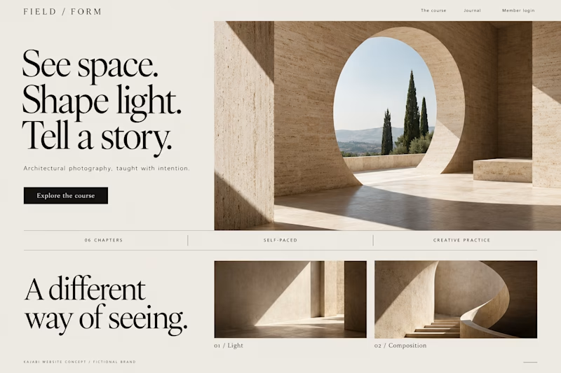
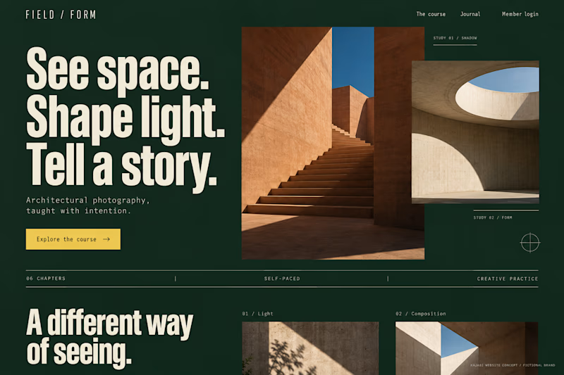
Which Kajabi photography-course design makes you want to explore?
Two original AI-generated concepts for FIELD / FORM, a fictional architectural-photography school. Gallery Study pairs expressive serif type with warm stone and generous space. Field Journal uses forest green, bold condensed type and a layered photo study.
Same course, two directions. Which would you choose, and why?
15 voted
75%
5 voted
25%
20 votes
Closed
Galary study Hits better to me❤️❤️
great job Kraig🔥🔥


Lovely cohesive work, Alex. The motion is spot on!

Hey everyone! 👋
Working on Cortiva, an AI-first hospital branding project.
I've already finalized the color direction, but I thought it would be fun to explore two different moods.
Option 01💚 or Option 02? 💜
Both have their own personality, and I'm curious to see which one you prefer!
Let's see which one wins! 👀
5 voted
33%
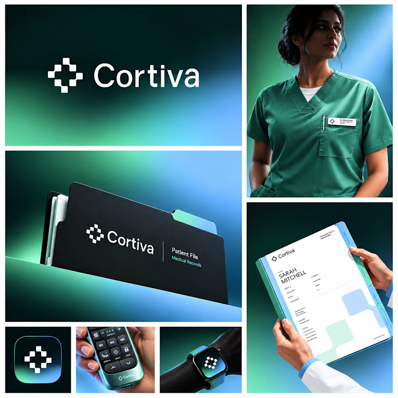
10 voted
67%
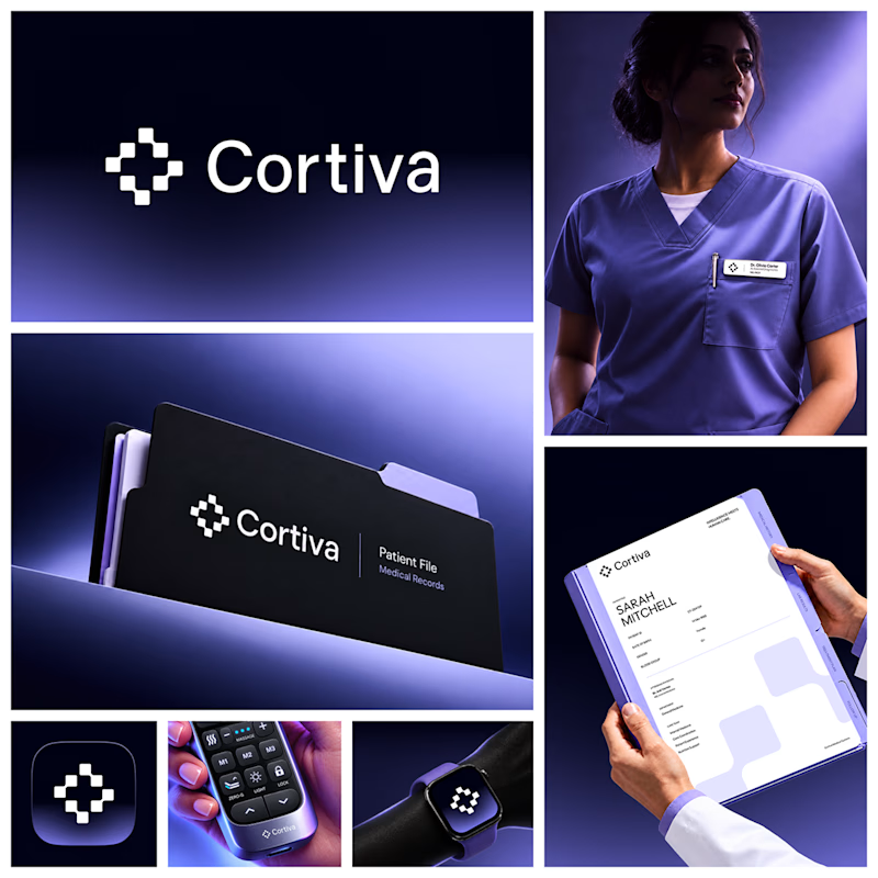
15 votes
Closed

Option 01 for me. Green gets to "care" faster in a hospital setting, while the violet pulls the whole system toward a tech product. Since the identity is AI-first, I'd be curious whether you want patients to read it as clinical or as friendly first.