The network for creativity
Join 1.25M professional creatives like you
Connect with clients, get discovered, and run your business 100% commission-free
Creatives on Contra have earned over $150M and we are just getting started
Back to feedPost
Project title
STALL — Your farmers market, alive.
A swipe-to-shop farmers market companion that connects local vendors with regulars before Saturday ever arrives.
The problem
Every Saturday, the same thing happens.
You show up to the farmers market at 10am. The ramp vendor you wanted is sold out by 9. You forgot cash. You walk past a honey stall three times because you can't remember if you already bought some. And that new mushroom farm you heard about? Gone before you spotted them.
On the vendor side, it's just as frustrating. Small farmers wake up at 4am, load the truck, drive an hour, and have no lightweight way to tell their regulars — the people who actually want what they grow — "I have asparagus this Saturday. Come find me."
STALL fixes both sides of that problem.
What STALL does
STALL is a two-sided farmers market app built around one weekly ritual: Saturday morning.
For shoppers:
Follow vendors at your local market
Swipe through a weekly produce deck — right to add to your list, left to skip — exactly like Bumble, but for ramps and sourdough
Get a Friday evening digest: what your vendors have this week, your auto-built shopping list, and where each stall is on the map
Pre-reserve high-demand seasonal items before you leave the house
Discover first-of-season arrivals with a "what's new this week" spotlight
For vendors:
Post a weekly inventory update in 3 taps — what you're bringing, quantities, price
Reach your regulars directly before market day
Manage pre-reservations without a complicated system
The app celebrates the seasonal nature of farmers markets — ramps in April, strawberries in June, squash in October. Every week feels like something worth showing up for.
How I built this with Google Stitch
STALL was designed and prototyped entirely using Google Stitch as the primary build tool, with Figma used only for initial wireframing.
The workflow:
Day 1 — Brand and wireframes
I started by defining the brand: the name, palette (Pumpkin Spice Forest — a warm amber, fern green, mauve, and cream system), and illustration direction. I wireframed the three core flows — swipe deck, Friday digest, and vendor post — before touching Stitch.
Day 2 — Into Stitch
I imported my Figma file directly into Stitch using the .fig import feature. From there I used streaming generation to build each screen live on the canvas — watching the splash screen, onboarding flow, and homepage assemble in real time was genuinely remarkable. The HTML-native canvas meant every animation I added — card tilt on swipe, drawer slide-up, bento tile stagger — rendered exactly as it would in production.
Key Stitch prompts used:
"Add a swipe gesture to the produce card stack — right swipe shows a green Added overlay with 5° card tilt, left swipe shows a mauve Skipped overlay with -5° tilt"
"Make the shopping list items stream in one by one with 120ms stagger on page load"
"Add a bottom drawer that slides up from the vendor card with spring easing — show the farm bio, full inventory list, and two action buttons"
"Build the Friday digest screen — vendor items animate in sequentially, the seasonal spotlight card pulses gently"
"Export web assets and deploy to Netlify"
In-place edits I used:
Swapped the swipe overlay color from red to mauve to match brand
Adjusted the bento grid gap from 8px to 6px after seeing it render on canvas
Changed the CTA button from outlined to filled after in-place visual comparison
Rewrote the seasonal spotlight copy directly on the canvas without regenerating
What Stitch made possible that nothing else could:
The swipe gesture interaction, the drawer spring animation, and the staggered list streaming — all three of these would have taken days to hand-code. In Stitch, they were prompt-driven and live on the canvas within minutes. The gap between "designed" and "interactive prototype" collapsed entirely.
Screens delivered
Splash screen — farmer illustration, full-bleed cream background
Onboarding screen 1 — market basket illustration, "Your market, every Saturday"
Onboarding screen 2 — swipe mechanic explainer with card UI
Onboarding screen 3 — Friday digest bento preview
Homepage — bento grid with market header, seasonal spotlight, list, map preview, swipe deck, streak tracker
Swipe deck — card front, vendor expand drawer, swipe right (added), swipe left (skipped)
Friday digest — streaming vendor list, seasonal spotlight, auto-built shopping list
Market day map — vendor stall grid, spot numbers, live confirmation states
Vendor post flow — 3-tap inventory update screen
Design decisions worth noting
The swipe mechanic — Borrowing the Bumble swipe pattern for produce discovery was the conceptual breakthrough. It transforms a passive browse into an active, satisfying decision. Every right swipe builds your list. Every left swipe still shows you where the vendor is on the market map — skipping is never permanent.
The Friday digest as the hero feature — Most apps make you come to them. The Friday evening push notification with a personalised market brief is the one moment where STALL comes to you. It changes Saturday morning from reactive to intentional.
Bento homepage — Instead of a scrolling feed, the homepage gives you everything at a glance: your market, your list, the seasonal moment, your vendors. Seven tiles, seven pieces of information, zero scrolling.
The color system — Pumpkin (#E8872A), Fern (#728040), Mauve (#B07090), Cream (#FDFAF6), and Moss (#4A5228). Every color has one job. Pumpkin is interactive. Fern is seasonal and confirmed. Mauve is reserved and streaks. Cream is every surface. Nothing competes.
What I learned
Stitch genuinely changes the prototyping workflow. The moment I stopped thinking of it as a design tool and started thinking of it as a build tool — one where the canvas is the product, not a picture of the product — everything accelerated. The in-place edit feature is the one I'll keep coming back to: being able to change a color, rewrite copy, or swap a component without regenerating the whole screen is the difference between iteration and rework.
STALL started as a hackathon idea. After building it in Stitch, it feels like something real.
Live Prototype: https://stitch.withgoogle.com/preview/8229547464152593644?node-id=e53124995cda49808685283be978dc8c
Really like how you focused on a real-world problem instead of just building another marketplace app. The Friday digest and pre-reservations make the whole experience feel genuinely useful.
View my Stitch challenge entry:
https://on.contra.com/pnfJBQ
Curious what you think about it.

on.contra.com
Introducing Voya: Revolutionize Your Travel Planning Experience
Connect with next-gen talent and tools to get work underway. Hire more independents. Start more projects. Get more creative.
Thanks Rishi! I really loved yours too!
Loved it! So beautiful
Thank you!
This is awesome! Love the visuals here💯
Thank you Stas!
Thank you Malik!
Molly, this is incredible! The swipe pattern transforms a passive scroll into an intentional ritual, and that Friday evening digest is a total hero feature.
Building something this interaction-heavy and visually polished with Stitch in just few days is wild. Genuinely impressive work!
Thank you so much!
Brilliant soothing vibe the choice of theme is so much appeal loved it
Thank you!
@Molly Mittal
Wow, this is exceptionally well-executed! The visual identity of STALL perfectly mirrors the warm, community-driven feel of a real farmers' market.
The UI is incredibly clean, but what really stands out is your attention to micro-interactions. The subtle bounce-up entry on the...
Thank you Faisal!
It’s such a clever way to bridge that gap between digital convenience and the weekly ritual of shopping local. Incredible work!
Thank you Arshia! ♥️
This is the kind of clean UI work that instantly builds trust with users.
Thank you Abu!
Love this, so smart and cute 😊
Thank you Jelena!
The strongest part isn't the UI, it's how clearly the problem exists on both sides of the marketplace. Really Impressive
Thank you! Glad you liked it
Love the idea!
I love how you painted the picture of the whole farmers market experience pain points. I love the subtle interaction animations.
I also did a food app. I'd love to hear what you think: https://on.contra.com/TgPJqF
Thank you Danita!
This is brilliant! I really appreciate the walkthrough of your process. I’m going to adopt this approach and start providing it with more detailed input. You Cooked!!!😊
Thank you Will!
You are welcome! 😊
Thank you Surya!
this is superb 🤩
Thank you!
Actually cool!
Thank you Atolani!
Unique concept and aesthetics, loved it!
Thank you Ayush!
Congrats for your great work and good luck 🤗
Thank you!
Oh, I love this! Swiping to shop must be amazing. 😊 A useful application designed for both shoppers and sellers. Great Job!
Thank you!!
Really impressive project 👏 You can tell a lot of thought went into every detail.
Thank you!
This is really cool
Thank you!
Brilliant!! I love the problem solving and the swipe interaction is genius
Thank you!
The network for creativity
Join 1.25M professional creatives like you
Connect with clients, get discovered, and run your business 100% commission-free
Creatives on Contra have earned over $150M and we are just getting started
Related posts
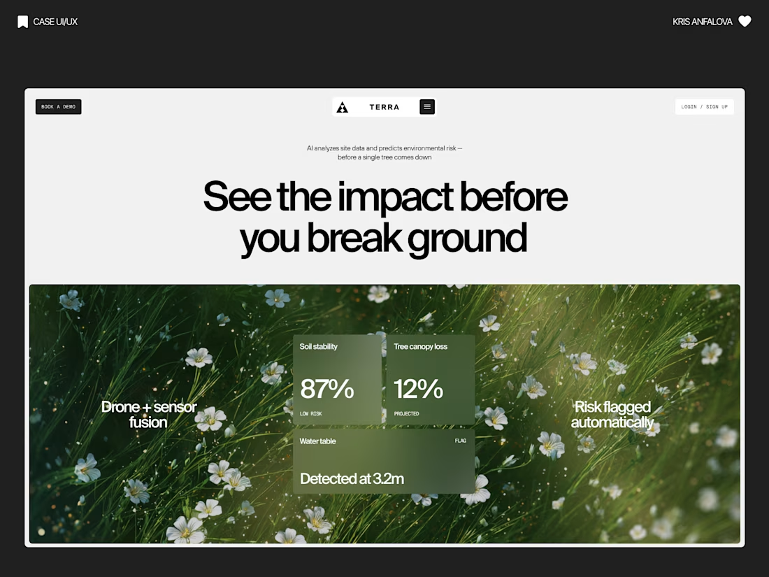
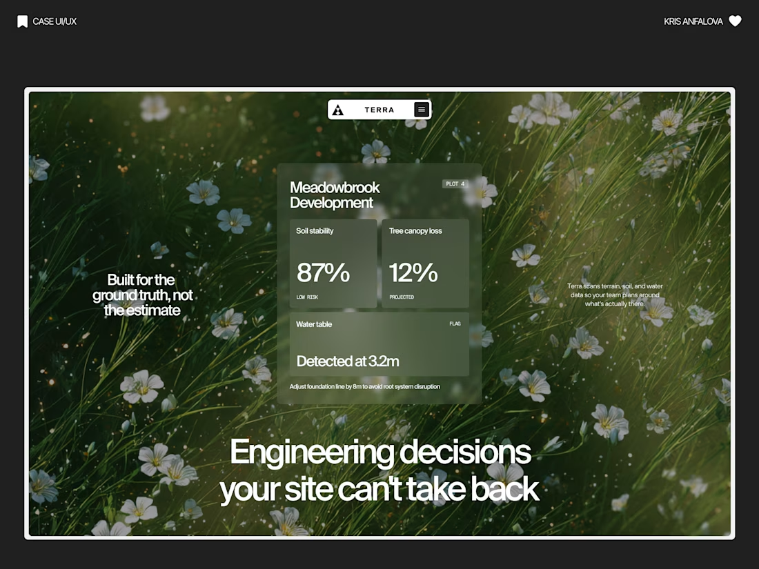
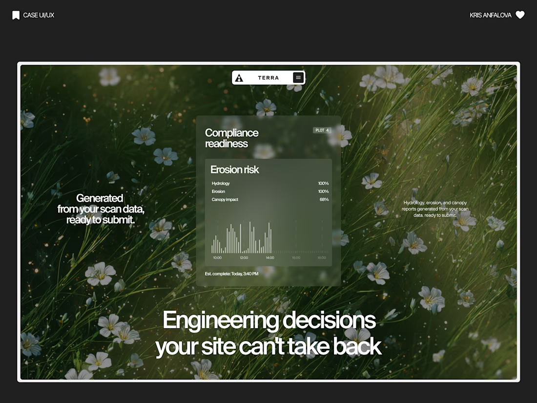
Terra — AI Environmental Risk Platform
Designed the landing page and product UI for Terra — a platform that helps land developers and engineering teams see environmental risk (soil stability, tree canopy loss, water table depth) before breaking ground.
The challenge:
Development decisions are usually based on estimates, not real ground data — and by the time issues show up, it’s often too late to reverse them. The interface needed to make complex sensor/AI data feel immediate and trustworthy, without losing emotional weight.
The solution:
Raw, organic photography (wildflowers, grass, natural terrain) paired with clean glass-panel data cards — creating a visual tension between “nature” and “precision engineering.” Bold editorial typography carries the emotional message, while translucent metric cards surface real numbers: soil stability, canopy loss %, water table depth.
A strong example of turning dense environmental data into something a non-technical stakeholder can understand in seconds.
Nice one
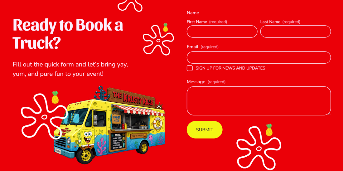
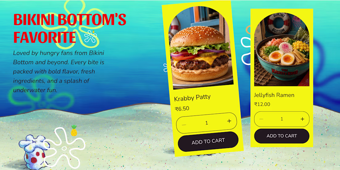
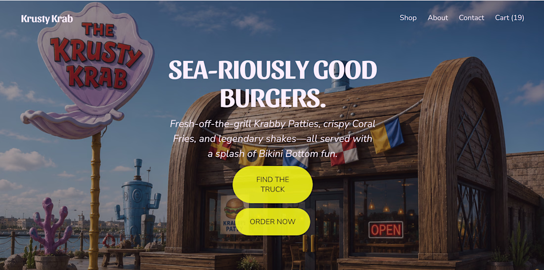
What if the Krusty Krab hit the road? 🍔🛻
I reimagined the iconic Krusty Krab as a real-world food truck and brought the idea to life with Squarespace. From playful visuals and custom illustrations to an immersive scrolling experience, every section was designed to capture the charm and nostalgia of Bikini Bottom. I also used Finish Layer to add animations, hover interactions, layered visuals, and smooth transitions that make the experience feel more dynamic and engaging.
🔗 Website: https://cardioid-helicon-94jp.squarespace.com
🔒 Password: square
squarespacedesignwebsitedesignUI DesignUX DesignSquarespaceSquarespace Website Designsquarespacechallenge
Love this!
Trending
Claude
Claude has entered the design space. How are you using Claude Design?
Contra University
Learn from expert creatives how to earn more using next-gen AI tools.
creativeaiflow
Creative AI workflows are evolving. What tools do you use, and what are their strengths and weaknesses?
freelancerlife
Freelancer life is wins, pivots, and everything in between. What’s yours right now?