The network for creativity
Join 1.25M professional creatives like you
Connect with clients, get discovered, and run your business 100% commission-free
Creatives on Contra have earned over $150M and we are just getting started
Back to feedPost

🛠️ The Process
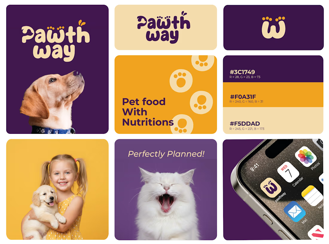
Research: Analyzing the pet food market to find a "white space" between clinical and overly-cartoonish brands.
Exploration: Iterating on the paw-print concept to ensure it remained legible even at small sizes (like an iPhone dock).
Refinement: Testing the "Pet Food With Nutritions" messaging against the bold iconography to ensure the hierarchy was clear.
The result? A brand that doesn't just look good on a shelf—it builds a community.

The network for creativity
Join 1.25M professional creatives like you
Connect with clients, get discovered, and run your business 100% commission-free
Creatives on Contra have earned over $150M and we are just getting started







Related posts


Four logo concepts, one direction: calmness, warmth, mental health and professionalism.
Which one feels most aligned with the brief to you?
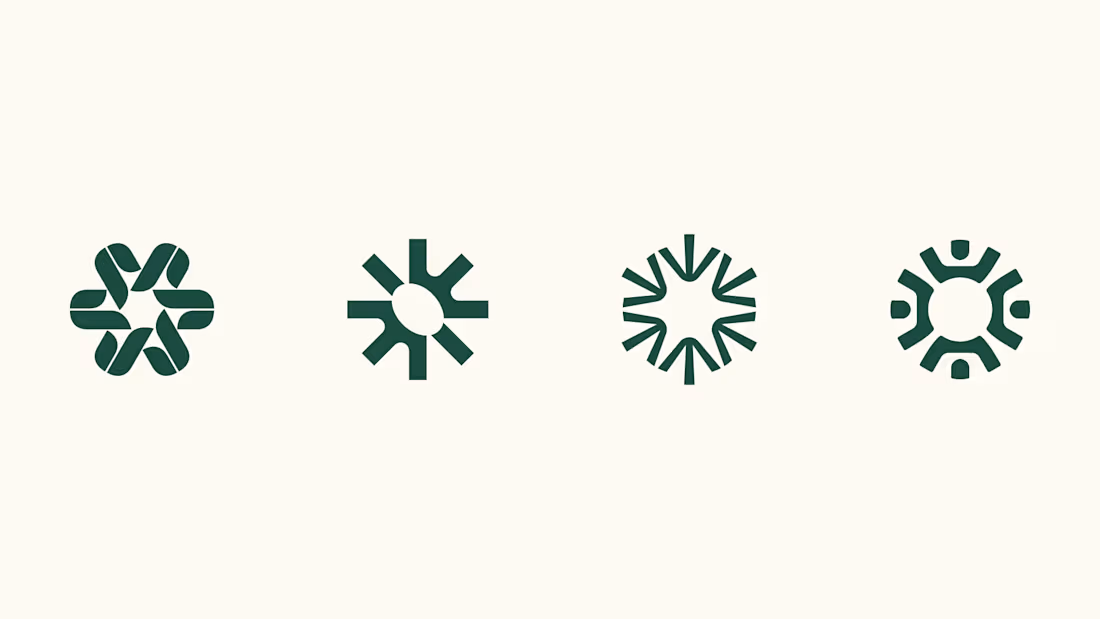

I think 3 or 4 work best. I really like the first one, but it moves away from the "calmness" concept

So, what is ROSI?
A few cans.
Five colours.
One very simple fish.
A ridiculously large wordmark.
And hopefully proof that everyday products don’t have to look everyday.


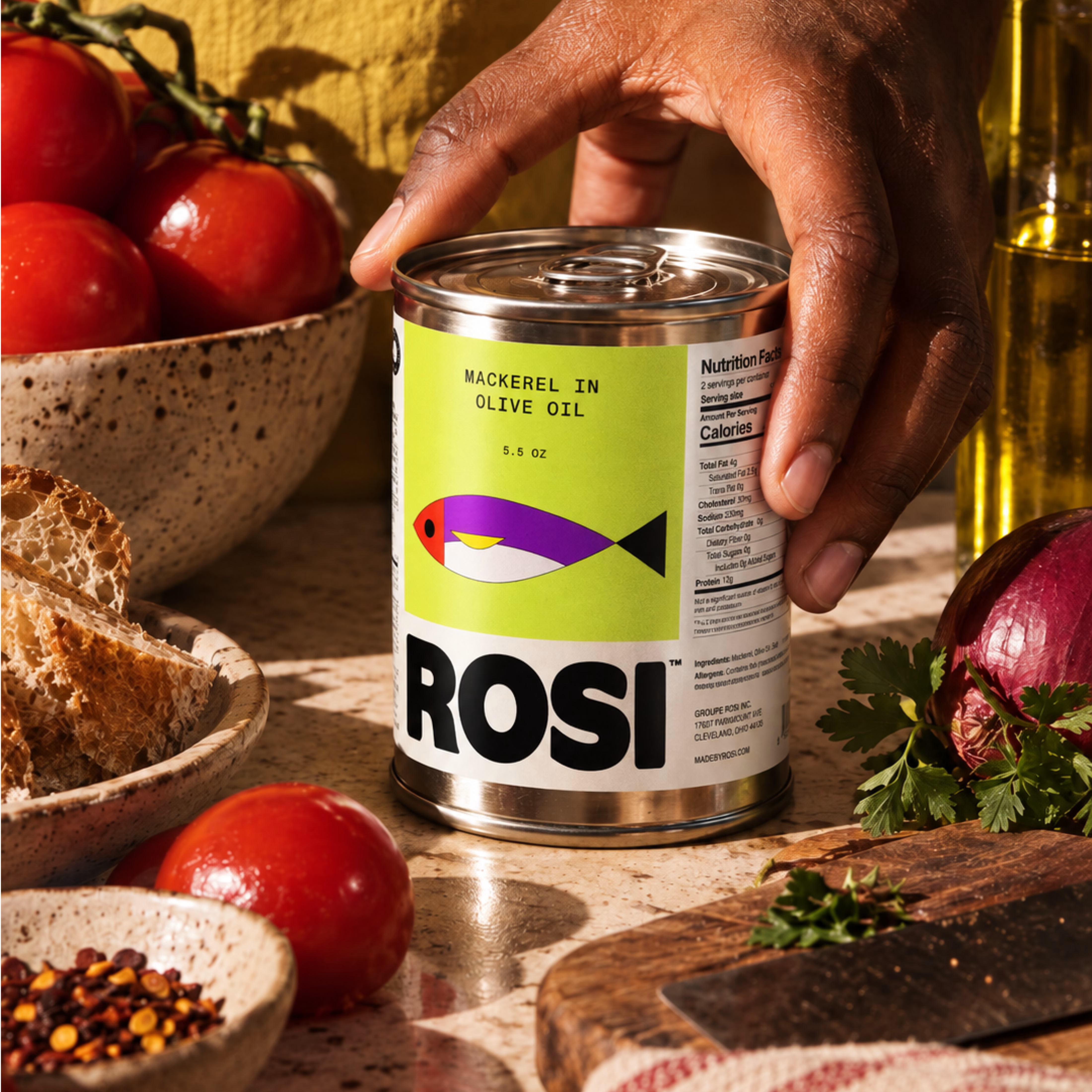
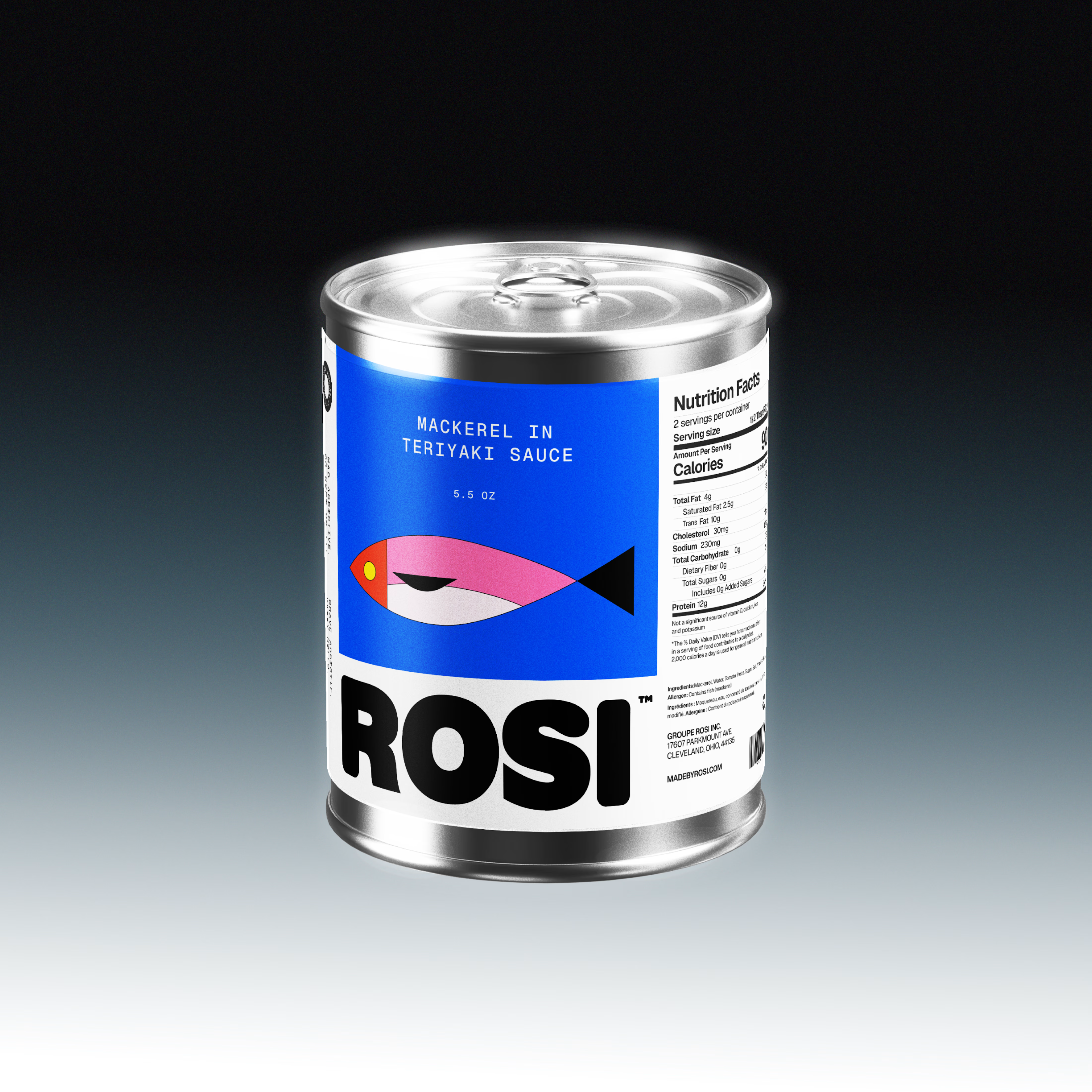
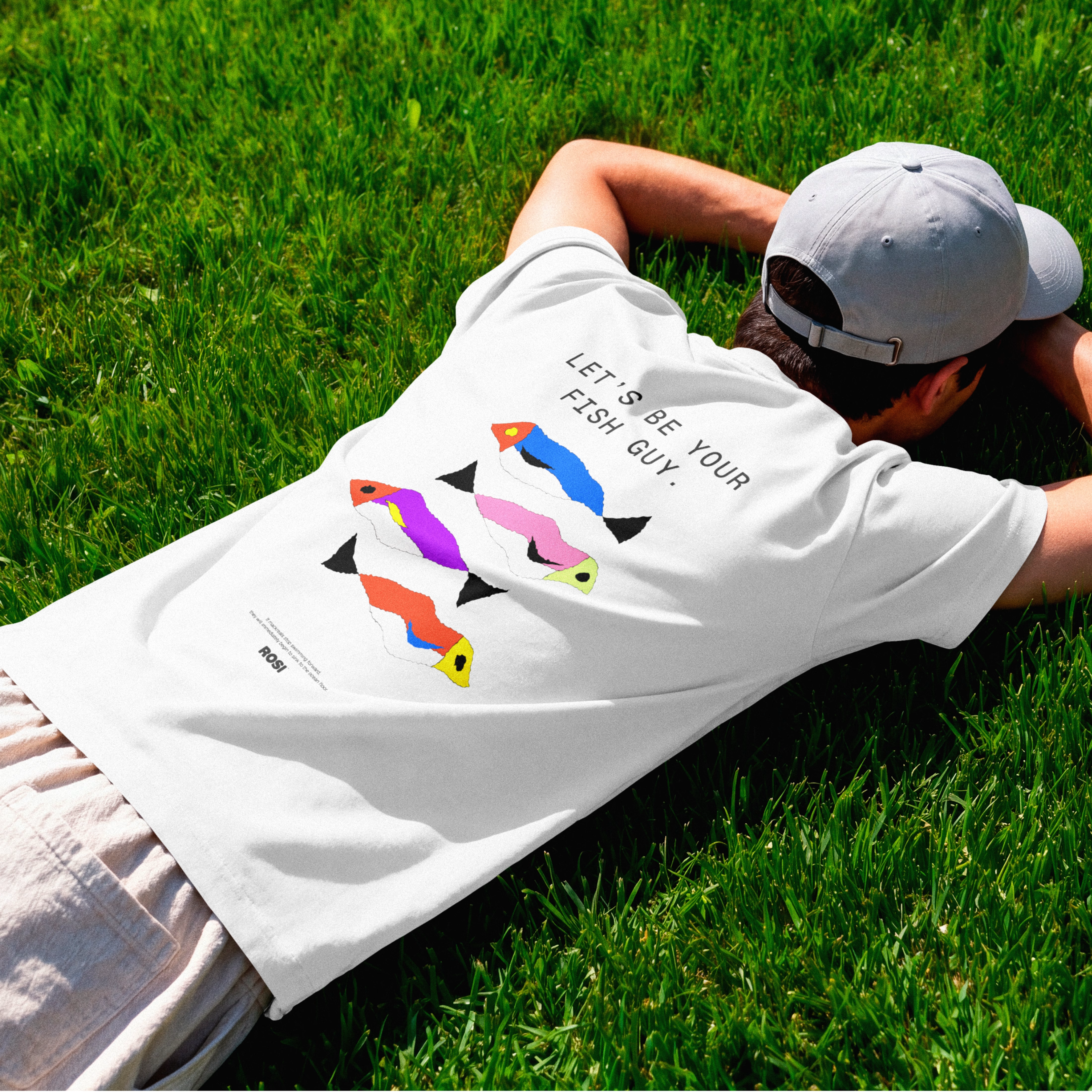

The ridiculously large wordmark is the entire personality, tinned fish has never strutted like this. Proof that confidence is a design decision, not a budget line.

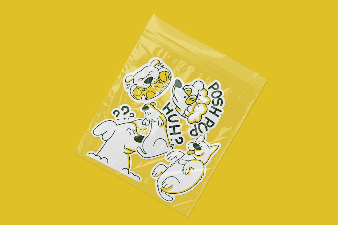
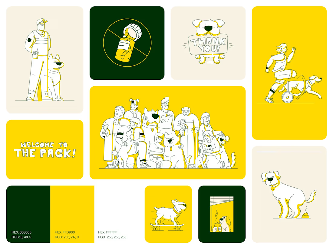
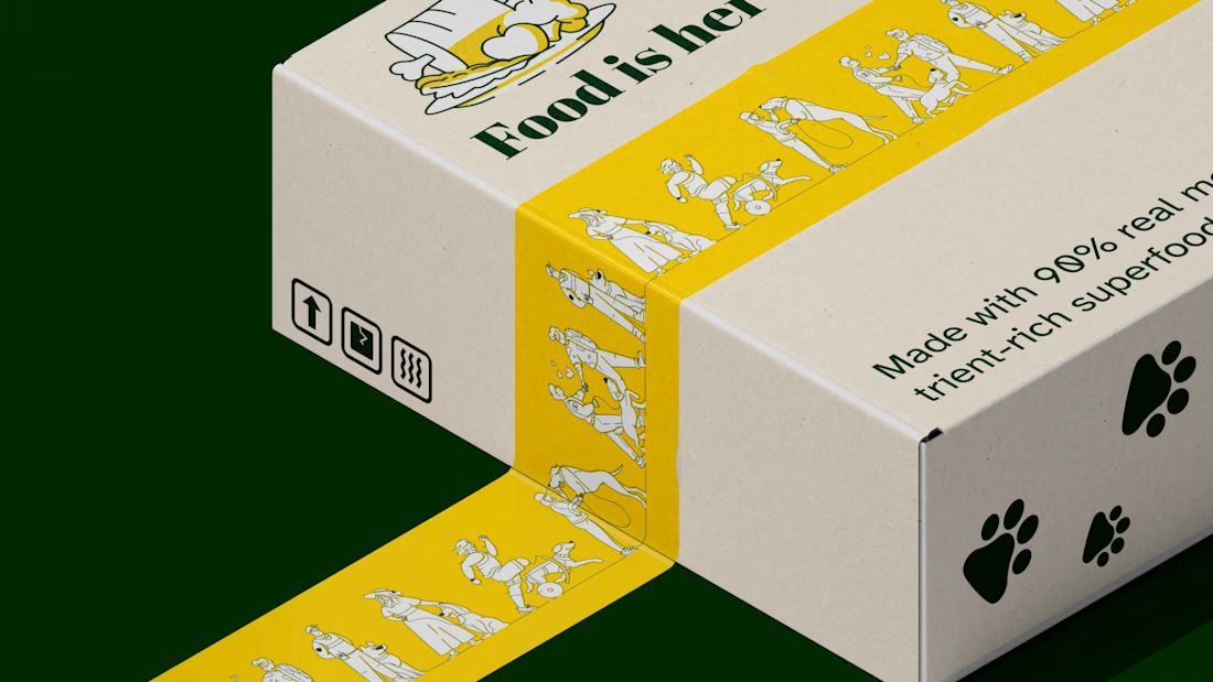
A few pieces from my illustration work for Sundays for Dogs.
I’m looking to take on more projects with pet and friendly consumer brands, developing characters and families of illustrations that feel like they belong together.
You can see more of the Sundays work in my portfolio. Have something in mind for your brand? I’d love to hear about it.

this is beautiful work, love the yellow!