
Arsal Art
Logo and brand identity designer
New to Contra
Arsal is ready for their next project!

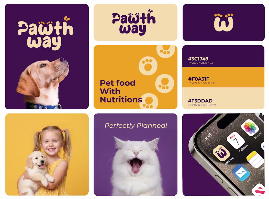
🛠️ The Process
Research: Analyzing the pet food market to find a "white space" between clinical and overly-cartoonish brands.
Exploration: Iterating on the paw-print concept to ensure it remained legible even at small sizes (like an iPhone dock).
Refinement: Testing the "Pet Food With Nutritions" messaging against the bold iconography to ensure the hierarchy was clear.
The result? A brand that doesn't just look good on a shelf—it builds a community.
0
8
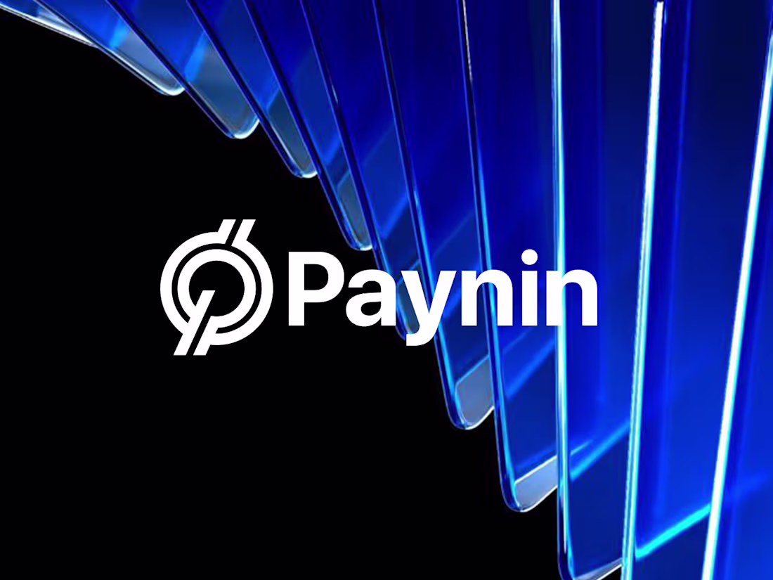
Paynin: Building a High-Tech Visual Identity for Modern Fintech
Effective design is about more than just aesthetics; as Steve Jobs famously said, "Design is how it works". For the Paynin project, I developed a visual identity designed to communicate security, speed, and innovation.
Key Deliverables
Strategic Brand Positioning: Defining the visual DNA for a tech-forward audience.
Logo Architecture: A scalable, minimalist primary mark designed for clarity.
Comprehensive Brand Guidelines: A complete system covering typography, color theory, and usage rules to maintain brand integrity.
#Branding #BrandIdentity #FintechDesign #VisualIdentity #BrandGuidelines #LogoDesign
1
35
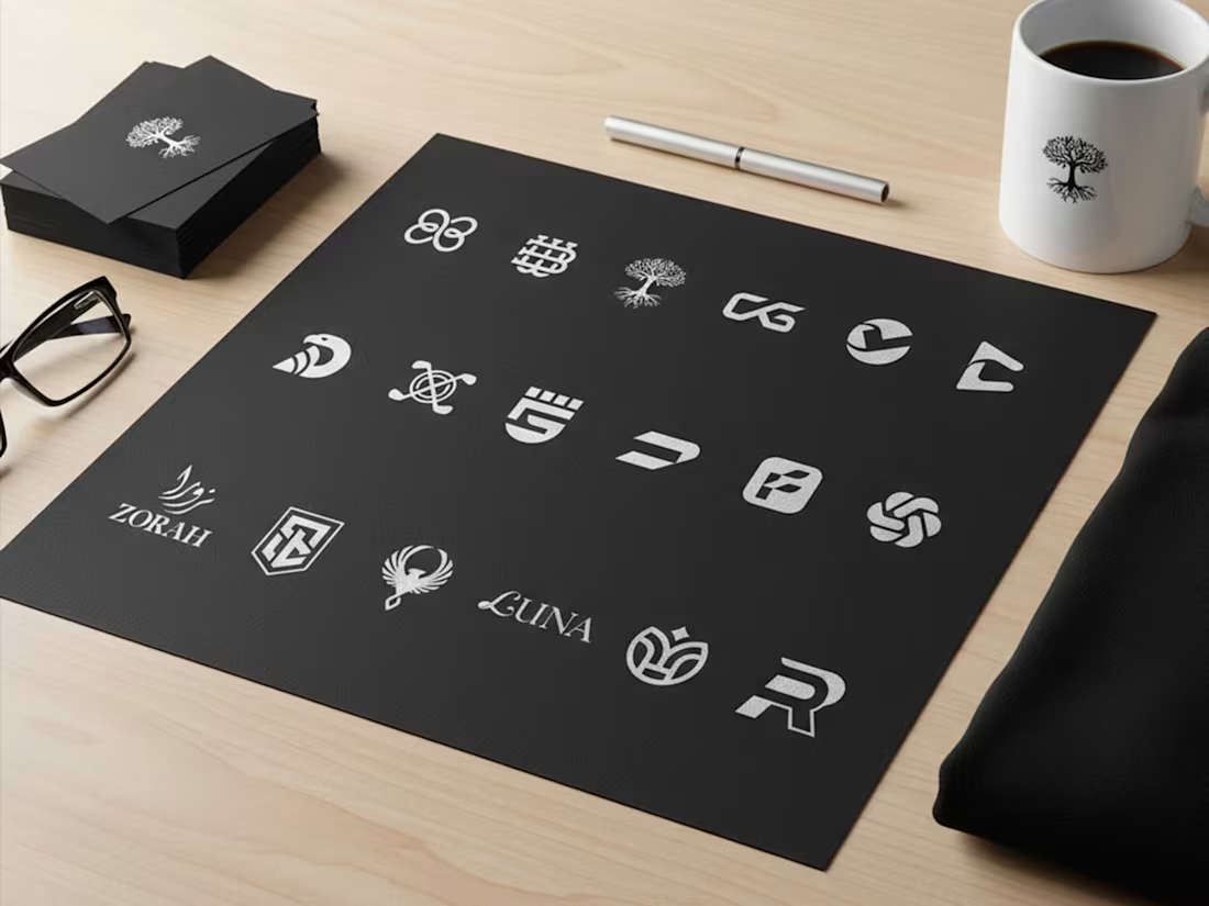
Just compile the collection i have created for different niche in 2025!
#Branding #BrandIdentity #BrandGuidelines #VisualIdentity #GraphicDesign #Branding #BrandIdentity #VisualIdentity #GraphicDesign #FreelanceDesigner #LogoDesign
1
33
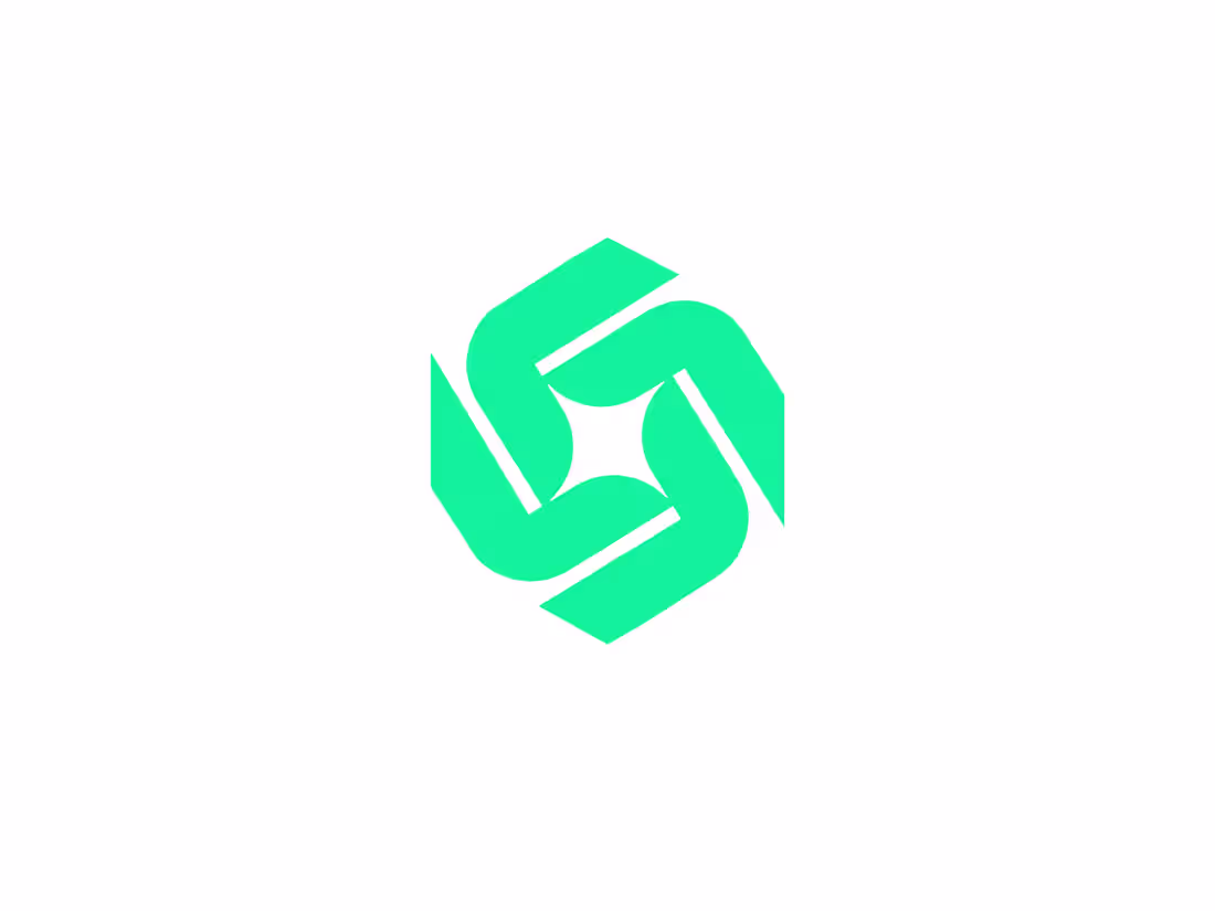
This abstract geometric symbol is designed for a tech-forward brand, a logistics powerhouse, or a collaborative platform. The interlocking teal shapes form a hexagonal vortex, representing movement, efficiency, and a connected ecosystem.
The central negative space creates a four-pointed star or spark, symbolizing the "bright idea" or the "perfect solution" that emerges when different parts of a business work in harmony.
Key Design Features:
Mathematical Precision: A perfectly balanced grid-based design that appeals to the tech and SaaS industries.
Rotational Symmetry: The logo feels balanced from every angle, suggesting stability and a 360-degree approach to service.
Refreshing Colorway: The electric mint/teal hue feels fresh, modern, and distinct from the traditional "corporate blue."
1
21
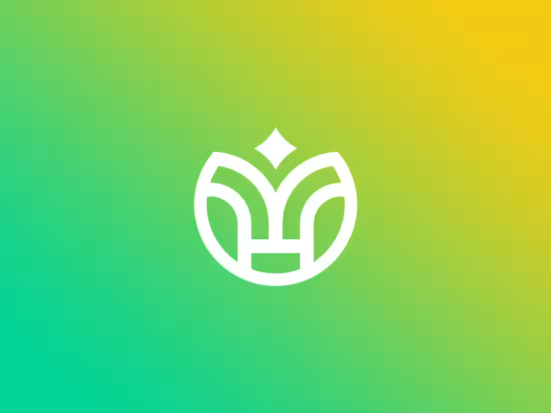
Description: Clean lines, bold shapes. 💎
I’ve been experimenting with monoline designs that feel both substantial and airy. This mark explores the symmetry of a stylized flower or sprout, grounded by a solid circular frame. Perfectly suited for an app icon or a high-end lifestyle brand.
Highlights: ✅ Minimalist construction ✅ High legibility at small scales ✅ Vibrant green-to-yellow gradient for that "fresh" energy
1
20
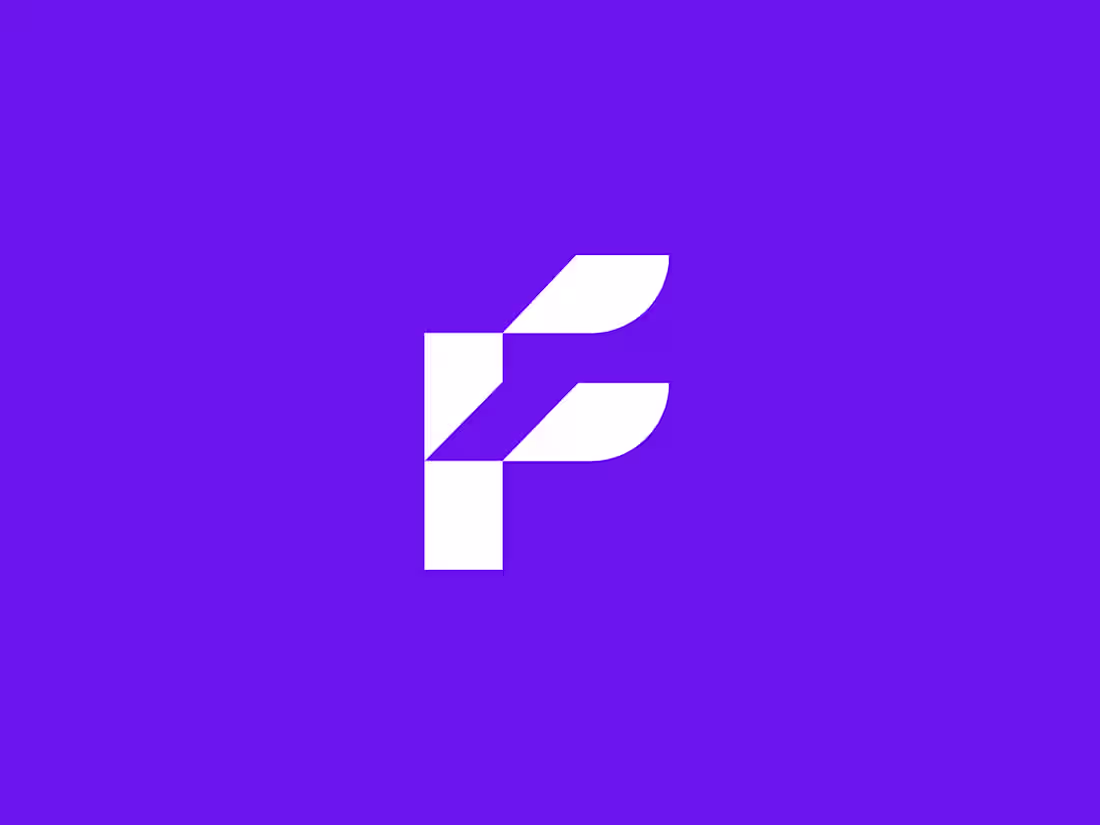
Digital Forward ⚡️
Clean. Sharp. Scalable.
This latest exploration for a fintech startup focuses on stability through structure. The vertical stack represents a solid foundation, while the feathered horizontal bars represent growth and agility.
Key Features:
✅ High legibility at small sizes
✅ Bold, high-contrast palette
✅ Geometric grid construction
1
18
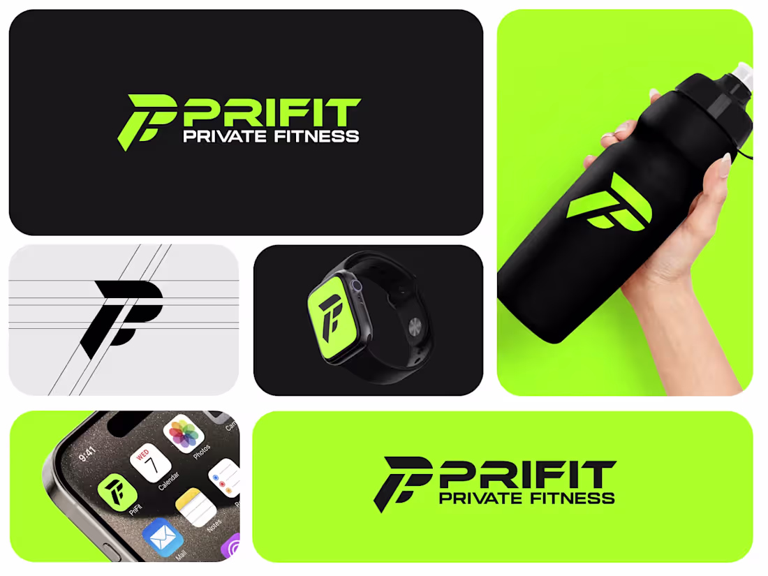
Experience a visual identity that moves as fast as you do. The PriFit Private Fitness branding suite combines a high-voltage "Electric Lime" and deep "Obsidian Black" palette to command attention and signal elite performance.
Key Highlights:
Dynamic Monogram: A sharp, geometric "PF" icon built on precision grid lines, symbolizing stability and forward momentum.
Versatile Wordmark: Bold, italicized typography that emphasizes speed and professional-grade private training.
Scalable Design: From a tiny smartwatch face to large-scale gym signage, the logo maintains perfect legibility and impact.
#Branding #BrandIdentity #VisualIdentity #GraphicDesign #FreelanceDesigner #LogoDesign #TechBranding #LifestyleBranding #MinimalistDesign #CorporateIdentity
1
20
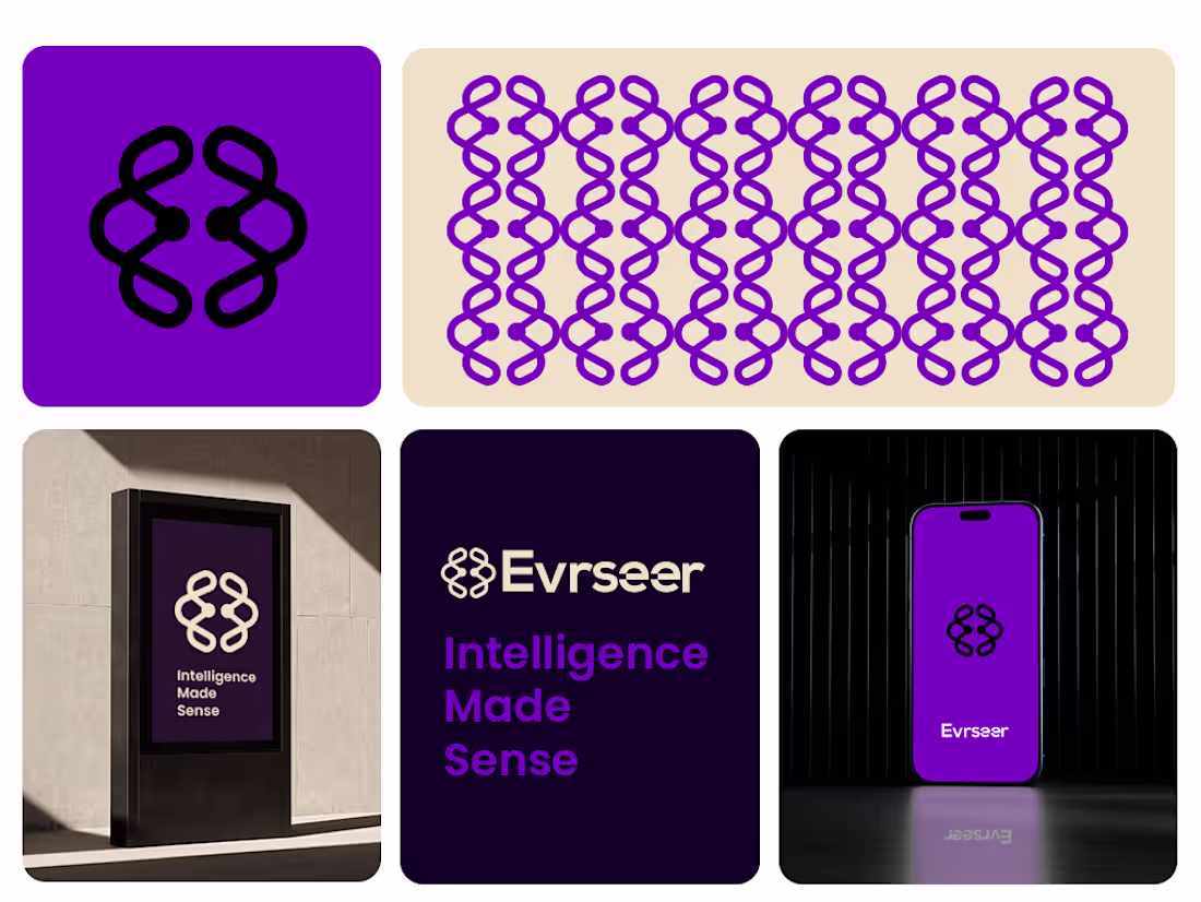
Visual Identity Breakdown
The Symbol: The logo mark is a stylized, symmetrical brain-like icon constructed from interlocking loops. It resembles neural pathways or a DNA double helix, cleverly blending the concepts of biological intelligence and algorithmic connectivity.
Typography: The wordmark "Evrseer" uses a clean, geometric sans-serif typeface. The lowercase "r" and "s" provide a friendly, accessible feel,
Color Palette: The primary color is a vibrant electric purple, which sits between the stability of blue and the energy of red. In the tech space, this color often symbolizes innovation, mystery, and premium quality. It is contrasted with deep obsidian and clean off-white for high visual impact.
#Branding #BrandIdentity #VisualIdentity #GraphicDesign #FreelanceDesigner #LogoDesign
1
21
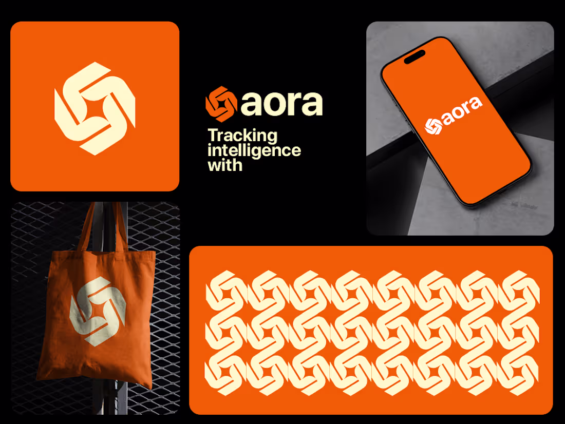
This branding for Aora showcases a modern, tech-forward identity designed to simplify tracking through the power of artificial intelligence. The visual system balances high-energy aesthetics with a sense of interconnected precision.
Brand Identity Breakdown
The Symbol: The logo features a dynamic, interlocking geometric mark that suggests connectivity,
Color Palette: A vibrant, high-visibility safety orange serves as the primary brand color. This choice conveys energy, alertness, and innovation, while the cream-colored accents provide a sophisticated contrast that improves legibility across digital and physical touchpoints.
#Branding #BrandIdentity #VisualIdentity #GraphicDesign #FreelanceDesigner #LogoDesign
2
1
23
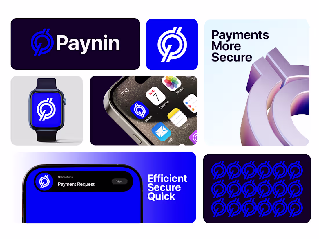
In the crypto industry, security is the top priority. The "Paynin" branding uses a bold, stable typeface and a structured geometric logo to communicate institutional-grade security. The blue-and-white palette is specifically chosen to evoke feelings of professionalism and reliability, which are essential for attracting users to a new financial ecosystem.
- Native Digital Optimization
This branding was designed with a mobile-first approach. The logo remains highly legible even at small scales, such as:
- App icons on smartphone home screens.
- Compact UI elements in digital wallets.
- Favicons and notification badges.
0
23