
Arsal Art
Logo and brand identity designer


🛠️ The Process
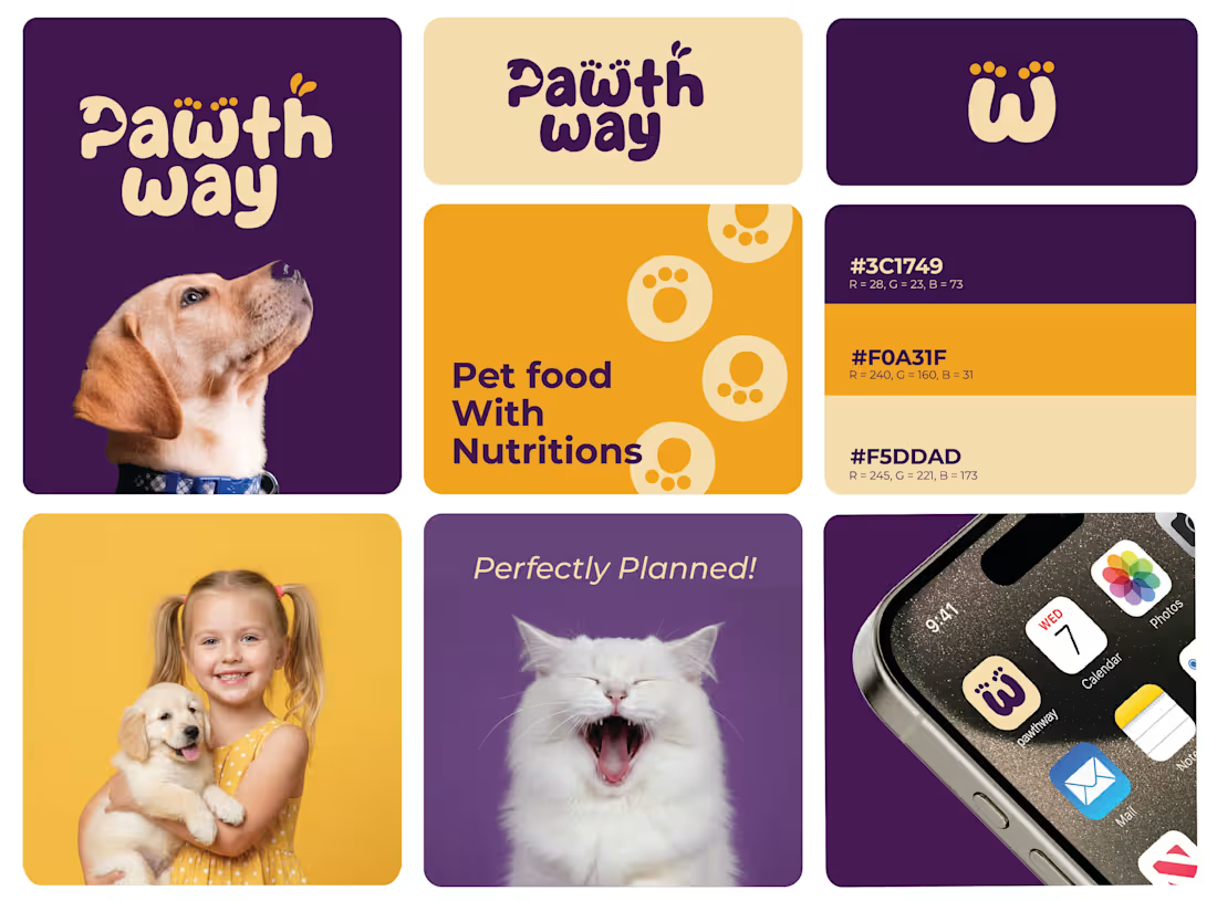
Research: Analyzing the pet food market to find a "white space" between clinical and overly-cartoonish brands.
Exploration: Iterating on the paw-print concept to ensure it remained legible even at small sizes (like an iPhone dock).
Refinement: Testing the "Pet Food With Nutritions" messaging against the bold iconography to ensure the hierarchy was clear.
The result? A brand that doesn't just look good on a shelf—it builds a community.
0
17
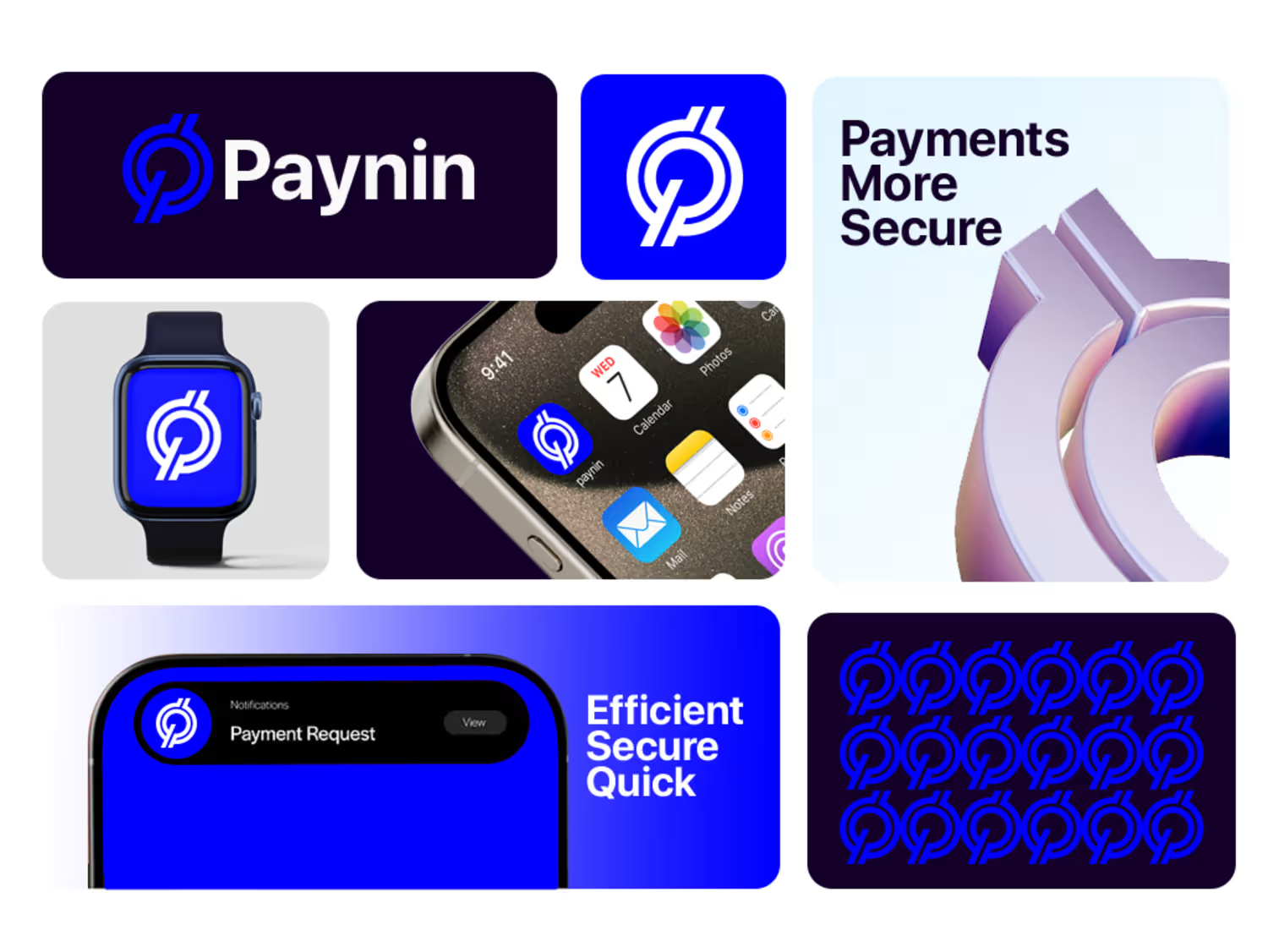
Paynin: Building a High-Tech Visual Identity for Modern Fintech
Effective design is about more than just aesthetics; as Steve Jobs famously said, "Design is how it works". For the Paynin project, I developed a visual identity designed to communicate security, speed, and innovation.
Key Deliverables
Strategic Brand Positioning: Defining the visual DNA for a tech-forward audience.
Logo Architecture: A scalable, minimalist primary mark designed for clarity.
Comprehensive Brand Guidelines: A complete system covering typography, color theory, and usage rules to maintain brand integrity.
#Branding #BrandIdentity #FintechDesign #VisualIdentity #BrandGuidelines #LogoDesign
1
50
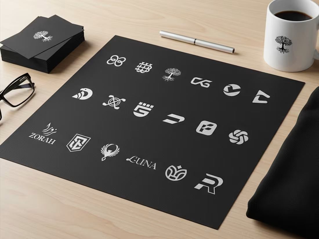
Just compile the collection i have created for different niche in 2025!
#Branding #BrandIdentity #BrandGuidelines #VisualIdentity #GraphicDesign #Branding #BrandIdentity #VisualIdentity #GraphicDesign #FreelanceDesigner #LogoDesign
1
45

This abstract geometric symbol is designed for a tech-forward brand, a logistics powerhouse, or a collaborative platform. The interlocking teal shapes form a hexagonal vortex, representing movement, efficiency, and a connected ecosystem.
The central negative space creates a four-pointed star or spark, symbolizing the "bright idea" or the "perfect solution" that emerges when different parts of a business work in harmony.
Key Design Features:
Mathematical Precision: A perfectly balanced grid-based design that appeals to the tech and SaaS industries.
Rotational Symmetry: The logo feels balanced from every angle, suggesting stability and a 360-degree approach to service.
Refreshing Colorway: The electric mint/teal hue feels fresh, modern, and distinct from the traditional "corporate blue."
1
29