The network for creativity
Join 1.25M professional creatives like you
Connect with clients, get discovered, and run your business 100% commission-free
Creatives on Contra have earned over $150M and we are just getting started
Back to feedPost
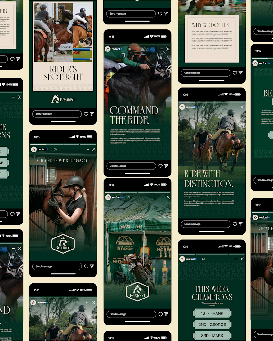
Rexford is now live on Behance.
…
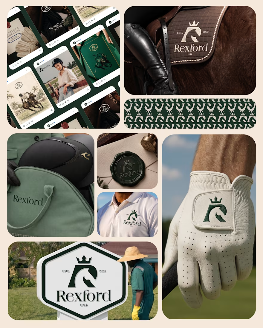
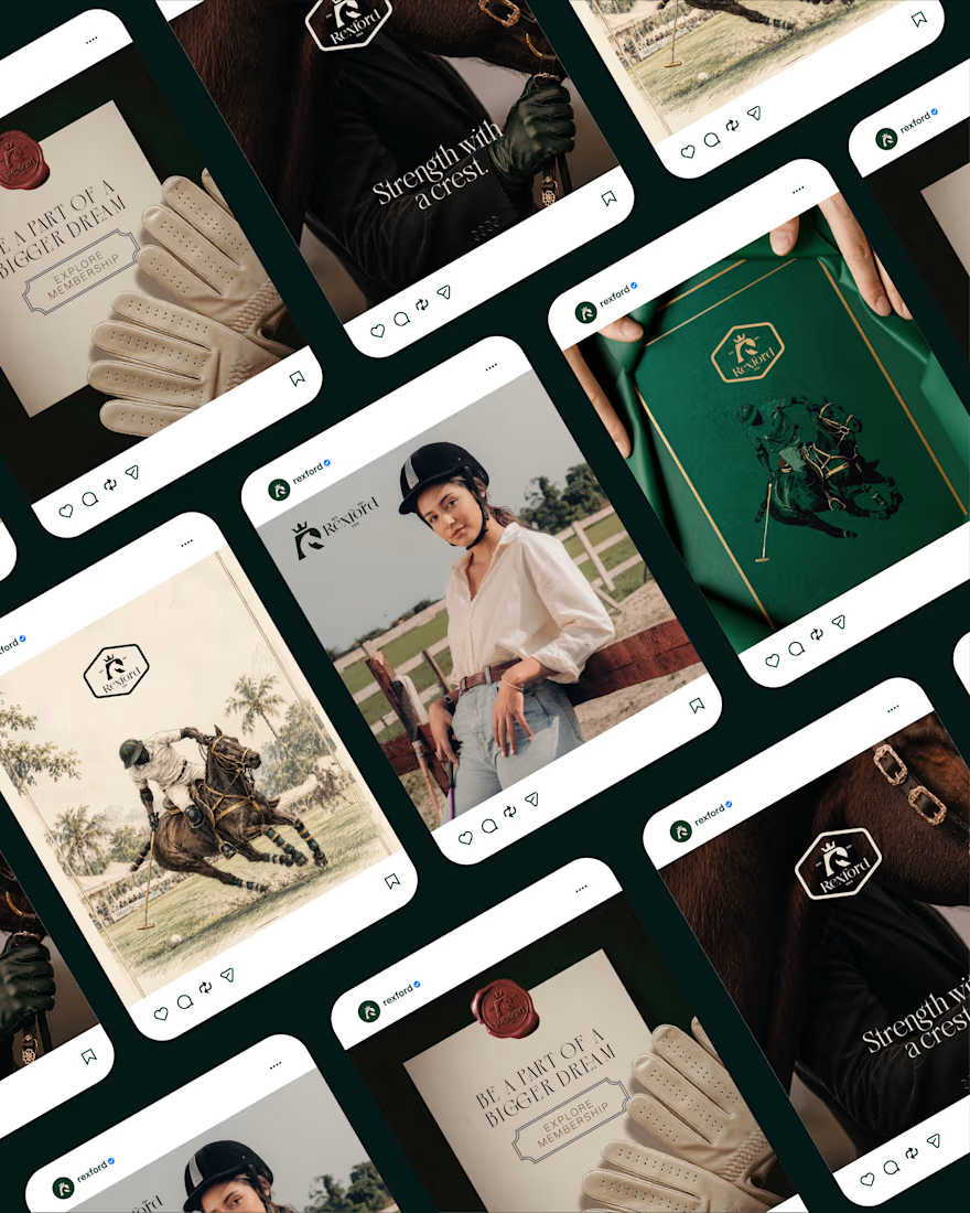
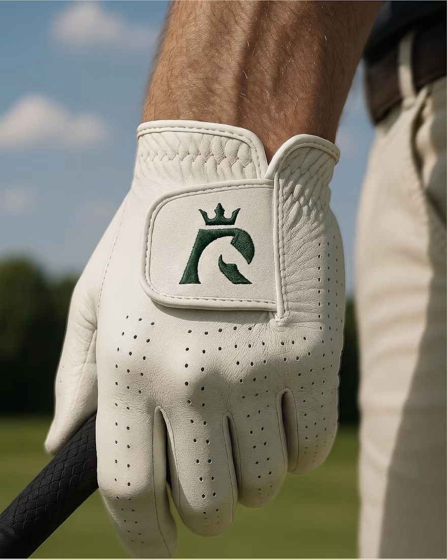
An equestrian brand deserves an identity that carries the same strength, discipline and distinction as the world it represents
The full case study is now available, showcasing the thinking,
process, and execution behind the project.
Behance: https://www.behance.net/gallery/258697619/An-Equestrian-Brand-Identity-REXFORD
.
.
.
I’m open to new projects, collaborations, and working with brands.
Always happy to connect.
#Rexford #BrandIdentity #LogoDesign #EquestrianBrand #BrandDesigner #VisualIdentity #Branding #CorporateIdentity #MinimalDesign

Very nice 👍🏻

Thank You!
The network for creativity
Join 1.25M professional creatives like you
Connect with clients, get discovered, and run your business 100% commission-free
Creatives on Contra have earned over $150M and we are just getting started


Related posts

My latest branding project for the Atlanta Museum of Paleontology.
Check out the full project at maximjungle.com


A T-rex drawn in one thin outline is such a good mark 🦖 I'd happily visit that museum.


How far can you take a logo beyond the first draft?
I started with Recraft's Logo Maker and a fictional idea: Bibu's Paws, a cosy little dog rescue and adoption shelter.
I wanted the identity to feel warm, homely and full of character, so I explored a few logo directions before settling on the little dog tucked inside a house.
From there, I took the idea further, building out the visual identity with an earthy colour palette, typography, illustrations and a few real-world applications: the shelter space, dog merchandise and an adoption welcome kit.
I enjoyed seeing how a small starting point could grow into a brand with its own personality and world.
Now I'm curious: if you were building a brand around this logo, what would you create next?






It turned out so cozy, you did great

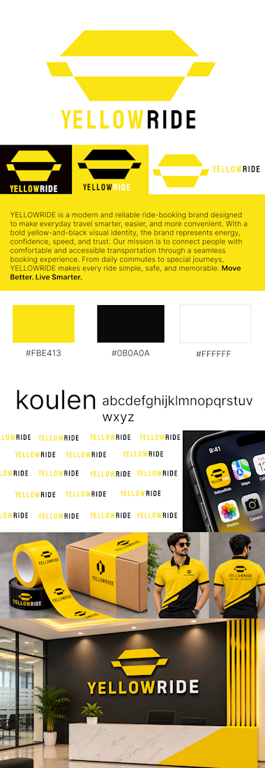
YELLOWRIDE – Complete Brand Identity Design
Moving Better. Living Smarter.
YELLOWRIDE is a modern ride-booking brand built around the idea of making everyday transportation smarter, simpler, and more convenient.
For this project, I developed a complete brand identity that reflects speed, reliability, confidence, and accessibility. The visual direction combines bold yellow (#FBE413), deep black (#0B0A0A), and clean white (#FFFFFF) to create a distinctive and memorable brand presence.
The identity includes a custom logo design, typography system, color palette, logo variations, brand patterns, mobile app icon, packaging design, staff uniforms, and office branding.
Every element was designed to maintain visual consistency across digital and physical touchpoints while building a strong and recognizable brand experience.
The goal: Create a bold, trustworthy, and memorable identity that makes every journey feel effortless.
Brand Tagline: Move Better. Live Smarter.