
Olatunde Sunday
Brand Identity Designer for Startups & Growing Businesses
New to Contra
Olatunde is building their profile!
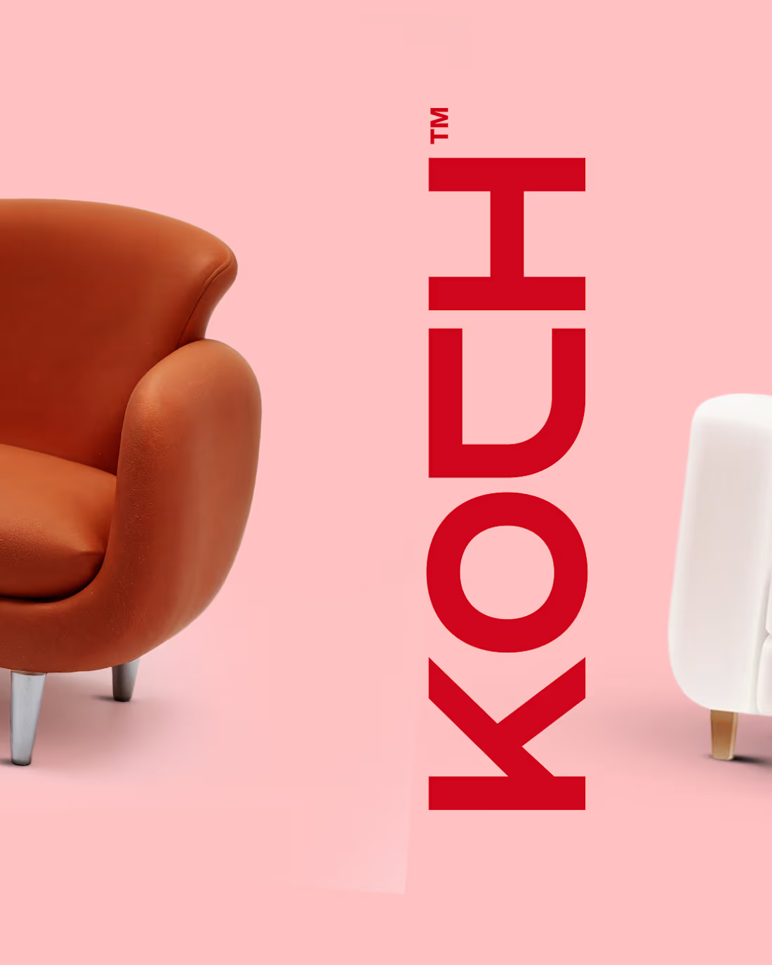
One of what i do at leisure is exploring design tools, on this i wanted to try creating longer board in photoshop. I used it to present this visual design i created for a furniture brand; Koch. It actually came out as expected... Just hope the arrangement wouldn't flop here
0
11
Visual Identity Design for a Streetwear brand, orla wear. We wanted something unusual while infusing the brand initial "O". Eventually we arrived at this up. Simple and Extraordinary.😍 🎉
Just something for attention without a single word.
0
20
Presenting Primovate: A Digital Growth Accelerator. Our approach moves businesses forward through decisive strategy and momentum. At the heart of our ethos lies a distinctive icon-style logo, an emblem of direction and drive. Lines converge to craft our logo, a duo of chevrons angled forward. This pairing mirrors our core values - momentum, precision, and forward-thinking execution. Through angles, we weave a narrative of movement that never stalls. Printing breathes life into our creativity. The chevrons transform into beacons of progress.
Branded elements emerge - stationery, digital assets, presentations, signage - each a canvas of clarity, alluring in carnival glass, black, and white hues. Visual harmony reigns supreme. A color palette that marries energy and precision. Carnival glass, symbolizing growth and forward motion; black, the essence of authority; white, the purity of clarity. And our signature typography - clean, geometric, unwavering - a testament to our commitment to progress.
In this digital realm, Primovate thrives. A logo that signals direction, branding that moves with intent, and colors that command attention. Step into a brand built to move first.
0
29
Vestra is a residential construction firm outside Amsterdam with nine years of solid, disciplined work. But almost no visibility. Good execution wasn't the problem. Perception was.
Challenge
Every tender Vestra submitted looked like every other contractor's tender. A generic logo, a template deck, a PDF that got skimmed once and set aside. Developers weren't comparing build quality, they were comparing brand presence, and Vestra had none. The firm was losing bids to companies with weaker portfolios simply because they looked more established.
Process
The starting point was the company name itself. We built the mark as an extension of the initial "V" shaped and angled to read as architectural form rather than typography. Every fold in the mark had to hold up as a structural line, not just a stylistic one.
Solution
A complete identity system built around a single mark: the "V" rendered as an architectural silhouette, sharp angles, clean intersections, a shape that reads as building as much as it reads as letter. Paired with a bold, structural wordmark, the identity carries across every surface; site signage, tender covers, stationery, with the same disciplined geometry.
0
37