The network for creativity
Join 1.25M professional creatives like you
Connect with clients, get discovered, and run your business 100% commission-free
Creatives on Contra have earned over $150M and we are just getting started
Back to feedPost

YELLOWRIDE – Complete Brand Identity Design
Moving Better. Living Smarter.
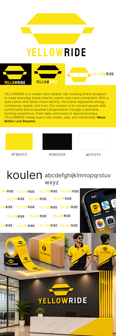
YELLOWRIDE is a modern ride-booking brand built around the idea of making everyday transportation smarter, simpler, and more convenient.
For this project, I developed a complete brand identity that reflects speed, reliability, confidence, and accessibility. The visual direction combines bold yellow (#FBE413), deep black (#0B0A0A), and clean white (#FFFFFF) to create a distinctive and memorable brand presence.
The identity includes a custom logo design, typography system, color palette, logo variations, brand patterns, mobile app icon, packaging design, staff uniforms, and office branding.
Every element was designed to maintain visual consistency across digital and physical touchpoints while building a strong and recognizable brand experience.
The goal: Create a bold, trustworthy, and memorable identity that makes every journey feel effortless.
Brand Tagline: Move Better. Live Smarter.



that yellow is LOUD in the best way. perfect for spotting a ride from across the street
The network for creativity
Join 1.25M professional creatives like you
Connect with clients, get discovered, and run your business 100% commission-free
Creatives on Contra have earned over $150M and we are just getting started





Related posts

A brand built on the daily walk.
For Patta, a Brazilian pet-lifestyle brand, the wordmark leans like a pair walking side by side, and dog-tag shapes frame everything from packaging to Barkz, its collectible charms.
Pet brands: cute, or bold enough to wear?


I like it!🔥 Best one since morning.


Has AI taken my job yet? 👀
As a designer, I feel like I constantly need to keep up with new tools and products, if only to keep my "has a computer replaced me already?" anxiety under control
At first, we expected AI to do everything with one click
Then we moved on to writing ridiculously long and detailed prompts
And now I feel like we're finally getting to a healthier place with our expectations: build a good system → get good results
I went to play with Recraft's new Logo Maker to see if AI can actually make decent logos now
Weeeeell, you can see the result for yourself! 🤩
Sure, it's not a magic button that reads your mind and does everything for you. But if you have a clear sense of your brand's style and personality, the results can be surprisingly good
Left - my usual aesthetic. Right - Recraft's take on me
So, what do you think of my one-click logo?
Does it feel like me? 🪩✨


“Build a good system, get good results” is exactly where I’ve landed too. The tool only goes as far as your sense of what you’re after. How many tries did it take to get there?

Real Estate Website
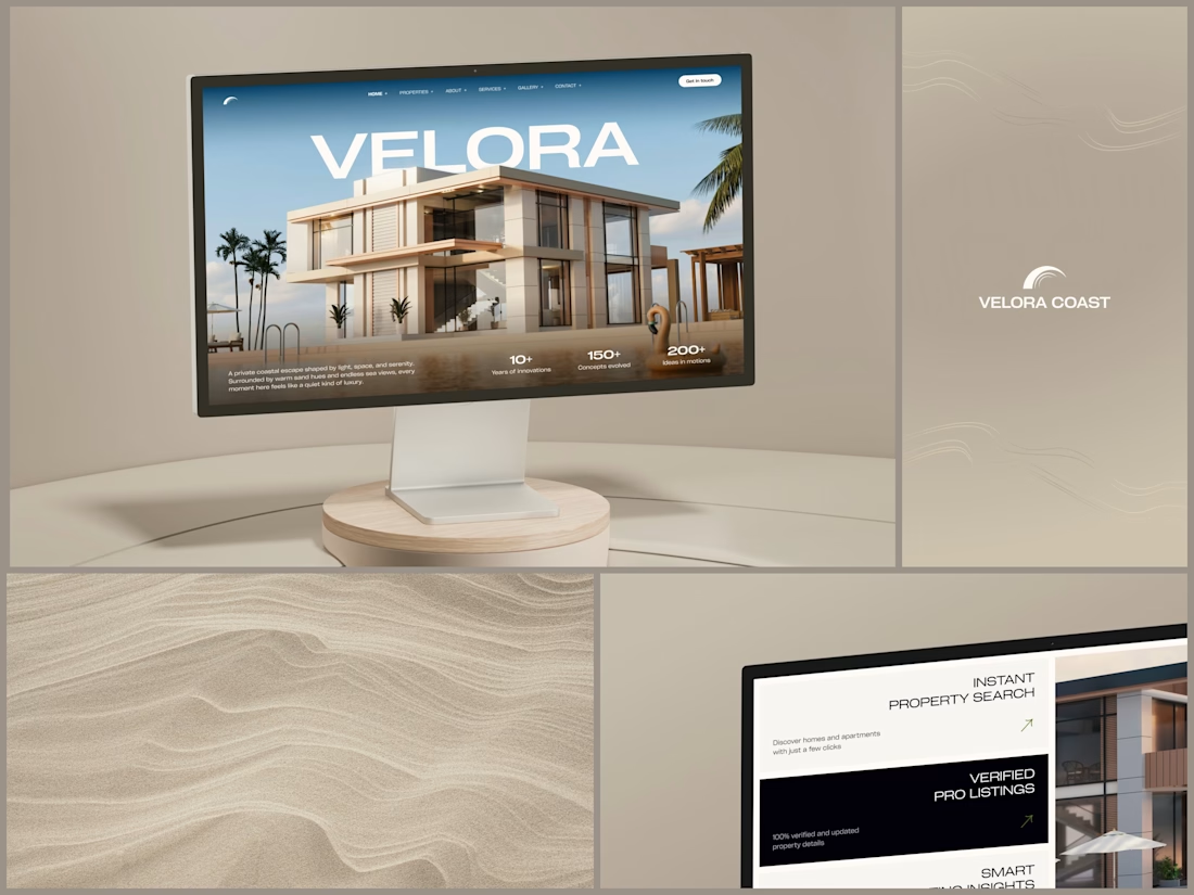
The villa stands in front of the name, on purpose.
The hero is one wide image of a modern villa under a blue sky, with palms at the sides and a pool in front. The name runs across the sky in wide white capitals, and the roof covers the bottom of the middle letters. It still reads at a glance, and the house keeps the foreground.
Lower on the page, the feature cards alternate cream and black, so it is clear where one card ends and the next begins. Each heading repeats the wide capitals of the name, aligned right, with a short line of copy and a small green arrow.
Designed by the Hue & Machine team.
#RealEstate #Architecture #RealEstateWebsite #WebDesign #LandingPage #HeroSection #Typography #UIDesign #DesktopDesign #FigmaDesign


This looks so premium! Love the concept of the villa standing in front of the name on purpose, it makes the hero feel so bold and confident. The wide image, the blue sky, palms and pool, everything feels luxurious but still clean. And the way VELORA runs across the sky in big...