The network for creativity
Join 1.25M professional creatives like you
Connect with clients, get discovered, and run your business 100% commission-free
Creatives on Contra have earned over $150M and we are just getting started
Back to feedPost


Another concept project wrapped.
I took an existing AI app builder direction and reimagined the entire visual identity around Launchly, an AI-powered platform that turns ideas into working apps.
The fun part wasn't just swapping the logo and colors. I wanted the new identity to actually feel native to the product, from the UI prompts and AI interactions to the little details throughout the motion system.
Clean visuals, restrained typography, a little bit of 3D, and enough motion to make the product feel alive without getting in its way.
This is the kind of work I enjoy most: taking an idea, finding the visual language for it, and then making that language move.
Built in After Effects.
What do you think of the direction?
#MotionDesign #BrandDesign #VisualDesign #AI #SaaS #AfterEffects #MotionGraphics


The network for creativity
Join 1.25M professional creatives like you
Connect with clients, get discovered, and run your business 100% commission-free
Creatives on Contra have earned over $150M and we are just getting started





Related posts

$10K earned on Contra. 🎉💸
Grateful for every client who took a chance on me. This is just the beginning. More great products, more real partnerships, more milestones to hit. 🙌
Thank you to everyone who's been part of it. Onward. 🚀
#10k #contraearnings #Freelance #Webflow #Framer #Webdesign


Congratulations nice job 🎉🎉


Hero exploration for an AI Startup - Orbio.
- Editorial serif caps
- Marble statue as the hero
- A live 01 grid reacting to mouse
- Different highlight color for each division


a different highlight colour per division is such a clean system move. the live 01 grid reacting to the mouse is a nice touch too

Done with the branding work for Yuzu! 🙌
This was so much more fun than I ever expected, I'm definitely going to be doing more beverage brands in the future.🙌


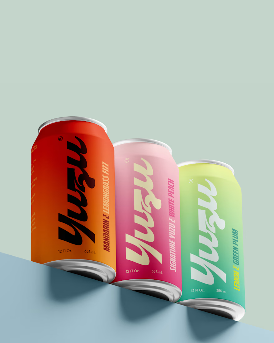
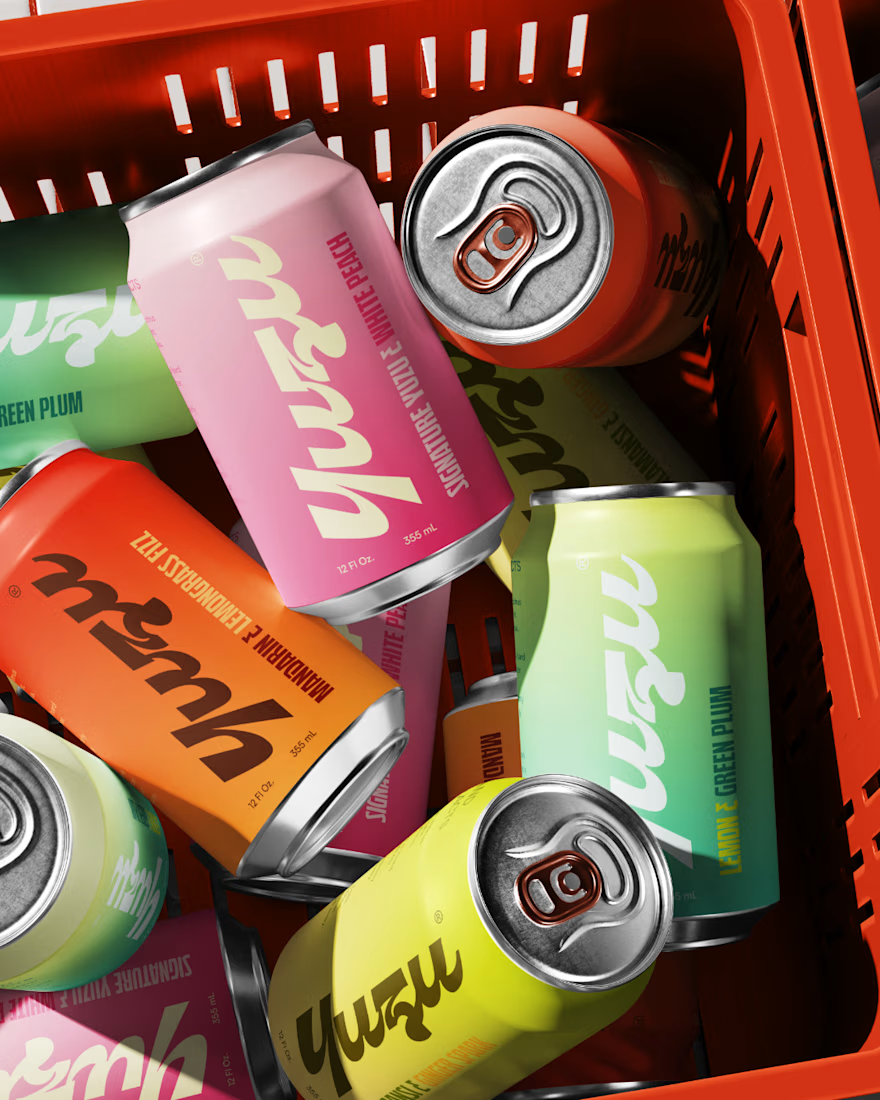
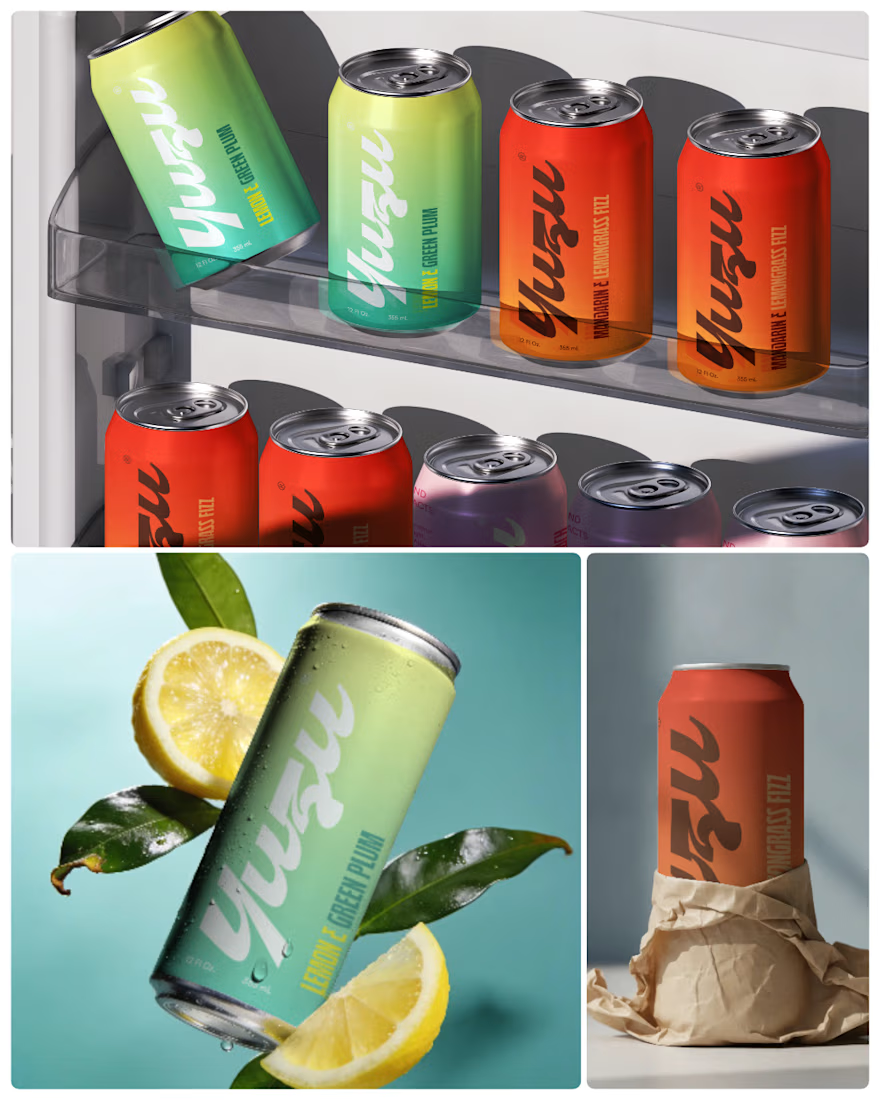

Amazing work! Love your design style, very creative and clean 👌