The network for creativity
Join 1.25M professional creatives like you
Connect with clients, get discovered, and run your business 100% commission-free
Creatives on Contra have earned over $150M and we are just getting started
Back to feedPost
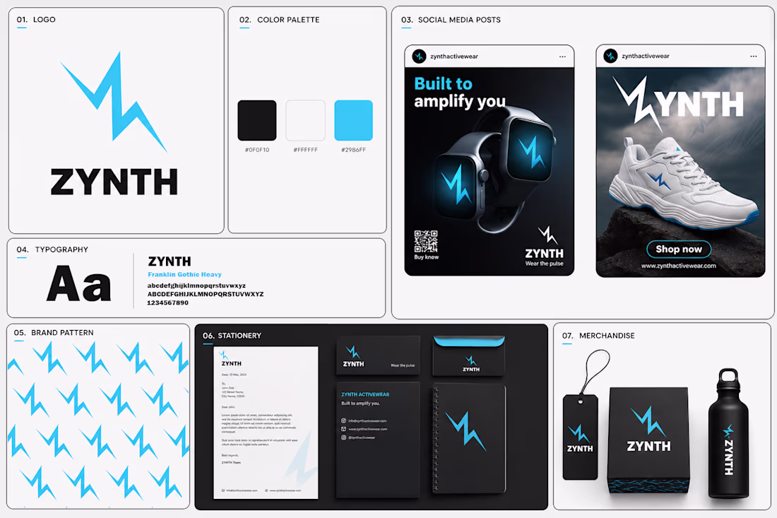
⚡ ZYNTH — Brand Identity Design
Some brands sell products. ZYNTH was designed to sell a feeling — energy in motion.
The idea behind this identity was to create a brand that feels fast, powerful, and future-ready. Since ZYNTH sits between sports and smart technology, I wanted the visual system to communicate both performance and innovation at the same time.
My thought process:
Instead of creating a generic sports logo, I explored movement, electricity, and pulse-like energy. The lightning-inspired "Z" became the core symbol — representing speed, power, and constant momentum.
The visual direction uses bold typography, high-contrast colors, and a dynamic system that can live across products, social media, mobile experiences, and brand applications.
The goal wasn't just to design a logo.
It was to build a brand that feels like movement before you even read the name.
Built to Amplify You. ⚡
#BrandIdentity #LogoDesign #SportsBranding #VisualIdentity #DesignProcess
Nice design
The network for creativity
Join 1.25M professional creatives like you
Connect with clients, get discovered, and run your business 100% commission-free
Creatives on Contra have earned over $150M and we are just getting started
Related posts
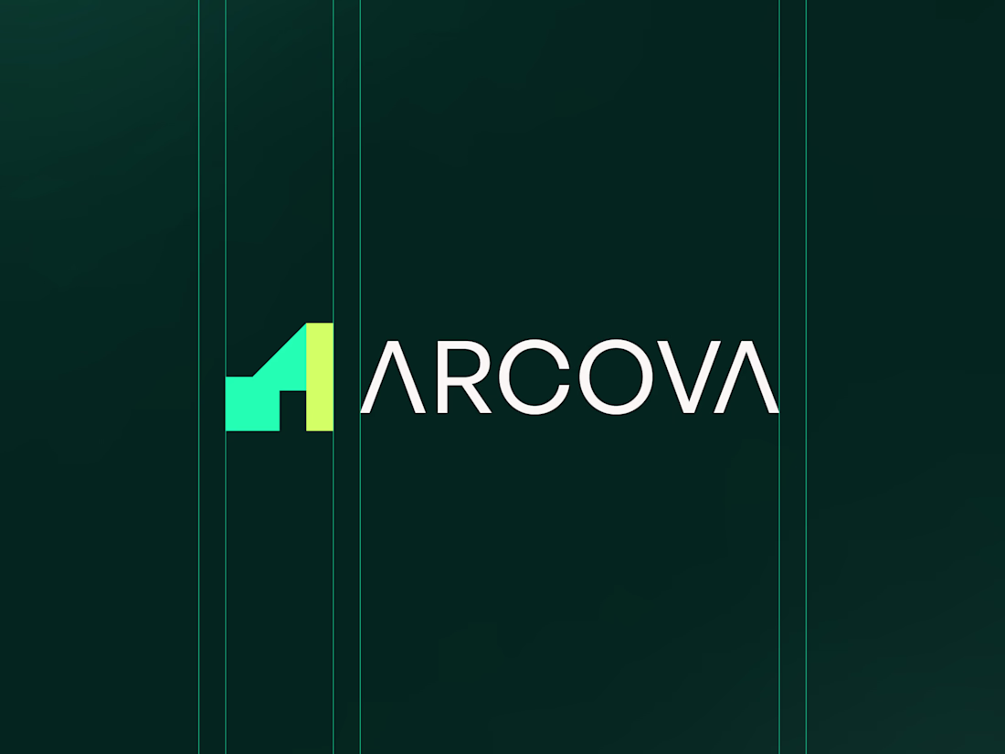
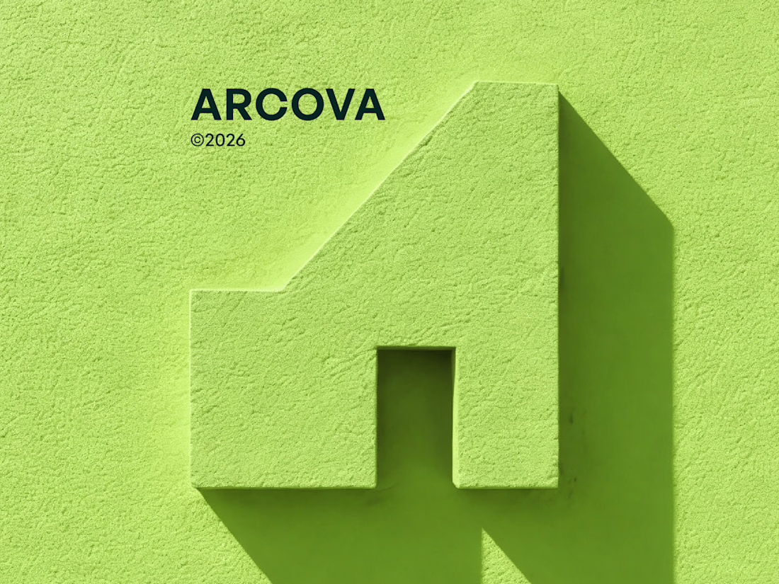
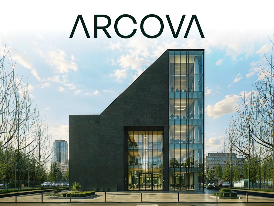
A complete brand identity for a real estate development company that needed to feel as permanent as the structures they build.
Arcova is a real estate development and construction company operating at the intersection of architecture, investment, and community building. They came to us at a pivotal moment, growing fast, winning larger contracts, and walking into rooms where their brand needed to do as much work as their portfolio.
The brief was clear: build an identity that communicates authority, permanence, and ambition. One that works on a business card and a building facade. One that looks like it was built, not assembled.
The result is a full brand identity system, logomark, color system, brand voice, and a complete set of applications that positions Arcova as a company you trust before they say a word.
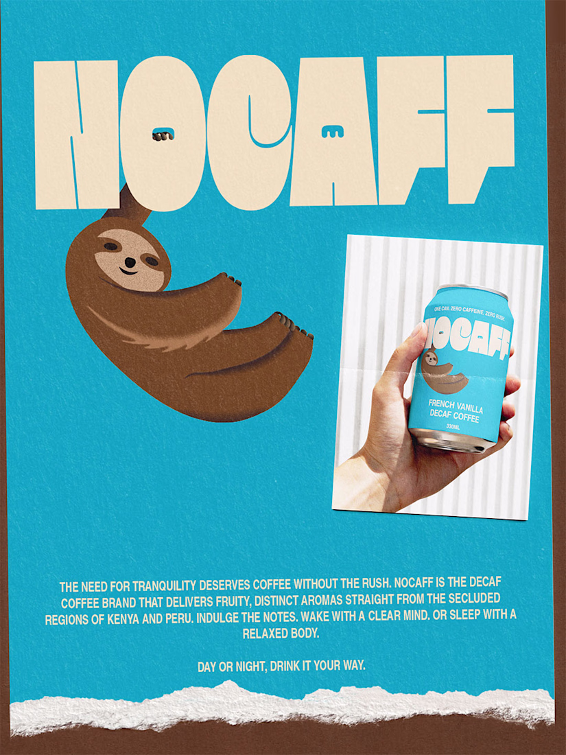
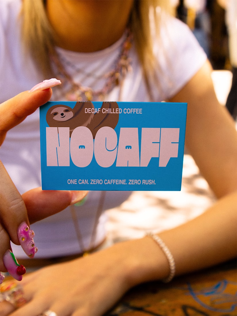
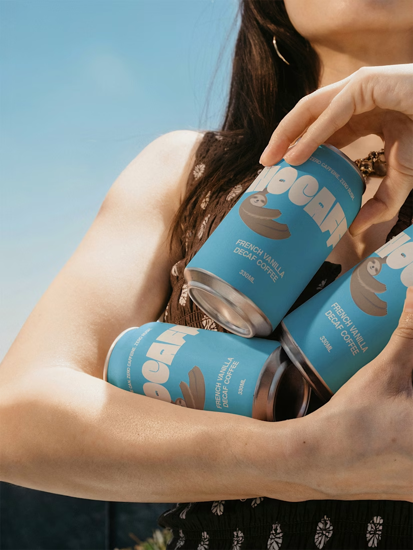
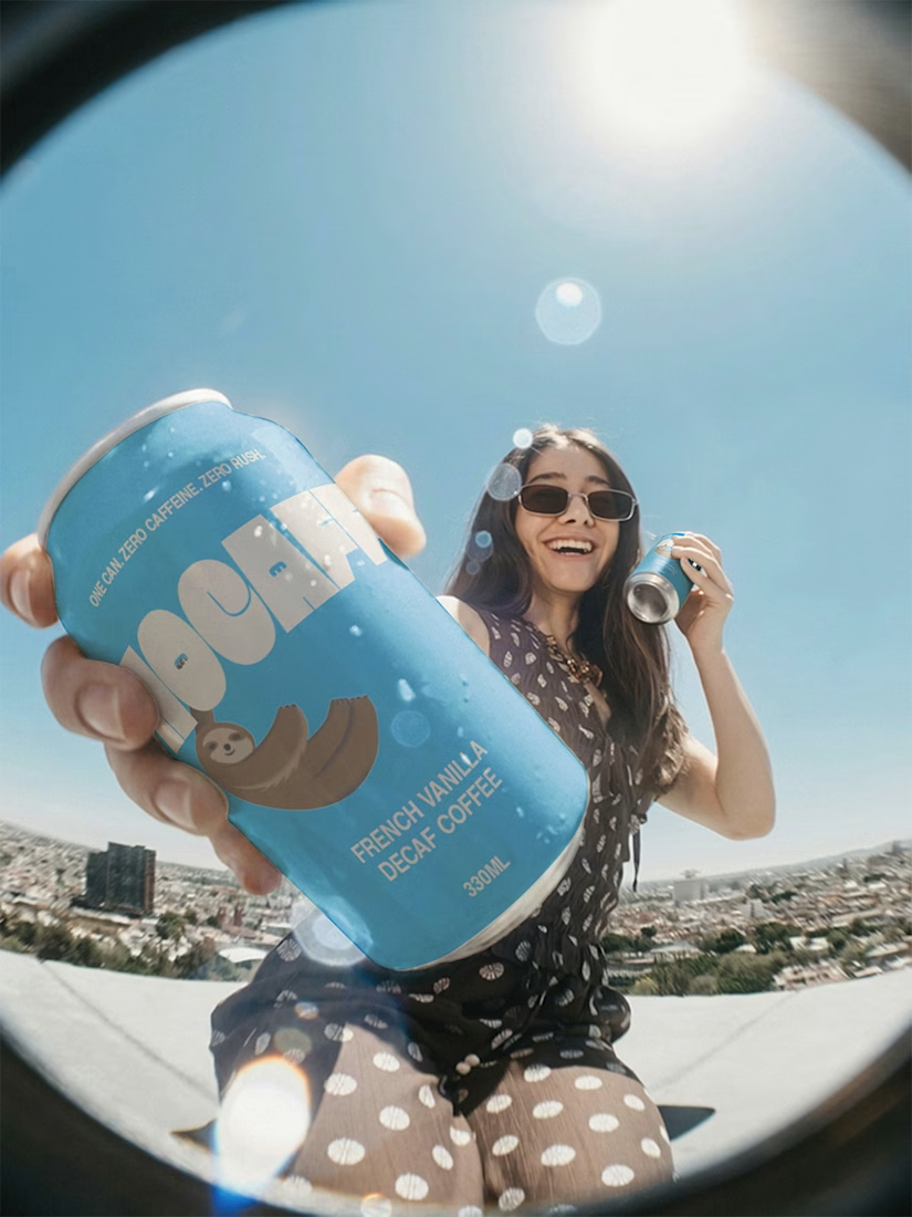
Not every coffee moment needs a rush.
Nocaff is my recent brand identity concept, created for people who want the ritual, flavour, and comfort of coffee without the caffeine kick.
Built around a French Vanilla profile and an identity rooted in ease, the brand was designed to feel calm, modern, and distinct on shelf. From the wordmark to the sloth illustration, every detail was made to turn decaf into something memorable, not ordinary.
It was a chance to explore how quiet can still stand out.
View the full project on Behance:
IllustrationBrand StrategyProduct DesignPacdoraAdobe PhotoshopAdobe Illustratorbrandingcoffeepackaging
Amazing work!
Stunning!
Trending
Claude
Claude has entered the design space. How are you using Claude Design?
Contra University
Learn from expert creatives how to earn more using next-gen AI tools.
creativeaiflow
Creative AI workflows are evolving. What tools do you use, and what are their strengths and weaknesses?
portfolioreview
The best portfolios tell a story, not just show a grid. Share yours for feedback.
freelancerlife
Freelancer life is wins, pivots, and everything in between. What’s yours right now?