The network for creativity
Join 1.25M professional creatives like you
Connect with clients, get discovered, and run your business 100% commission-free
Creatives on Contra have earned over $150M and we are just getting started
Back to feedPost
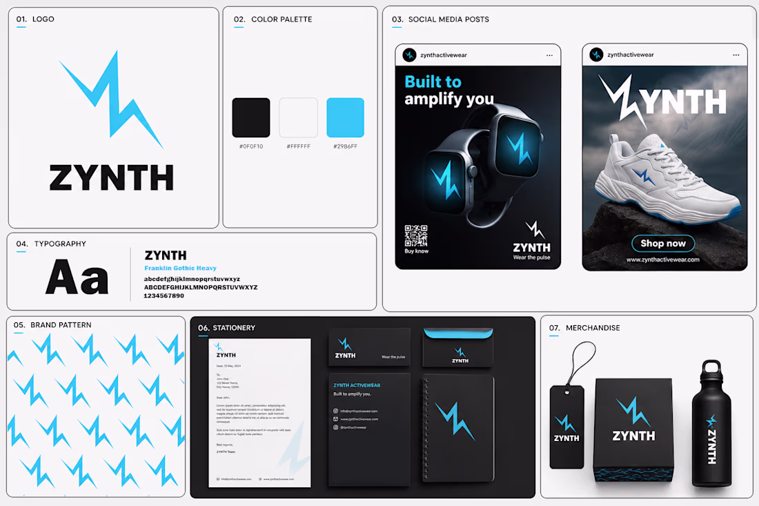
⚡ ZYNTH — Brand Identity Design
Some brands sell products. ZYNTH was designed to sell a feeling — energy in motion.
The idea behind this identity was to create a brand that feels fast, powerful, and future-ready. Since ZYNTH sits between sports and smart technology, I wanted the visual system to communicate both performance and innovation at the same time.
My thought process:
Instead of creating a generic sports logo, I explored movement, electricity, and pulse-like energy. The lightning-inspired "Z" became the core symbol — representing speed, power, and constant momentum.
The visual direction uses bold typography, high-contrast colors, and a dynamic system that can live across products, social media, mobile experiences, and brand applications.
The goal wasn't just to design a logo.
It was to build a brand that feels like movement before you even read the name.
Built to Amplify You. ⚡
#BrandIdentity #LogoDesign #SportsBranding #VisualIdentity #DesignProcess
The network for creativity
Join 1.25M professional creatives like you
Connect with clients, get discovered, and run your business 100% commission-free
Creatives on Contra have earned over $150M and we are just getting started
Related posts
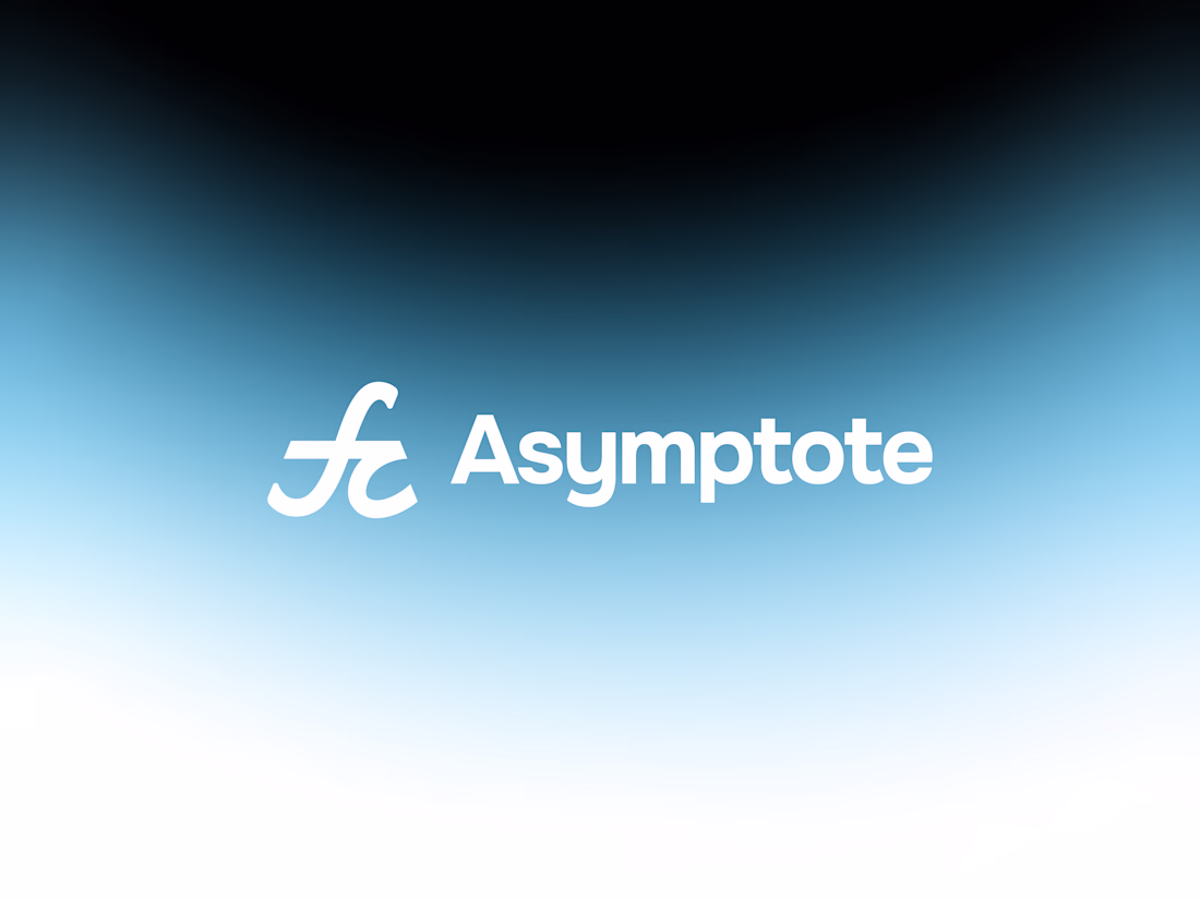
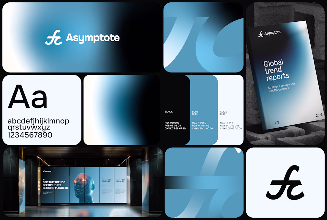
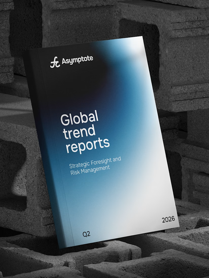
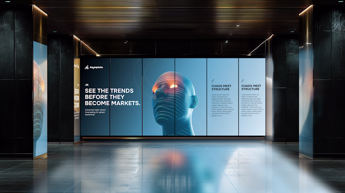
Originally conceived for a completely different space, this identity found its true calling and repurposed for Asymptote a conceptual quantitative speculation firm and strategic think-tank.
Built around the mathematical interplay of the integral symbol (∫) and π, the system bridges the fluid tracking of volatile macro trends with the unyielding, foundational parameters of quantitative science.
A masterclass in transforming abstract mathematical logic into a premium, structure-led visual identity system.
How mindful gradients are they! 👌👀
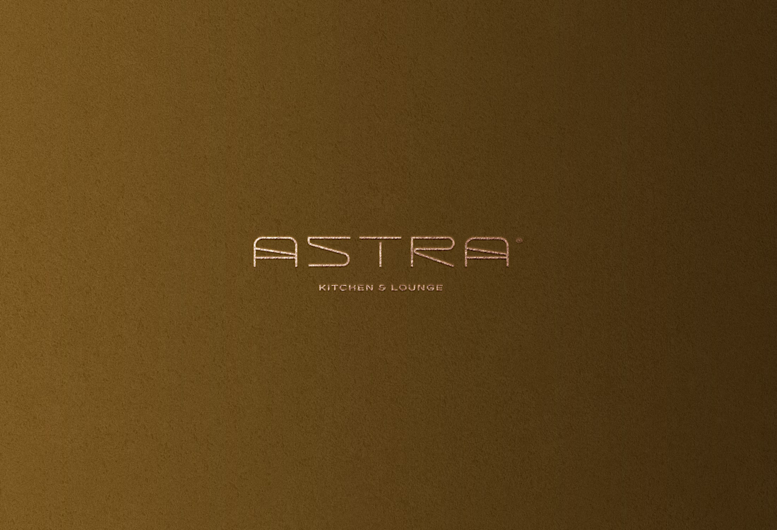
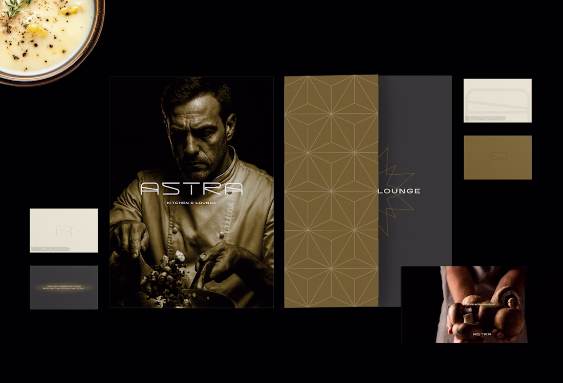
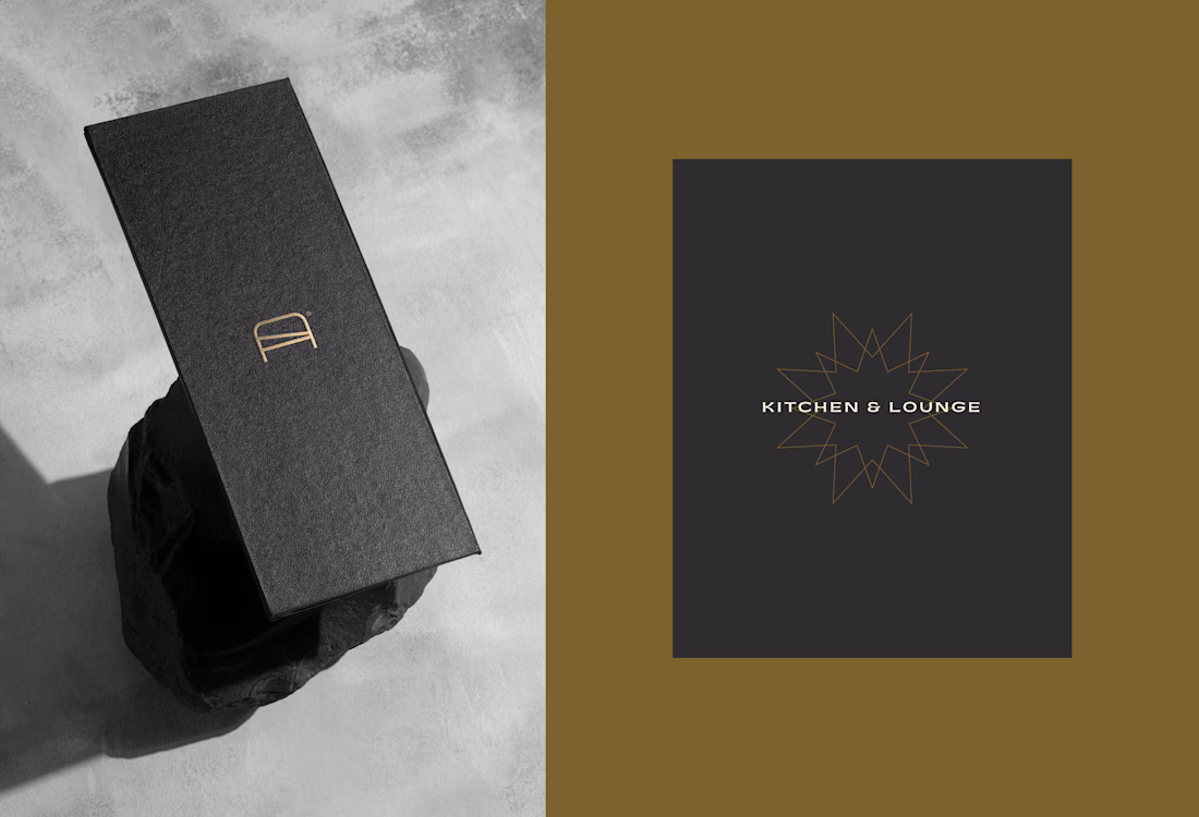
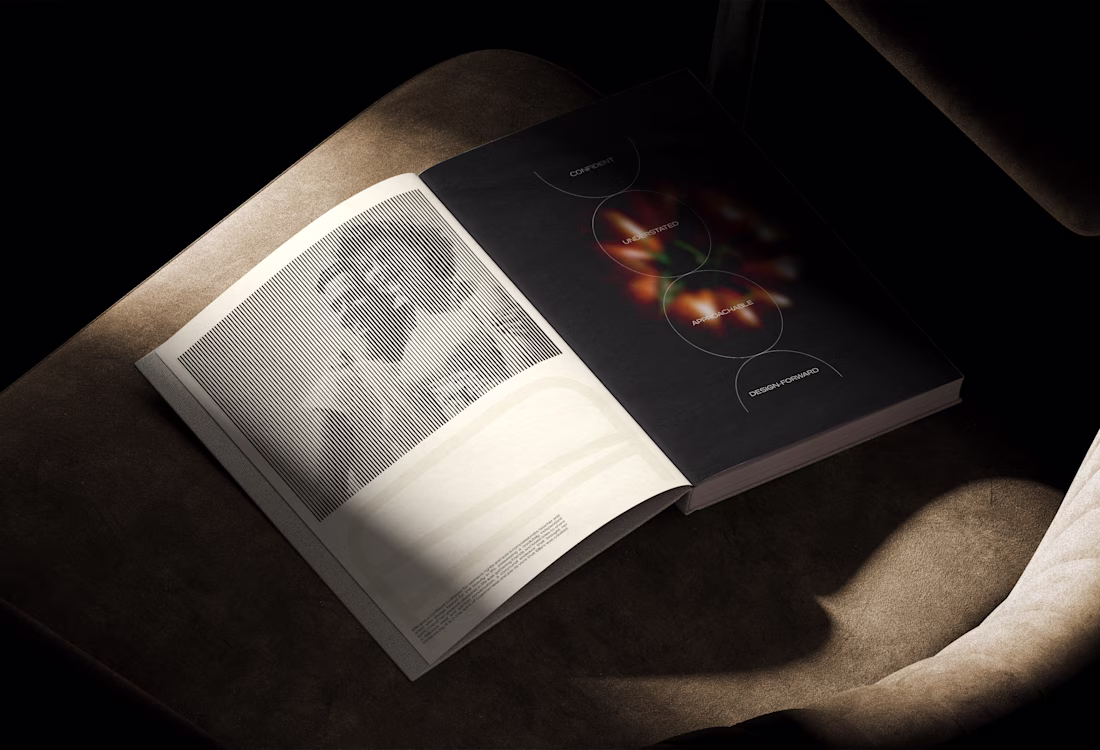
Astra Kitchen & Lounge | Brand Identity
Astra Kitchen & Lounge is a new restaurant concept offering a refined casual dining experience — consistent, design-forward, and welcoming. It’s an everyday destination that feels warm & elevated, blending clean aesthetics, rhythmic energy, and high-quality American cuisine with global influences.
See full project here
It's an older project but had to keep it archieved until the they announced their identity.
Nice 👏
BrightNotes - Letter B Pencil Logo Design.
Challenges
View allTrending
Claude
Claude has entered the design space. How are you using Claude Design?
Contra University
Learn from expert creatives how to earn more using next-gen AI tools.
fifaworldcup2026
The World Cup is here and the whole world's watching. How are you designing for the world stage?
creativeaiflow
Creative AI workflows are evolving. What tools do you use, and what are their strengths and weaknesses?
freelancerlife
Freelancer life is wins, pivots, and everything in between. What’s yours right now?