The network for creativity
Join 1.25M professional creatives like you
Connect with clients, get discovered, and run your business 100% commission-free
Creatives on Contra have earned over $150M and we are just getting started
Back to feedPost

Your product deserves to move.
Static screenshots get scrolled past. Motion gets remembered. This is a 30-second Apple-inspired UI animation and kinetic typography reel, built to show what a product launch video can do for an app or SaaS brand.
Made to work with the sound off: bold colour fields, word-by-word type locked to the beat, and iOS-style interface motion that explains itself.
What’s inside:
Kinetic typography cut to a 120 BPM track, every scene change on the beat
Original iOS-inspired UI: glossy app icons, a dynamic island, notification banners, a player card, chat bubbles, toggles and sliders
Match cuts on every transition: an icon, a chat bubble or a full stop grows into the next colour
Spring physics on the interface, smooth settle on the type
A seamless loop at 60 fps, composed natively for 4:3
Use it for: app launches, onboarding flows, feature drops, App Store previews, SaaS explainers and social ads.
Have a product that should move like this? Message me and let’s talk.


The network for creativity
Join 1.25M professional creatives like you
Connect with clients, get discovered, and run your business 100% commission-free
Creatives on Contra have earned over $150M and we are just getting started



Related posts

What should a beekeeping website explain before asking someone to choose a hive?
For Bee Girl, I designed and built a complete Shopify website around a clear journey: meet the colony, understand what’s inside a nucleus hive, compare the options, and connect with the beekeeper.
Honey yellow, hive black, warm cream, and bold typography bring the same visual language across desktop and mobile layouts.
One design decision that ties it together: the page explains the colony and its five frames before introducing the hive-quantity choices. Education gives the product selection context.
I handled the complete website project for the client through Fiverr, using Shopify. This video walks through the homepage.
Which would you explore first—the hive options, field classes, or the beekeeper’s story?
Explore the full Bee Girl case study: https://contra.com/p/WqNFR67b-bee-girl-shopify-website-design-for-beekeeping
If you’re building a Shopify website for a specialist business, I’m available for website design and development projects.


I'd open the hive options first, but only because the colony section already told me what I'm buying. Explaining the five frames before the quantity choice is a smart order. Teaching before asking someone to choose is so underrated in Shopify stores.

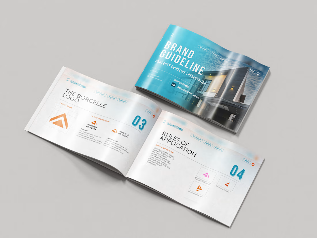
Just wrapped a brand identity concept for Haven Ridge Properties, a real estate developer selling to first-time buyers and investors.
The challenge: feel premium without feeling cold.
The answer was two ideas shelter and growth.
The mark is a roofline that doubles as an upward arrow: home and long term value in one symbol.
What's inside the guidelines:
• Primary and secondary logo lockups
• Logo usage rules
• Typography system
• Colour palette with clear roles
• Imagery direction
• Digital and print applications
Which detail stands out most to you?
#branding #brandidentity #logodesign #brandguidelines #realestate

What if your product could steal the spotlight without saying a word? 🍉✨
A product deserves more than just a beautiful image. It deserves an experience.
This 3D product animation was all about bringing a beverage brand to life through eye-catching visuals, dynamic product movements, realistic details, and refreshing fruit elements.
From the product presentation to the final reveal, every frame was crafted to make the product feel more appealing, memorable, and impossible to scroll past.
Looking to give your product the same treatment?
I create:
3D Product Animations & Commercials
Premium Product Ads
3D Modeling & Rendering
Creative Brand Visuals
Let's turn your product into something people can't ignore. DM me and let's create something remarkable! 🚀
3D Modeling3D AnimationmotiongraphicsadvertisingAdvertisement DesignAdobe After EffectsAdobe Premiere ProBlender


Amazing!