The network for creativity
Join 1.25M professional creatives like you
Connect with clients, get discovered, and run your business 100% commission-free
Creatives on Contra have earned over $150M and we are just getting started
Back to feedPost

Reimagining CapCut as CapCut Publishing.
CapCut helps creators create content. CapCut Publishing reimagines that journey by helping creators transform videos, podcasts, blogs, and social content into books, publications, and intellectual property.
The concept includes:
• AI-powered publishing tools
• Creator-authored book collections
• Physical publishing hubs
• Author events and community experiences
• A complete editorial brand identity
Built using CapCut Design Studio.
#CapCutDesignStudio #BrandDesign #Publishing #CreativeDirection

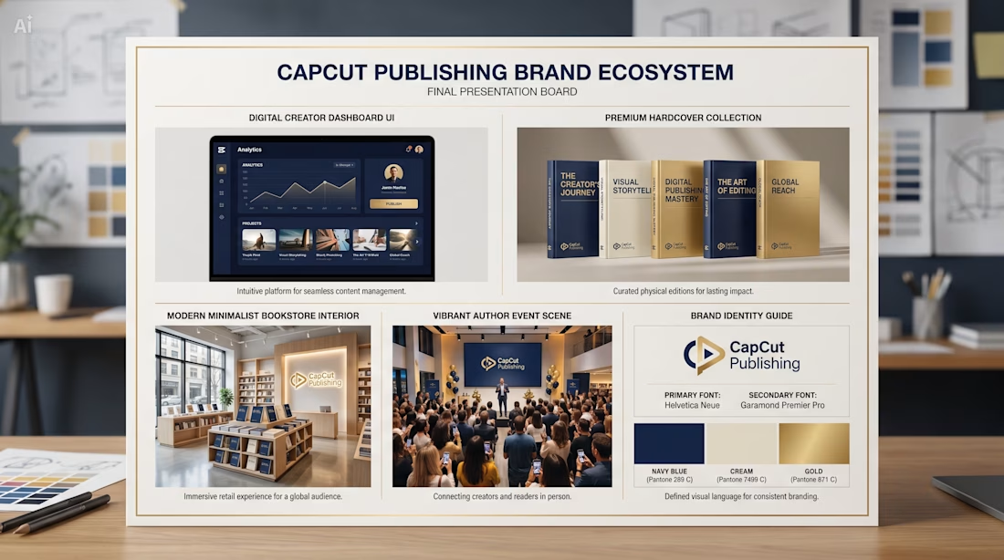
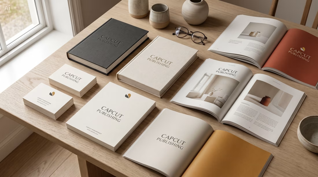
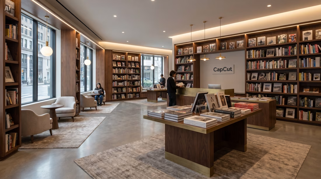
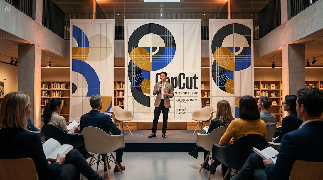

this is so fascinating to consider as what capcut could look like, what a unique idea! i love the simplicity of the materials set out on the table so much, & the third photo definitely looks like a place i'd want to visit!
Thank you!! Yes, I was exploring how CapCut could evolve beyond video creation into a complete creator publishing ecosystem. I'm so glad you enjoyed the bookstore and author event concepts!
The network for creativity
Join 1.25M professional creatives like you
Connect with clients, get discovered, and run your business 100% commission-free
Creatives on Contra have earned over $150M and we are just getting started

Challenges
View all


Related posts

Client’s choice vs. Designer’s choice 👀
I’m currently working on a branding project for Massage & Mocktails — a concept built around couples learning massage together in a relaxed, social atmosphere.
These are two early, black & white directions from Stage 2 of my branding process, before moving into color, typography, and the full visual system.
The interesting part?
My client chose Concept 1. I chose Concept 2.
Now I’m curious what other creatives think.
Which direction would you choose — 1 or 2? And why?
Sometimes the most interesting part of branding is seeing how differently a client and a designer respond to the same brief.
21 voted
44%
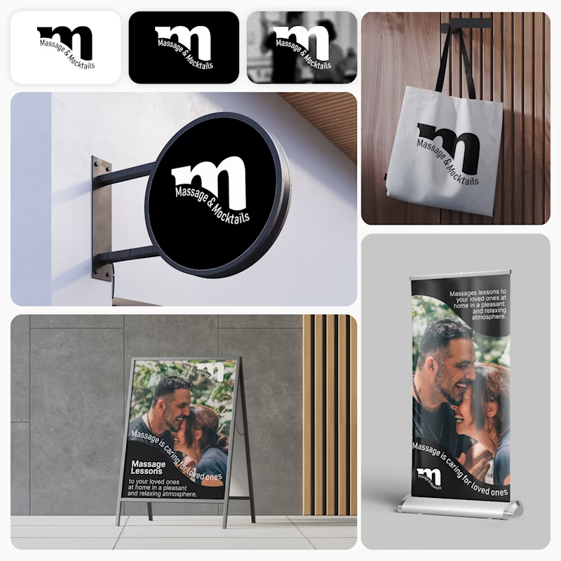
27 voted
56%
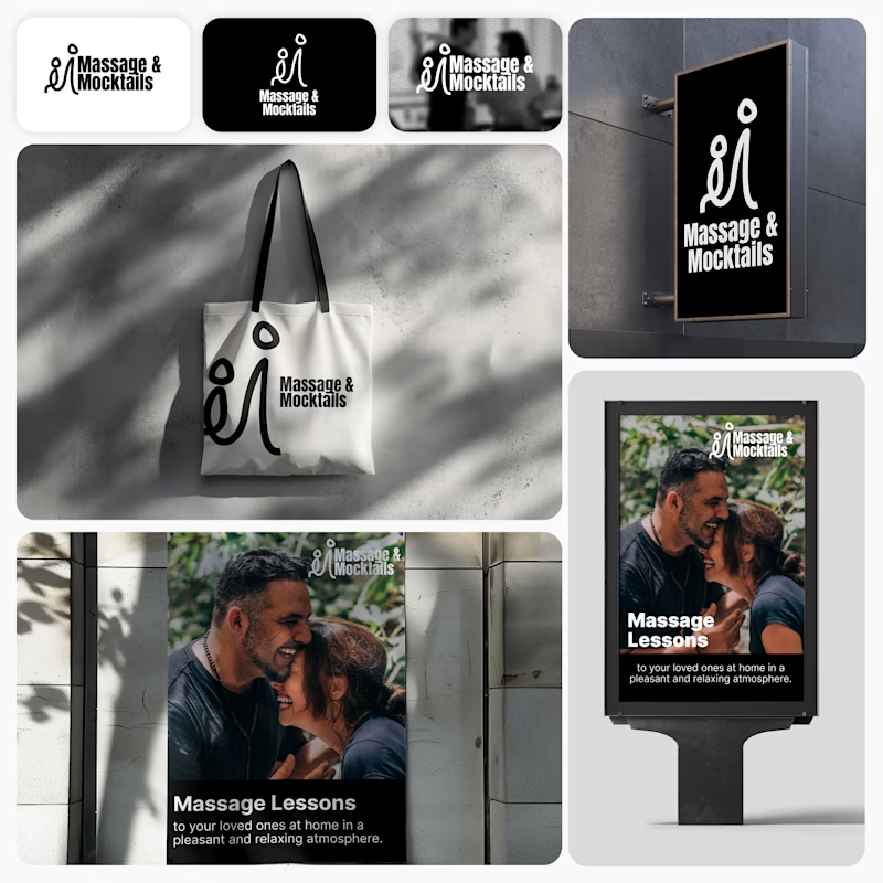
48 votes
Closed

Concept 2 for me. That interlocking figure mark reads as two people meeting, which is the actual brief here, so it gives you more to build a system on. Concept 1 is the safer, more literal pick, which is usually why clients reach for it.


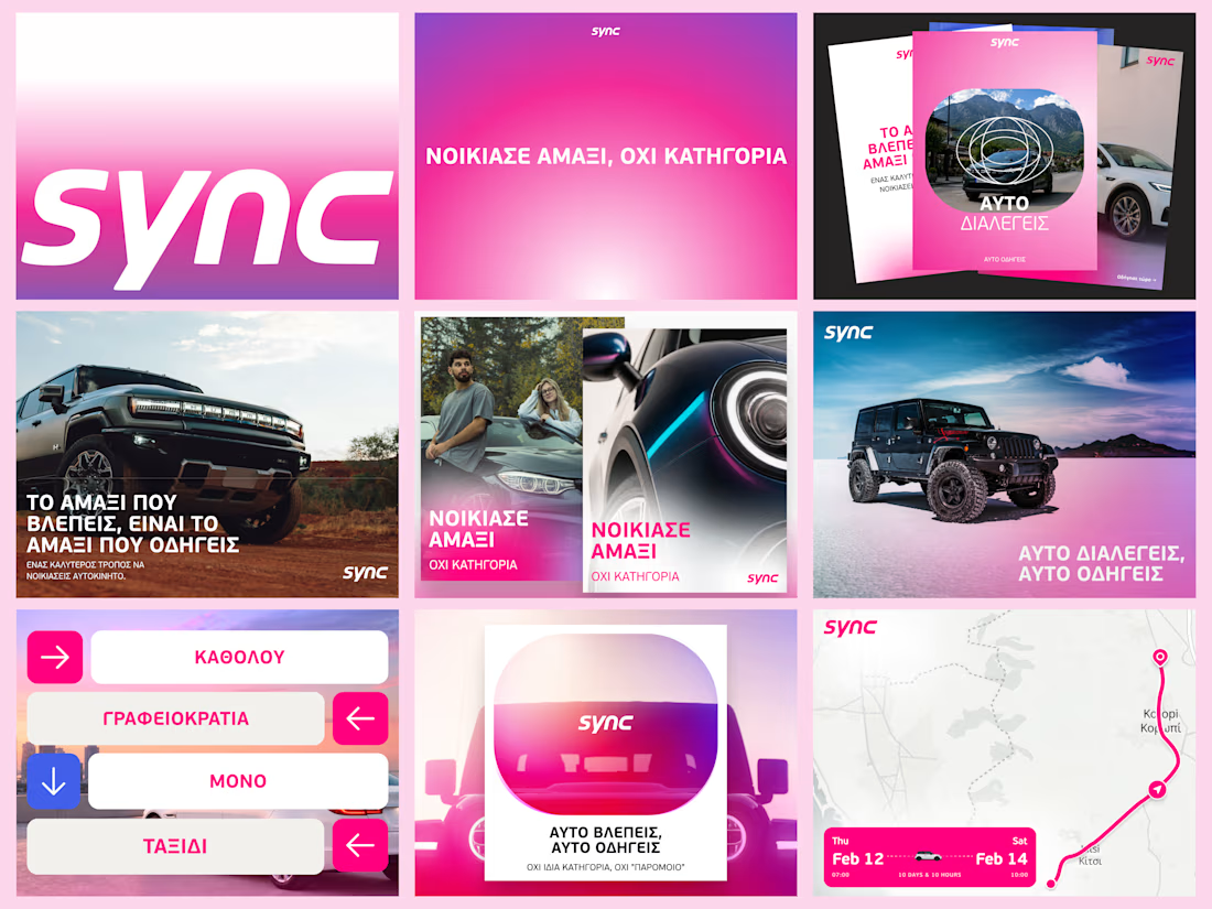
A few more pieces from my work on Sync’s identity.
The idea was to give this Greek car rental brand enough polish to sit next to the big names, with a personality of its own.
The pink was already there. I gave it more space and paired it with bold Greek typography and a frame inspired by a car’s side mirror.
Here’s a closer look at how it works across the layouts.


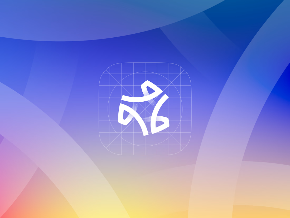
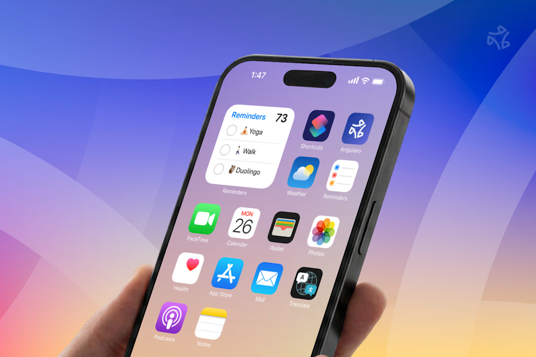
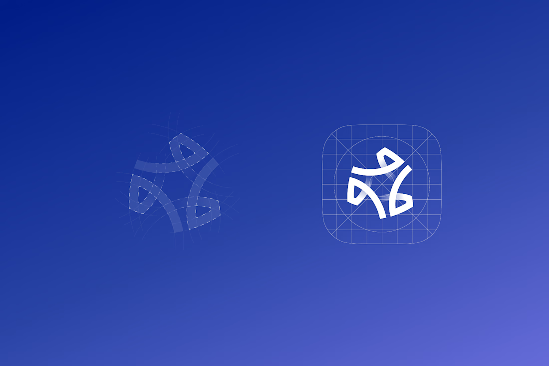

The wide counters are what let it survive the home screen — in that grid of other app icons it still reads as one shape instead of collapsing into noise, which is the real test for a CRM mark. Is the gradient locked to the logo, or does it shift across the product surfaces?