The network for creativity
Join 1.25M professional creatives like you
Connect with clients, get discovered, and run your business 100% commission-free
Creatives on Contra have earned over $150M and we are just getting started
Back to feedPost
VERRANÉ™ — Luxury Logo Design & Brand Identity
Luxury Fashion • Contemporary Streetwear • Premium Brand Identity
Project Overview
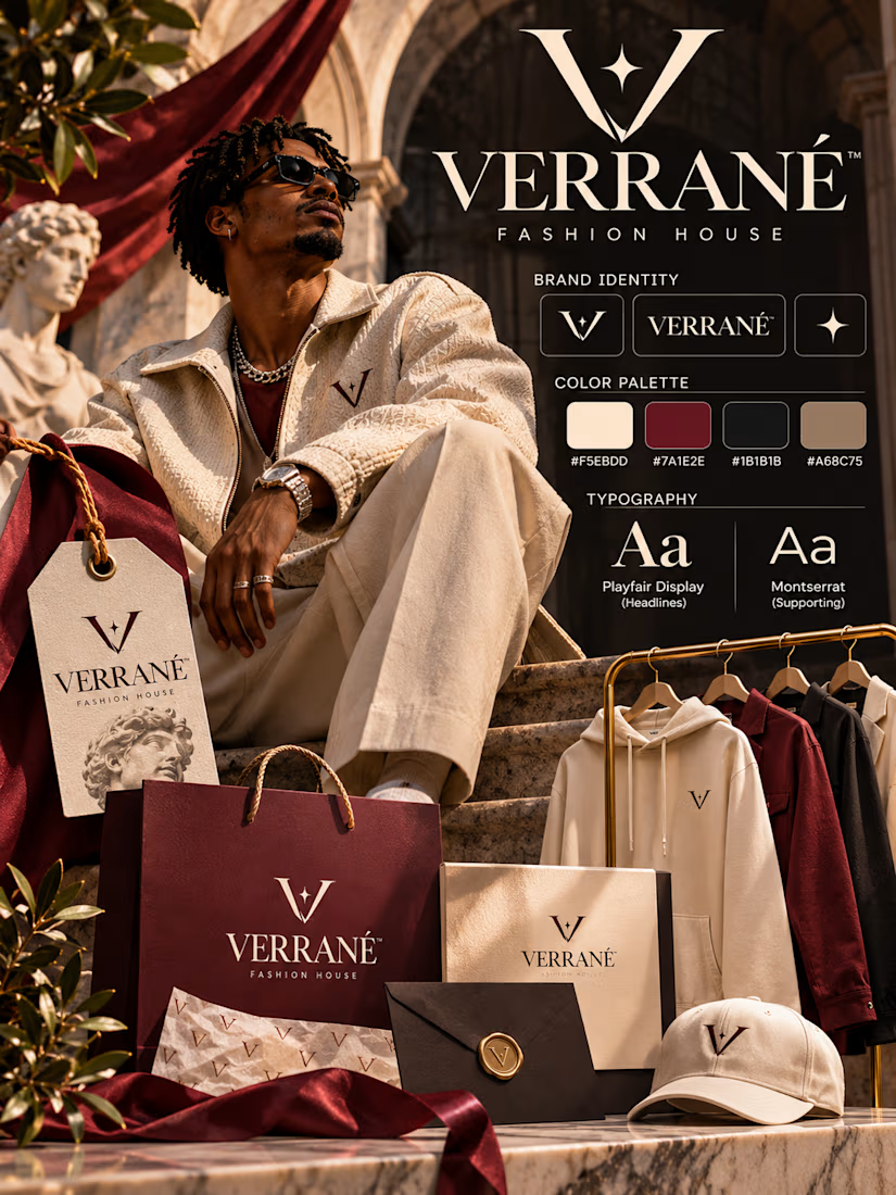
VERRANÉ™ is a self-initiated Logo Design & Brand Identity concept developed for a contemporary luxury fashion house that combines refined tailoring, modern streetwear influences, and sophisticated lifestyle branding.
The project explores how a distinctive visual identity can communicate exclusivity, confidence, craftsmanship, and contemporary fashion culture while remaining cohesive across physical and digital applications.
The creative objective was to establish a brand that feels premium without becoming overly traditional, balancing classical luxury references with the confidence and individuality of modern streetwear.
The completed identity brings together custom-inspired monogram design, elegant typography, a carefully selected color palette, editorial fashion imagery, premium packaging, and branded apparel applications.
Brand Concept & Creative Direction
VERRANÉ is imagined as a fashion house built around the idea of modern luxury without compromise.
Its creative positioning celebrates personal style, elevated everyday dressing, and the relationship between heritage-inspired elegance and contemporary fashion expression.
The visual direction draws inspiration from European fashion houses, architectural grandeur, luxury retail environments, and high-end editorial campaigns.
Classical stone arches, sculptural marble surfaces, burgundy drapery, and carefully styled fashion photography establish an atmosphere of sophistication.
These traditional elements are contrasted with relaxed silhouettes, textured contemporary garments, sunglasses, and confident street-luxury styling.
The result is a fashion identity that feels established, aspirational, and modern.
Logo Design & Symbolism
The central identity element is a distinctive V monogram.
Its elegant, sharply tapered letterform creates a recognizable symbol while communicating refinement, precision, and confidence.
A small four-point star is incorporated into the negative space of the mark, introducing a subtle visual reference to distinction, brilliance, and elevated quality.
The monogram is designed to work independently from the full wordmark, allowing it to function as a recognizable signature across apparel, packaging, accessories, and branded materials.
The identity also incorporates a standalone star symbol as a secondary graphic element.
Together, the V monogram, wordmark, and supporting symbol establish a flexible visual system that can adapt to both understated luxury applications and more expressive fashion presentations.
Typography & Wordmark
Typography is essential to the brand's premium character.
The VERRANÉ wordmark features elegant, high-contrast serif lettering inspired by classical luxury fashion typography.
Its refined proportions, sharp terminals, and carefully controlled spacing communicate sophistication and establish a strong visual presence.
The accented final letter adds a distinctive European-inspired character to the brand name.
The identity presentation pairs two complementary typographic directions:
Primary display typography — Playfair Display-inspired serif
Used for brand statements, editorial headlines, and luxury-focused visual communication.
Supporting typography — Montserrat-inspired sans-serif
Used for secondary information, packaging details, product descriptions, and supporting brand applications.
This contrast creates a visual system that feels expressive and refined while maintaining clarity across different formats.
Color Palette
The brand identity uses four coordinated colors:
Champagne Cream — #F5EBDD: A soft, elegant foundation that communicates refinement and understated luxury.
Heritage Burgundy — #7A1E2E: A rich accent color that introduces depth, sophistication, and visual distinction.
Midnight Black — #1B1B1B: Provides contrast, authority, and a timeless luxury foundation.
Warm Taupe — #A68C75: Introduces warmth and balance while complementing the architectural and lifestyle imagery.
The palette is intentionally restrained, allowing the brand to remain recognizable across apparel, packaging, and campaign materials.
Burgundy provides the strongest signature accent, while cream and black establish a timeless visual foundation.
Fashion Photography & Editorial Art Direction
The campaign imagery is central to the identity presentation.
A confidently styled Black male model wearing a textured cream jacket, relaxed tailored trousers, layered jewelry, and dark sunglasses establishes the brand's contemporary fashion personality.
His relaxed seated pose creates a sense of effortless confidence, contrasting with the grandeur of the classical architectural setting.
Warm directional lighting emphasizes the texture of the garments, the depth of the surrounding stone surfaces, and the richness of the burgundy drapery.
The composition draws from luxury fashion editorials, combining aspirational lifestyle photography with a carefully controlled brand environment.
Rather than separating the identity elements from the campaign imagery, the design presents them together as one cohesive fashion experience.
Packaging & Retail Applications
The identity extends into a coordinated collection of premium retail applications.
Luxury shopping bags: Burgundy and champagne packaging featuring the VERRANÉ wordmark and monogram.
Branded boxes: Refined packaging designed to reinforce the premium retail experience.
Garment hangtags: Elegant product tags incorporating the brand symbol and editorial detailing.
Patterned tissue paper: Repeating monogram graphics that extend brand recognition into the unboxing experience.
Sealed correspondence: A dark envelope with a metallic-style monogram seal, communicating exclusivity and attention to detail.
Apparel and accessories: Coordinated hoodies, outerwear, and a branded cap demonstrate how the identity translates onto wearable products.
These applications illustrate how a recognizable visual system can create consistency across multiple customer touchpoints.
Brand Identity System
The completed presentation establishes several interconnected components:
Primary identity: The full VERRANÉ wordmark.
Secondary identity: The standalone V monogram.
Supporting symbol: A refined four-point star.
Typography: Elegant serif display lettering combined with contemporary sans-serif supporting type.
Color system: Champagne cream, heritage burgundy, midnight black, and warm taupe.
Fashion applications: Contemporary apparel, embroidered accessories, and coordinated merchandise.
Retail applications: Shopping bags, product boxes, hangtags, tissue paper, and branded correspondence.
Editorial direction: Classical architecture, warm cinematic lighting, premium textures, and sophisticated fashion styling.
Each element contributes to a consistent identity designed to communicate the brand's premium positioning.
Design Outcome
VERRANÉ demonstrates an approach to Logo Design & Brand Identity that combines elegant logo symbolism, premium typography, sophisticated art direction, and realistic brand applications.
The project illustrates how a luxury fashion identity can extend beyond its logo to create a recognizable experience across photography, apparel, packaging, and retail presentation.
Developed as a portfolio concept, it showcases the ability to translate a fashion brand's personality into a cohesive visual language with both commercial versatility and strong aesthetic appeal.
VERRANÉ™ — Contemporary expression. Timeless distinction.



Looks amazing

Thank you very much🔥
The network for creativity
Join 1.25M professional creatives like you
Connect with clients, get discovered, and run your business 100% commission-free
Creatives on Contra have earned over $150M and we are just getting started
Related posts

A little more about the inspiration behind Tindara.
I wanted the identity to have a connection to Tindari, Sicily. The Madonna di Tindari statue was the starting point for the symbol, while Sicilian decorative patterns inspired the graphics around it.
For the colors, I chose mustard yellow, deep green, and burgundy, balanced with cream. I wanted to bring some of that warmth and richness into the packaging, while keeping the different elements comfortable together.
For me, these references are what give the project its character and sense of place.



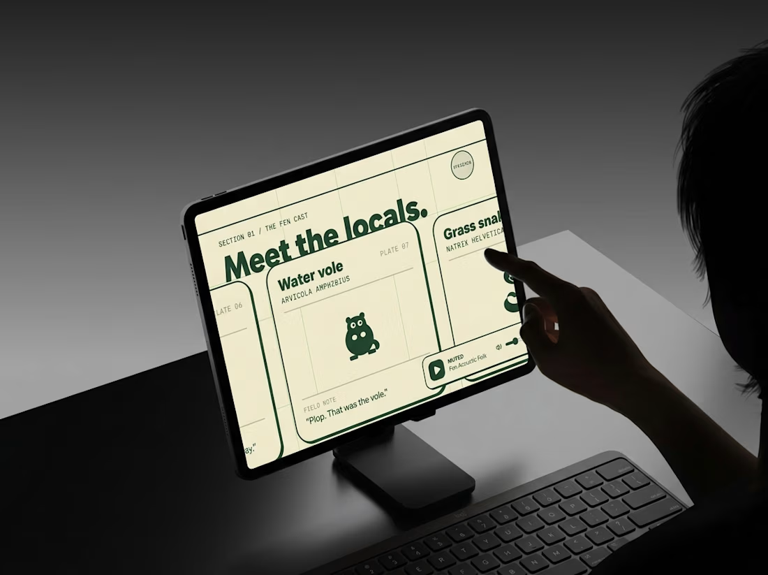
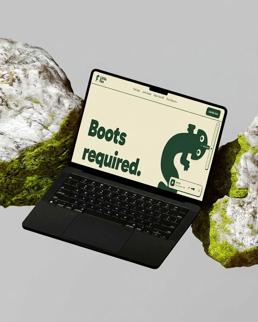
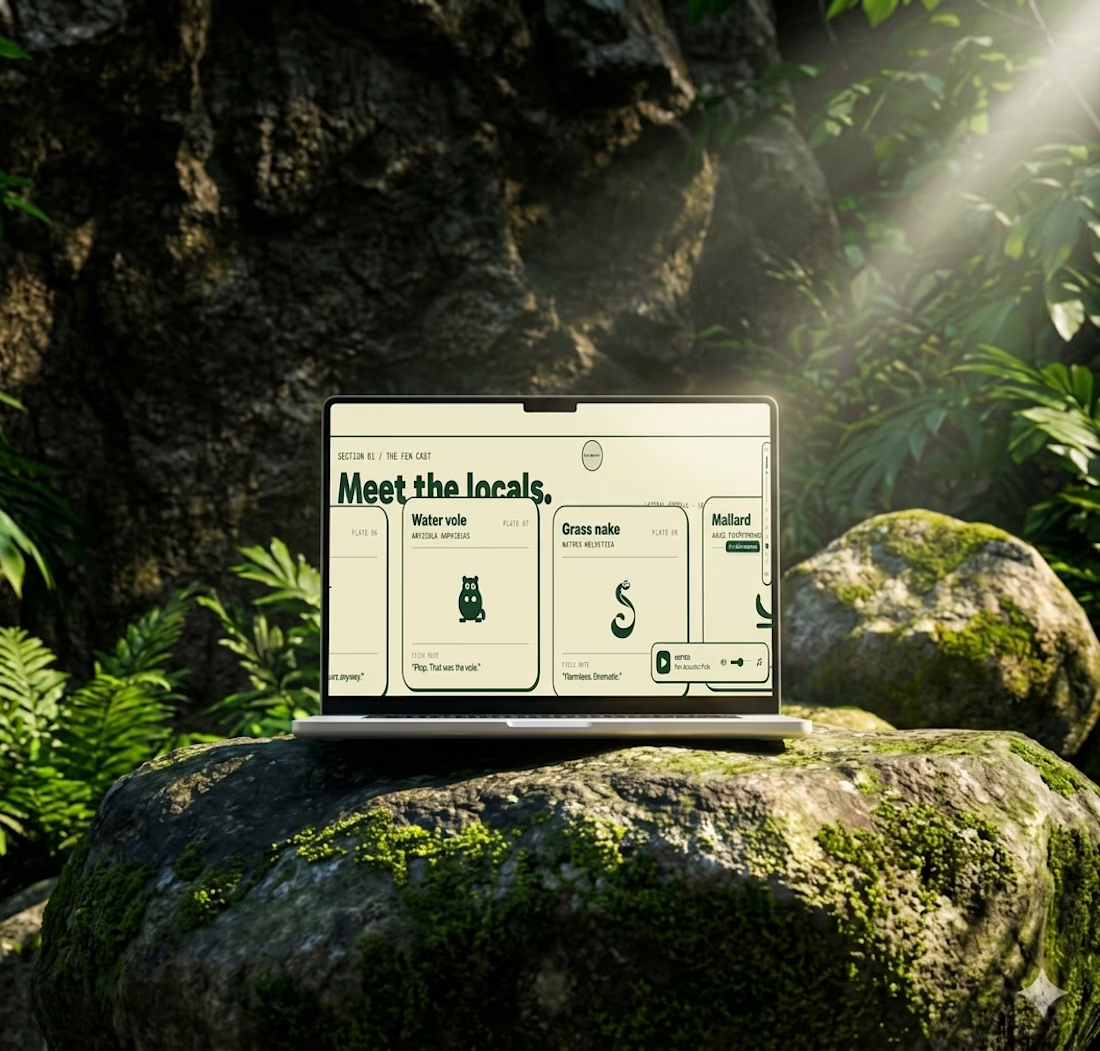
Most websites open with “Welcome.”
This one opens with “Boots required.”
Little Fen’s site is a field guide: locals with Latin names and a heron soundtrack.
Go meet the vole.

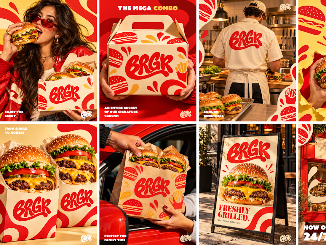
Good branding isn’t just about making things look pretty. It’s about making people crave your product before they even take a bite. 🔥
For BRGR, we focused on creating a bold, mouthwatering visual identity that brings the brand to life across every touchpoint — from Logo Branding and food photography to social media graphics and content.
Because when your visuals have direction and your social media has consistency, your brand doesn’t just show up — it stands out. ❤️=



Clean execution! Making people crave the product before the first bite is exactly what high-converting ad creative needs to do. Coupling this strong branding with direct response video hooks on Meta is a lethal combination for driving restaurant revenue!