The network for creativity
Join 1.25M professional creatives like you
Connect with clients, get discovered, and run your business 100% commission-free
Creatives on Contra have earned over $150M and we are just getting started
Back to feedPost
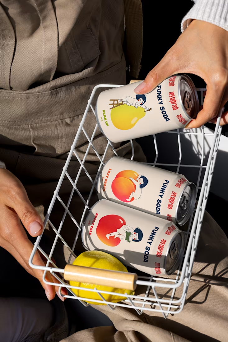
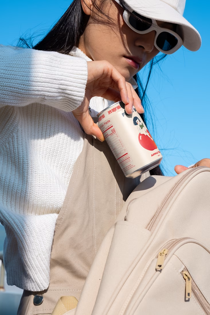
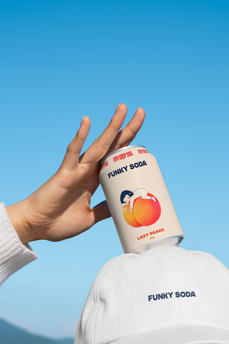

Pro Design :)

Thank You Umar!!

these look amazing!
Thank You Nicolette 😍 🙌

Wow

Nice visuals
Thank You!!

Thank You Leon 😍 🙌

The fruit-forward palette and lifestyle crops make the packaging feel playful without losing product clarity. I especially like how the can mockups keep the system readable across different contexts.
Thank you so much, Rohan! Really glad you noticed that. Keeping the system playful while maintaining clarity across different applications was a big part of the concept. Really appreciate your feedback!

Funky Soda's palette is confident in a way that most beverage packaging plays too safe to try. Was that color story part of the brand from day one, or did it evolve through a few rounds?
Thank you, Diego! The bold color direction was there from the very beginning, but the palette definitely evolved as the system developed. I wanted each flavor to have its own strong personality while still feeling unmistakably part of the same Funky Soda family. Really glad that confidence comes through! 🙌

Beautiful design are the mockups ai generated?
Thank you so much! They’re actually mockups from Asia Mockup :)

Outstanding work
Thank Youuu!! 🙌

great work,,,
Thank You!!

The art direction on this shoot is fantastic. The bright, natural sunlight perfectly complements the playful illustrations and makes the whole brand feel incredibly refreshing. Beautiful work!
Thank you so much! Really appreciate this 🤍 I had so much fun building the art direction for this project!

Thank Youu!! 🙌 🔥

The fruit illustrations doing double duty as flavor cue and pattern keeps the cans reading as a set even loose in a basket like that. Was the candid, handheld photography direction something you art directed too, or did the photographer bring that energy?
Thank you! These are mockups for now — we’re still waiting for the actual photoshoot. The photography direction will build on the visual language of the packaging, so I’m excited to see it come to life

The fruit color coding on the cans is doing most of the flavor communication before anyone reads the label, that's the hard part to get right in a lineup. Shooting it in a shopping cart instead of a studio flat lay makes it feel like it already exists on shelf.
Thank you! That was exactly the intention — making the flavor instantly recognizable while keeping the whole presentation feeling real and shelf-ready. Really appreciate you noticing that :)

Creative branding
Thank You Jabel 🙌

Legendary!
Thank You, Yaroslav 🙌

Beautiful work! Must have been so much fun to work on this!
Yeeeeah!! Thank You!!😍
The network for creativity
Join 1.25M professional creatives like you
Connect with clients, get discovered, and run your business 100% commission-free
Creatives on Contra have earned over $150M and we are just getting started











Related posts
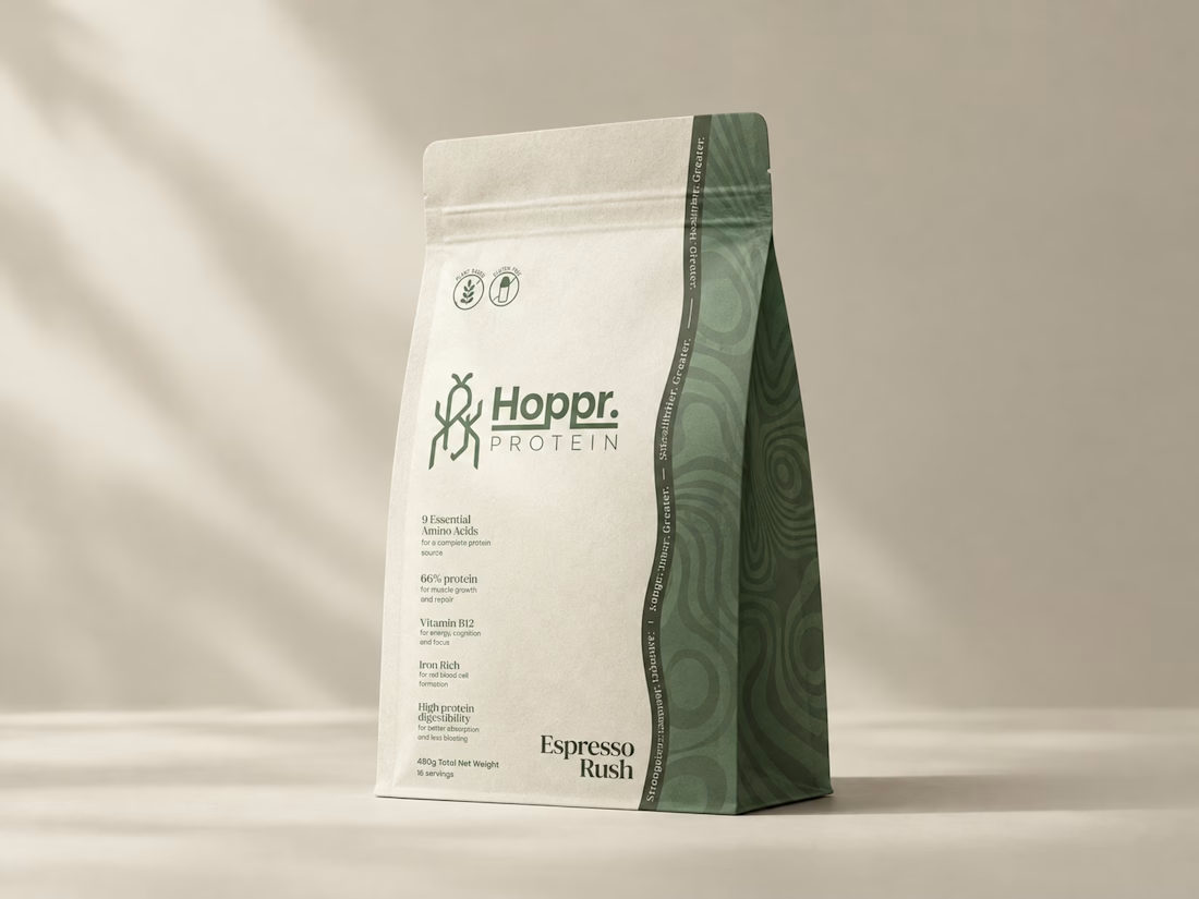
Not every client comes to me for a brand identity and not all my clients are skincare or cosmetic brands.
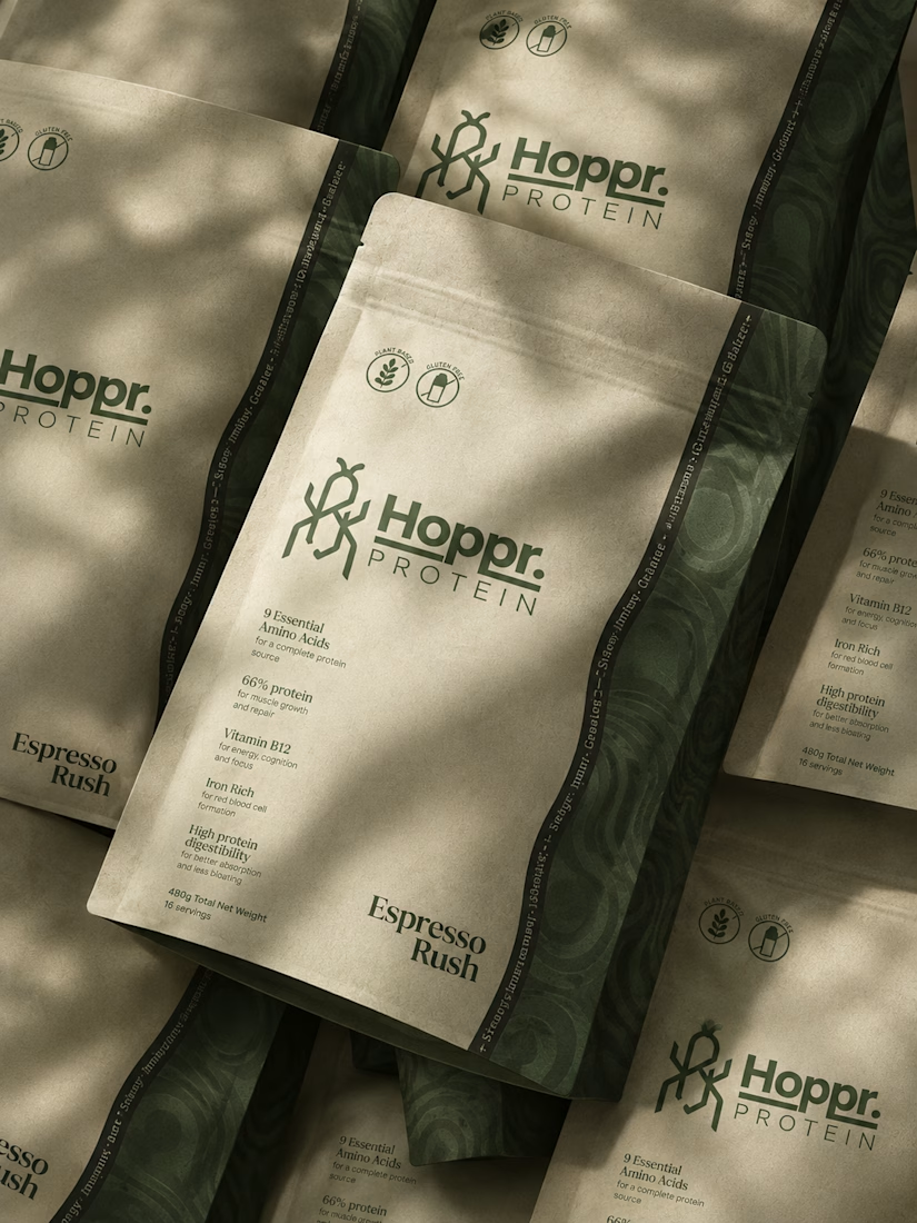
That was the case with Hoppr, a protein powder brand made from crickets. 🦗 YES, CRICKETS!
Sometimes the logo, colors, and visual system are already there and my job is to bring them to life on packaging and see how far I can push them.
I love projects like this because I get to play with typography, layout, and materials while working within an existing identity.
How much freedom do you think a designer should have when working with an established brand?


Great packaging work, nice job

A flower that inflates arrives in the mail.
Next month, a phone made of shell.
STILL LIFE SERVICE. Case study dropping soon.
Which object earns your shelf? Reply below.
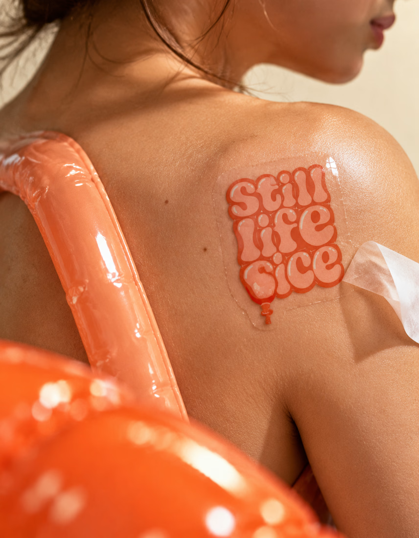
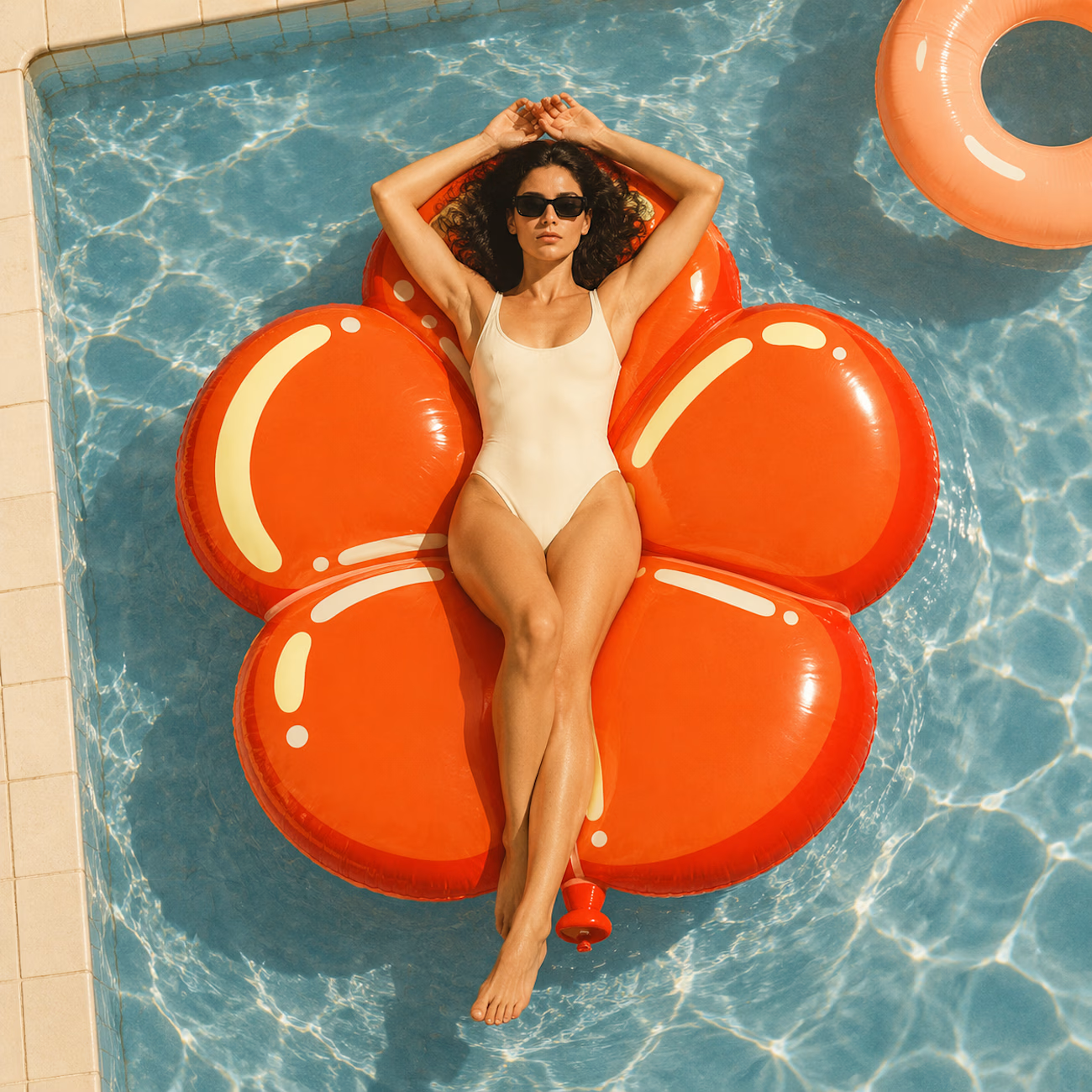
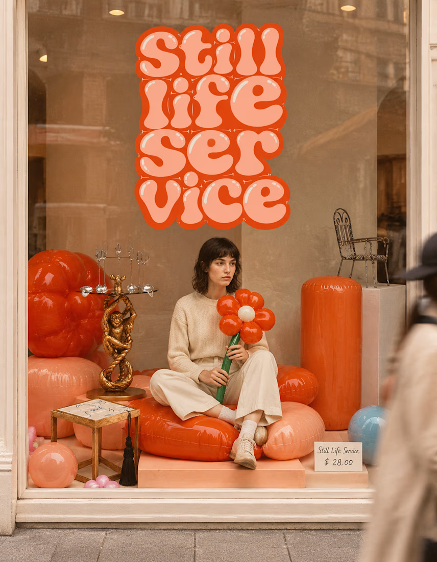

The inflatable flower. Only houseplant I'm guaranteed not to kill. Also, a new object every month is a sneaky good retention hook, people will stay subscribed just to see what's next.

Same design. Which palette? 👀
You picked your favorite preview last time. This time, I’m putting the colors to the vote.
One body-care packaging concept, with the same typography and composition:
A · Rose Cream, Strawberry Sorbet + Plum Jelly
B · Lime Mousse, Coconut Cream + Plum Jelly
Which would you choose and what does it make you feel about the brand?
Both palettes use colors and matching ingredient textures from DCS 654, my library of 654 dessert-inspired colors.
Take a closer look: dcs.mariya.design

7 voted
44%
9 voted
56%
16 votes
Closed

B is absolutely stunning 🎉🎉🎉🎉
Great job Mariya❤️