The network for creativity
Join 1.25M professional creatives like you
Connect with clients, get discovered, and run your business 100% commission-free
Creatives on Contra have earned over $150M and we are just getting started
Back to feedPost


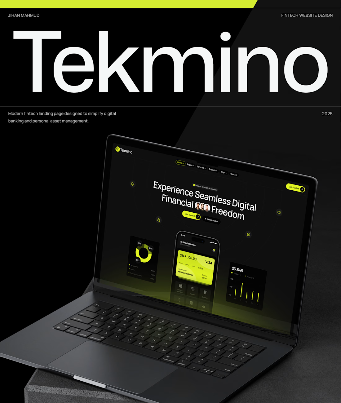
Tekmino’s wordmark does most of the work — huge type on that black field reads as fintech before the supporting line even starts. The lime accent keeps the laptop UI sharp without crowding the layout.

Thanks a Lot for your Valuable Comment

The redesign feels clean and easy to navigate.
Thanks a Lot
The network for creativity
Join 1.25M professional creatives like you
Connect with clients, get discovered, and run your business 100% commission-free
Creatives on Contra have earned over $150M and we are just getting started


Challenges
View all


Related posts

Yesterday, I posted my first (one of my favorite complete case study on 0 → 1 product design (award winning app) on Contra.
I never been loud about my work 😂 but this time, I am finding my way around contra to improve my scores by showcasing some of my favourite work. Let me know if you like it 🙌
The walkthrough makes the 0→1 journey easy to follow—the tutorial overlay and scan flow explain the product without overloading the screen. The restrained purple framing also gives the case study a memorable visual identity.

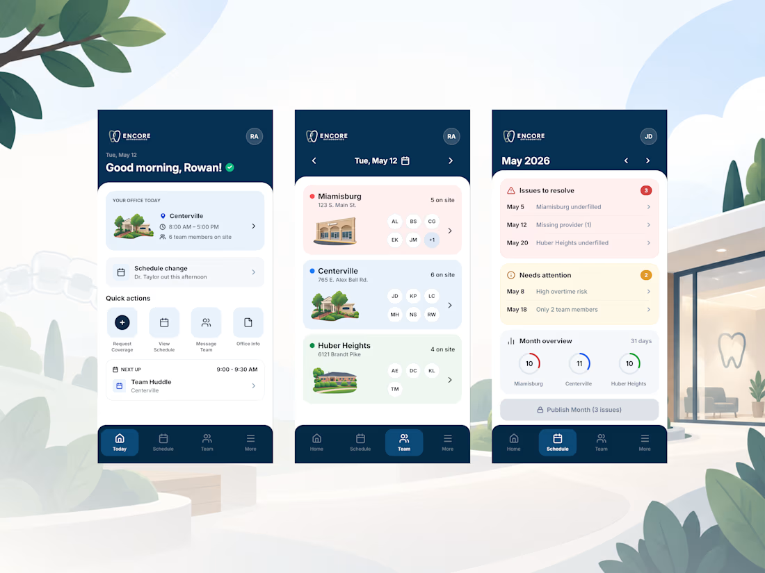
Finishing up a mobile app design for Burke Orthodontics! (rebranding to Encore Orthodontics)
Check it out


Outstanding

Ledger — AI CFO Platform
Ledger is an AI platform that acts as an always-on Chief Financial Officer for founders — connecting to accounts, learning cash rhythm, and surfacing risks before they become real problems. I designed the full landing page.
My role: UI/UX Design
Scope: Landing page
Financial tools for founders usually feel either cold (dashboards) or intimidating (accounting software).
For Ledger, we borrowed from old-world institutional finance instead — serif type, oil-painting textures, classical architecture — so an AI CFO feels like real authority, not another app.


This color pallet works so well with data and makes everything look premium. love it!