The network for creativity
Join 1.25M professional creatives like you
Connect with clients, get discovered, and run your business 100% commission-free
Creatives on Contra have earned over $150M and we are just getting started
Back to feedPost

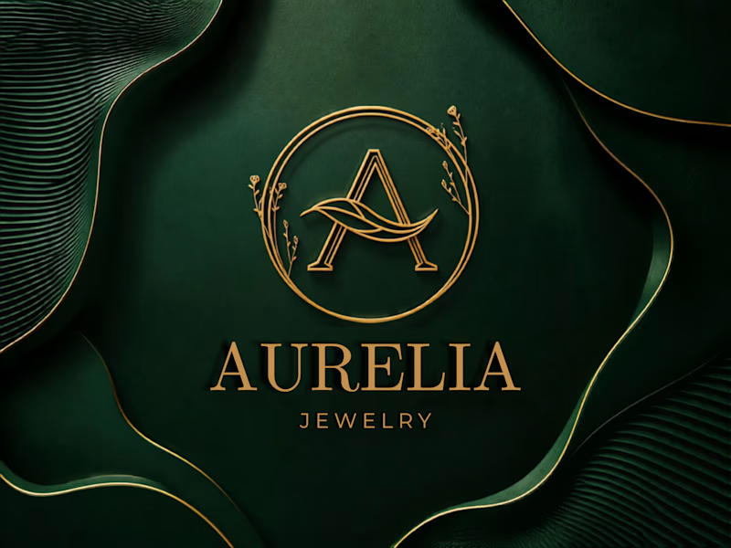
The design on the emerald background caught my attention first. It feels bold, rich, and full of character.
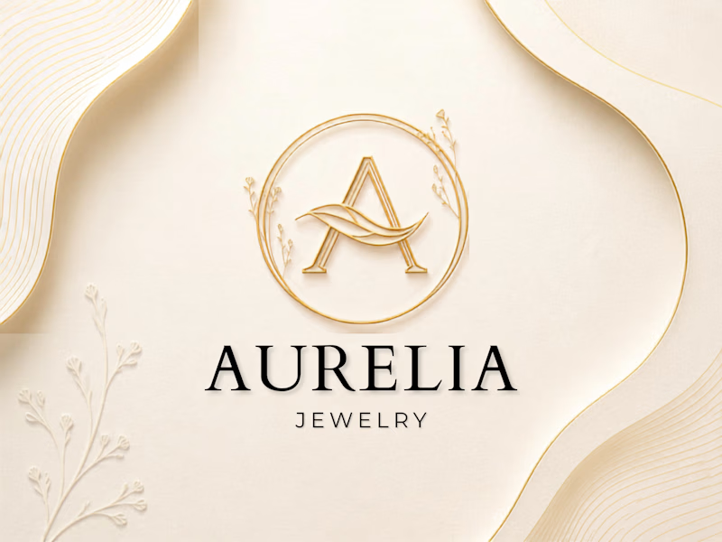
But when I think about the complete brand identity, I would choose the soft minimalist direction. Its clean look feels more timeless and gives the brand a stronger luxury presence.
It would also work beautifully across packaging, boxes, cards, store displays, and even when engraved or embossed on physical products.
The emerald version stands out immediately, but the minimalist option feels more flexible for building a lasting luxury brand.

Which aesthetic conveys luxury best for AURELIA Jewelry? Deep Emerald or Soft Cream? Drop your thoughts below! 👇✨
13 voted
45%
16 voted
55%
29 votes
Closed
The network for creativity
Join 1.25M professional creatives like you
Connect with clients, get discovered, and run your business 100% commission-free
Creatives on Contra have earned over $150M and we are just getting started
Trending
retrofuturism
Share your favorite designs from the past exploring the distant future. Or your own take on the aesthetic 🚀
halftone
Dots. Texture. Grain. Let's see your designs using the halftone technique.

Midjourney
Creatives are showing off what they're making with Midjourney.
colorgrade
Video editors sound off: How do you enhance the mood of your video in color grading?





Related posts


A playful sparkling fruit drink built around bold flavour, bright colours, and a personality that refuses to take itself too seriously. Every element is designed to feel energetic, juicy, and instantly recognizable.


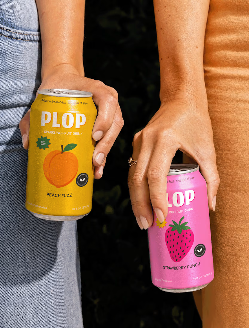
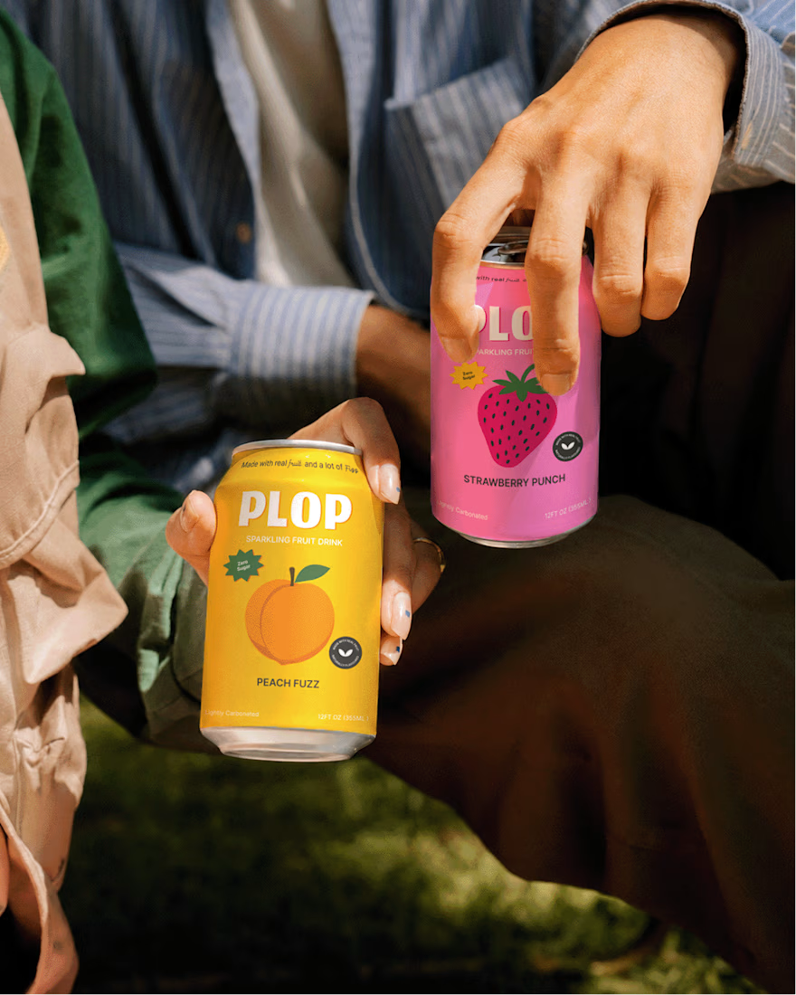
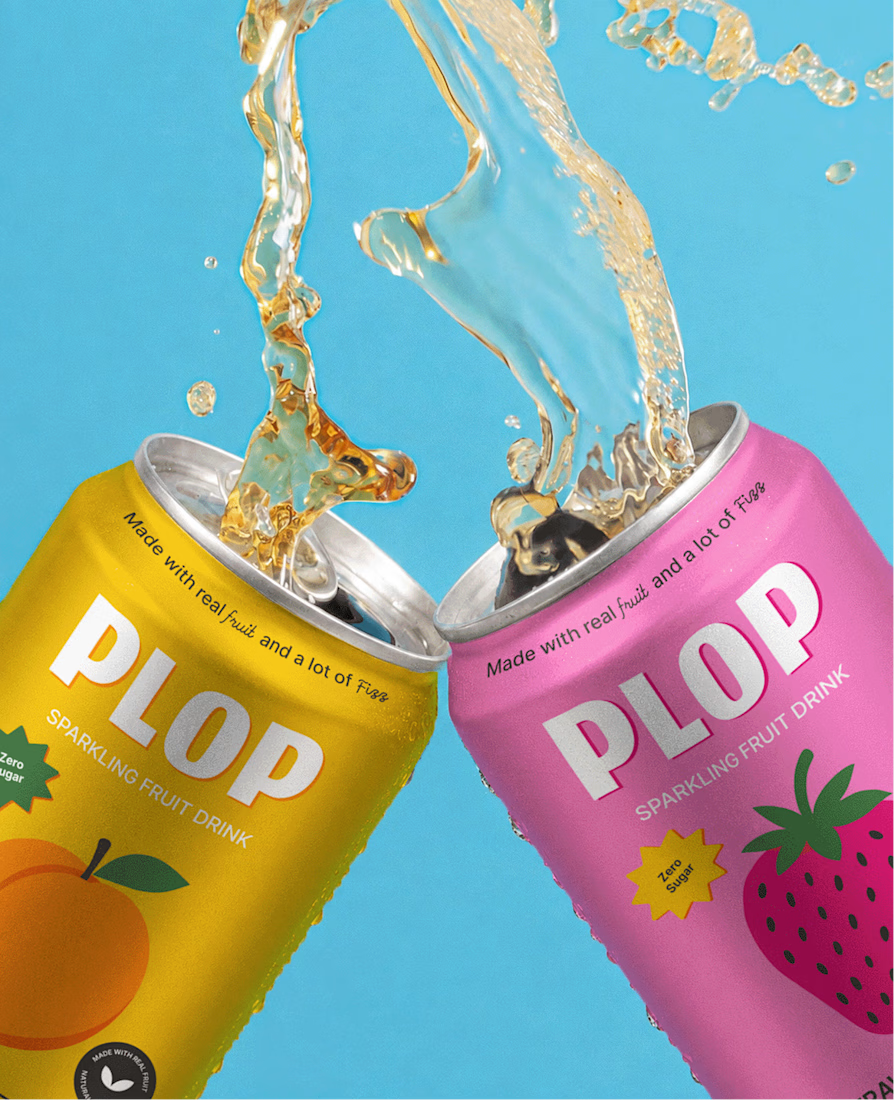
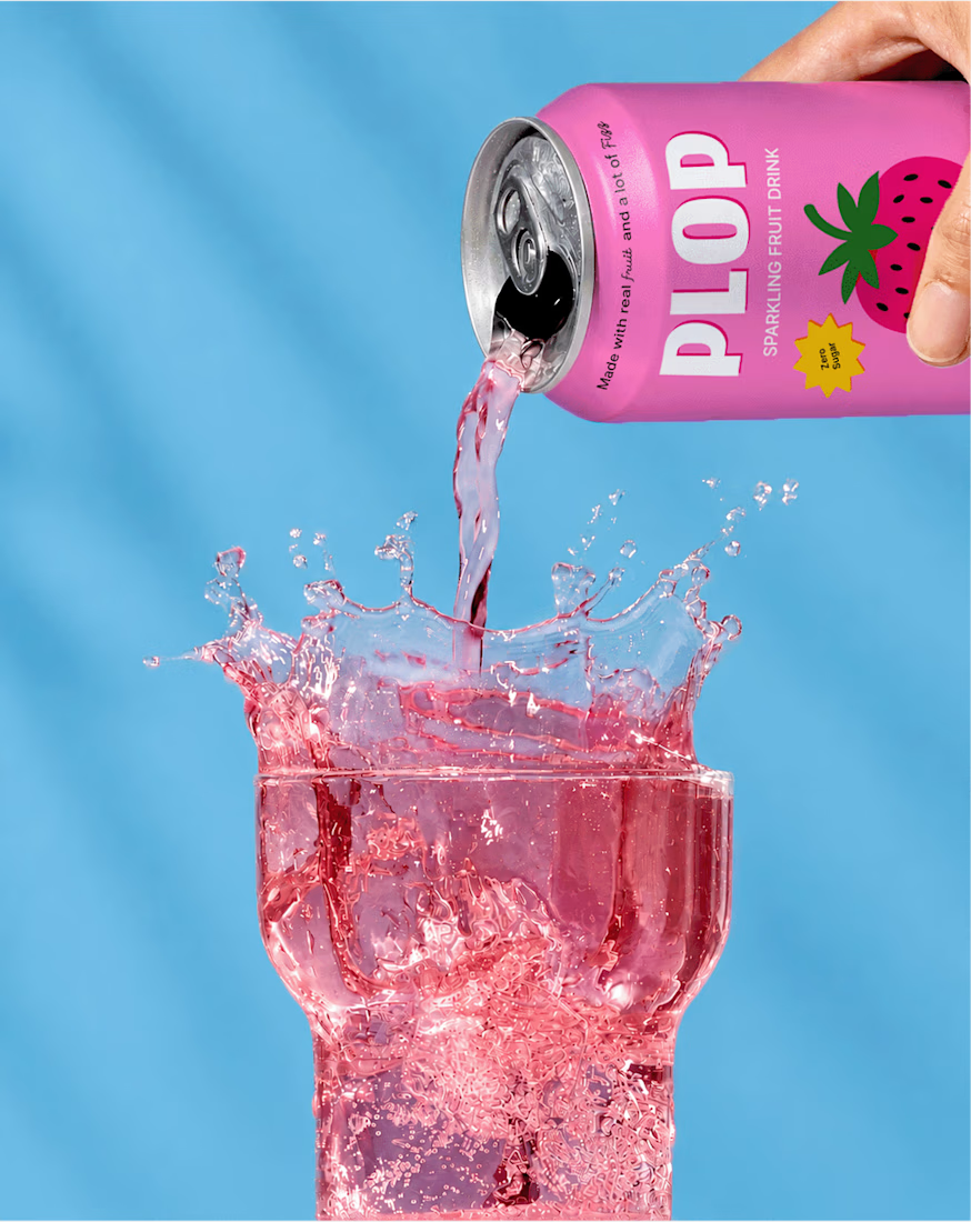

If I walk into a store I will definitely make a buying decision before even checking the content of this drink. The color and branding is eye catching

I've built enough Middle-East-facing products to know: "East" isn't a blue color swatch bolted onto a hero image. It's rhythm, texture, warmth the stuff a user feels before they can name it. One of these two designs gets that in my opinion.
If the client pushes back, which detail do you defend first ?
#uidesign #uxdesign #figma #webdesign
3 voted
25%
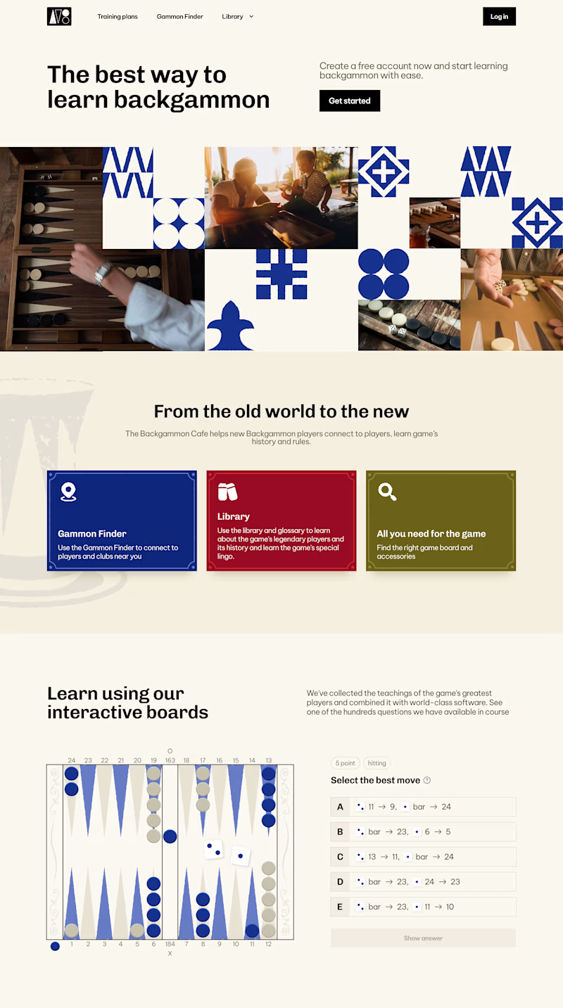
9 voted
75%
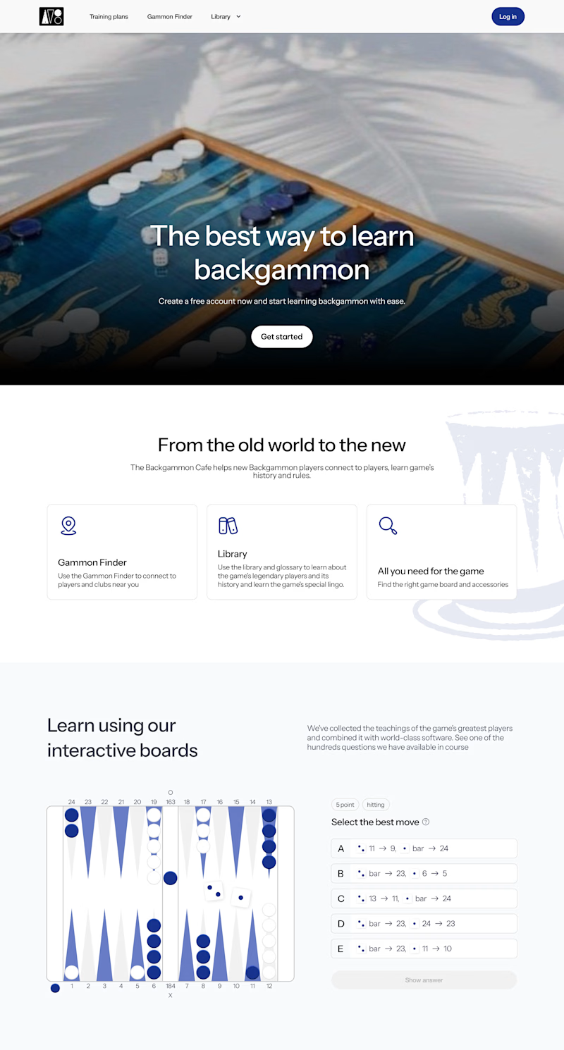
12 votes
Closed


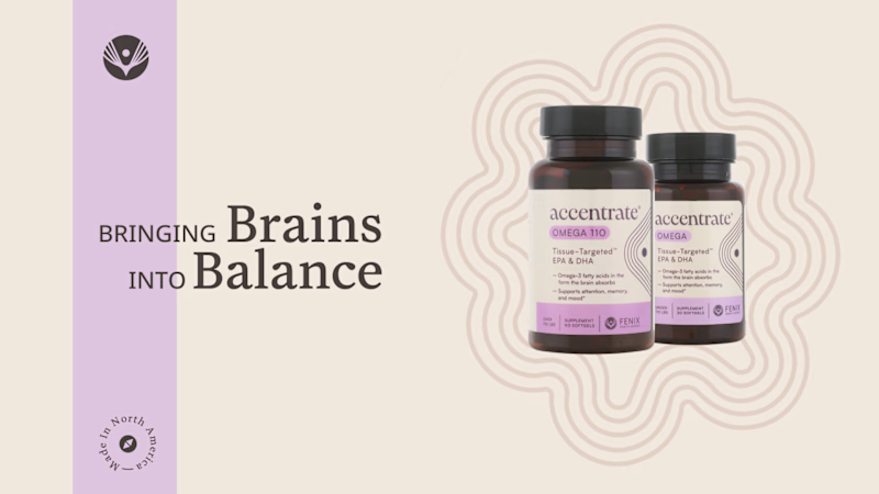
Now I'll show you a design that was created based on the principle that “the most important thing is not to scare the patient before it's time.”
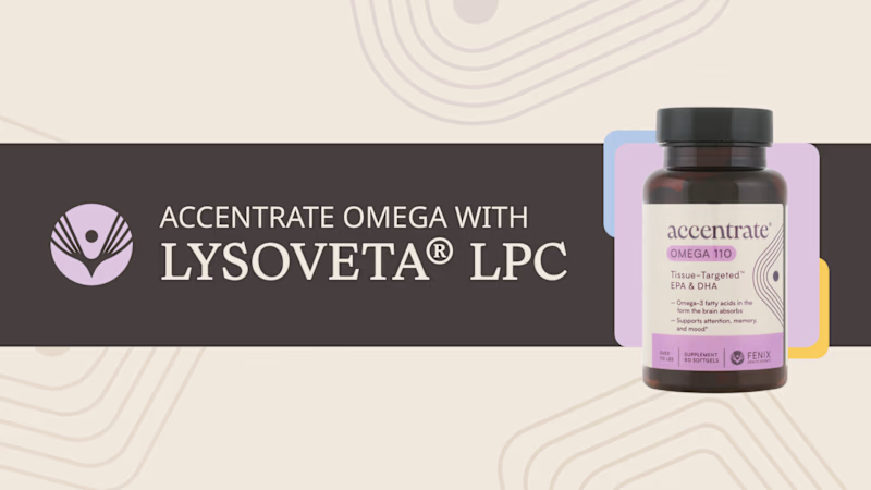
This is a pharmaceutical project, so the design is very understated. But even with this approach, I want to make the product look more appealing. Which option stands out more?
#storyboard
9 voted
75%
3 voted
25%
12 votes
Closed

Option 2 imo - that dark banner makes the bottle pop so much more, feels more premium too