The network for creativity
Join 1.25M professional creatives like you
Connect with clients, get discovered, and run your business 100% commission-free
Creatives on Contra have earned over $150M and we are just getting started
Back to feedPost
Taste Test

professional

thanks for the professional take

playful and expressive for sure

Left leans playful and nostalgic, right feels like it wants to be taken a bit more seriously as a napoletana spot. Which direction is closer to how the owner actually talks about the place?
super helpful perspective thank you

The red script one honestly makes me hungry, the green monogram feels like it would scale better onto boxes and signage though. Is this a spot that already has regulars, or one still trying to find its crowd?
hungry and scalable both valid

Both are unfinished for me dude 🤷🏽
still refining them both dude
The network for creativity
Join 1.25M professional creatives like you
Connect with clients, get discovered, and run your business 100% commission-free
Creatives on Contra have earned over $150M and we are just getting started





Related posts

Another category comparison, and this one's going to make you look twice.
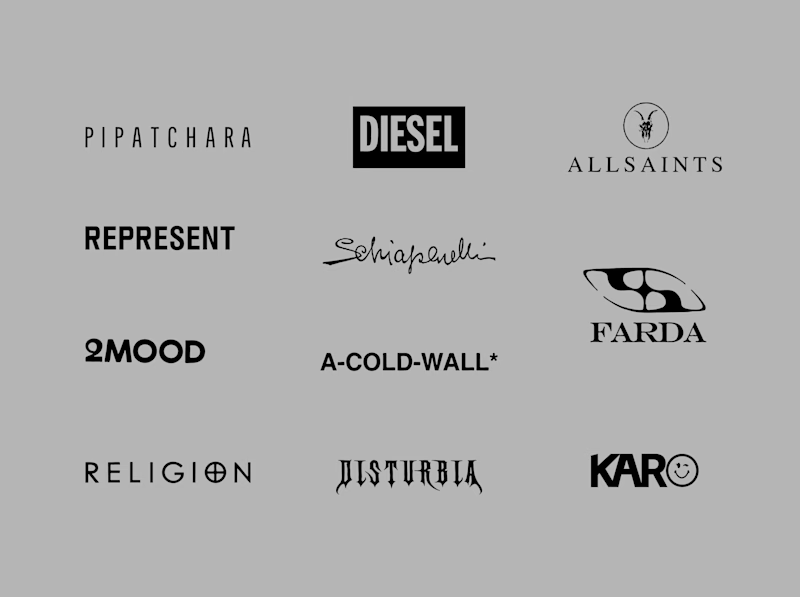
The fashion category needed a fresh point of view. Most established players relied on functional wordmarks and relatively restrained visual identities.
With Ru’asā, we took a different route. We challenged those conventions and built an identity designed to stand apart, be remembered and give the brand a world of its own.
Distinctive by design. Unconventional by nature.
Which would you choose?
Familiar category conventions
A fresh point of view
1 voted
11%
8 voted
89%
9 votes
Closed


Motion wins

FLIGHT OR TRAIN? — YOU DECIDE!
Two travel experiences. Two different vibes. One question: Which hero design would you choose?
A — Flight Experience ✈️
A modern, premium travel feel with a stunning aerial view and a clean booking interface.
B — Train Journey 🚆
A scenic, immersive experience featuring beautiful mountain views and a premium train-booking interface.
Both designs focus on making travel booking feel effortless, engaging, and memorable.
👇 YOUR TURN TO VOTE!
Which design wins your attention?
Drop your choice in the comments!


8 voted
80%
2 voted
20%
10 votes
Closed

Both look great, and it’s really hard to choose one over the other.

Same lettering, two color directions. Which one would you pick?
I got nostalgic this week looking at this lettering design. About 8 years ago I was deep into it and drew every day. Little by little I lost that rhythm, and now I only do it once in a while for gifts and small things.
Back then I could spend a lot of time choosing colors and comparing options. A taste test like this would have saved me so much time. 😅 I keep wondering how much I would have improved if I had never stopped practicing.
Is there something you used to practice a lot and would love to get back to? I had my lettering, illustration AND tufting phase.
37 voted
61%
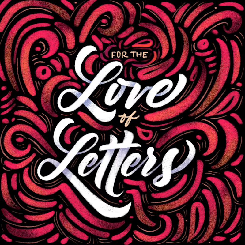
24 voted
39%
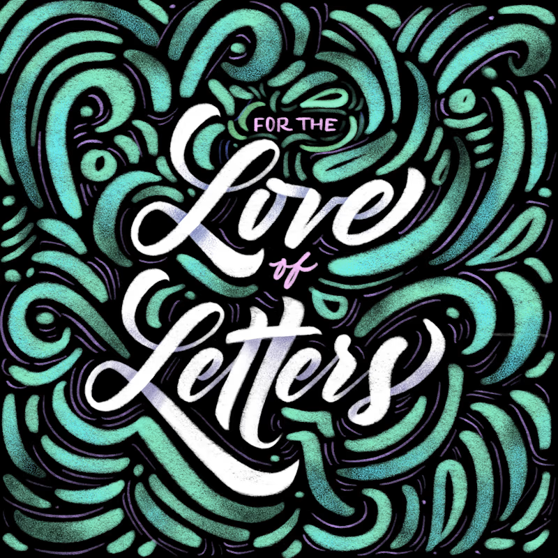
61 votes
Closed


8 years later and the lettering still holds up