The network for creativity
Join 1.25M professional creatives like you
Connect with clients, get discovered, and run your business 100% commission-free
Creatives on Contra have earned over $150M and we are just getting started
Back to feedPost
Taste Test


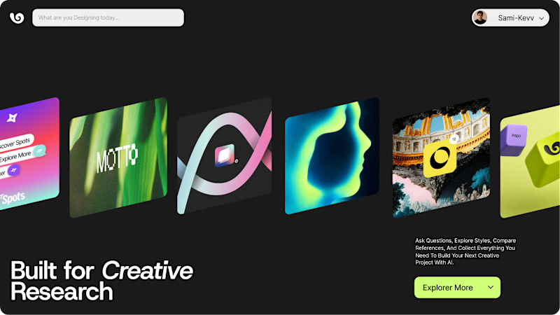
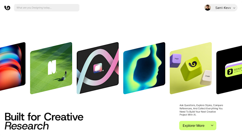


put the two users can choose

tap to that!

Has to be dark mode for me.
cause of my habits and all

Option 1

Option 2

i love this premium work

Voted option 1. Dark mode makes those gradient app icons pop way more than they do against the light lime background, and it feels more premium for a research tool.

Option 1 for me. The dark mode makes the visuals pop and gives the interface a more focused feel. I think using Framer is a good choice for things like this.
The network for creativity
Join 1.25M professional creatives like you
Connect with clients, get discovered, and run your business 100% commission-free
Creatives on Contra have earned over $150M and we are just getting started





Related posts


dithered reads calmer against the blue pill icon. pixelated competes with the card edges more.


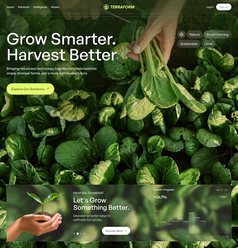
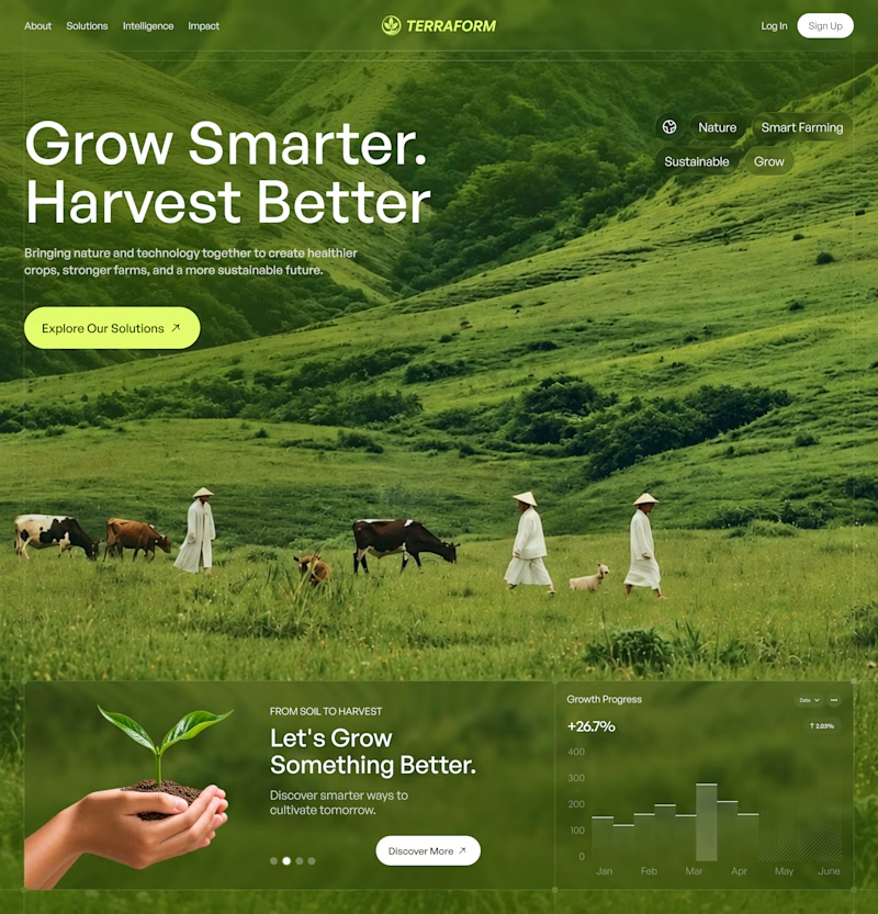

Both look great, but A feels more memorable at first glance.

Do you prefer having cards directly on the hero section for a faster access, or a minimal hero layout that focused on visual impact?
Which approach works better for a music plateform?
6 voted
50%
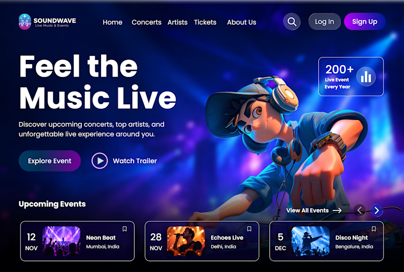
6 voted
50%
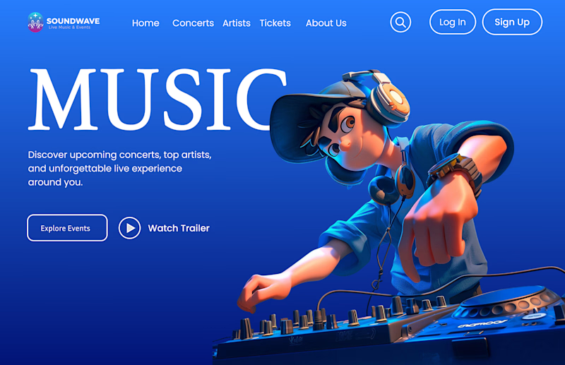
12 votes
Closed

Immersive Dark UI is stunning🔥🔥🔥🔥