The network for creativity
Join 1.25M professional creatives like you
Connect with clients, get discovered, and run your business 100% commission-free
Creatives on Contra have earned over $150M and we are just getting started
Back to feedPost

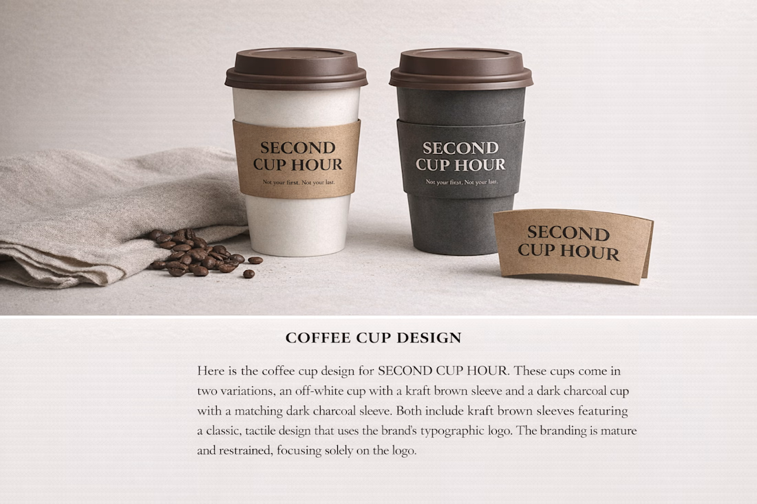
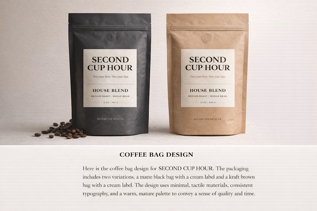
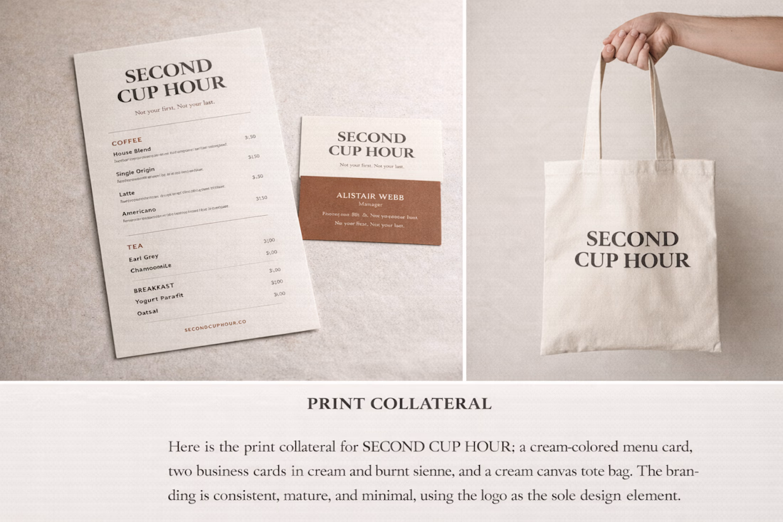
Second Cup Hour is a modern, minimalist coffee brand designed for early-morning office and workgoers who rely on routine, quiet moments, and consistency rather than spectacle.
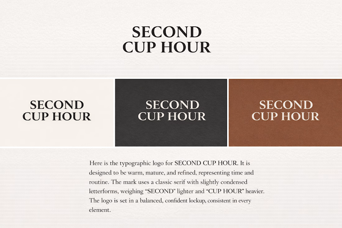
The brand identity is intentionally mature, warm, and restrained, reflecting the idea of a second cup not rushed, not indulgent, but dependable and familiar. Typography takes center stage, using a classic serif with subtle weight contrast to convey confidence, adulthood, and a sense of time.
The packaging system focuses on tactile materials, neutral tones, and minimal layouts to create a calm visual presence suited for daily rituals. Rather than competing for attention, the design aims to feel trusted, timeless, and quietly premium—something that belongs naturally on a work desk or in a morning commute.
The network for creativity
Join 1.25M professional creatives like you
Connect with clients, get discovered, and run your business 100% commission-free
Creatives on Contra have earned over $150M and we are just getting started

Challenges
View all


Related posts

Brand Identity for Propane
Propane is an experience-led platform firm that helps organizations sell and scale complex offerings. We operate between traditional agencies and large
consultancies: strategic, but accountable to what actually gets built.
The brand identity for Propane is built as a disciplined, scalable system that
reflects its role as an experience-led platform firm operating between agencies and consultancies. Positioned at the intersection of human-centered thinking and industrial-grade complexity, the identity resolves this tension with calm confidence—balancing precision, systems logic, and usability without leaning into coldness or superficial warmth.
View full project and more structured context on the link above or my profile.
Feel free to share your constructive feedback ⚡

Yooo this visual language is great🔥


You spend 6 figures on a brand tracking agency. They spend three months "running the wave." You get a 100-page slide deck that tells you what happened in Q2 while you’re already halfway through Q3.
That’s a post-mortem, not a strategy.
We built the identity and product framing for Timelaps to represent the opposite: continuous visibility.
Research-grade data from 4,000+ consumers, flowing in real-time. No "waves", no dusty decks, just an always on dashboard that shows you if your marketing is actually landing before the budget is gone.
If you’re still waiting 90 days to see if your brand is growing, you’re flying blind.


I have to say, You leave an ipression everytime you appear in my feed. You have got great taste Daniel💪

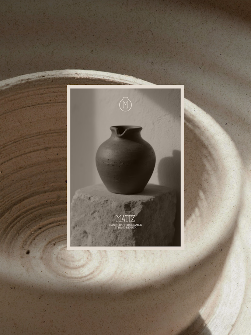
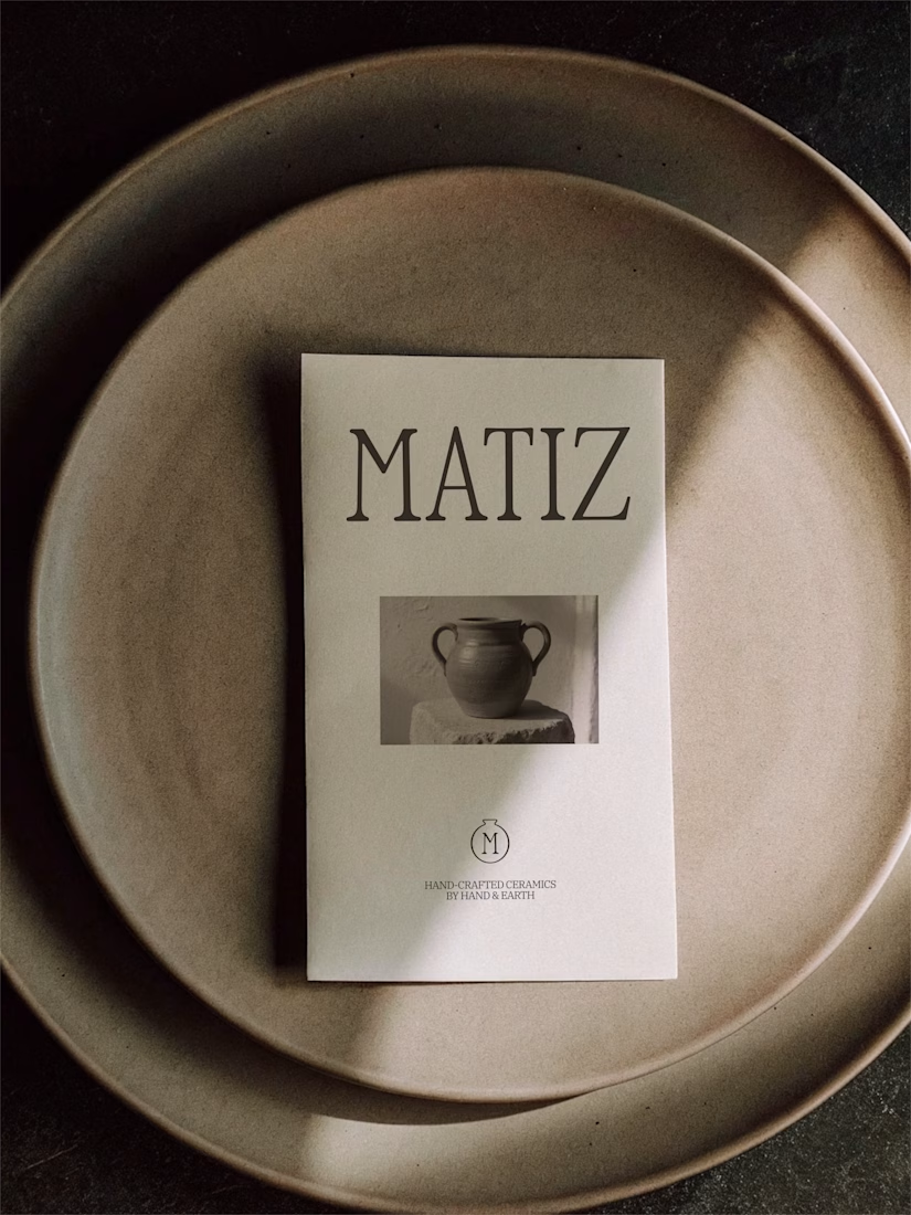
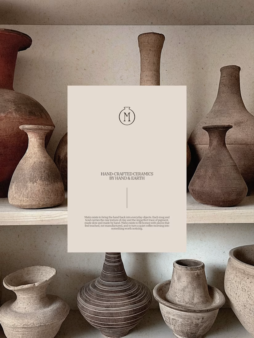
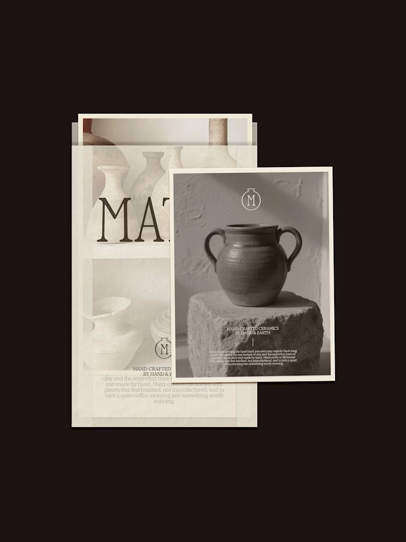
MATIZ pt. 2
Matiz is a handmade ceramics brand built around raw texture, natural pigment, and the small imperfections that make something feel truly made by hand. Matiz creates mugs and bowls designed for slow mornings, and decor for quiet, tactile homes.
View the full project here

Great work!


