The network for creativity
Join 1.25M professional creatives like you
Connect with clients, get discovered, and run your business 100% commission-free
Creatives on Contra have earned over $150M and we are just getting started
Back to feedPost
Taste Test
Hi Contra Community! 👋
I’d love to get your opinion on this logo concept for Fabrial, a clothing brand I’m working on.
Which version feels stronger to you — with the border or without it?
I’m curious to hear which one feels more clean, memorable, and suitable for a fashion brand. Your feedback would be really helpful. 🙌
3 voted
50%
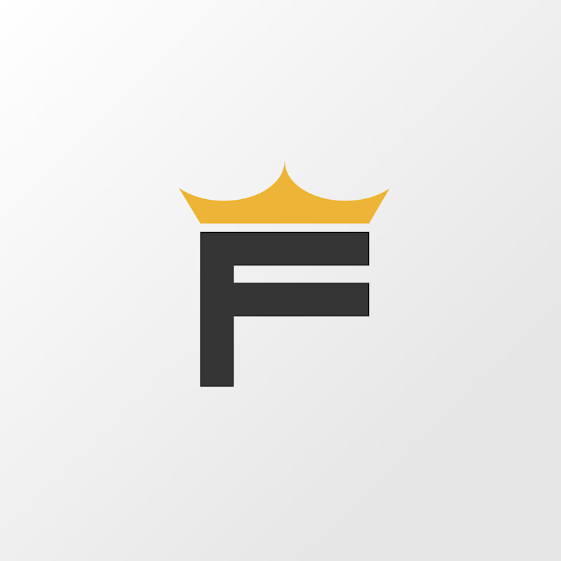
3 voted
50%
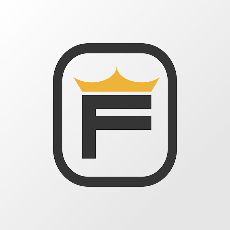
6 votes
Closed

The border treatment gives the mark a confident, badge-like silhouette; I’d test it at tiny label sizes next, but the core shape is already very memorable.

Really appreciate your feedback.

Appreciate your opinion! It really helps.


Option 2 feels clean and strong. The border gives the F a nice shape.
Thanks for the feedback.

option 1
The network for creativity
Join 1.25M professional creatives like you
Connect with clients, get discovered, and run your business 100% commission-free
Creatives on Contra have earned over $150M and we are just getting started








Related posts


Collage

I'm excited to share the full case study from our collaboration on the Unik Mindz logo design and branding, completed in August 2026.
Unik Mindz is a creative design studio born from the legacy of the Unik family brand. Founded on the belief that every idea begins with a unique mind, the studio needed an identity that could carry that message and become the face of the brand.
The logo draws inspiration from Michelangelo’s The Creation of Adam, focusing on the idea of connection. It captures the moment two minds meet to create something greater, reflecting the brand’s conviction that meaningful creativity starts with connection.
We wrapped the project with a clear system and guide for how the brand assets should be used going forward.
Want to work with us? Send a DM or email to info@donatus.agency


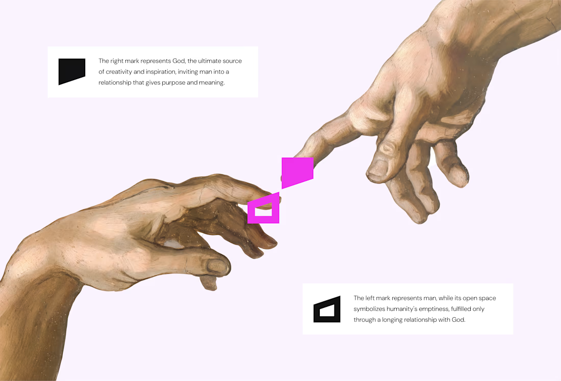
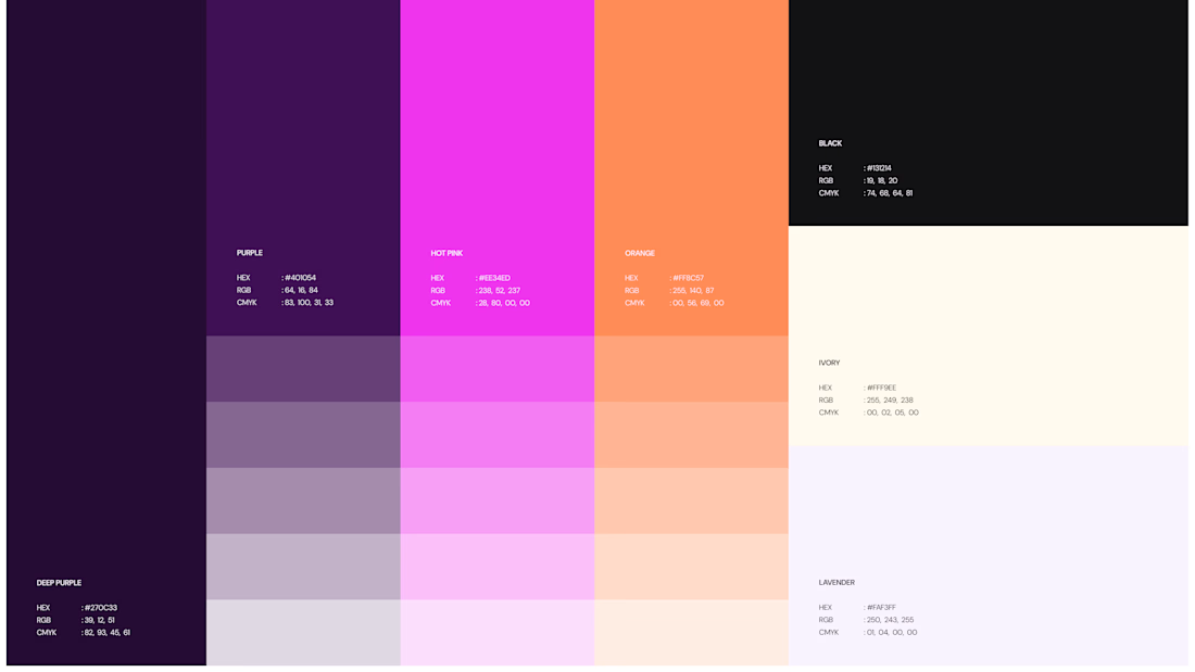
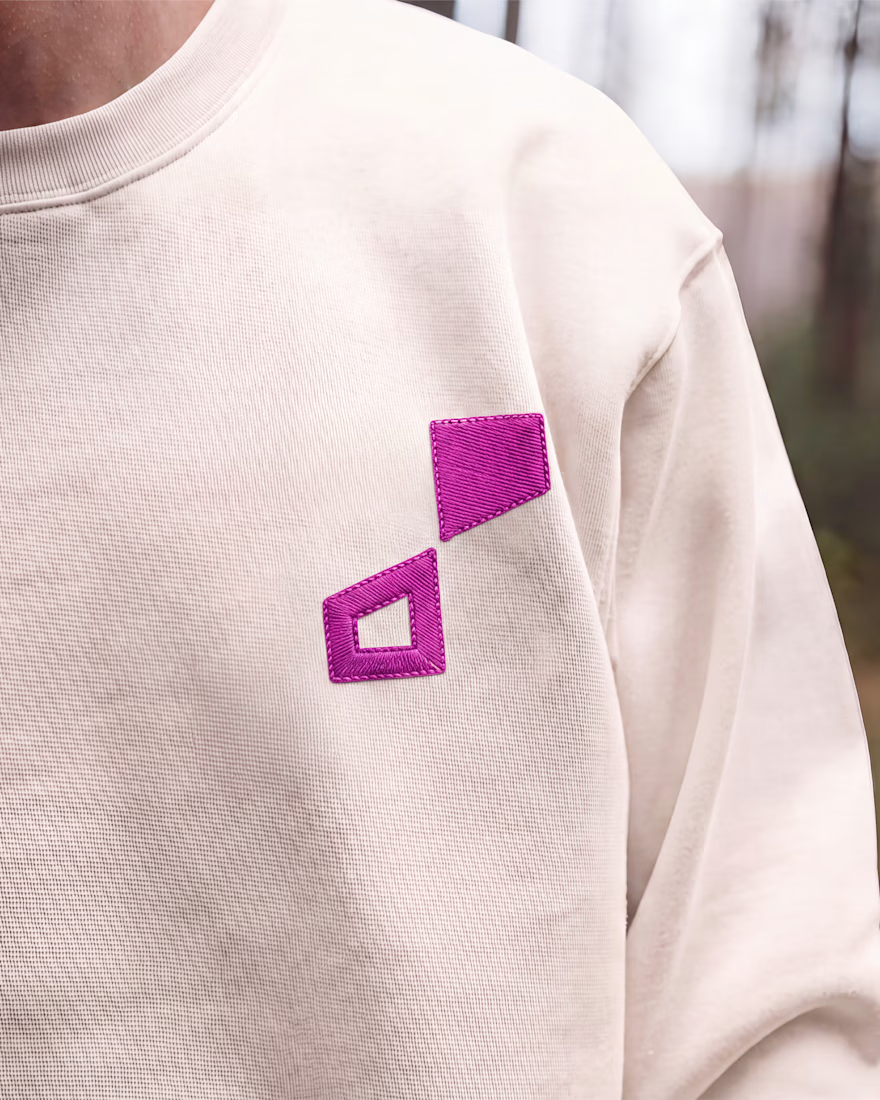

Honestly I never see something like this before I love the uniqueness of the design and it's vibrant color palette great job 🎉🎉

This year, I worked on a mental health app where I explored using water to represent brainwaves and quality sleep.
I think it communicates the idea much better than the typical green energy orb. 🌊
What do you think?
27 voted
43%
36 voted
57%
63 votes
Closed

Love the energy orb. which one is your pick here?