The network for creativity
Join 1.25M professional creatives like you
Connect with clients, get discovered, and run your business 100% commission-free
Creatives on Contra have earned over $150M and we are just getting started
Back to feedPost
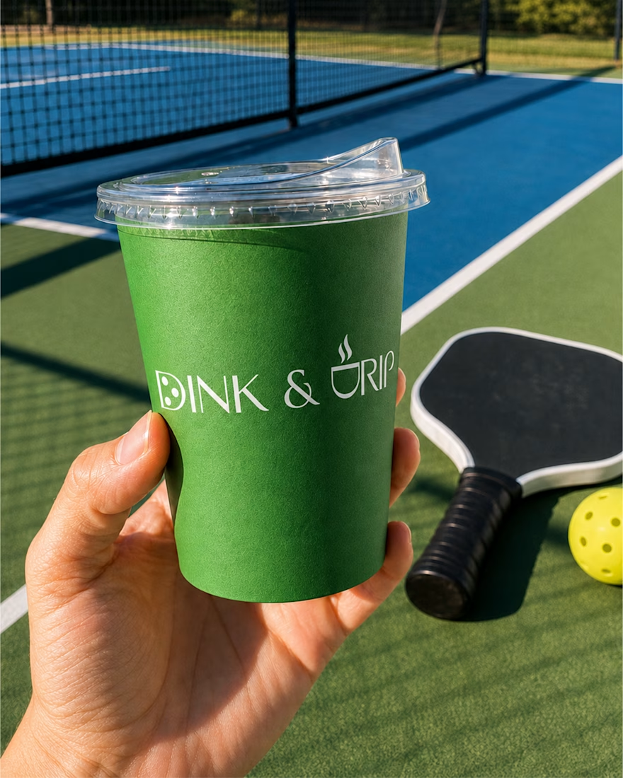
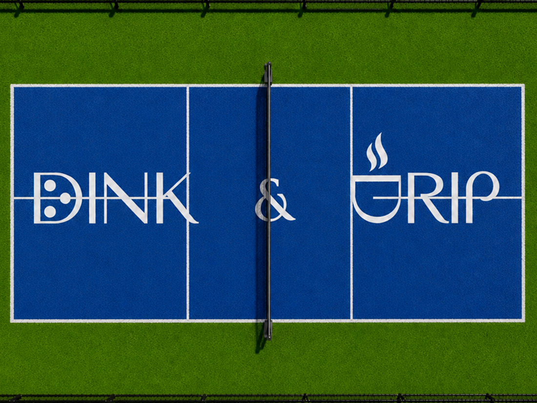
DINK & DRIP - Where the serve meets the sip.
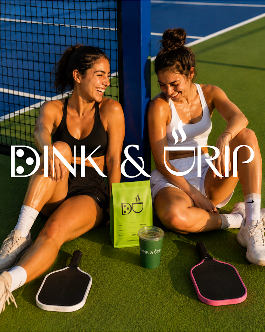
A brand built at the intersection of two rituals, coffee and pickleball, for a generation that treats the court like a social club and coffee like a pre game ritual.
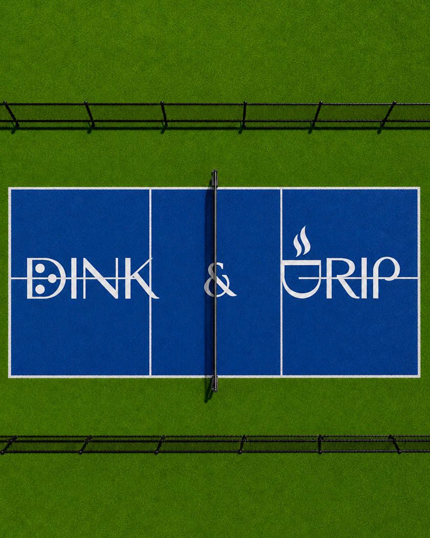
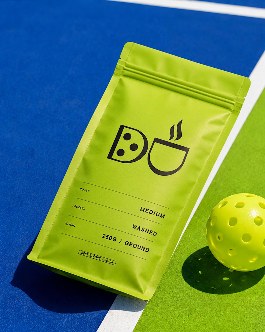
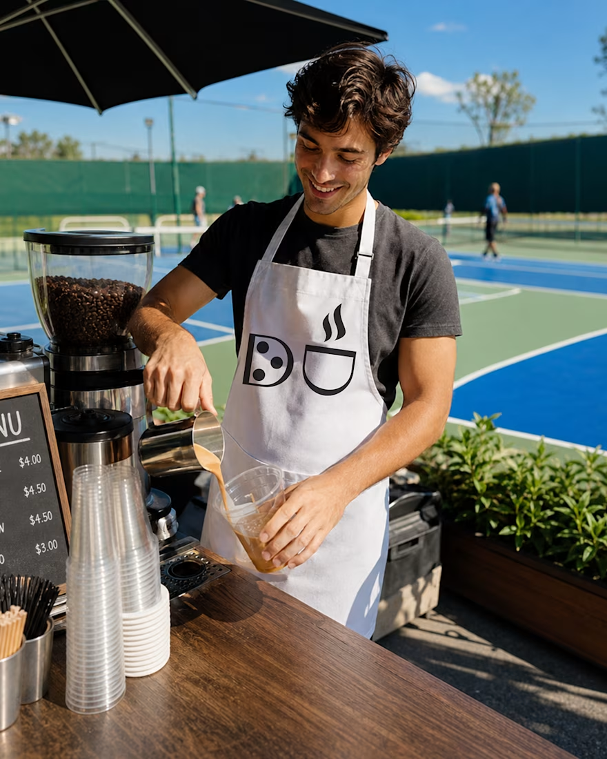
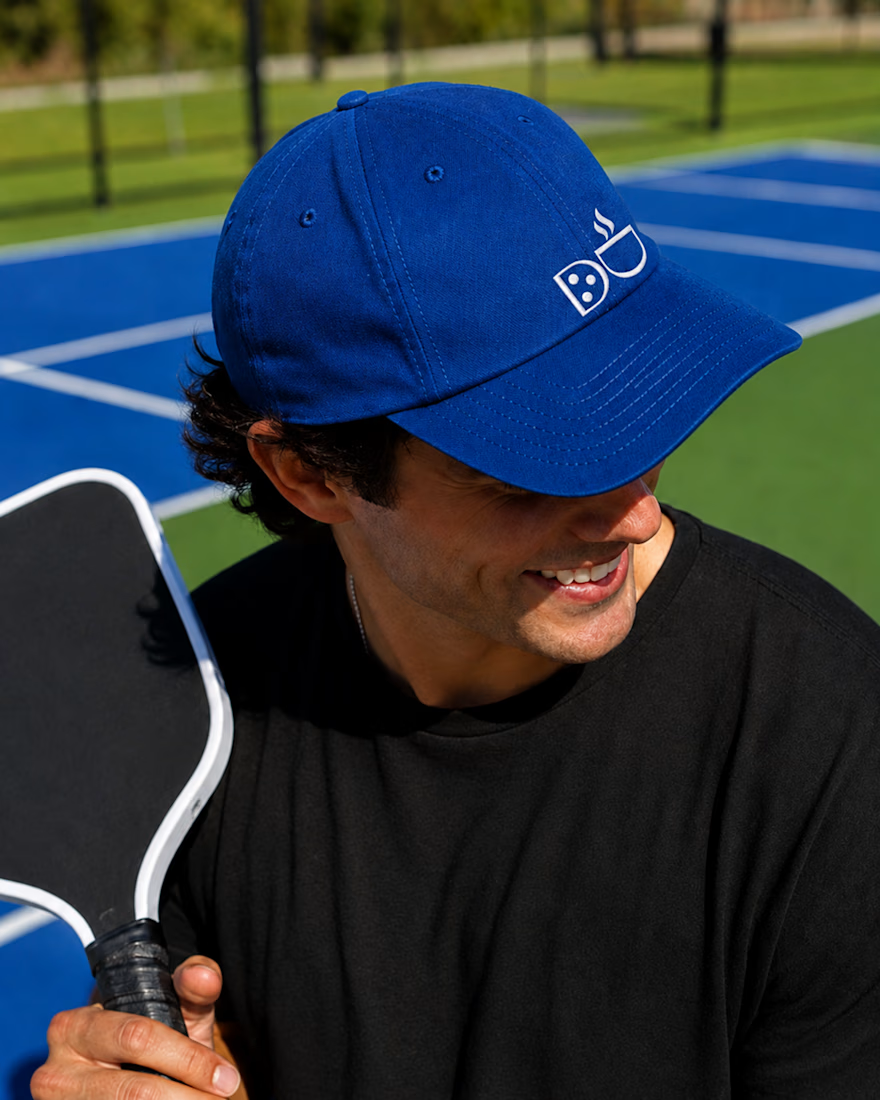
The mark says it all before a single word does. One D becomes a paddle. The other is turned into a cup, topped with a curl of steam. One letter, two rituals, one story, working just as hard on a cap as it does painted across an entire court.
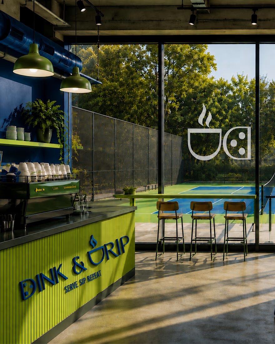
Cobalt, chartreuse, and forest green. An editorial serif paired with a playful icon. And a tagline that does double duty as brand voice: Serve. Sip. Repeat.
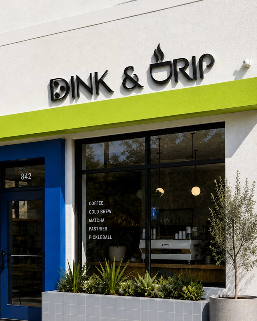
From storefront signage to packaging to a literal court branded takeover, this identity was built to move fluidly across every touchpoint without losing itself once.
Full case study coming soon.

More from DINK & DRIP
The network for creativity
Join 1.25M professional creatives like you
Connect with clients, get discovered, and run your business 100% commission-free
Creatives on Contra have earned over $150M and we are just getting started










Related posts

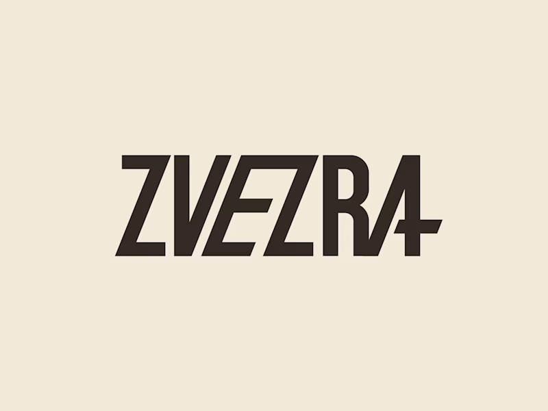
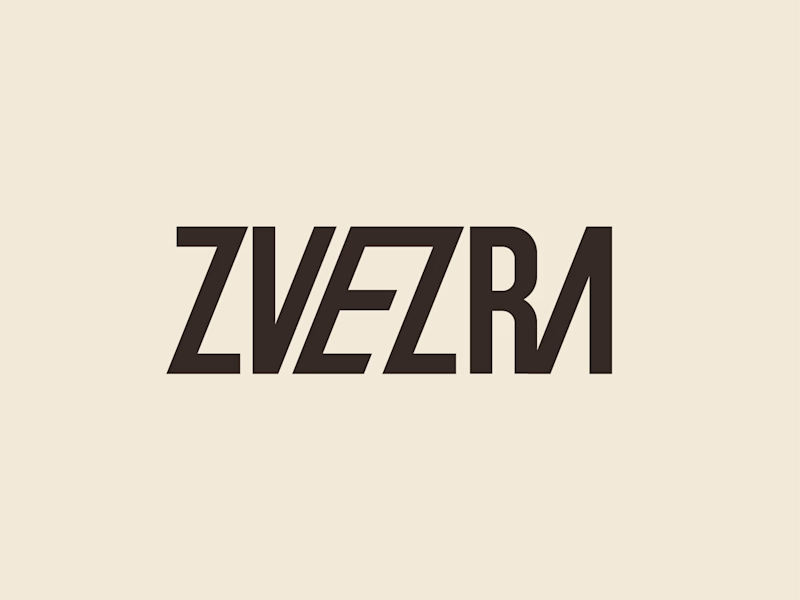
Which ZVEZRA logo direction do you prefer? 👀
I’ve been exploring two variations of the wordmark. Both follow the same visual direction, but each has its own character.
Vote below!
I’d love to hear your thoughts! 👇

39 voted
53%
34 voted
47%
73 votes
Closed

Option 1 for me, it has a bit more personality. Both are strong though, tough call

Recovery Brand Identity / Logo & Visual Direction
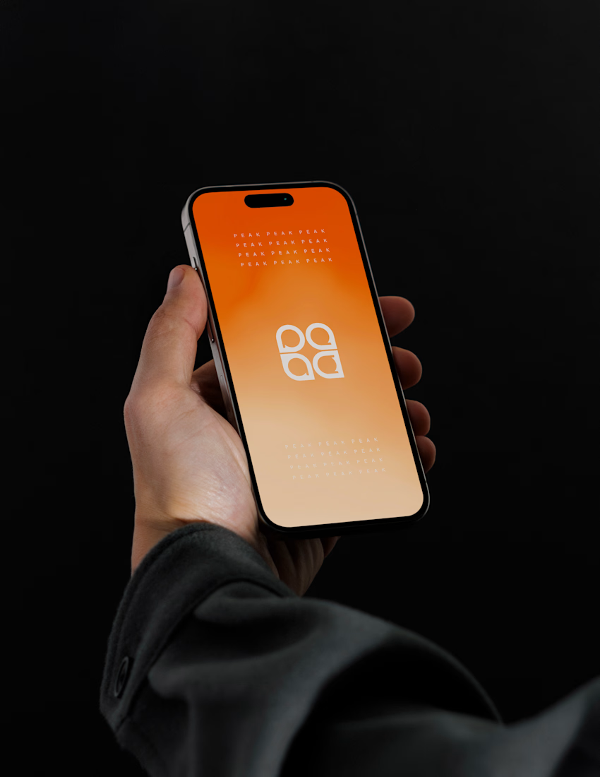
A new identity project for a recovery-focused brand that wanted to move away from the conventional clinical look of its category.
The direction combines clinical credibility with a more modern, movement- and performance-driven visual language.
First look at the logo. Full identity coming next.
Logo design and creative direction by Lepisov Branding
Social media Branding: collab with Mike Creative Mints



Beautyy