The network for creativity
Join 1.25M professional creatives like you
Connect with clients, get discovered, and run your business 100% commission-free
Creatives on Contra have earned over $150M and we are just getting started
Back to feedPost
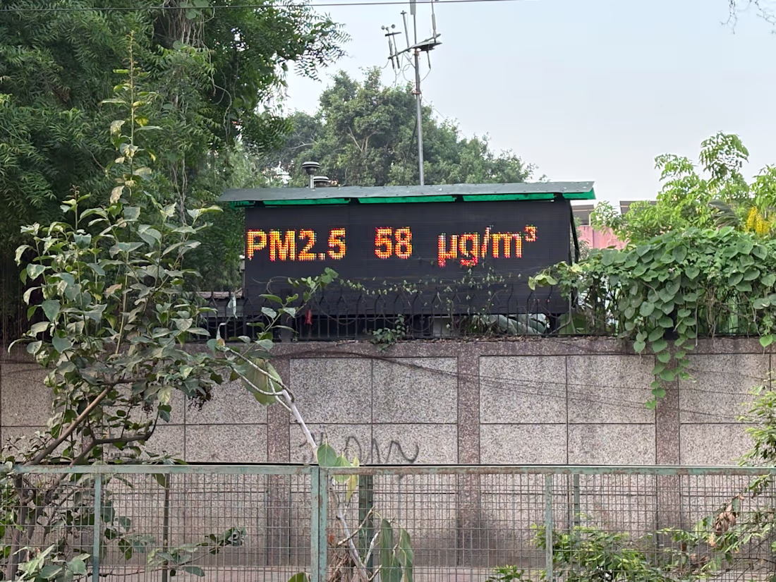
This morning, during a walk, I came across a public display board showing live air pollution data.
“PM2.5 58 µg/m³”
Then it switched to ozone levels. Then NO₂. Then more scientific terms.
And that got me thinking:
This is a perfect example of how information can be technically correct but still fail the user.
Most people passing by won’t know:
• What PM2.5 means
• Whether 58 is dangerous
• If it’s safe to exercise outside
• Or if they should simply wear a mask
The data exists.
The communication doesn’t.
Good UX isn’t just about apps, websites, or shiny interfaces. It’s about translating complexity into clarity. Especially in public experiences where everyone, regardless of background, should understand what’s being communicated.
Imagine if the board instead said:
🟢 Air Quality: Moderate
😷 Sensitive groups should wear masks
🏃 Outdoor exercise: Okay in moderation
Same data.
Far better experience.
Design is not only about displaying information.
It’s about making information understandable.
The network for creativity
Join 1.25M professional creatives like you
Connect with clients, get discovered, and run your business 100% commission-free
Creatives on Contra have earned over $150M and we are just getting started
Related posts
Avoiding the obvious is one of the hardest parts of branding.
If the project is connected to the music industry, the first solution that comes to mind is almost always a note or an instrument.
Everyone understands the category immediately, yes.
But they probably won’t remember the brand.
That symbol won’t tell you if the brand is about discipline, energy, intimacy, underground culture, technical precision, experimentation, or mass entertainment.
A symbol becomes interesting when it’s transformed, reduced, connected with other elements, and brought into a visual system built around a specific problem.
The work becomes interesting when you’re not simply representing the most obvious symbol, but interpreting the experience.
A typographic composition that suggests rhythm.
A grid that feels like timing.
Empty space that makes you feel pause.
A visual system that behaves like a composition, instead of simply showing a note.
When design is too literal, it leaves you at the first level and becomes intellectually thin.
Good branding goes deeper and becomes memorable.
100% 😊
Tokenomics isn’t design decoration — it’s communication.
For Vortex FX, we created a tokenomics landing page concept built for readability and trust. Clean layout, strong hierarchy, and controlled 3D animation help guide users through the story without overwhelming them.
Designed to feel modern, structured, and conversion-ready.
This was created with a design subscription from FANCY — and yes, we’re currently open to new projects.
Stunning!
I can't wait to animate this little guy!
eggcellent character design! 🔥
Trending
Claude
Claude has entered the design space. How are you using Claude Design?
Contra University
Learn from expert creatives how to earn more using next-gen AI tools.
creativeaiflow
Creative AI workflows are evolving. What tools do you use, and what are their strengths and weaknesses?
portfolioreview
The best portfolios tell a story, not just show a grid. Share yours for feedback.
freelancerlife
Freelancer life is wins, pivots, and everything in between. What’s yours right now?