The network for creativity
Join 1.25M professional creatives like you
Connect with clients, get discovered, and run your business 100% commission-free
Creatives on Contra have earned over $150M and we are just getting started
Back to feedPost
Taste Test
Both looks good 👍
Love the dark mode one!
I will go for the black mode!
I prefer dark theme
option 2 for me, dark mode looks more refined. spacing is on point either way
I appreciate that Noah!
Both look good, but the light option greatly improves readability due to the contrast.
Both looks good. i choose auto that set according the phone mood.😍
wise choice man!
White look clean
White is brighter. Great work
Light one looks better to me for this one!
I'm a Dark-themed person....I'll go for options 2
The network for creativity
Join 1.25M professional creatives like you
Connect with clients, get discovered, and run your business 100% commission-free
Creatives on Contra have earned over $150M and we are just getting started
Related posts
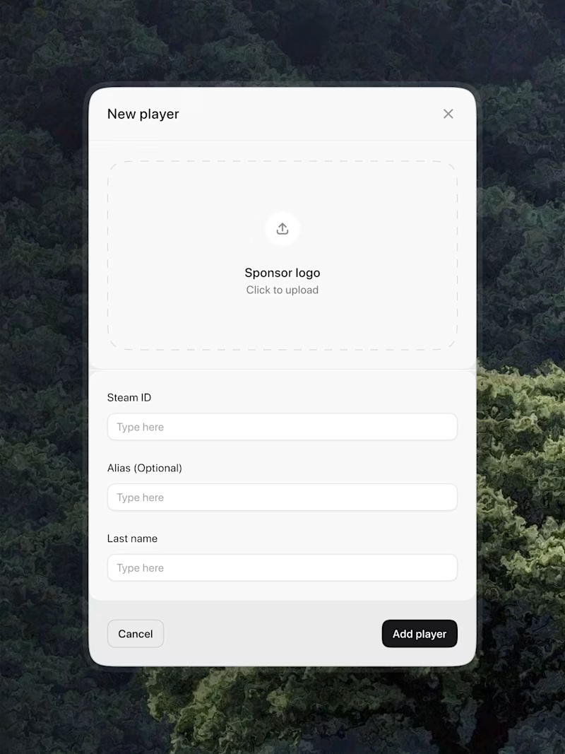
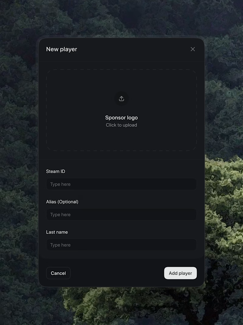
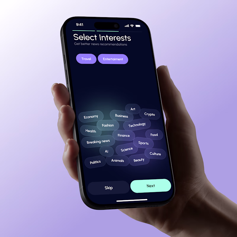
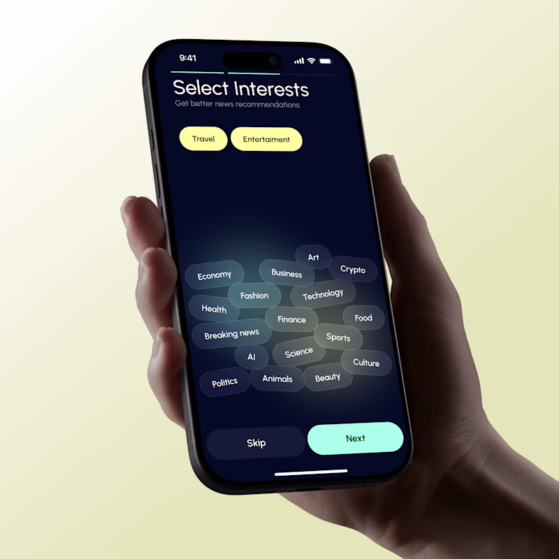
Light or dark. Which theme works better here?
13 votes
Ends in 1d
The colours of dark mode is something that will keep me working on the site…..
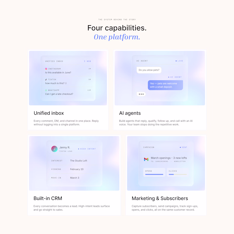
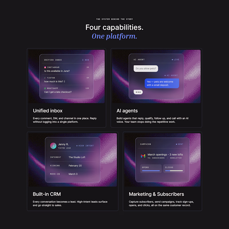
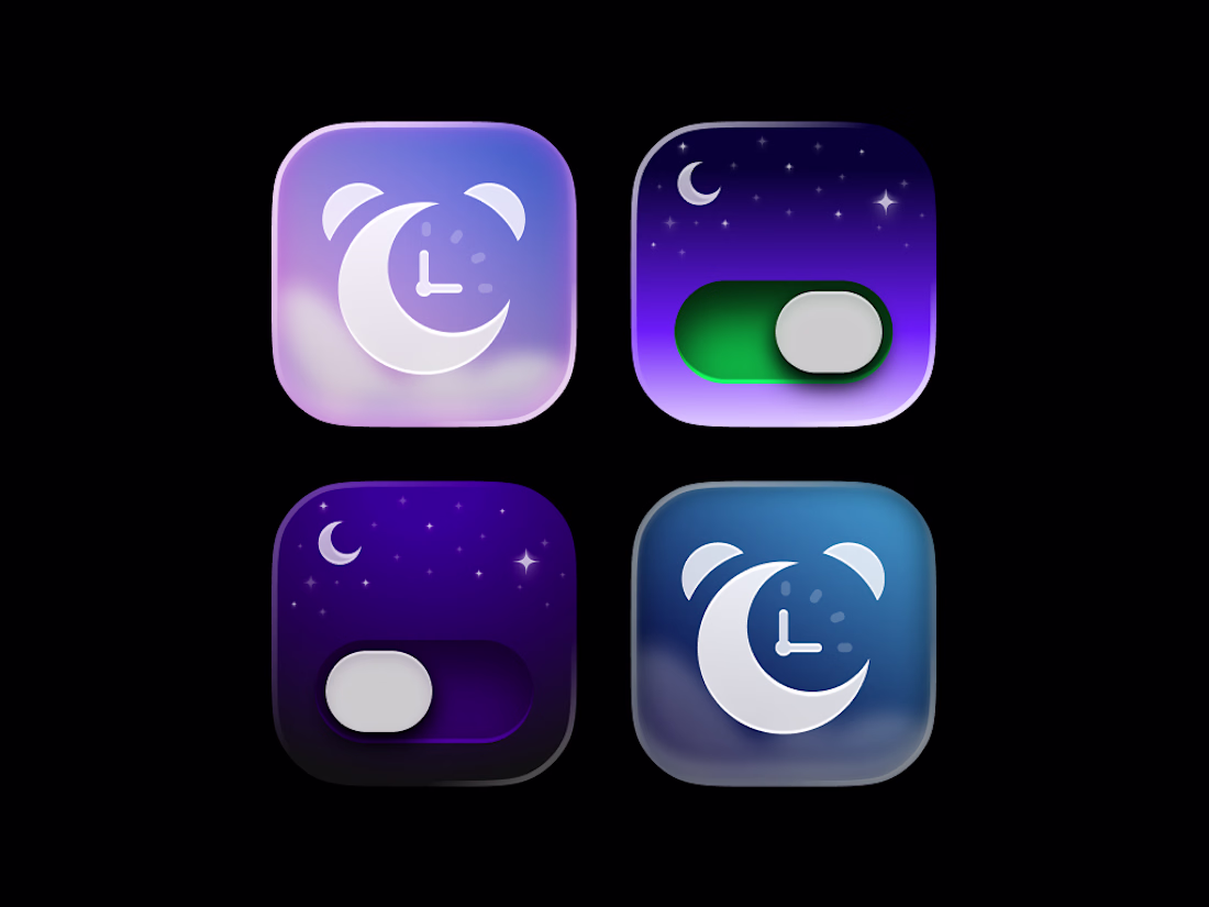
Color palette vote 🎨
Same product. Same layout. Different color direction.
Which palette feels stronger to you and why? 🎨
33 votes
Ends in 1d
Trending
Claude
Claude has entered the design space. How are you using Claude Design?
Contra University
Learn from expert creatives how to earn more using next-gen AI tools.
fifaworldcup2026
The World Cup is here and the whole world's watching. How are you designing for the world stage?
creativeaiflow
Creative AI workflows are evolving. What tools do you use, and what are their strengths and weaknesses?
freelancerlife
Freelancer life is wins, pivots, and everything in between. What’s yours right now?