The network for creativity
Join 1.25M professional creatives like you
Connect with clients, get discovered, and run your business 100% commission-free
Creatives on Contra have earned over $150M and we are just getting started
Back to feedPost
Taste Test
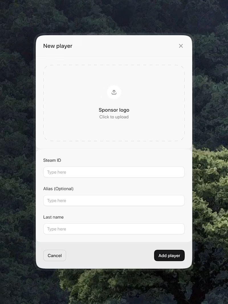
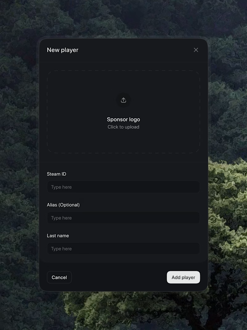
option 2 for me, dark mode looks more refined. spacing is on point either way
I appreciate that Noah!
nice work , i will prefer the light
Thanks! good choice
Love the dark mode one!
Both looks good 👍
I will go for the black mode!
I prefer dark theme
Both look good, but the light option greatly improves readability due to the contrast.
Both looks good. i choose auto that set according the phone mood.😍
wise choice man!
White look clean
White is brighter. Great work
Light one looks better to me for this one!
I'm a Dark-themed person....I'll go for options 2
The network for creativity
Join 1.25M professional creatives like you
Connect with clients, get discovered, and run your business 100% commission-free
Creatives on Contra have earned over $150M and we are just getting started
Related posts
Technology is slowly affecting our sleep patterns; we all know that internally.
You'll laugh when I tell you how many times I've passed out while working or scrolling at night!! Phone dropped on my chest. Laptop nearly kicked off the bed. Waking up at 3 am with the lights still on and a neck cramp.
Dim is a simple interaction that passively detects your eyes while you're working on a laptop or scrolling on your phone, mostly at night.
The moment you're sleepy, and your eyes stay closed for 5 seconds or more, it plays some music and wakes you just enough to put your phone down and actually sleep properly. As your eyes open, the music fades away.
And for those working against an early-morning deadline, when Dim catches your eyes drooping, it also gives you the option to take a nap. If you don't wish to sleep, set the timer, take a quick nap and wake up fresh. No more missing deadlines because you passed out and nobody woke you up.
I kept the interaction as simple, satisfying and warm as possible. I reimagined the light bulb as a group of fireflies sitting on a string. Pull the string - they fly away into the dark.
That's your light turning off. That's you finally sleeping properly.
Goodnight :)
Built with @Figma & Figma Make using TensorFlow.js (for face detection), MediaPipe (eye landmark tracking) and Eye Aspect Ratio (EAR) algorithm
i need this
Led design + full stack development for a wellness app.
Trending
Claude
Claude has entered the design space. How are you using Claude Design?
Contra University
Learn from expert creatives how to earn more using next-gen AI tools.
MagicPath
The canvas is infinite, and exploration is becoming the workflow. How are you using MagicPath?
creativeaiflow
Creative AI workflows are evolving. What tools do you use, and what are their strengths and weaknesses?
freelancerlife
Freelancer life is wins, pivots, and everything in between. What’s yours right now?