
Katya N.
Digital Designer · Making icons people actually want to tap
- $1k+
- Earned
- 1x
- Hired
- 21
- Followers
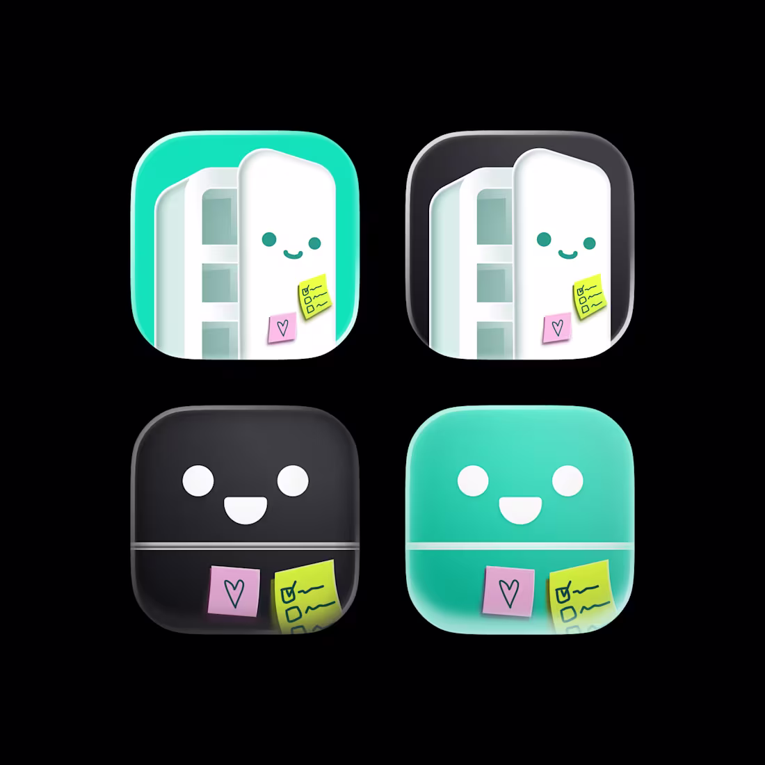
Fridge App Icon Exploration
2
2
20
Terminal app icon concept
2
53
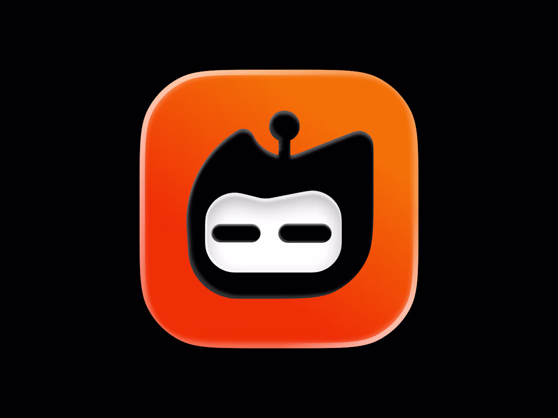
Designed an app icon for an AI coding buddy
1
108
Agentkit logo and animation
1
3
136
Small animation for app icons
1
50
Butterfly logo concept
1
145
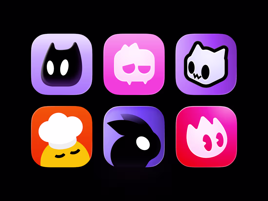
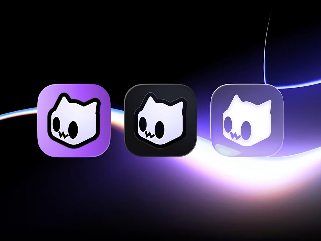
Cute Mascot App Icons Collection
2
1
App icon animation
6
5
254
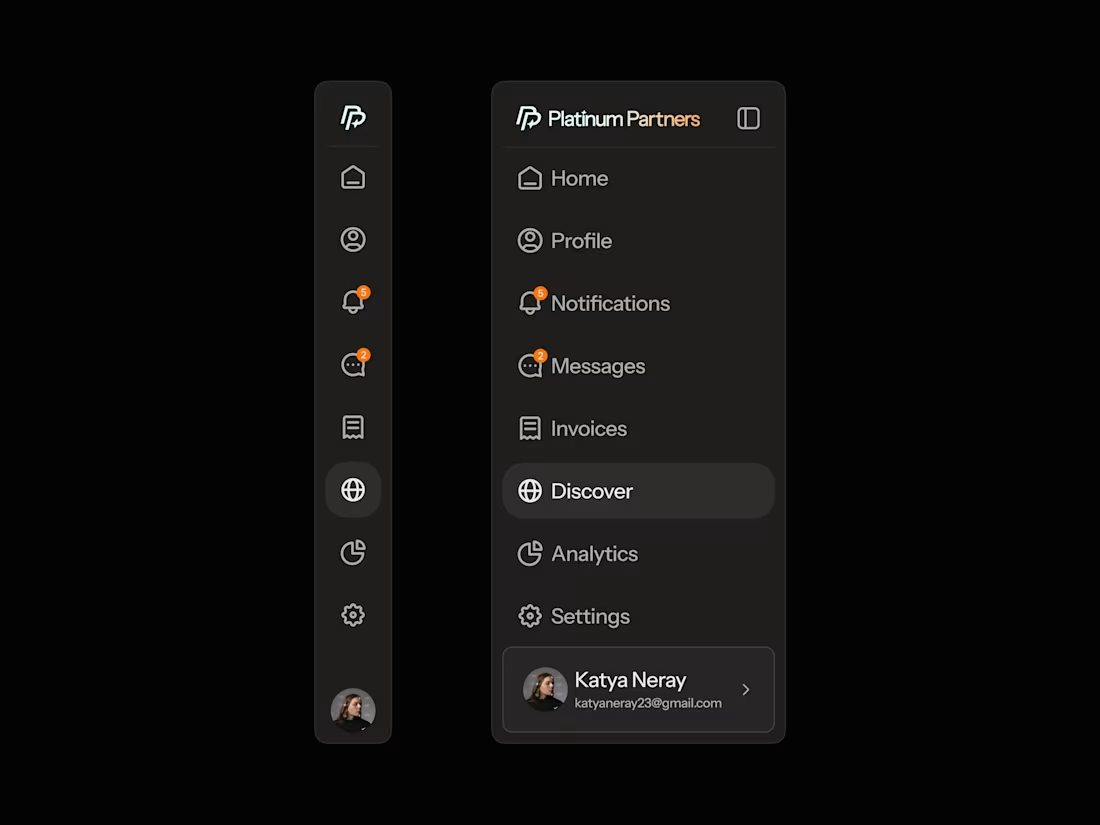
Sidebar UI
1
193
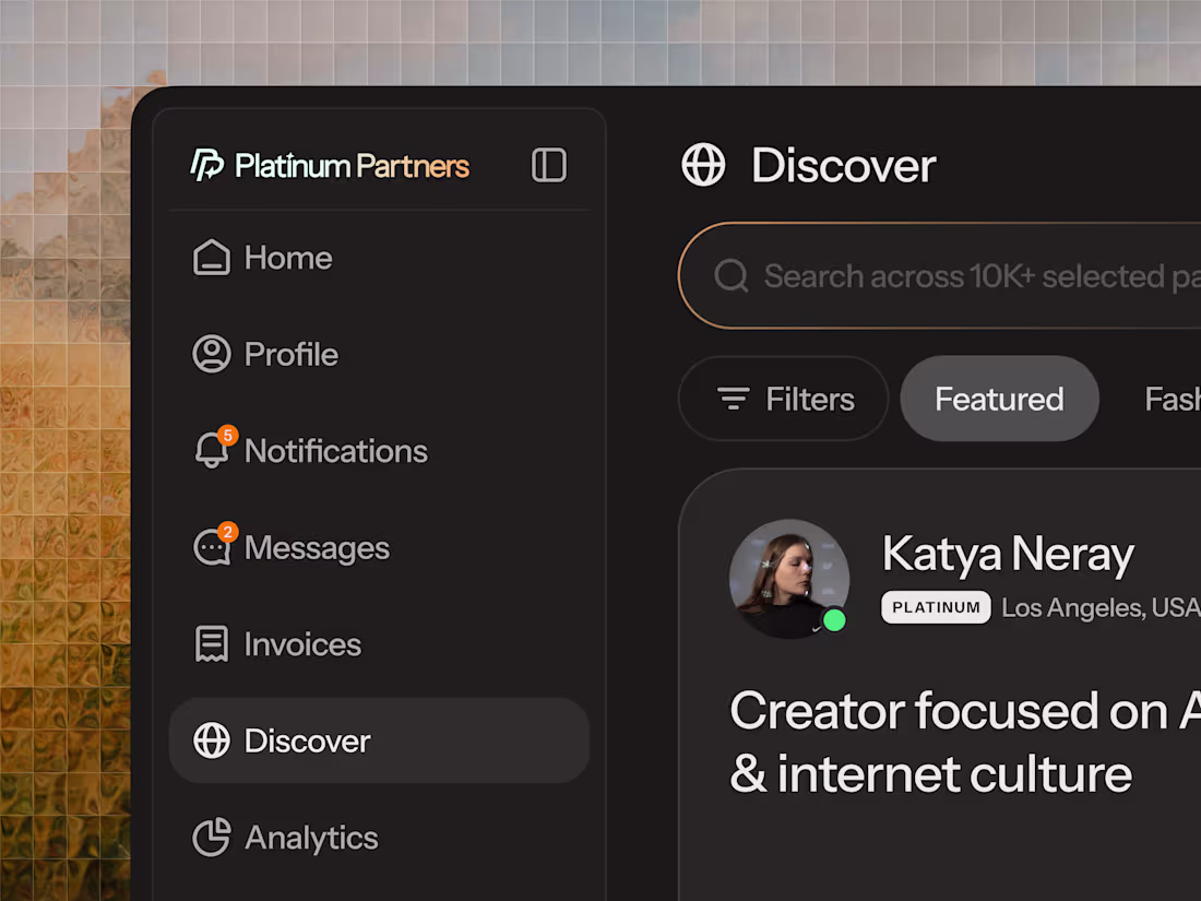
Logo concept for a design cooperation platform
2
201
Platform UI & Brand Direction
1
193
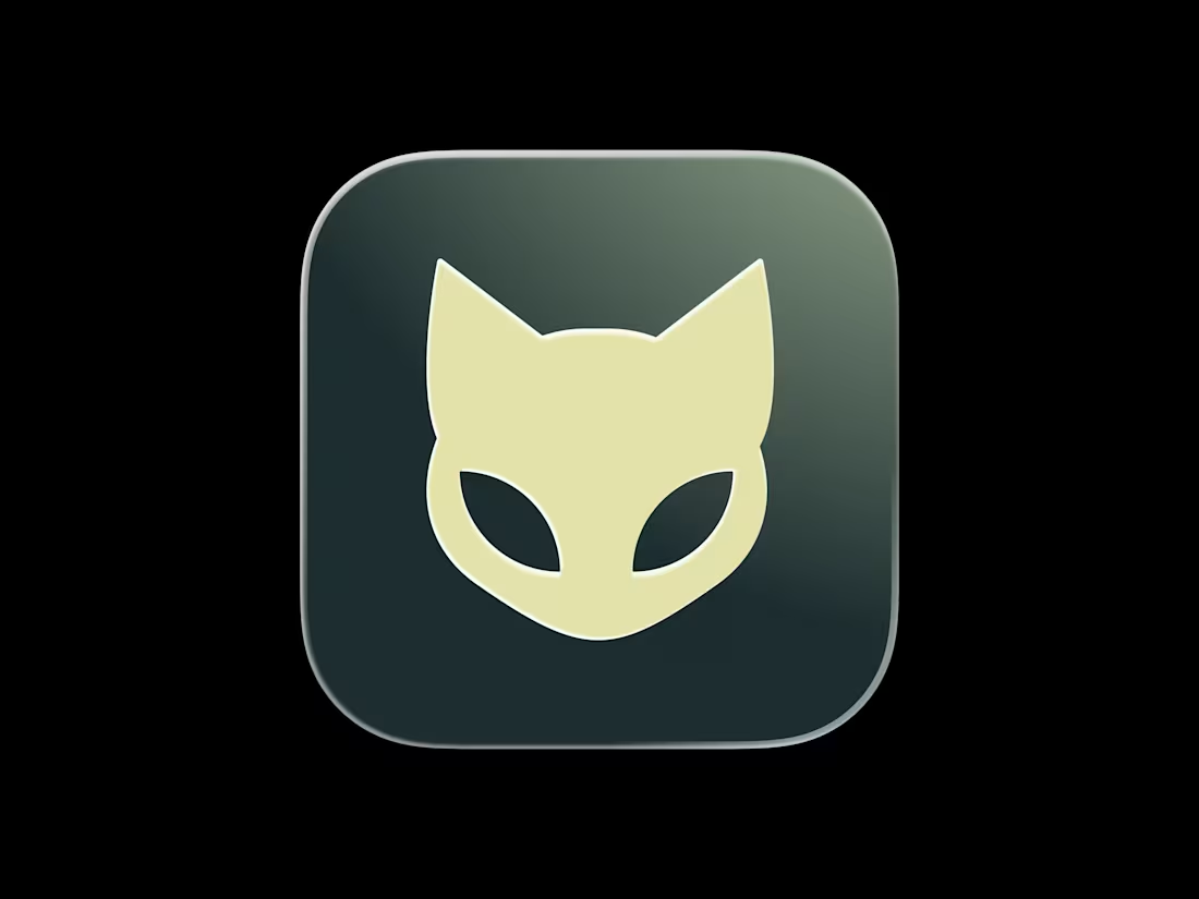
Designed a cute cat logo for a cloud infrastructure company
1
243
Trace | Crypto tracker app
1
0
Feather animation
3
68
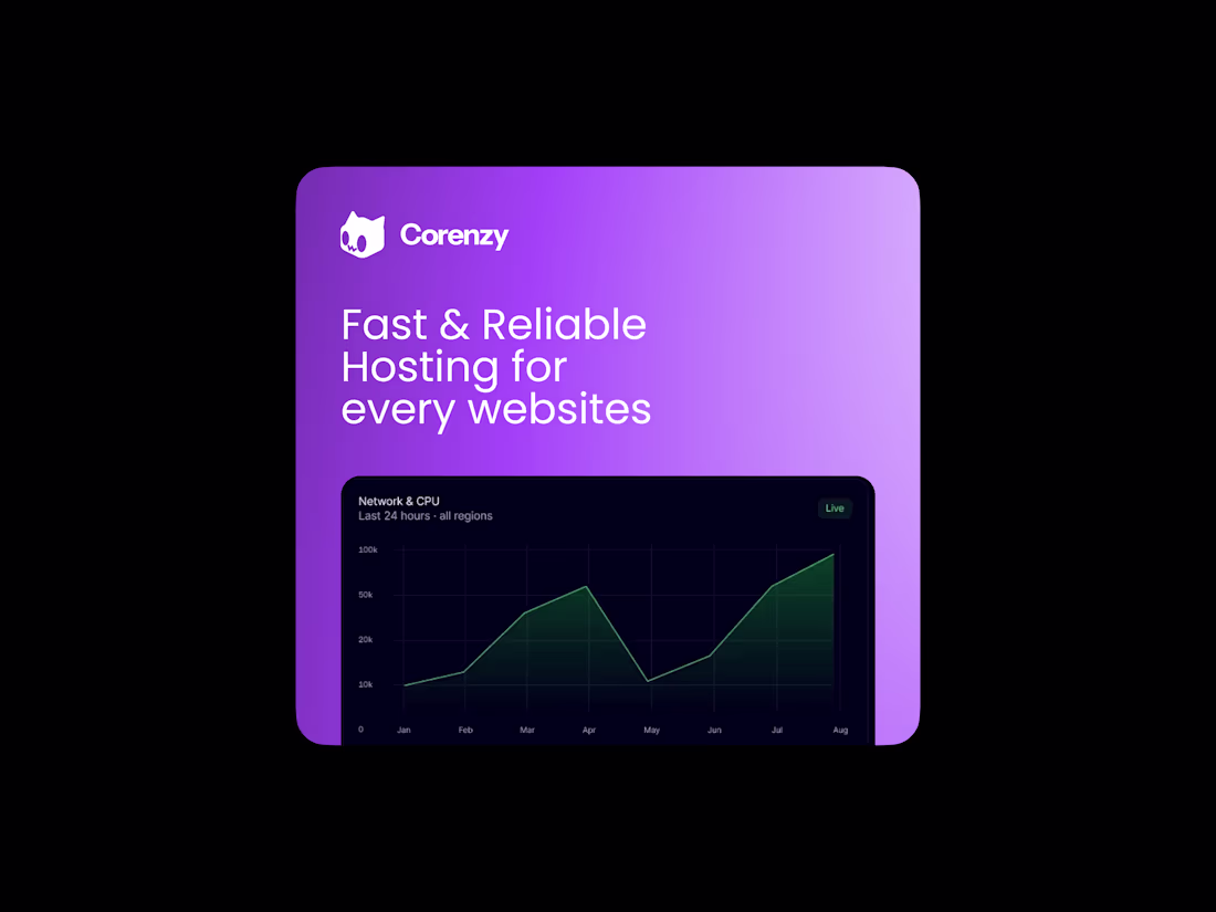
Designed a cube cat logo for a hosting company
1
223
made some motion design for an AI platform
better experience with sound
1
205
Light, Dark and Tinted mode for Corenzy app icon
1
168
Designed an app icon for a travel memories app
1
163
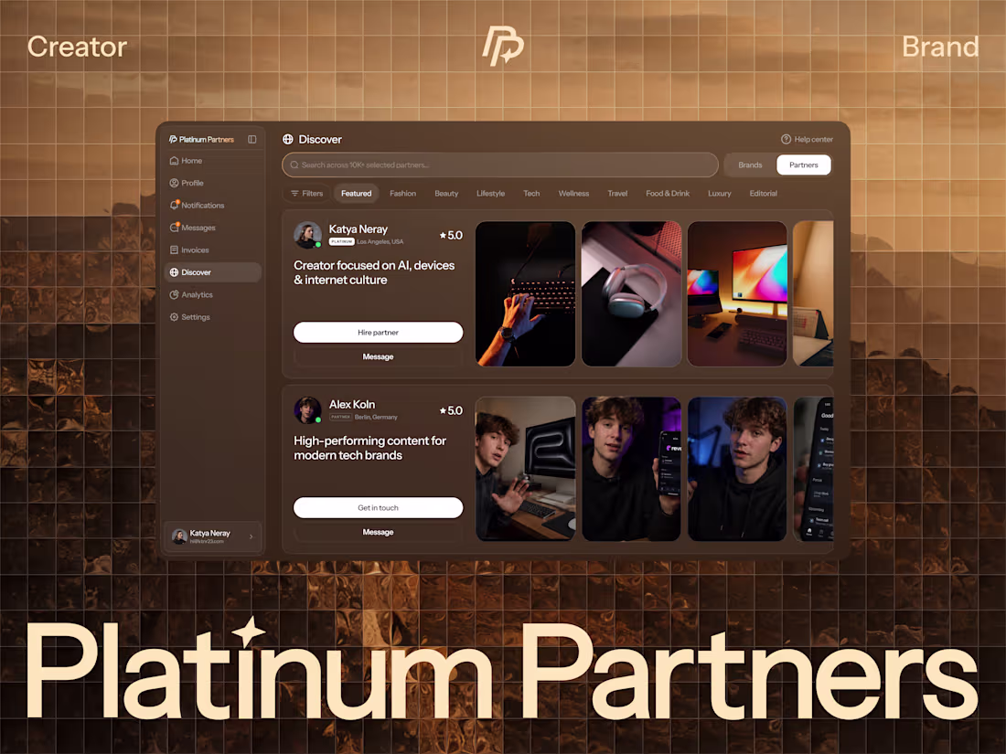
Platform UI & Brand Direction
1
174
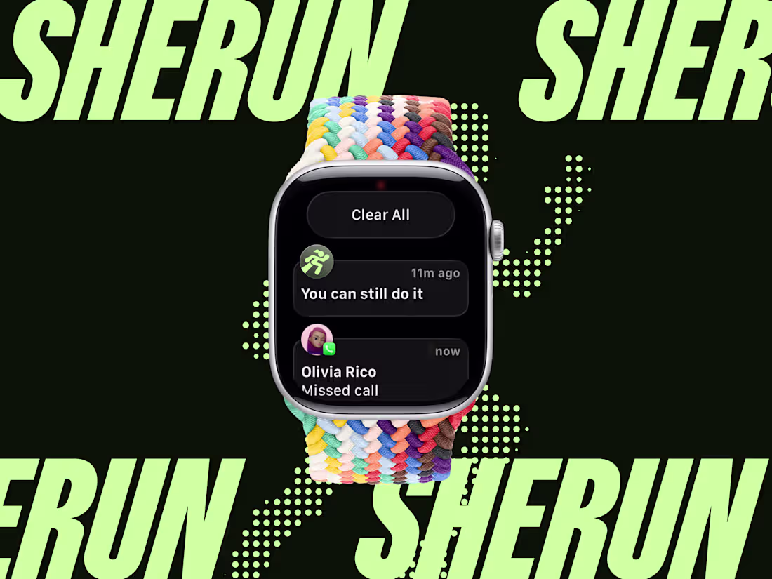
Fitness App Branding
1
5
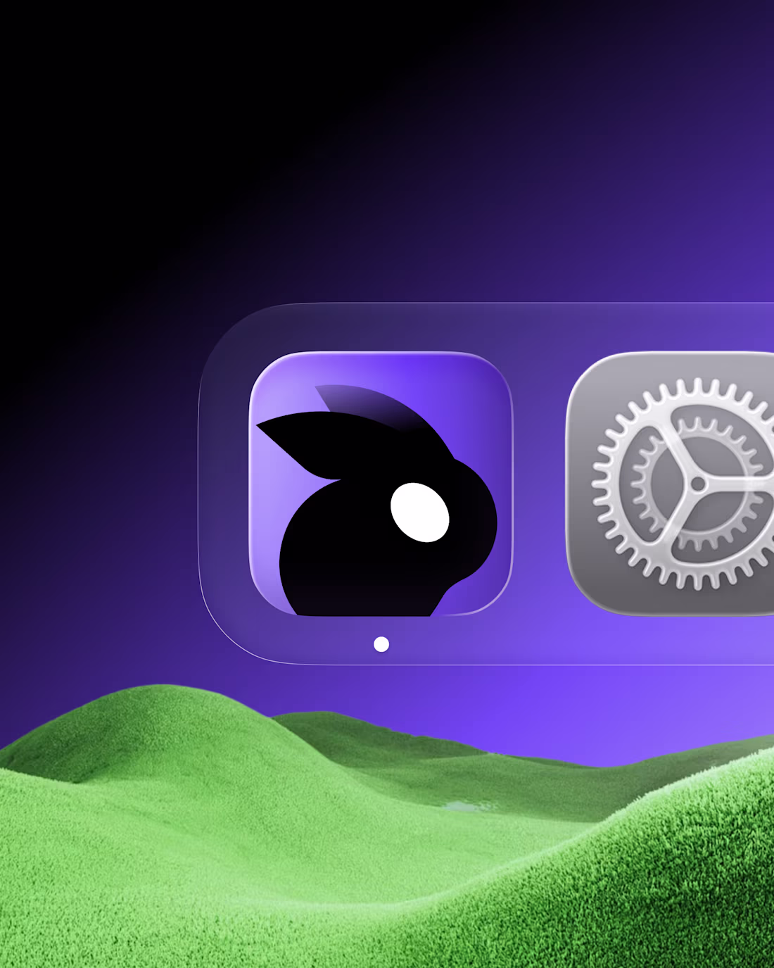
Designed an app icon with a cute rabbit
1
205
Designed an app logo concept for an AI platform
2
168
Designed an icon for a learning app
1
220
designed mascot for another habit tracker
1
195
app icons I designed in May
1
171
Designed an app icon for a travel memories app
1
158
Designed a cube cat logo for a hosting company
1
122
Designed an app icon for a new music platform
1
181
Designed an app icon for a anon-dating app
1
165
motion shots from an upcoming case study
1
164
some motion work for an upcoming project
1
154
EKZO® — Package design
Nicotine Pouches · European Market · 2026
The visual system is built on acid accents, dynamic compositions, and structured hype aesthetics designed to own shelf space and stop the scroll.
Full case study → (https://dribbble.com/shots/27103988-EKZO-Nicotine-pouches)
1
259
EKZO Brand Identity Development
1
5
Grid is not a cage — it's the frame that gives freedom.
Structure brings consistency. Consistency builds trust.
On Dribbble, I shared a few spreads from the EKZO brand book — how geometry, rhythm and rules shape a system that works across all touchpoints.
Full case study → (https://dribbble.com/shots/27103988-EKZO-Nicotine-pouches)
2
3
295
CIRCLE® — Brand Identity
Hookah lounge · USA, Los Angeles · 2025
The pattern isn't decoration — it's the desert, the smoke, the atmosphere of the space. Animated, it comes alive.
Motion turns a visual system into an experience.
Full case study → (https://dribbble.com/shots/26510727-CIRCLE-Hookah-lounge-LA)
2
271
EKZO case in progress...
1
220
A logo isn't just a shape.
For CIRCLE®, it had to feel like something — a ring of smoke, a social circle, a moment of connection.
Full case study → (https://dribbble.com/shots/26510727-CIRCLE-Hookah-lounge-LA)
2
260
ULAR Brand Identity Redesign
1
7